Just two and a half weeks after the Super Bowl, the Tampa Bay Buccaneers are the first team out of the gate with a new look for the 2014 NFL season... and it didn't leak beforehand, well done Tampa Bay.
I'll first off apologize to fans of the old "Bucco Bruce" look of the 1970s and '80s, he ain't coming back, at least not this time around. Might have to keep those old creamsicle-colored jerseys mothballed for another generation or two.
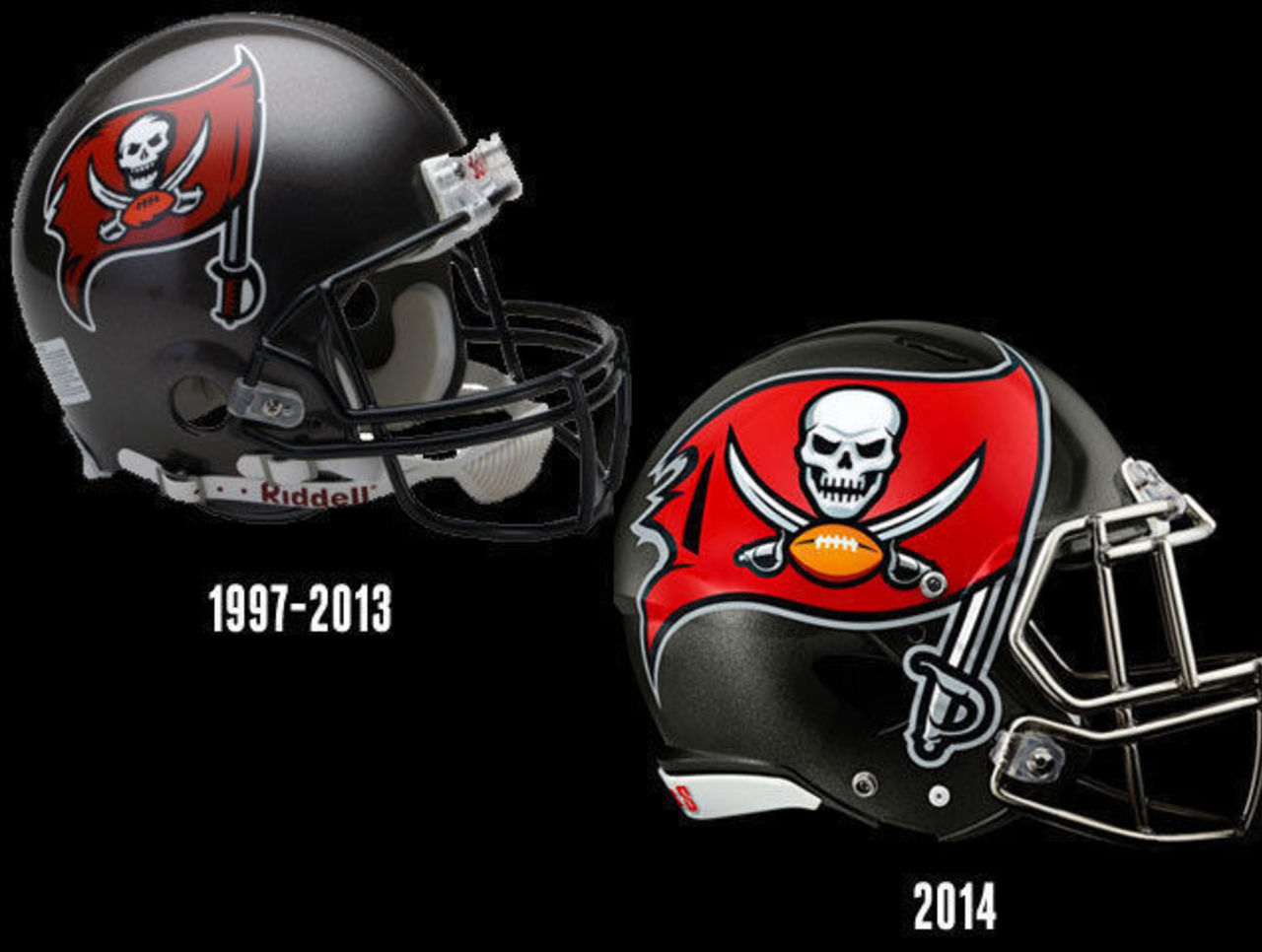
The new Bucs look is realistically a modernization of their previous set, one which they had been wearing since 1997 -- including during their lone Super Bowl victory in the 2002 season. Slightly modernizing your look over time is a great way to keep things fresh but also keep that connection to the teams of your past; over time it helps strengthen the connection a fan has with the brand and avoids the "it's a total rebrand... eh, nevermind, right back to the old look" embarrassment that we've seen teams like the Toronto Blue Jays, Detroit Pistons, and New York Islanders go through in recent years.
What's changed between the new Bucs and the old Bucs you ask? Fantastic question. We'll start with the color scheme since that has an affect on everything in the new set:
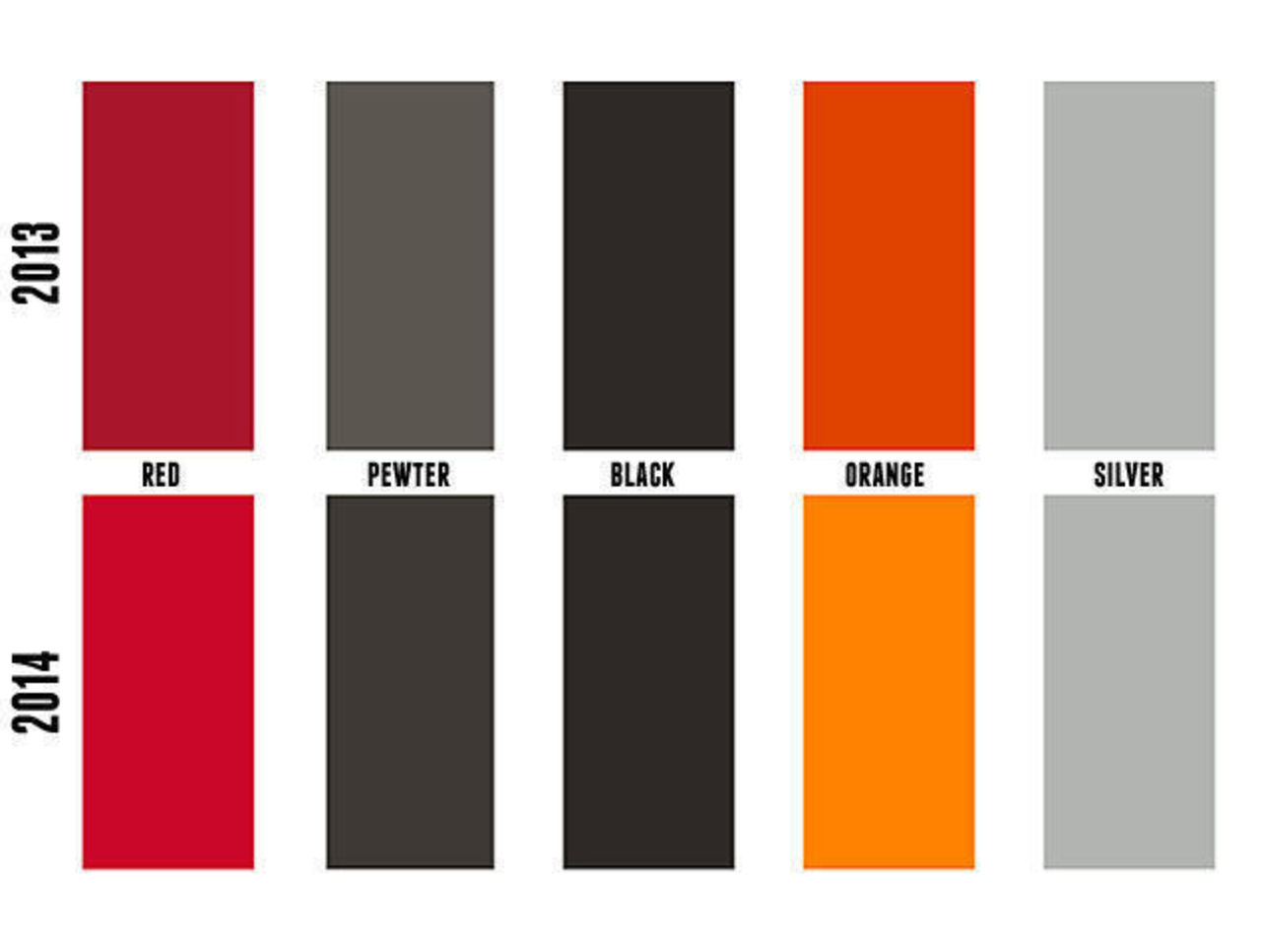
(Team color information courtesy ColorWerx.us)
As you can see, the red and orange has been lightened considerably - the new orange is actually spot on with their old orange of the 80s. The pewter, a silver lookalike which the team uses on their helmet shell, is now much darker and metallic (or chrome). Black and silver remain relatively unchanged.
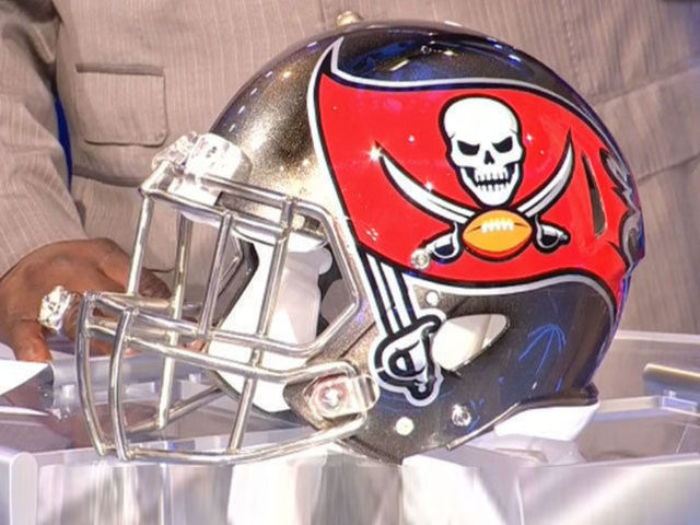
You'll see the differences between 2013 pewter and 2014's chrome pewter in the actual photograph comparison of the helmets here:
You can really see the difference with the chrome in the logo and the facemask. Yes, the facemask is also chrome - this is the first of its kind in the NFL.
Buccaneers Pro Bowl DT Gerald McCoy does a pretty good job describing it:
"There are so many unique things about this helmet, and that’s what we want to be as a team and as an organization. The skull is modernized and he looks meaner. And the vibrant red on the side is going to stand out and shine. I love it, and I’m sure my teammates are going to love it."
Also changed, the size of the logo... she's huge! So huge it actually gets cut off by a ventilation hole in the shell.
“The logo stands out, and that’s exactly what we want to do in the NFL. People will see us and say, ‘That’s the Bucs.’. We want to be us and we want to stand out as the Bucs. The huge logo and the chrome facemask, it does all of that." - McCoy continued.
Moving on to the actual logos, starting with the primary pirate flag mark which appears on the side of the helmets:
Again the shade of red has been lightened quite a bit, as has the orange. The flag loses some of it's tatteredness (word?) and looks much more clean, which might not necessarily be a good thing for a team using pirate imagery.
The skull has been modernized, with a more menacing appearance and there's an update to the design of the sword, most noticeably in the handle. While silver is practically non-existent in the 1997-2013 logo, it's much more prevalent in the new 2014 design, used as an outline, in the sword handle, and as a detail on the skull itself.
The star of this new set has been the alternate "pirate ship" logo, which has scored a near record-breaking high rating over on SportsLogos.Net at the time of this post. Very early candidate for 2014's best new logo of the year.
The differences between these two logos are much more obvious, the 2014 mark is a much more realistic and detailed portrayal of an ancient pirate ship with waves crashing right into it, whereas the 97-13 image is much more simplified and heavy in its use of black.
Much less exciting but still a part of the set, the wordmark logos have also been updated. These logos are typically found on jersey collars and in team endzones, so they do actually play a role in the overall new brand of a team.
Like the rest of the new stuff, it's all much more clean versus last year. Again, the use of silver has been increased and once again the shade of red is lightened. New for 2014, a wordmark which simply reads "BUCS", the shortened nickname of the club, this might be a good candidate for use on the uniform since it's much shorter in length than the standard "Buccaneers" mark, you can also just barely see that this logo is on the back of the new helmet in the pic a couple of paragraphs up.
Overall, a much improved look to this team over last season and the early fan feedback indicates most of you feel the same way about it. As for the uniforms? We'll have to wait just a little longer, they're set for unveiling on March 5th. I'm predicting an orange alternate jersey, a nice compromise for the "creamsicle" fans!