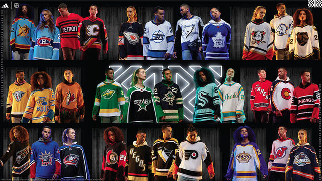
The NHL reignited its Reverse Retro craze on Thursday, unveiling alternate uniforms for all 32 teams for the second time in three seasons.
Some are incredible, some are not. Most fall somewhere in between. Without further ado, scroll down and find out where your favorite team ranks.
32. Detroit Red Wings
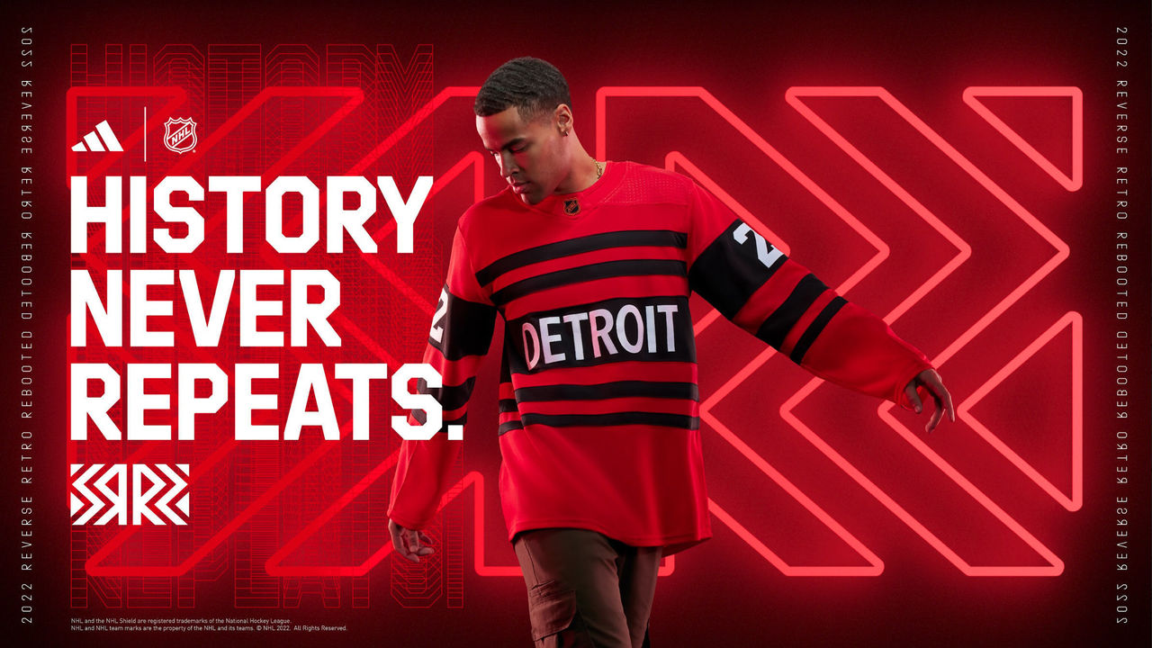
Sure, Detroit's options are limited, but a red version of these, with the addition of black, is a massive failure.
31. Chicago Blackhawks
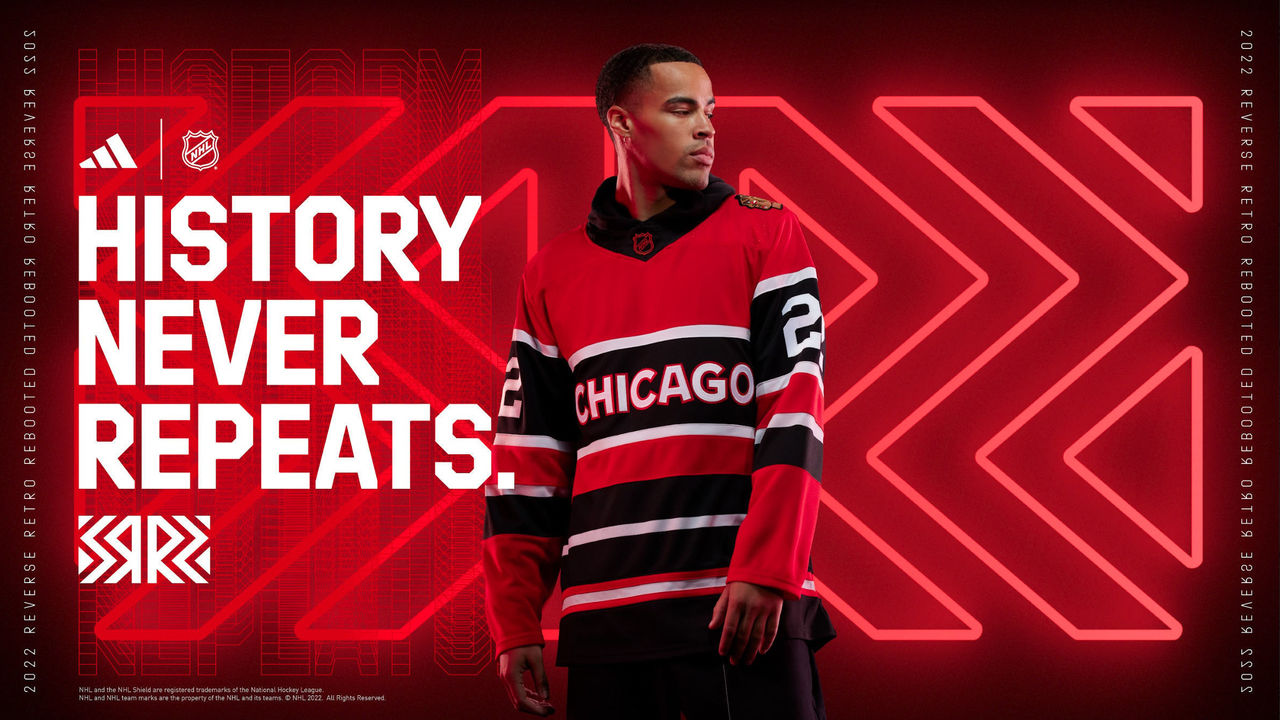
These are basically the same as Detroit's, only slightly less bad.
30. Tampa Bay Lightning
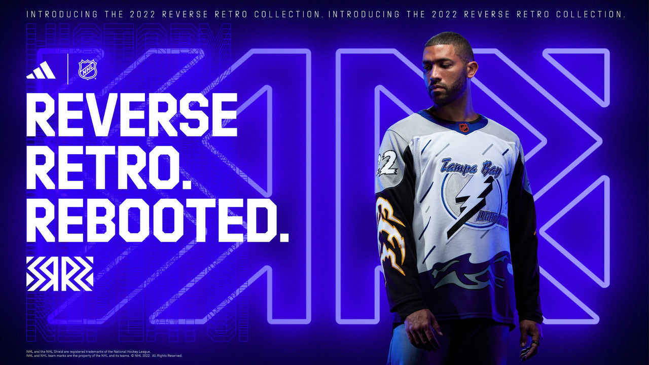
If a storm came and swept these jerseys away, nobody would be upset. The sleeves in particular make these dreadful.
29. Columbus Blue Jackets
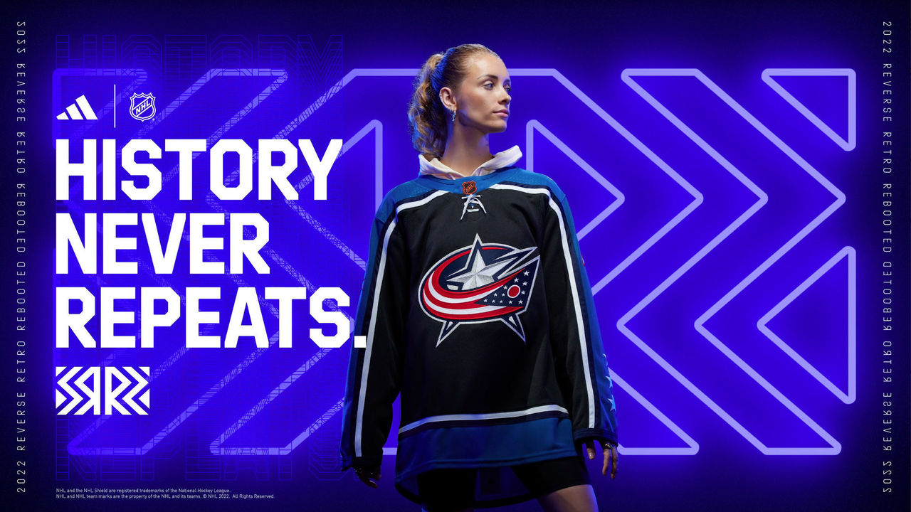
Fans mainly want Reverse Retros to be fun, and these aren't. The Blue Jackets' short history doesn't give them a ton of colors to work with, but incorporating the infamous bug mascot shoulder patch as the primary logo could have been a hit.
28. Calgary Flames
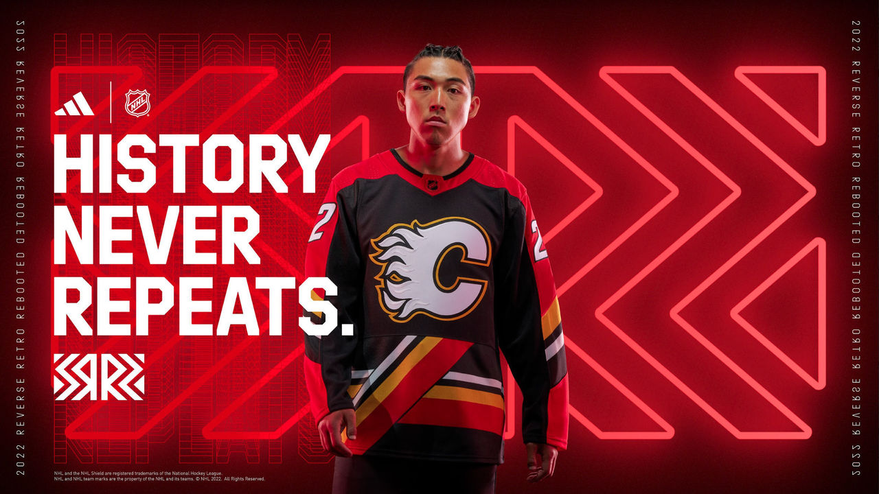
It's a good thing Calgary's primary uniforms are nearly perfect, because yikes.
27. Winnipeg Jets
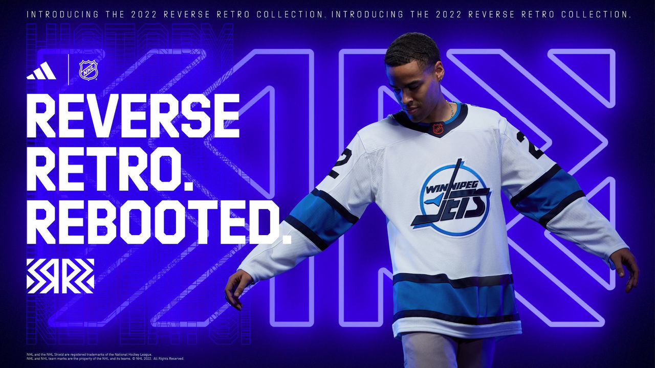
The throwback logo is great, but the Jets' current color scheme doesn't do it justice. An ode to the Thrashers days will have to wait.
26. Philadelphia Flyers
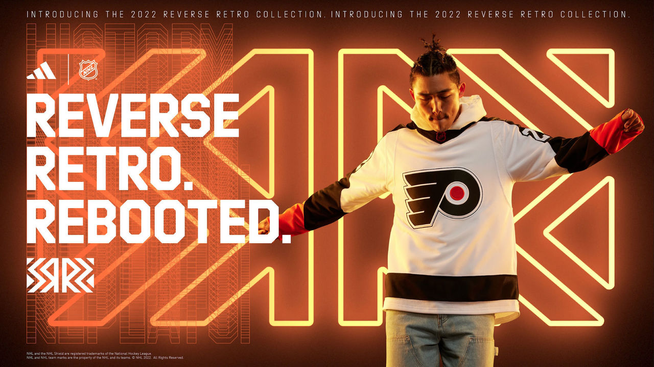
Subtracting most of the orange from the Flyers' threads wasn't a good idea in the early 2000s, and it still isn't now. The one saving grace is the usage of Cooperalls, but unfortunately, the team will only wear those in warmups.
25. Nashville Predators
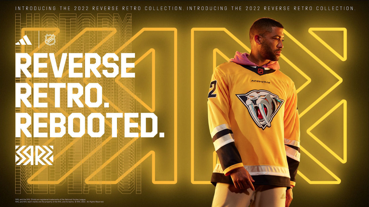
This is basically the same as the mid-2000s alternate without the mustard shade of yellow. We like the logo, but a blue base color would've worked better.
24. Ottawa Senators
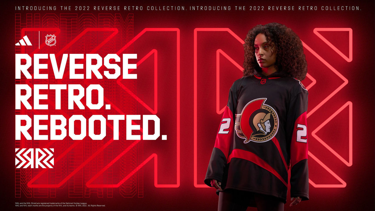
This is extremely similar to Ottawa's current black jersey, albeit with an ode to the design of the pre-lockout reds. The Senators' refusal to apply gold to their Reverse Retros after featuring it in these mid-2000s alternates is simply befuddling.
23. Carolina Hurricanes
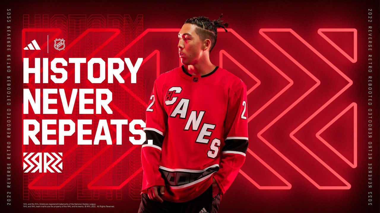
Using the "Canes" wordmark instead of a logo is a big miss. At least there are warning flags in the bottom stripe.
22. Seattle Kraken
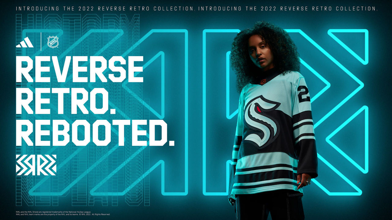
The design is clearly an homage to the Seattle Metropolitans, but it's not a perfect match with the Kraken's color scheme.
21. Montreal Canadiens
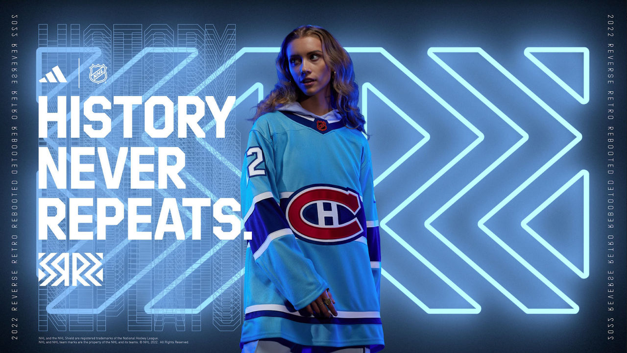
While the baby blue may be a shoutout to MLB's defunct Montreal Expos, a Canadiens jersey without the color red (aside from the logo) just seems wrong.
20. New York Rangers
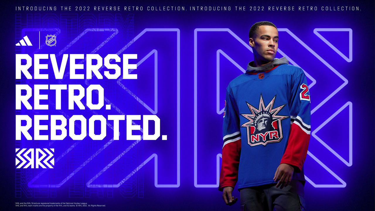
The Lady Liberty logo is always a hit, but we're not loving the base shade of blue.
19. St. Louis Blues
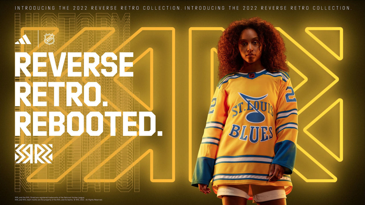
The Blues are supposed to be blue, not yellow, and there's a reason the franchise didn't go with this prototype design.
18. Vegas Golden Knights
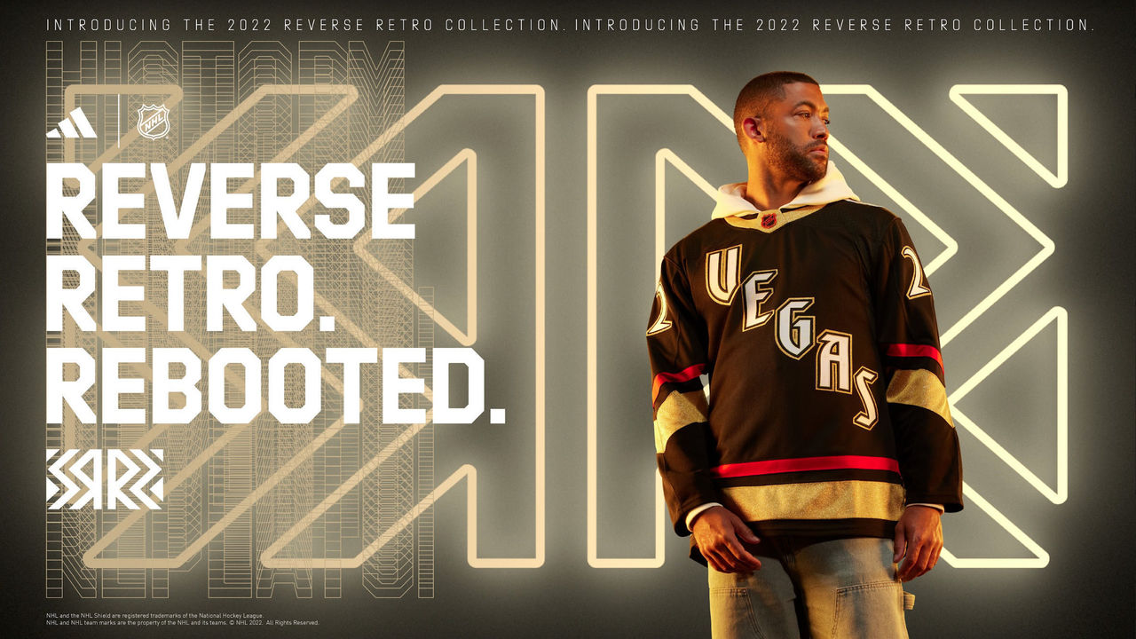
Without a long history of hockey in Vegas, the Golden Knights had to get creative, and they did so by making these glow in the dark.
17. Arizona Coyotes
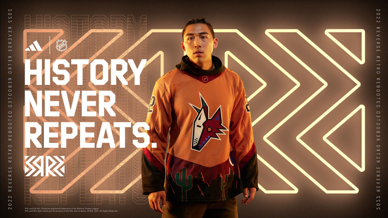
The sand color goes well with the desert theme, but we find the previous purple Reverse Retros superior.
16. New Jersey Devils
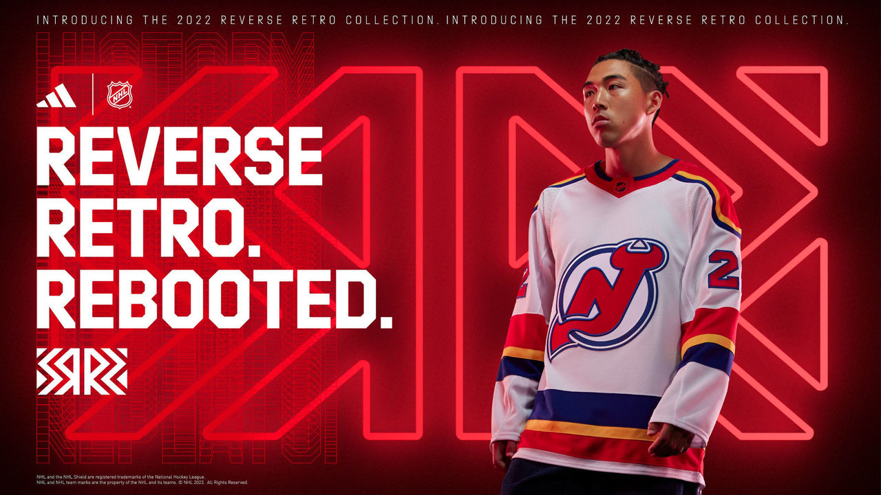
The Devils incorporated blue and yellow into their standard design as a throwback to the Colorado Rockies, who moved to New Jersey in 1982. We're neutral on it.
15. Boston Bruins
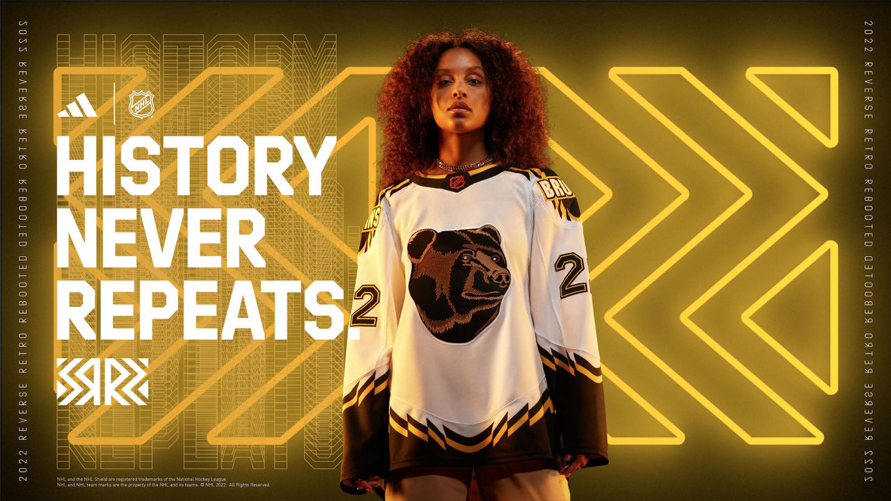
These aren't the eyesore that the original yellows were, thanks in large part to the white base. Fans seem to love the "Pooh Bear" logo, even though it's the least menacing-looking bear ever.
14. Edmonton Oilers
Adding orange to the Oil Gear alternates of the 2000s will likely be a hit with millennials, but older generations may not take to them.
13. Dallas Stars
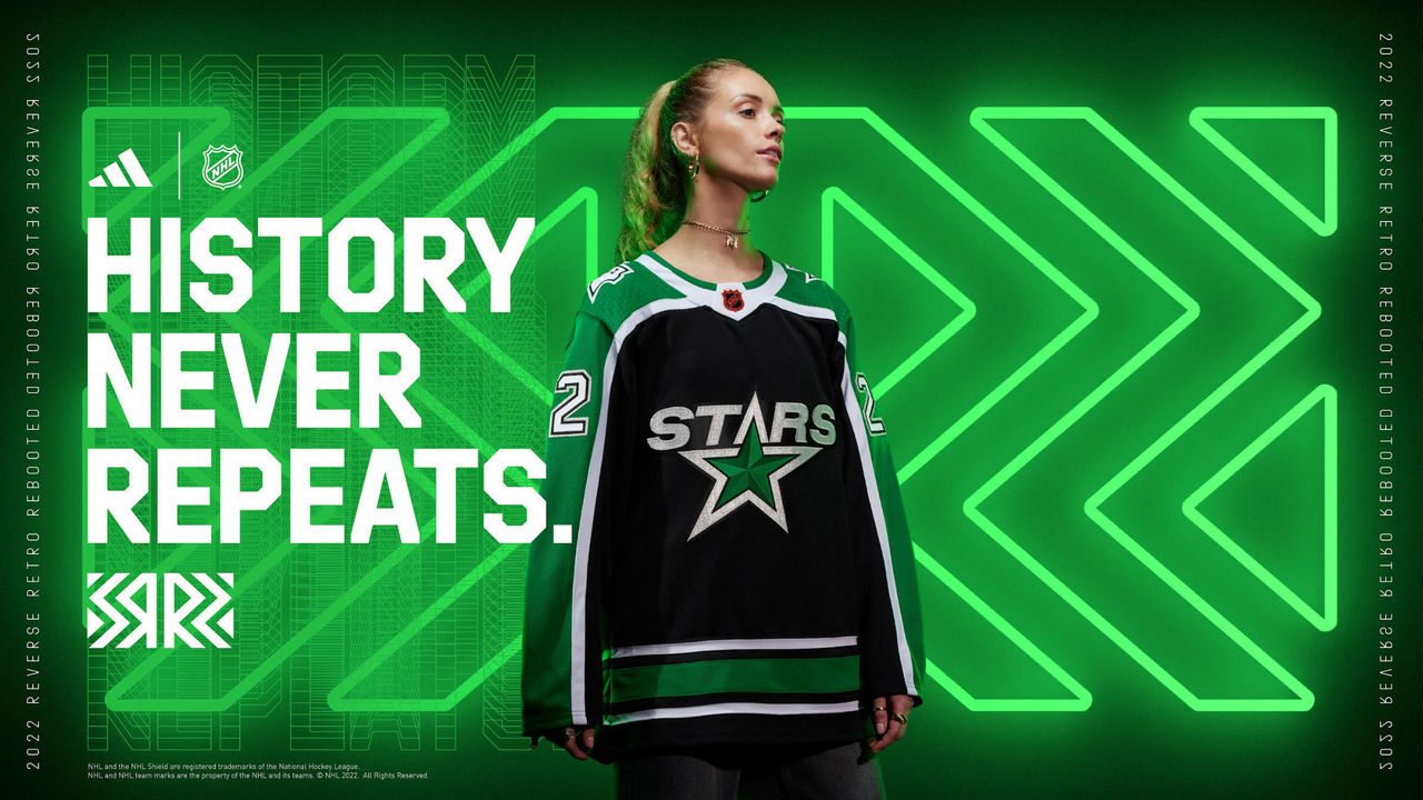
An homage to the uniforms the Stars first wore after moving to Dallas, the green shoulders could really make these pop.
12. New York Islanders
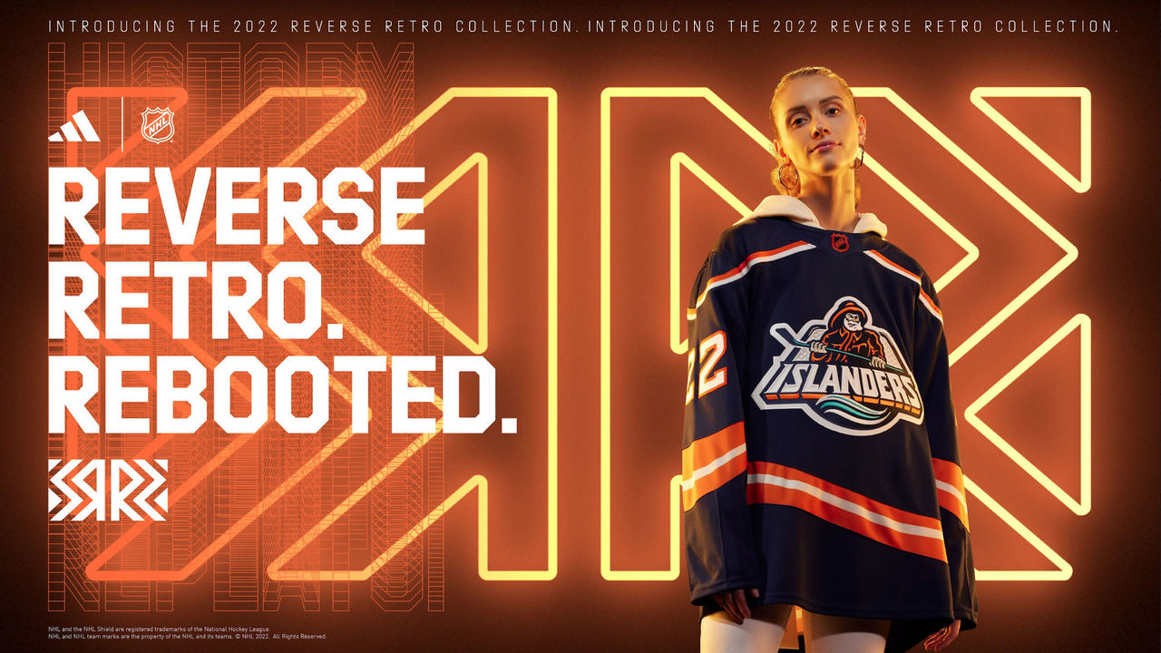
The fisherman logo was much-maligned in its day, but it works for an alternate jersey like this. Leaving aqua out of the color scheme aside from the logo was a great call.
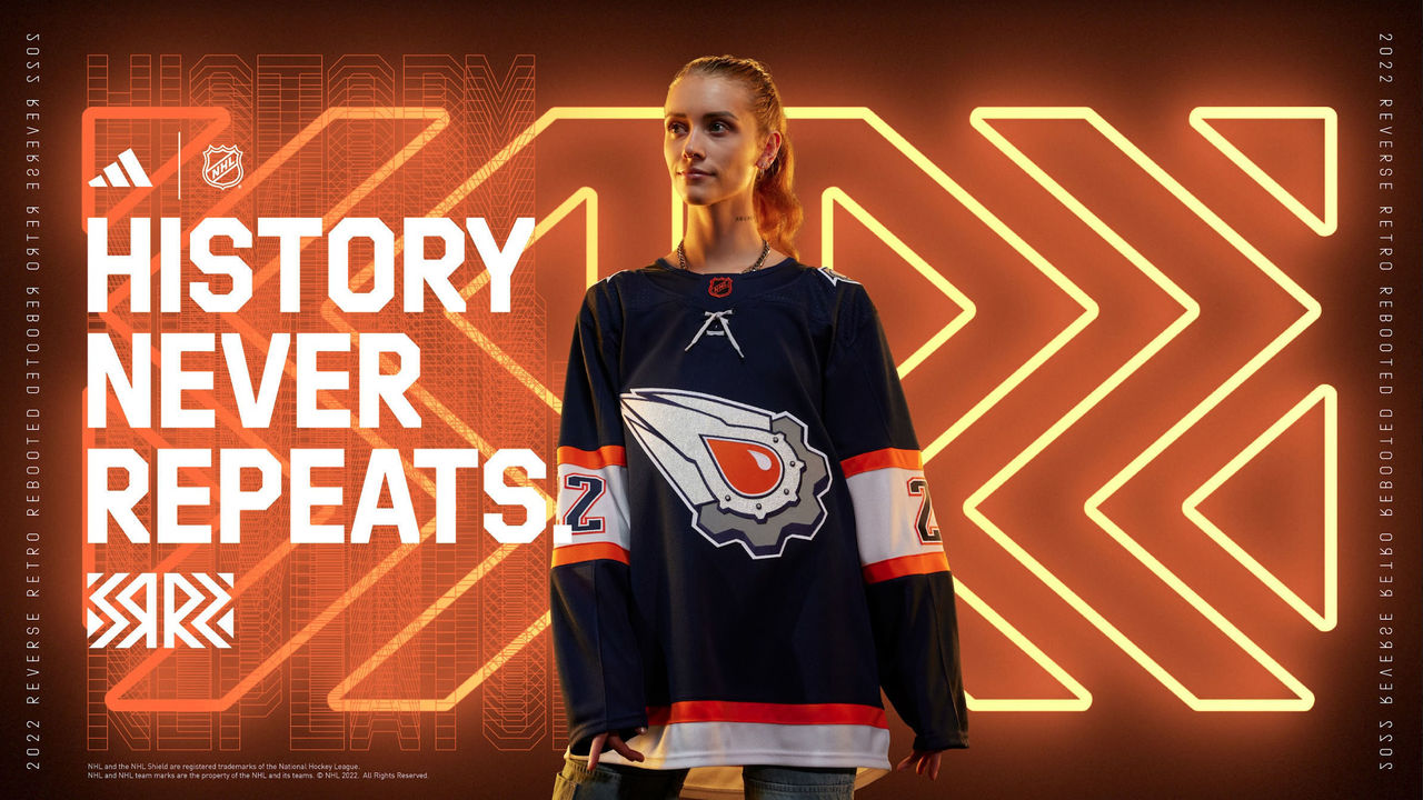
11. Buffalo Sabres
"Goathead": check. Updated color scheme: check. A win-win.
10. San Jose Sharks
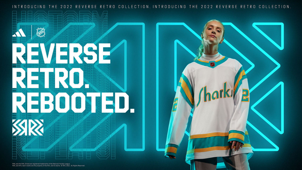
Just changing the "Seals" lettering to "Sharks" without doing anything else is a bit lazy, but this is a nice throwback to the California Golden Seals.
9. Toronto Maple Leafs
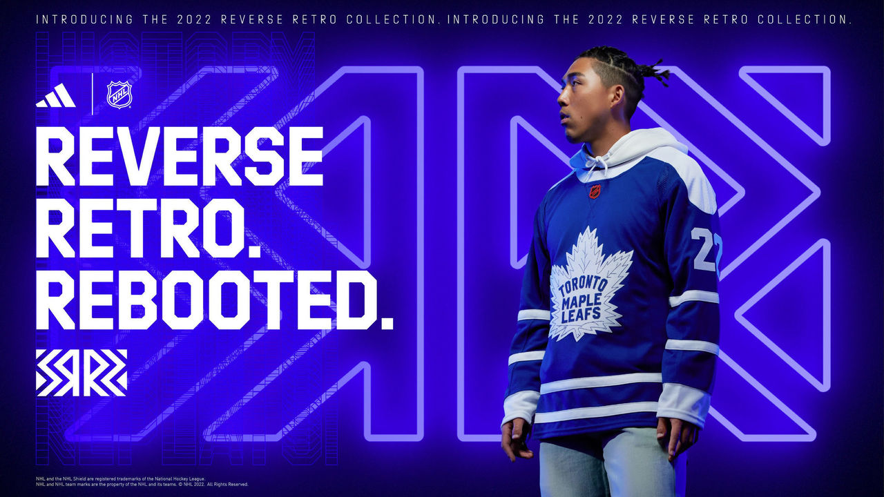
Yes, it's similar to their current blues - but even better. The shoulder yoke is fantastic, and the tweaked logo really makes this look like an old-time hockey "sweater."
8. Minnesota Wild
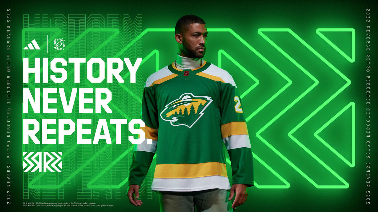
This North Stars-inspired uniform is awesome, but this is basically just a green version of the Wild's previous Reverse Retro, so they lose marks for creativity. I thought history never repeats?
7. Colorado Avalanche
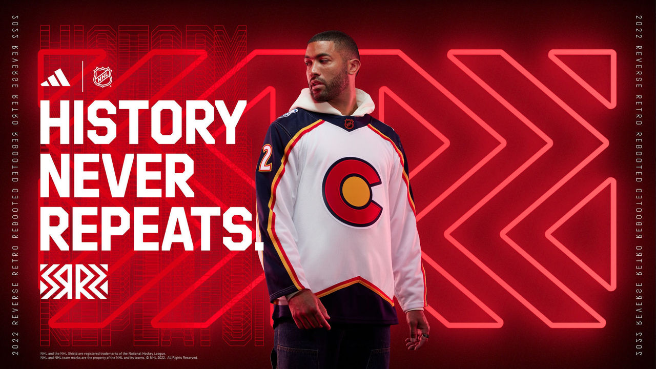
The Avalanche put their own spin on the Colorado Rockies uniforms (the former NHL team, not the MLB club) but it's much more successful, and creative, than New Jersey's. The Colorado state flag logo and the early Avalanche jersey design are big wins.
6. Vancouver Canucks
The design and color scheme are clean, and while the Johnny Canuck logo is a little corny, it's a nice nod to the history of professional hockey in Vancouver.
5. Washington Capitals
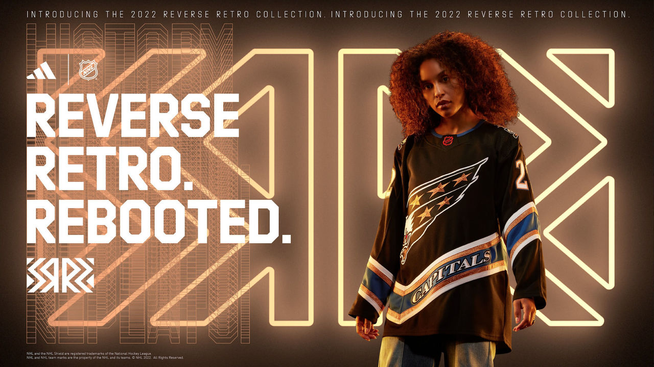
The flying eagle is back - this time, with era-appropriate colors. These are better than the team's '90s blue jerseys and the U.S. Capitol logo uniforms that Alex Ovechkin debuted in.
4. Florida Panthers
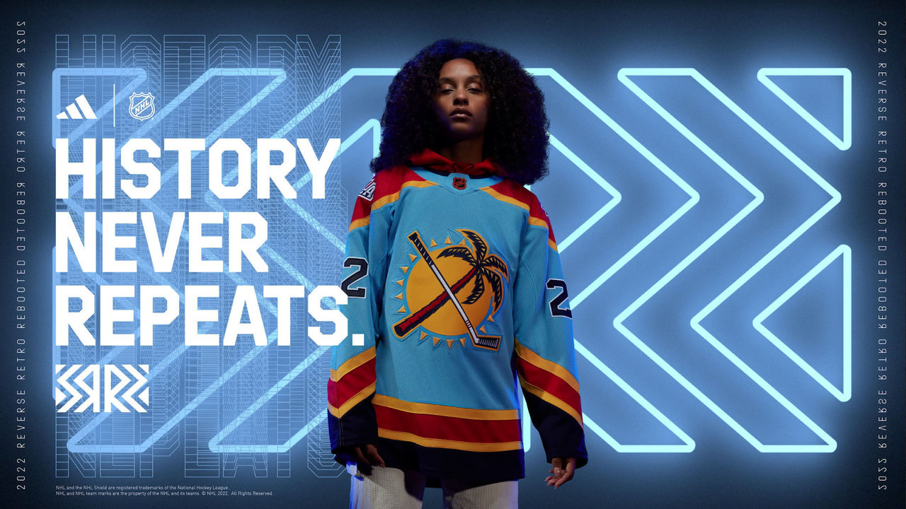
This jersey may clash a bit by using so many colors, but it's incredibly fun, and that's what it's all about, right? The palm tree on the front crest really pops.
3. Pittsburgh Penguins
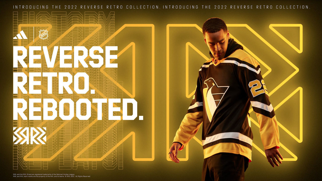
The '90s "Robo-Penguin" logo and triangular shoulder yokes make this jersey a massive win.
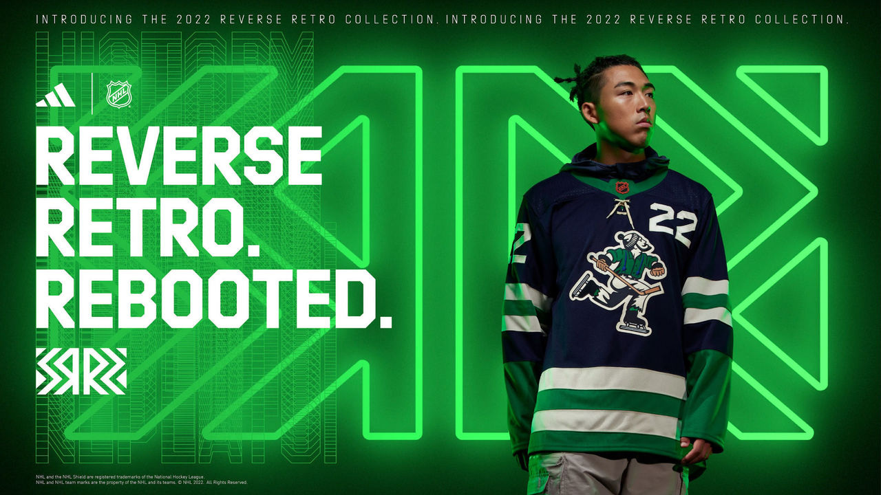
2. Anaheim Ducks
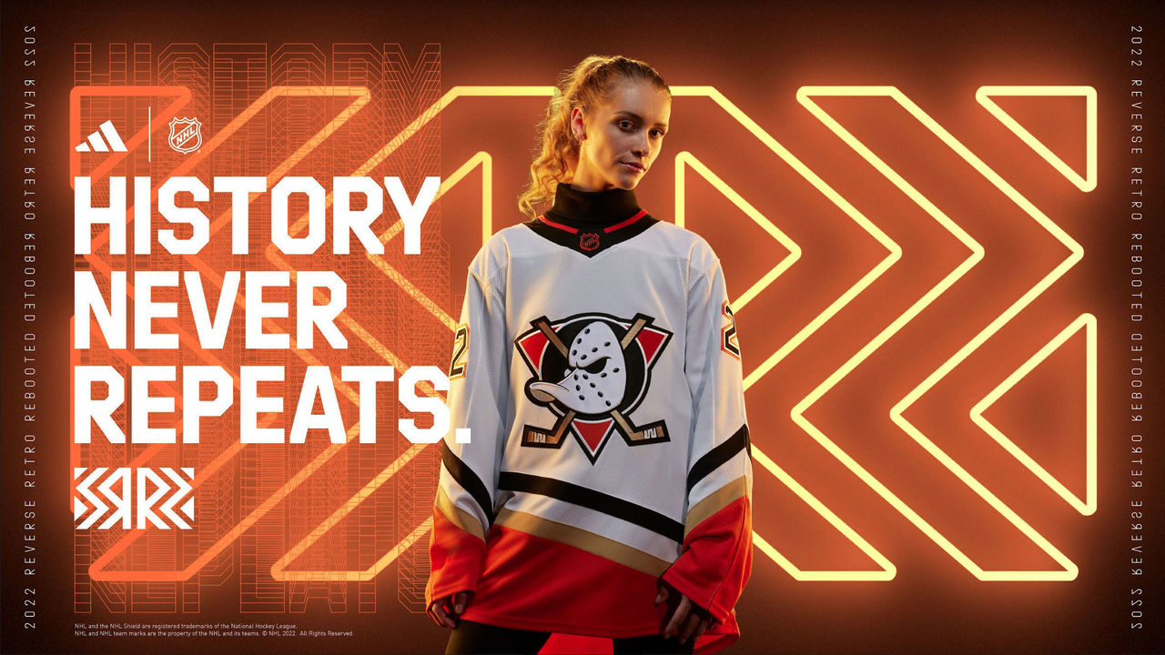
With these uniforms, the Ducks could very well be Mighty again. The original logo and jersey design are perfect, and the orange color scheme works.
1. Los Angeles Kings
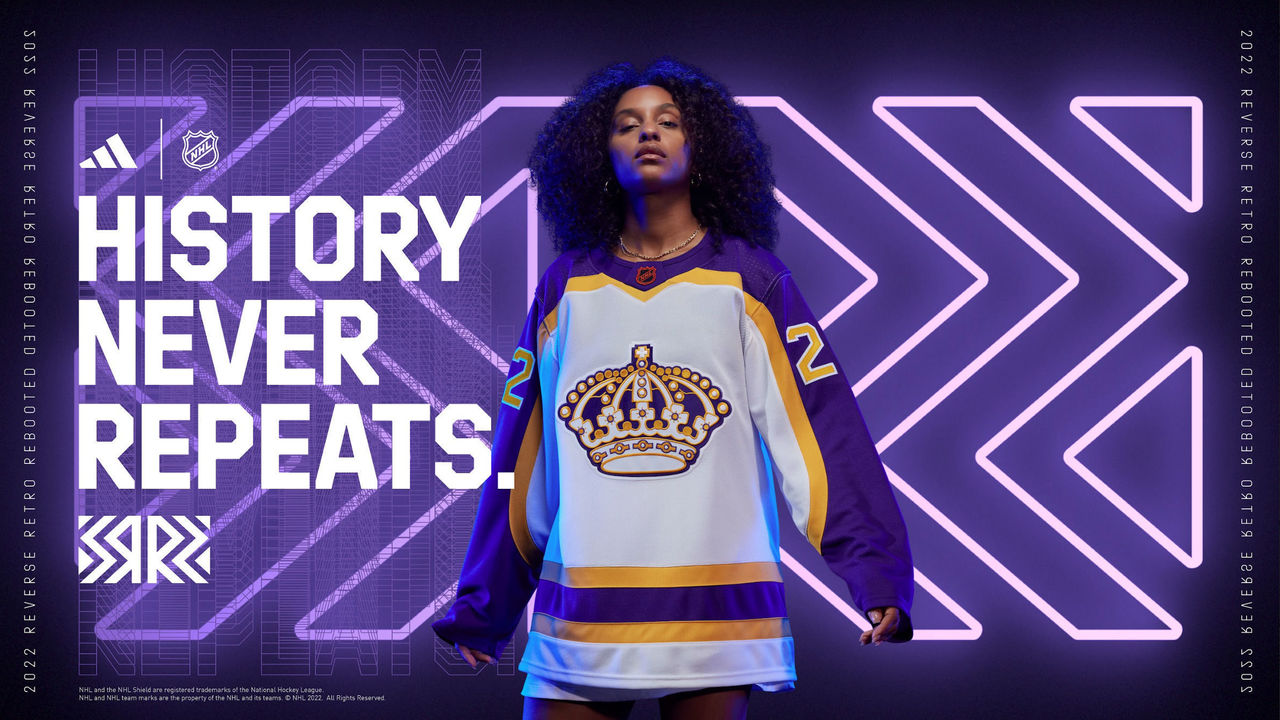
The purple-and-gold color scheme never misses, does it? The crown logo is severely underrated too.