"If you look good, you play good." - Deion Sanders
theScore is counting down the 100 best uniforms in sports history, with a new post every weekday until May 15.
100-91 | 90-81 | 80-71 | 70-61 | 60-51
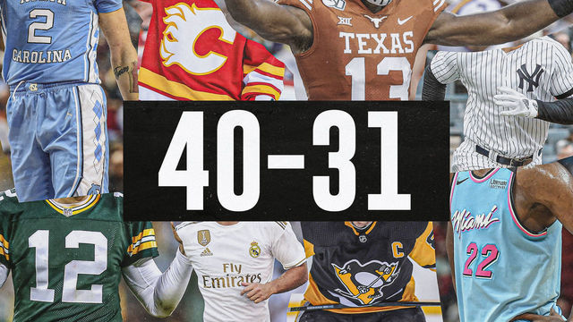
50-41 | 40-31 | 30-21 | 20-11 | 10-1
40. Brazil (2014)

You could draw three stripes - yellow, blue, white - and every soccer fan on the planet would instantly know what they represent. The five-time World Cup winners first donned their iconic kit in 1954 following the national tragedy that was a home defeat to Uruguay at the 1950 World Cup in all-white attire. A newspaper ran a contest to design a new strip for the national team that needed to incorporate all four colors of Brazil's flag: green, yellow, blue, and white. A 19-year old illustrator won the prize, in part thanks to his genius idea to use green merely as trim on the yellow shirts.
39. Portland Trail Blazers (1990s)
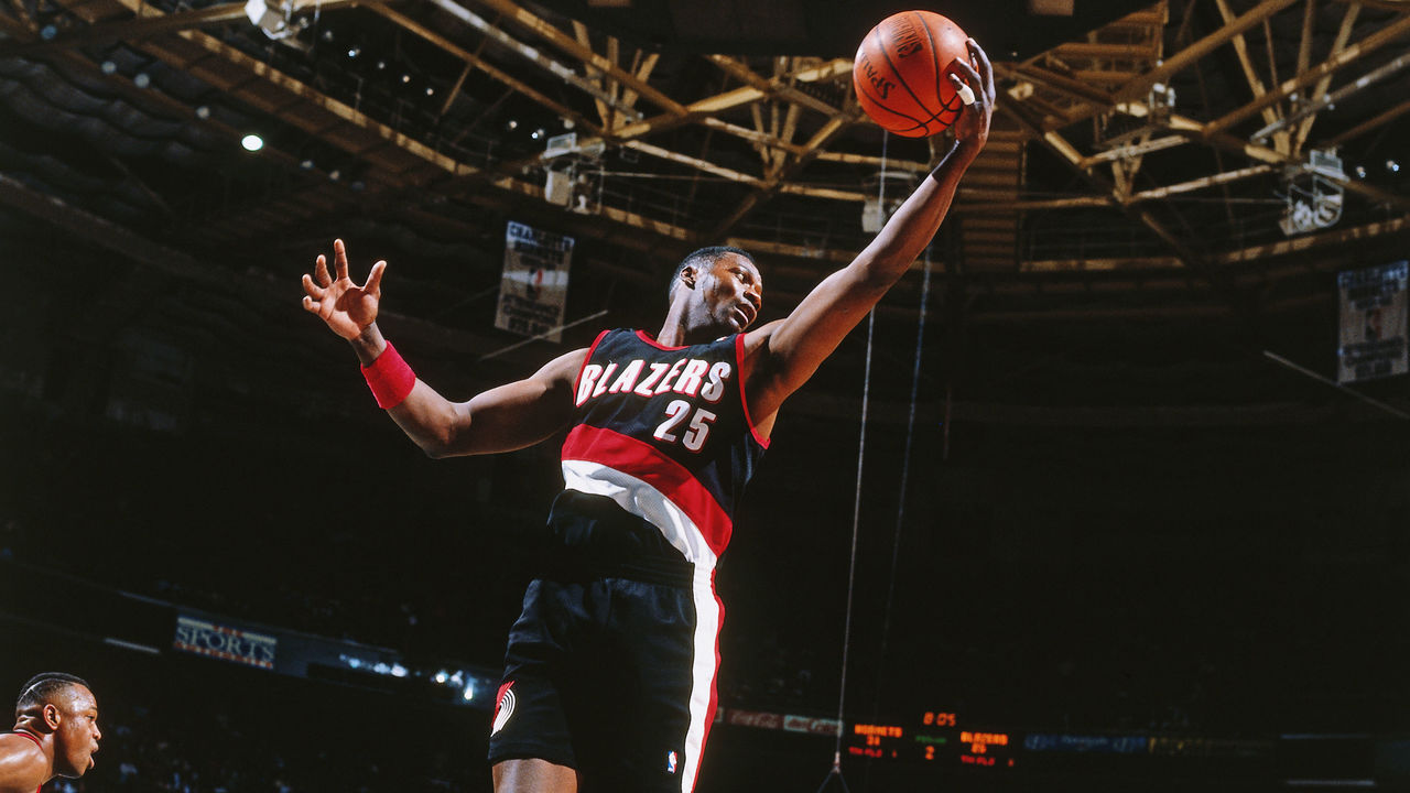
The Blazers' diagonal jersey stripe debuted in the '70s but was perfected in the '90s. The fluidity of the design running down the side of the shorts is magnificent work, and the pinwheel logo on the opposite leg, along with a bolder wordmark than in years past, created a uniform that never needs to be altered.
38. Real Madrid (2011-12)

The panache and glamor of Real Madrid live vicariously through their all-white kits. Owning perhaps the most iconic look in all of Europe on a year-to-year basis, Los Blancos' style peaked in 2011-12 with a look that featured collars and gold trim. Really, though, pick any given year and you'll find one of the cleanest and classiest home kits in all of footy.
37. Miami Dolphins (1970s)
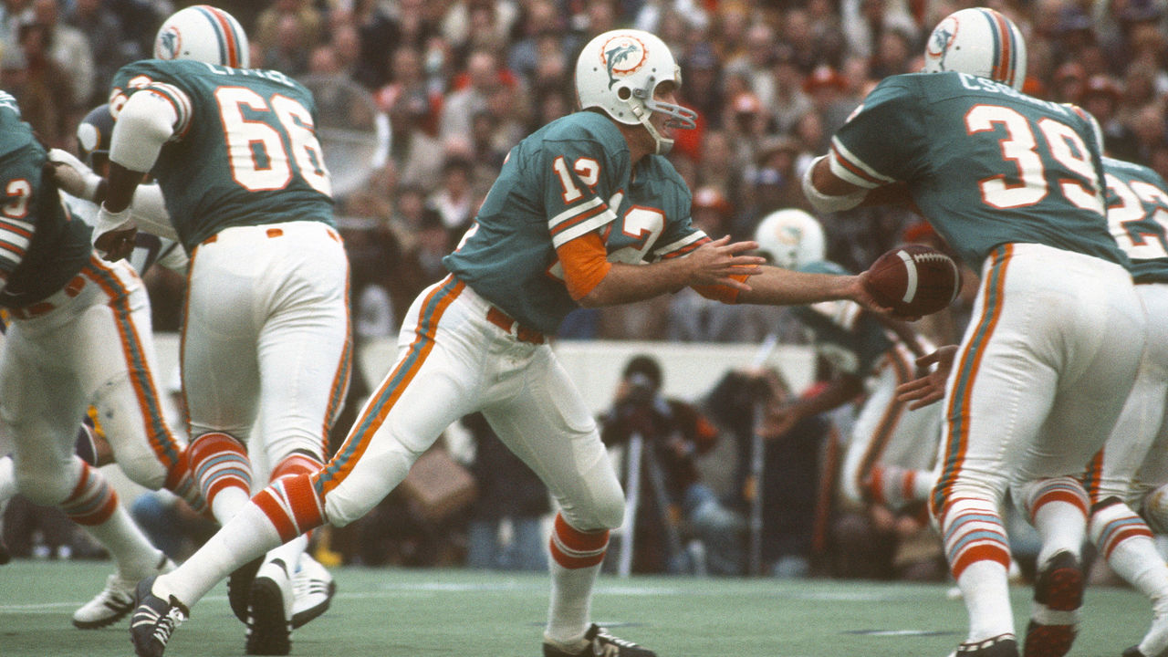
Not only did the Dolphins produce a perfect season in 1972, but they also owned perfect uniforms. The aqua and orange combo sparkles to this day, but the prime years of Miami's franchise and uniforms also featured the ideal jersey and sock stripes, along with a cartoonish yet brilliant helmet logo. It's no wonder today's Dolphins are showered with praise any time they break out their '70s throwbacks.
36. St. Louis Blues (1970s)
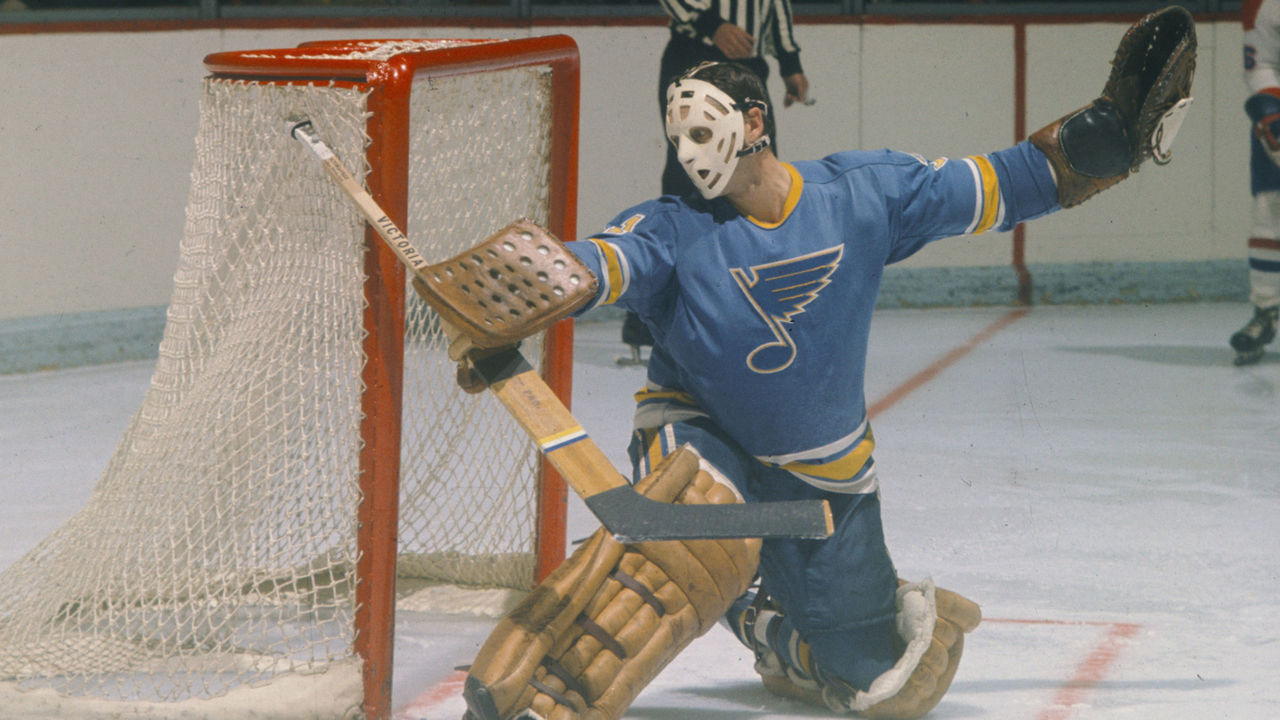
After joining the NHL in the league's first wave of expansion in 1967, the Blues opened eyes by making the Stanley Cup Final in each of their first three seasons. They also made an immediate impact by looking incredible as soon as they took the ice, donning uniforms that rivaled those in the "Original 6." St. Louis' blue was unique compared to those of the Maple Leafs, Rangers, and Canadiens back in the day, and the dull yellow complemented it exquisitely. Shifting to darker shades is a decision we wish the Blues never made.
35. Penn State football (current)
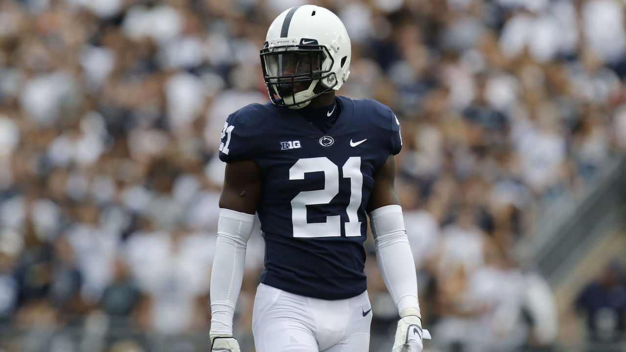
It's difficult to conceive of a more simple uniform than the Nittany Lions' white stripeless pants, navy blue stripeless home jerseys, and logo-less white helmets adorned with a single navy stripe. In this case, simplicity is pretty close to perfection.
34. Netherlands (2016)

The flag of the Netherlands is red, white, and blue, but the Dutch aren't counted among the too-long list of sports teams donning those three colors. Instead, they've carved out perhaps the most unique and famous look in international sports by wearing the colors of the House of Orange, the Dutch Royal Family. The throngs of orange-clad fans who follow the Netherlands' national soccer teams create a home stadium atmosphere anywhere on the planet.
33. Kansas City Chiefs (current)
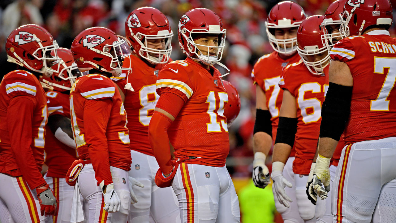
Full credit to the Chiefs for never entertaining the idea of redesigning their traditional uniforms, as tempting as it may have been, over the decades that passed between their Super Bowl appearances. Now, with the best football player alive donning red and yellow, the Chiefs' classic look has a new sheen. Those bright colors really pop under the September sun in Arrowhead, but they also look great on a snowy Sunday night in January.
32. Vegas Golden Knights (current)

The Golden Knights needed to make a splash with their identity as Sin City's first professional franchise. And as if making the Stanley Cup Final in their expansion season wasn't enough, they also happened to settle on a perfect contemporary design. Vegas opted for granite, gold, white, and a clever dash of red. The use of white gloves with the road uniforms was a phenomenal touch, one that bucked the conservative nature that consistently holds hockey back.
31. Toronto Blue Jays (1990s)
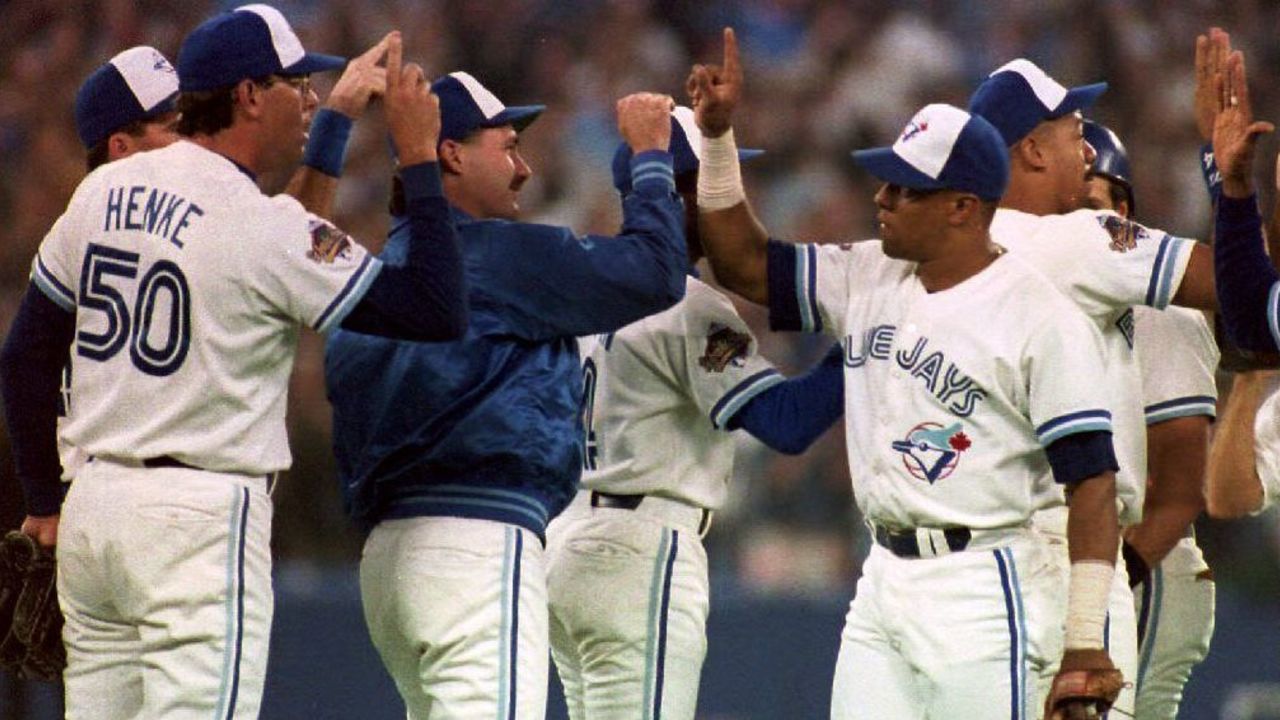
The Blue Jays' digs are sharp today, but the original look that provided the inspiration for Toronto's current uniforms was even better. The tri-color hat is an all-time classic, and the use of baby blue in the logo and stripes is a style forever immortalized thanks to the club's back-to-back World Series titles in the early '90's.