"If you look good, you play good." - Deion Sanders
theScore is counting down the 100 best uniforms in sports history, with a new post every weekday until May 15.
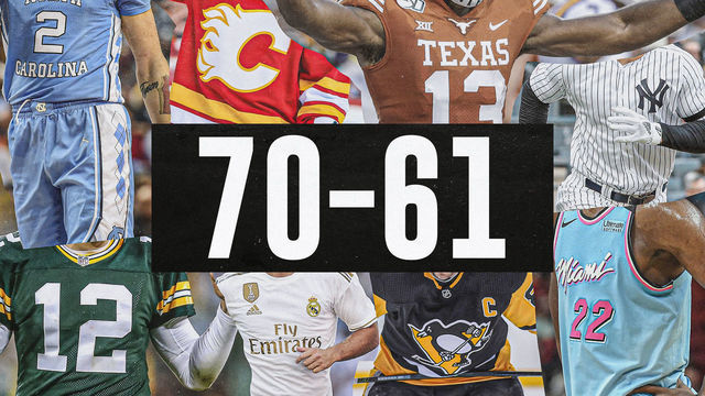
100-91 | 90-81 | 80-71 | 70-61 | 60-51
50-41 | 40-31 | 30-21 | 20-11 | 10-1
70. Charlotte Hornets (1990s)
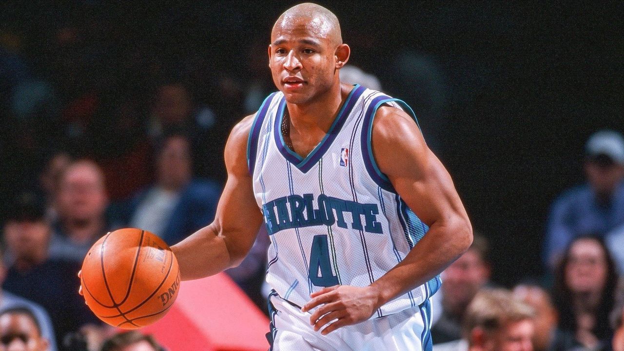
The retro Charlotte uniform may not be the most visually appealing at first glance, but the franchise's initial choice of teal kickstarted a major trend across sports in the '90s, and it was the first basketball uniform to feature pinstripes. The overall look holds up today, but the historical significance also carries weight.
69. Seattle SuperSonics (1990s)
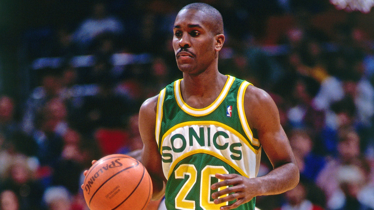
Green and yellow, largely underused in sports, belonged exclusively to the Sonics in the NBA before they became the Thunder. The colors are aesthetically pleasing, but the arched white patch and wordmark helped this jersey become a classic. Is the font a little amateurish? Perhaps. Even if this uniform's absence has made our hearts grow fonder for it, we're unashamed to rank it this high.
68. Minnesota Vikings (current)
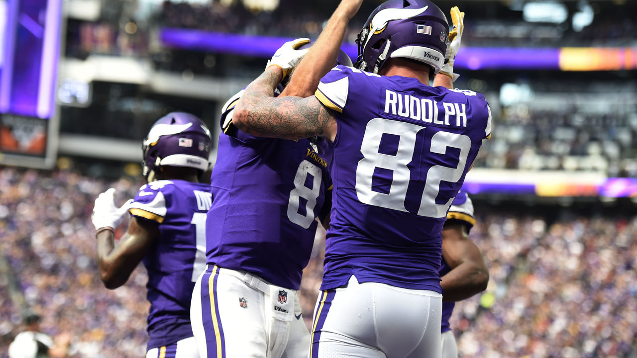
The Vikings' 2013 redesign yielded an absolute gem. The horned helmet will be a staple for the franchise forever, but the shoulder stripe mimicking a boat's sail, the yellow accent underneath, and an updated font were all welcome additions. This modern design is the best the Vikings have ever looked and makes us yearn for more purple uniforms.
67. Vancouver Canucks (1990s)
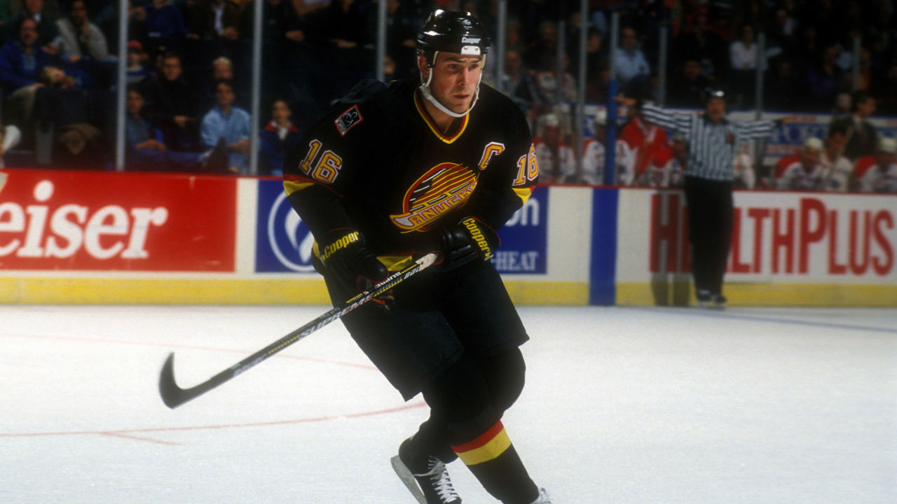
Not many teams have had such a drastic range of colors and logos throughout their history as the Canucks, but the "Flying Skate" era in Vancouver stands above the rest. Black, yellow, and red complement each other perfectly, and when the club brought these back as its alternates this past season, they flew off of the shelves and drew admiration across the NHL.
66. Tampa Bay Buccaneers (1970s)
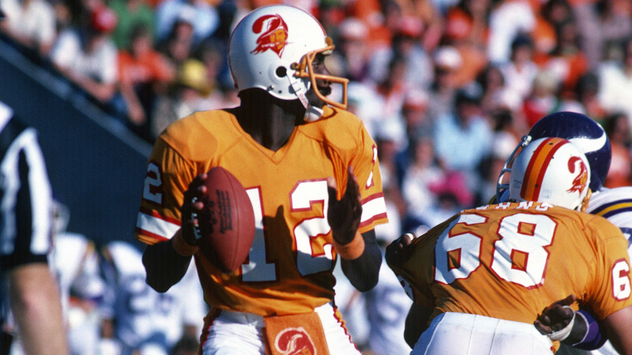
The Bucs' creamsicle getups are perhaps the most divisive uniforms in all of sports. They were mocked relentlessly when they debuted, but that was partly because the team itself was so dreadful. Now, the bright orange digs are semi-revered for their uniqueness. We're on the side of the latter, as vibrant colors almost always win out. Plus, we unironically love the "Bucco Bruce" logo.
65. Clemson football (current)
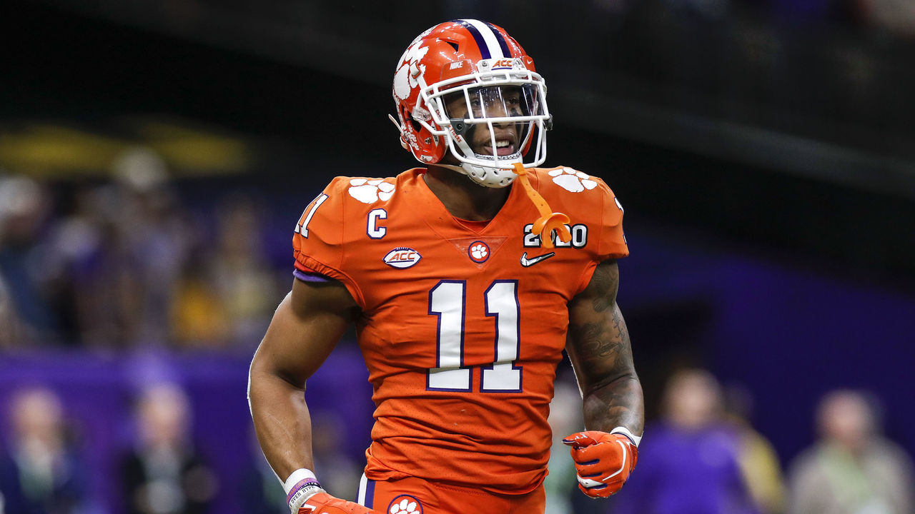
The combination of purple and orange certainly isn't common, but Clemson pulls it off beautifully. Not going overboard with the accent colors is the key, as matching stripes down the pants and helmet help create one of the most recognizable uniforms in college football. The paw prints on the helmet and shoulders are also a clever touch.
64. Philadelphia 76ers (current)
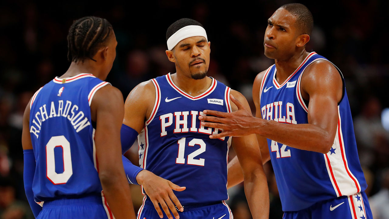
While it isn't unique, the 76ers' current red, white, and blue setup deserves recognition for being so clean. The 3D font on the front is gorgeous, and the red trim and stars down the sides are the little details that will help this uniform stand the test of time.
63. Kansas City Royals (current)
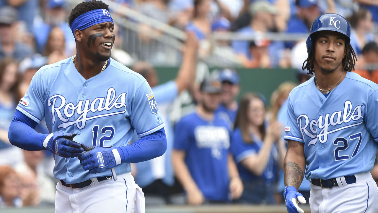
Multiple MLB teams have experimented with baby blue over the years, but the Royals have stuck with it from the jump. The light and dark shades of blue blend together incredibly, and the white cursive writing and touch of gold in the logo on the sleeve add to a near-perfect design. It's tough to top these beauties during a sunny afternoon game in the dog days of summer.
62. Chicago Bears (current)
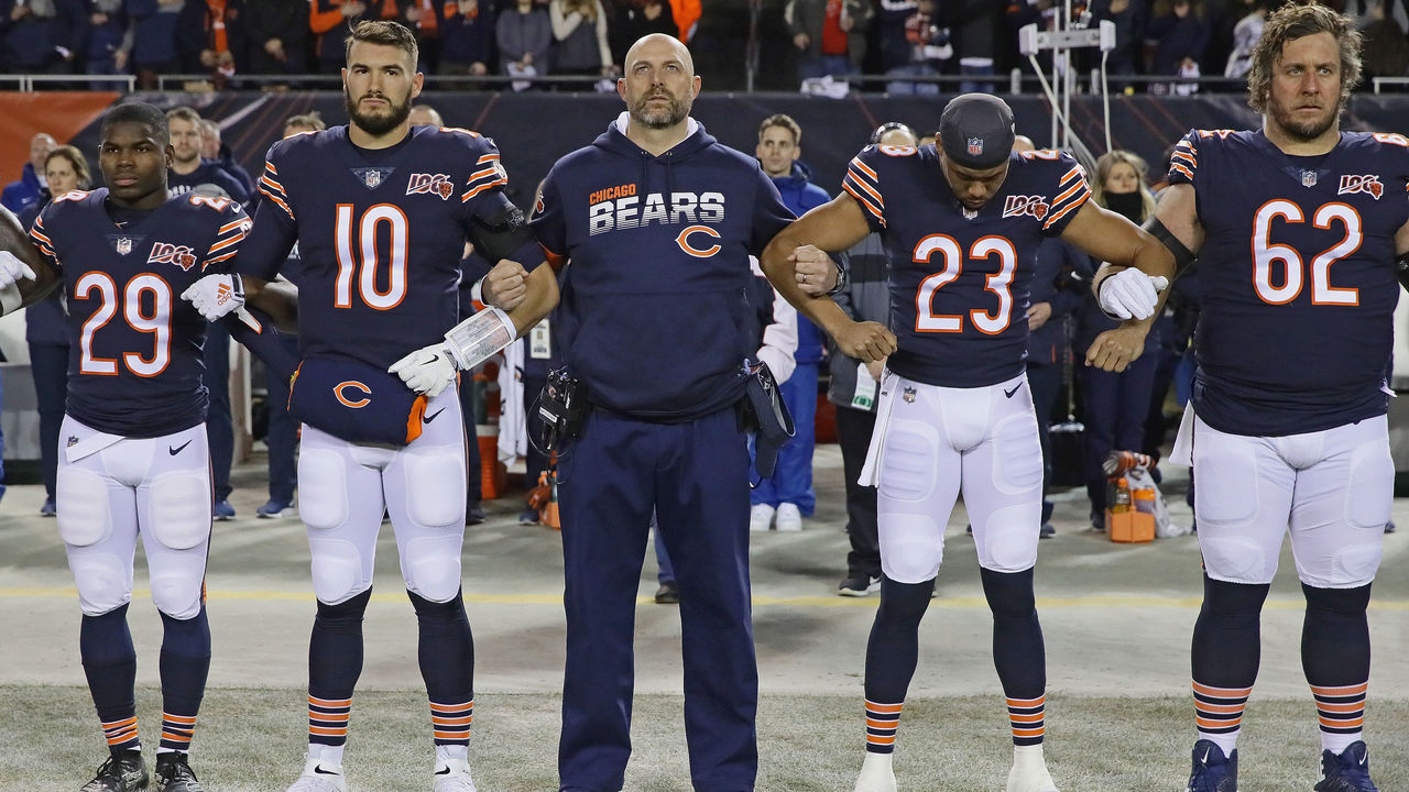
The Bears' look is iconic. Navy and orange is almost always a hit, and the matching stripes on the shoulders and socks should not go unnoticed. Chicago also gets bonus points for being the first NFL team to use rounded numbers instead of the traditional block style and sticking with them to this day.
61. Baltimore Orioles (1980s)
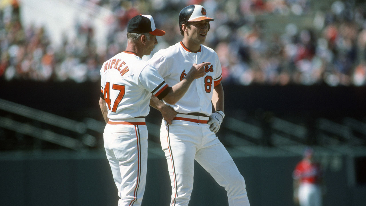
Take a long, hard look at this picture and try to find anything wrong with what the Ripkens are wearing. Tri-color hats and helmets, matching stripes on the sleeves and waist, and a pair of perfect fonts to display logos and names. The cartoon bird is perhaps the pinnacle of a design era where team logos were more likely to smile at you than sneer. The O's nailed this one.