GOAT Uniforms: Kicking off our countdown of the top 100 sports uniforms
"If you look good, you play good." - Deion Sanders
theScore is counting down the 100 best uniforms in sports history, with a new post every weekday until May 15.
100-91 | 90-81 | 80-71 | 70-61 | 60-51
50-41 | 40-31 | 30-21 | 20-11 | 10-1
100. New York Giants (current)
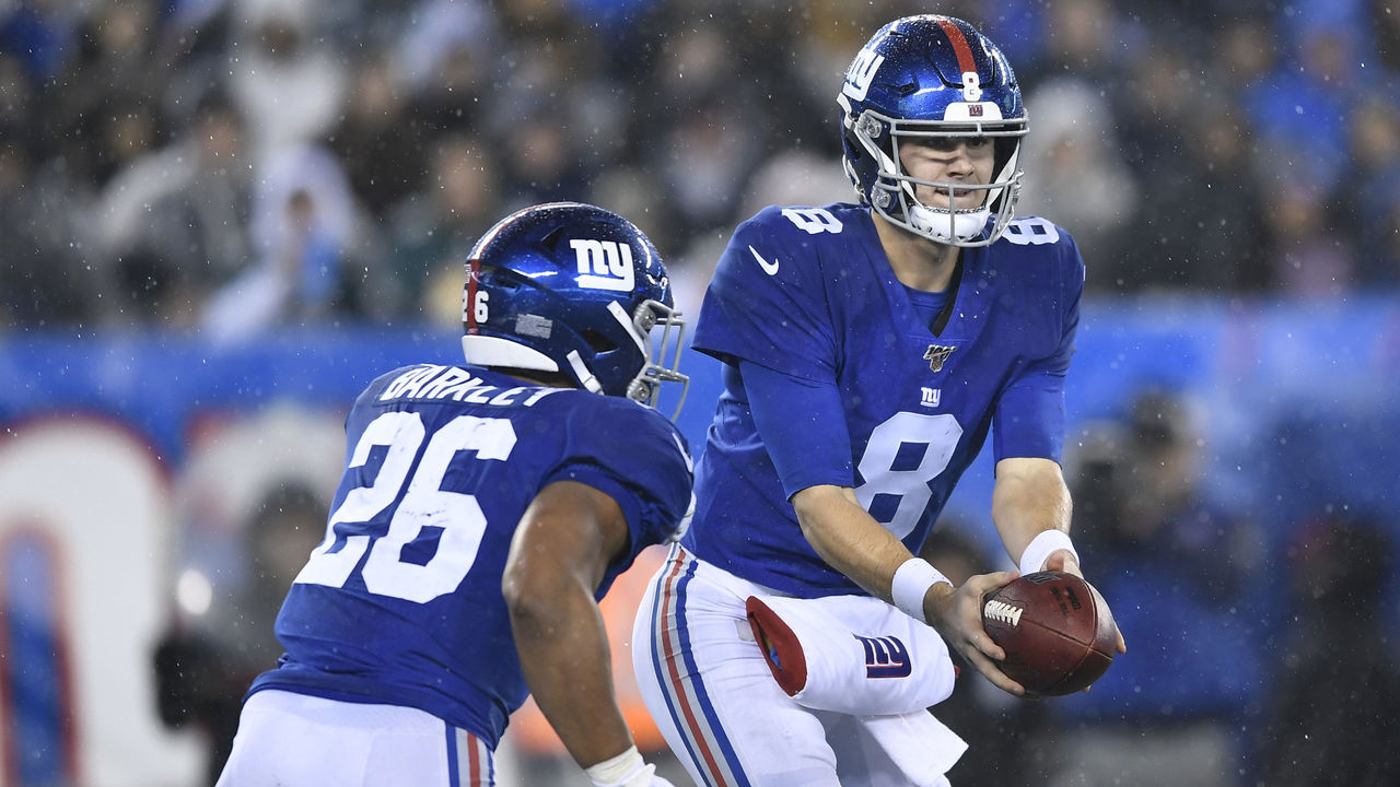
The Giants have rocked the same style for most of their history - and for good reason. The crisp combination of red, white, and blue represents America's most iconic city perfectly. The Yankees' interlocked "NY" logo is world-famous, but don't overlook the Giants' retro-chic lowercase "ny." The 1980s throwbacks reintroduced as part of the NFL's Color Rush initiative complete one of the league's simplest and most effective uniform sets.
99. Orlando Magic (1990s)
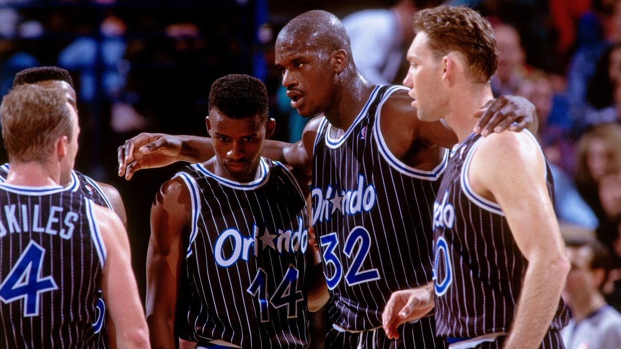
The Magic's first look was easily their best. The pinstriped black road unis stood out the most, with a blue-and-white script that truly popped. The font is very '90s but in a good way. The team's logo was created after consultation with Walt Disney World artists and consideration of thousands of suggestions submitted by fans.
98. Florida Panthers (1990s)
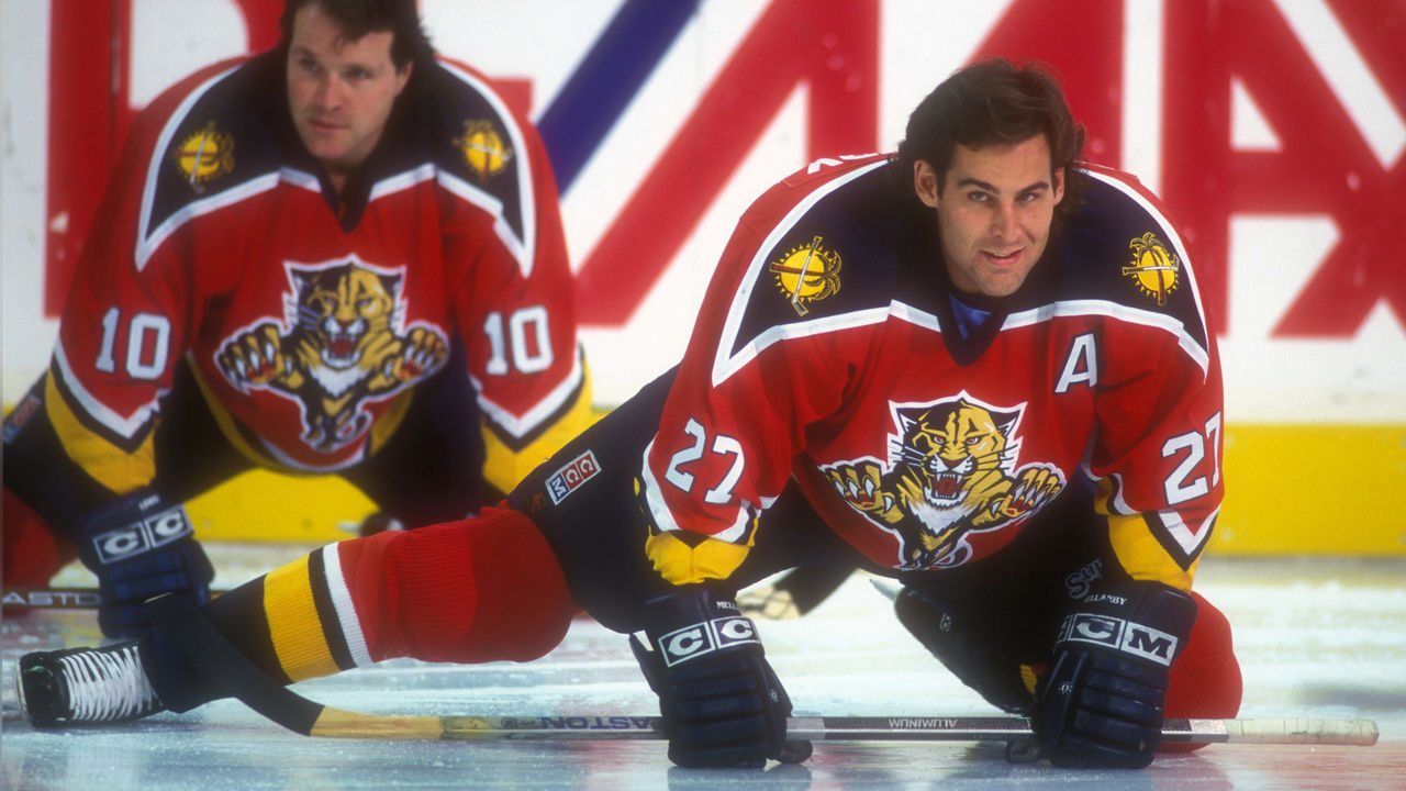
Sticking to the Sunshine State, the uniform of the '90s-era Panthers is a forgotten gem. The sharp points in the lines created a unique effect, and the crests on the chest and shoulders tied together a sweater we sorely miss. Every change the Panthers have made since their inaugural scheme has been a downgrade.
97. San Antonio Spurs (current)
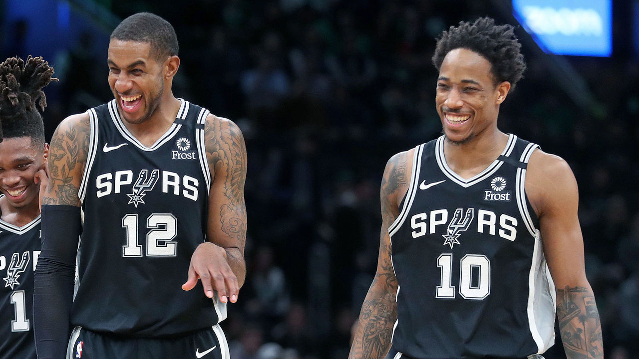
The Spurs always opt for simplicity, and it works. Silver and black is a timeless combination, and San Antonio gets bonus points for its seamless implementation of the logo in the wordmark. Still, is it too much to ask for the Spurs to finally use their "fiesta" logo colors in an alternate uniform?
96. Kansas basketball (1990s)
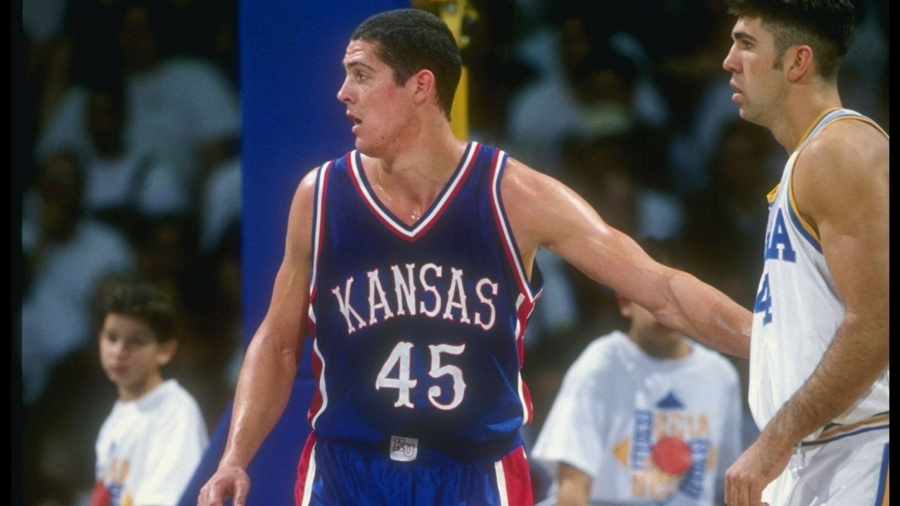
While the current iteration of the Jayhawks' jerseys leaves something to be desired, the "circus" number font used in their 90s-era attire helped pull together a college hoops classic.
95. Seattle Seahawks (current)
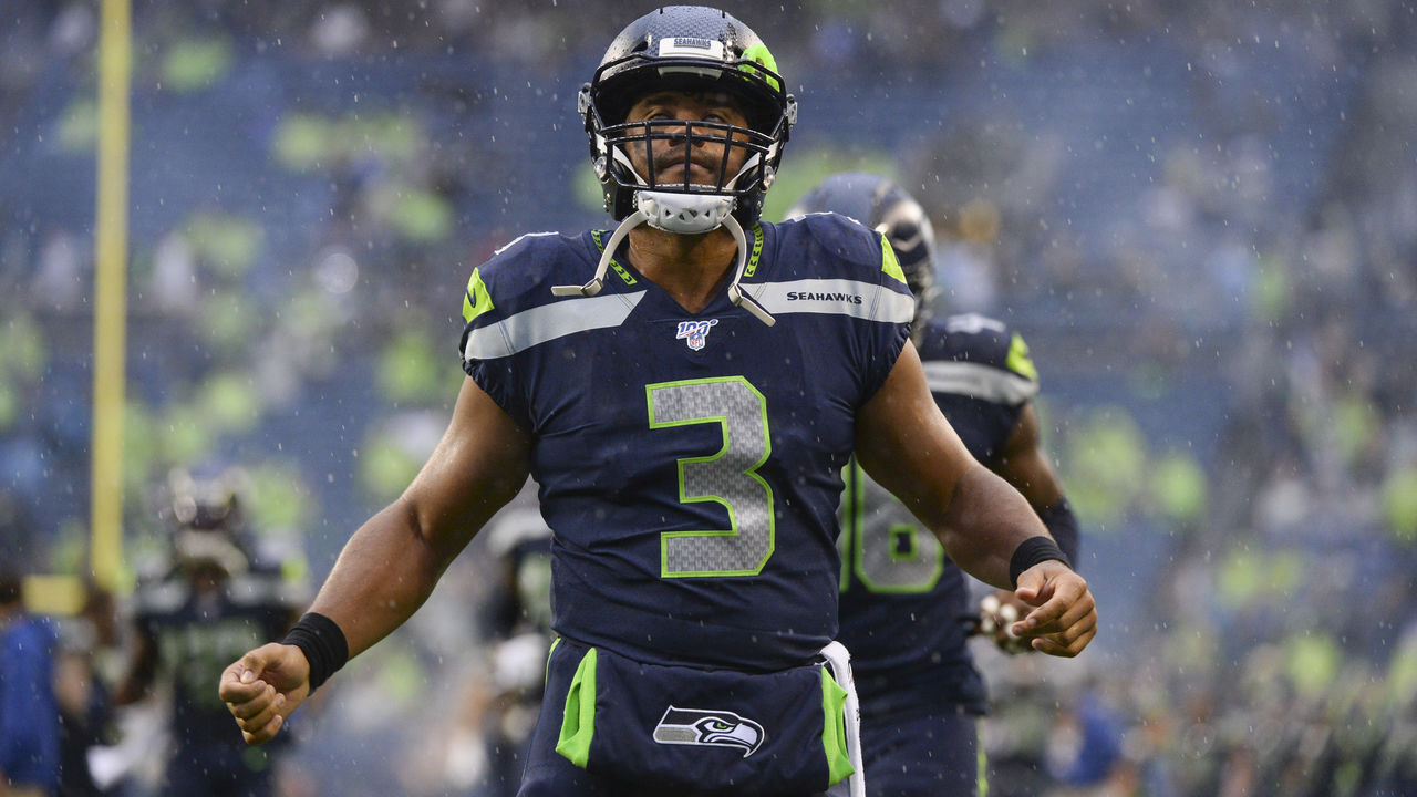
Nike got plenty of redesigns wrong after taking over as the NFL's uniform maker in 2012, but the company nailed the Seahawks' digs. Neon green and navy was a previously unexplored combo, and now it belongs exclusively to Seattle. It's the tasteful use of green as only trim that brings this whole set together.
94. Edmonton Oilers (1980s)
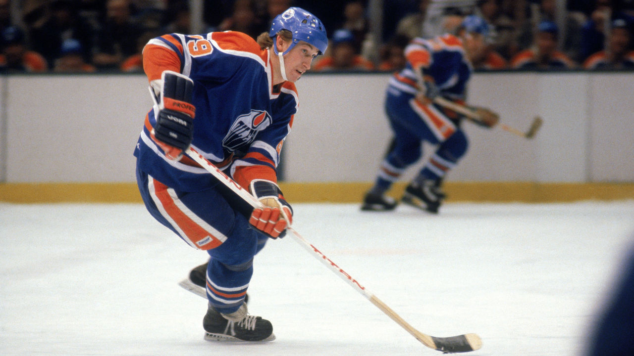
The Oilers have experimented with a few different concepts since their glory days, and it's difficult to comprehend why. The simple blue-and-orange scheme repped by Wayne Gretzky and Co. at the height of the team's powers is the way to go.
93. New York Mets (1980s)
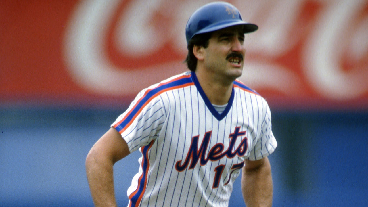
Aside from their attempt to incorporate black as their primary color in the late 1990s, the Mets have always looked sharp. That said, their getups in the 80s - which featured pullovers instead of button-ups, thick racing stripes down the side, and pinstripes everywhere else - are easily their best.
92. Juventus (1980s)
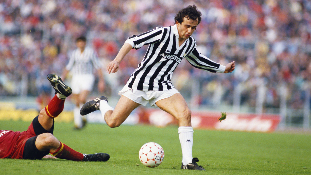
While Juve might look like a team of referees to North American soccer novices, their signature black and white stripes are iconic throughout the rest of the world. Worn with only subtle changes for more than a century, these shirts are synonymous with Italian soccer dominance. Imagine if the club had stuck with its original attire: pink shirts with black ties.
91. USA Basketball (1992)
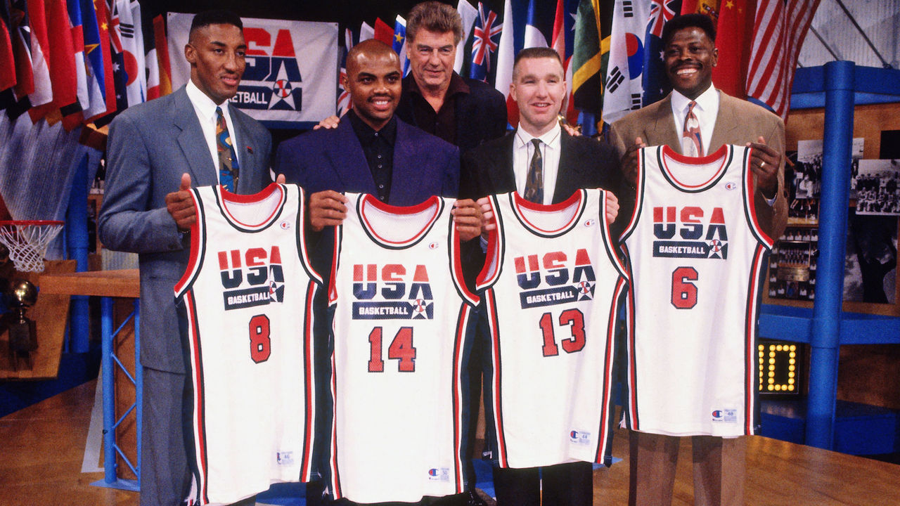
The 1992 Olympics in Barcelona marked the first time NBAers were allowed to represent their countries at the games. It was also the debut of USA Basketball's logo, proudly displayed front and center on the U.S. national team's jerseys. The new design, tied in with the dominance of "The Dream Team" and its march to gold, created an ageless uniform.