With spring training rapidly approaching, all 30 MLB clubs unveiled the hats they'll wear during exhibition games. Here, we took a look at the best and worst lids from this year's crop.
(Images courtesy: MLBShop.com)
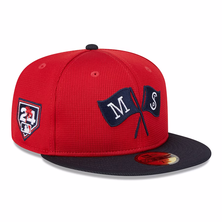
30. Chicago White Sox
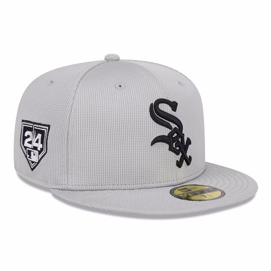
The White Sox plummeted from second on our 2022 list. It's a fitting fall from grace for a franchise that's also tumbled in on-field productivity.
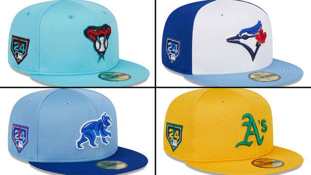
29. San Diego Padres
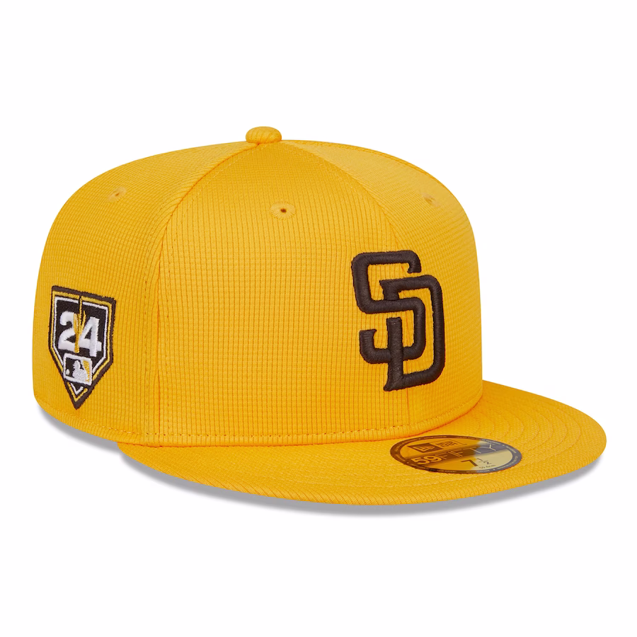
Continuing to embrace the brown and gold feels like a wise move for the Padres, unless your spring cap looks more yellow than Big Bird of "Sesame Street."
28. Los Angeles Dodgers
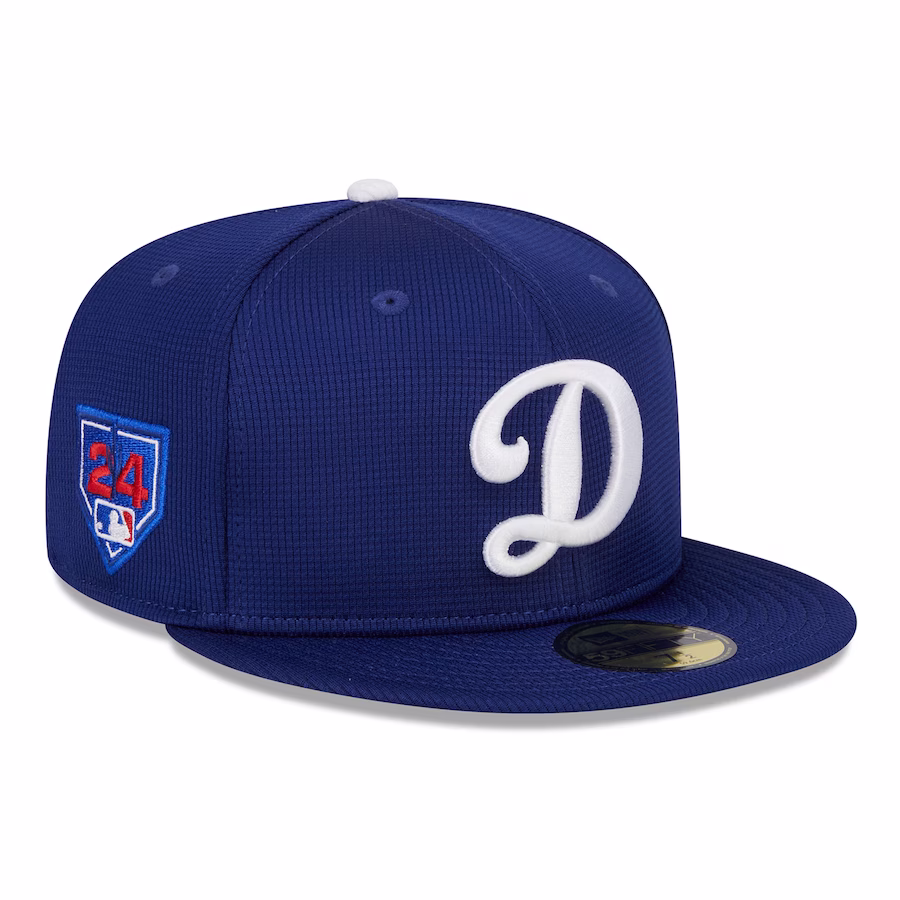
The Dodgers may have won the offseason, but they posted a big L using a cursive D that more resembles an F1 track than the franchise's iconic brand.
27. New York Mets
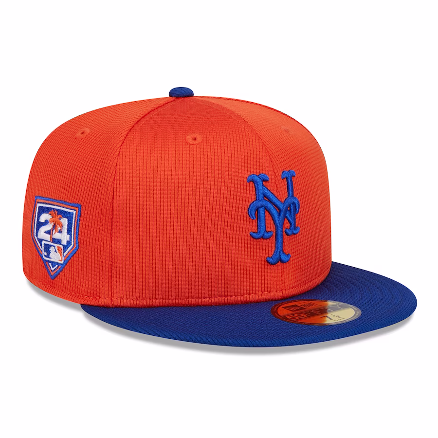
The Mets' spring hats sort of resemble their offseason player additions. Nothing too exciting, but it should keep the fans happy.
26. Pittsburgh Pirates
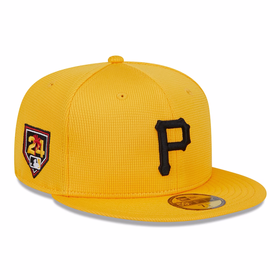
Didn't we already see these? The Pirates' lids look similar to the Padres', but Pittsburgh gets a higher mark because this hat better fits its regular look.
25. Houston Astros
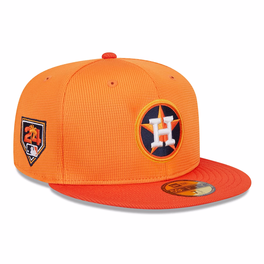
The Astros may look unbeatable in the AL West, but their merch game needs work. This all-orange offering might be worse than their dark blue lid from 2022.
24. Cincinnati Reds
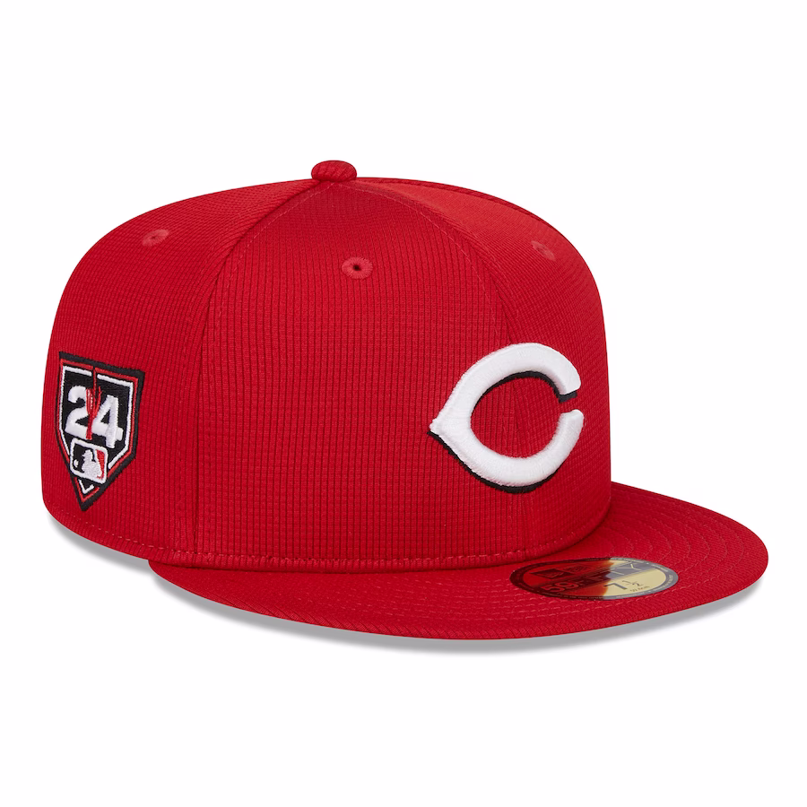
While the Reds' classic look is fine, they're probably not going to sell many of the same old thing.
23. Milwaukee Brewers
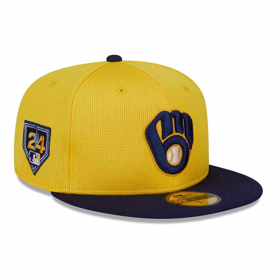
The logo is iconic and meshes well with the color scheme, but like the Reds, we've seen these before.
22. Colorado Rockies
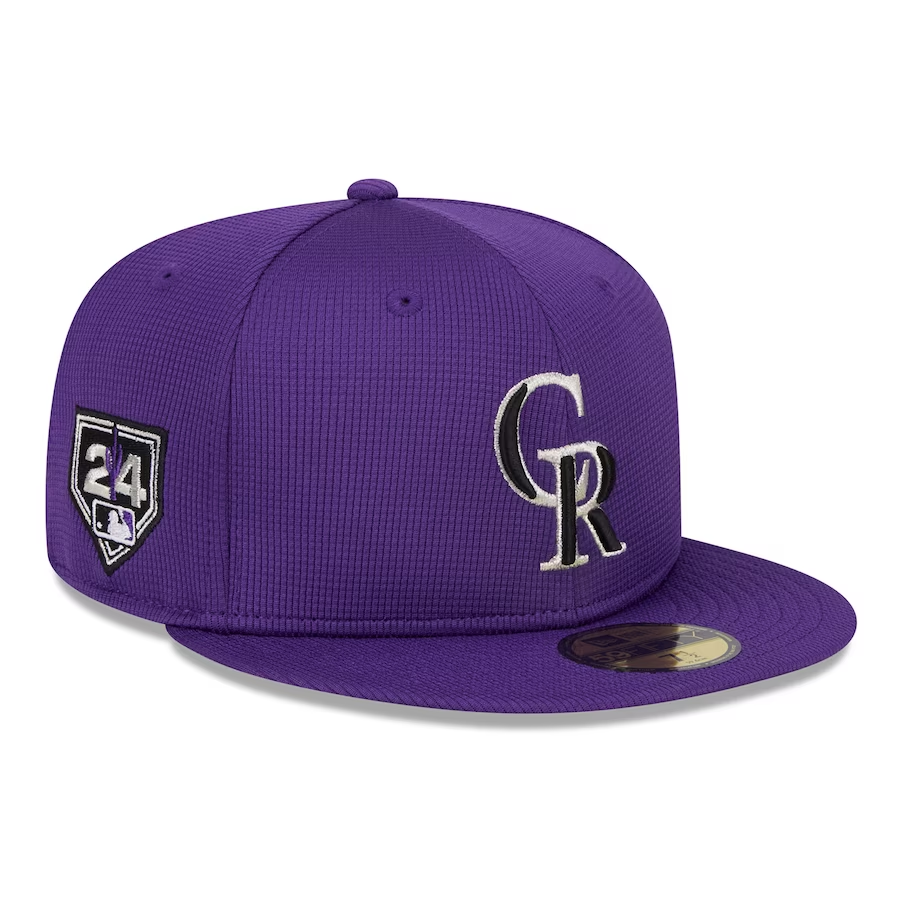
Baseball's only purple team went all in on using the color for this year's spring edition. Feels like a step back compared to the purple-trimmed mountain from 2022.
21. San Francisco Giants
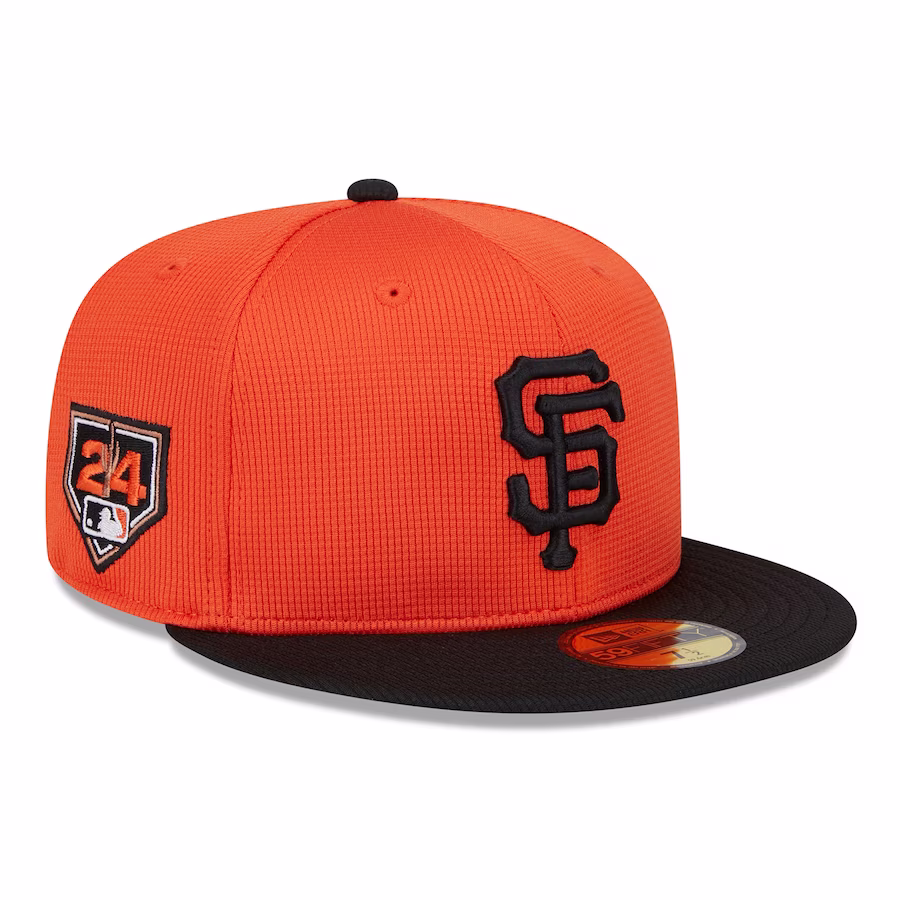
Black and orange is classic Giants. Reversing the color scheme to feature more orange doesn't do as good of a job, but it's decent.
20. Oakland Athletics
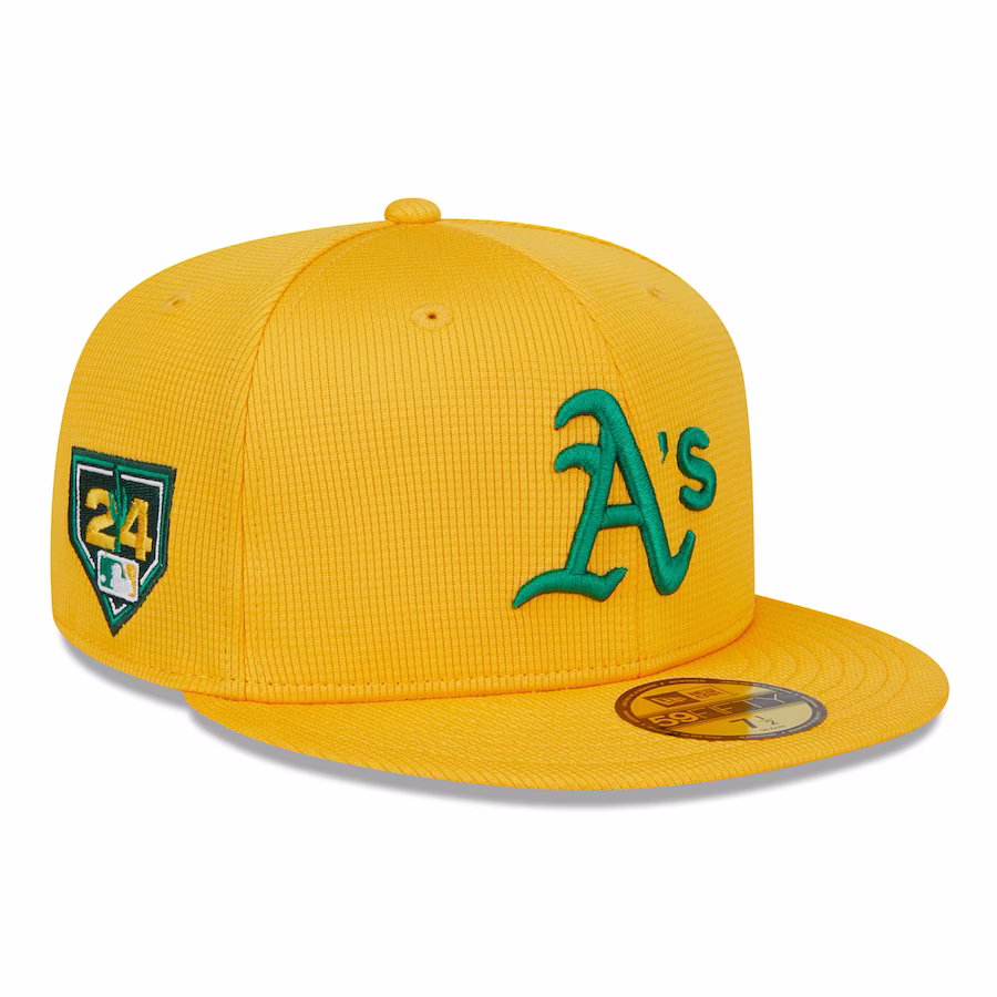
Paying homage to the mostly green hat with gold lettering would've been a better look for what will be the A's last season in Oakland, but these still work.
19. Los Angeles Angels
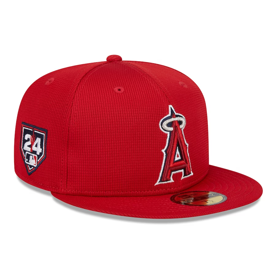
It's a nice hat with a great logo, and who doesn't like red? But nothing much happening here from a creative perspective.
18. Seattle Mariners

The compass is cool, but these lack the same visual appeal as a similar 2022 version, which looked nicer with a teal-and-white compass plastered across a mostly navy-blue background.
17. New York Yankees
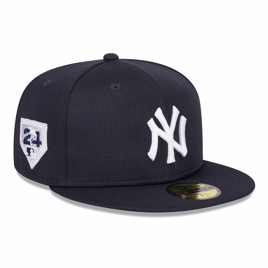
Classic Yankees. Not much else to say.
16. St. Louis Cardinals
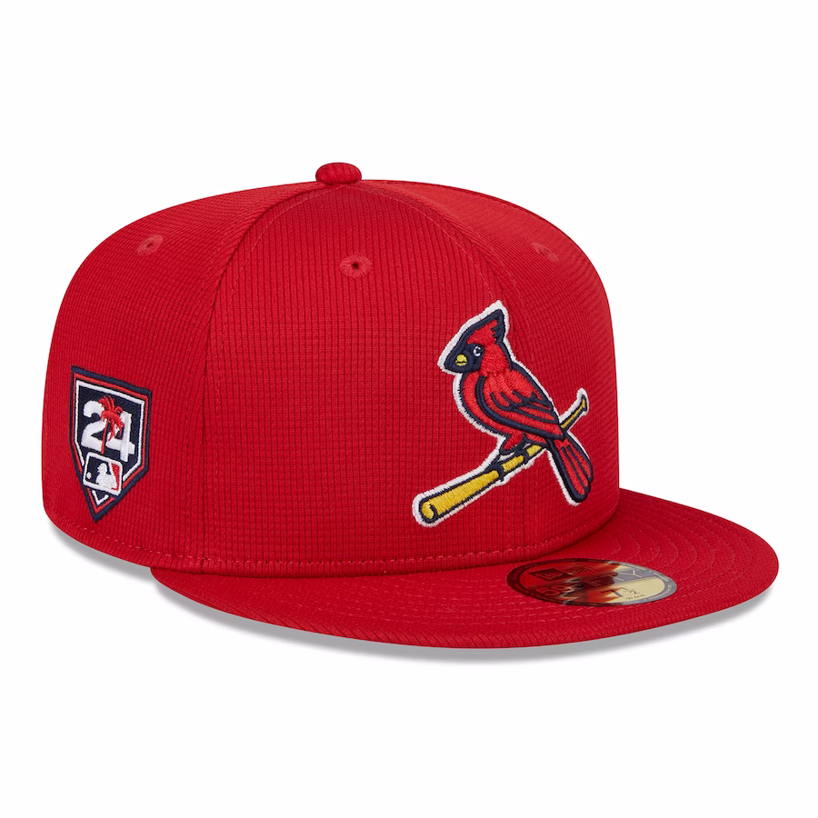
The Cardinals bring back the more notable version of the logo after switching things up with the tough-looking bird design of 2022. Traditionalists approve.
15. Baltimore Orioles
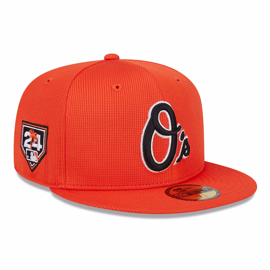
This mostly orange lid works far better for the Orioles than the aforementioned Astros, but the O's logo is a touch bland compared to some of the other options of years past.
14. Minnesota Twins
This is a unique design, paying homage to the franchise's place in the Twin Cities. Bonus points for trying something different.
13. Miami Marlins
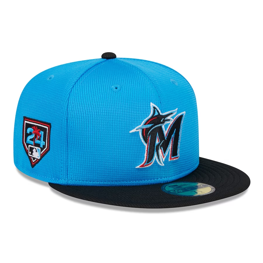
The Marlins leaned into aqua blue as the primary color after using it on the piping of the logo recently. It's a sleek look that's pretty easy on the eyes.
12. Kansas City Royals
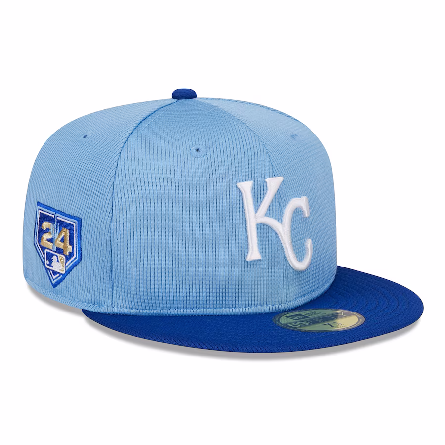
The baby blue with the royal blue on the brim and the white logo is an excellent combination. The Royals consistently have some of the most underrated uniforms and caps.
11. Tampa Bay Rays

The Rays went with yellow as the primary color, a bold move that they've managed to pull off pretty well.
10. Philadelphia Phillies
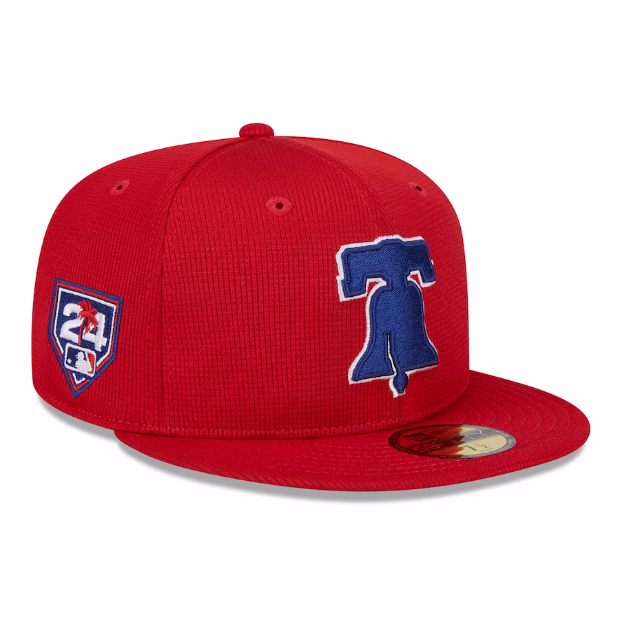
The Phillies pay tribute to the Liberty Bell in Philadelphia with a nice blue logo to pair well with the red cap.
9. Atlanta Braves
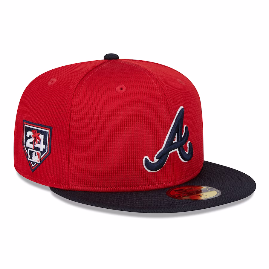
The red hat with the navy logo and brim work very nicely together for the Braves.
8. Boston Red Sox
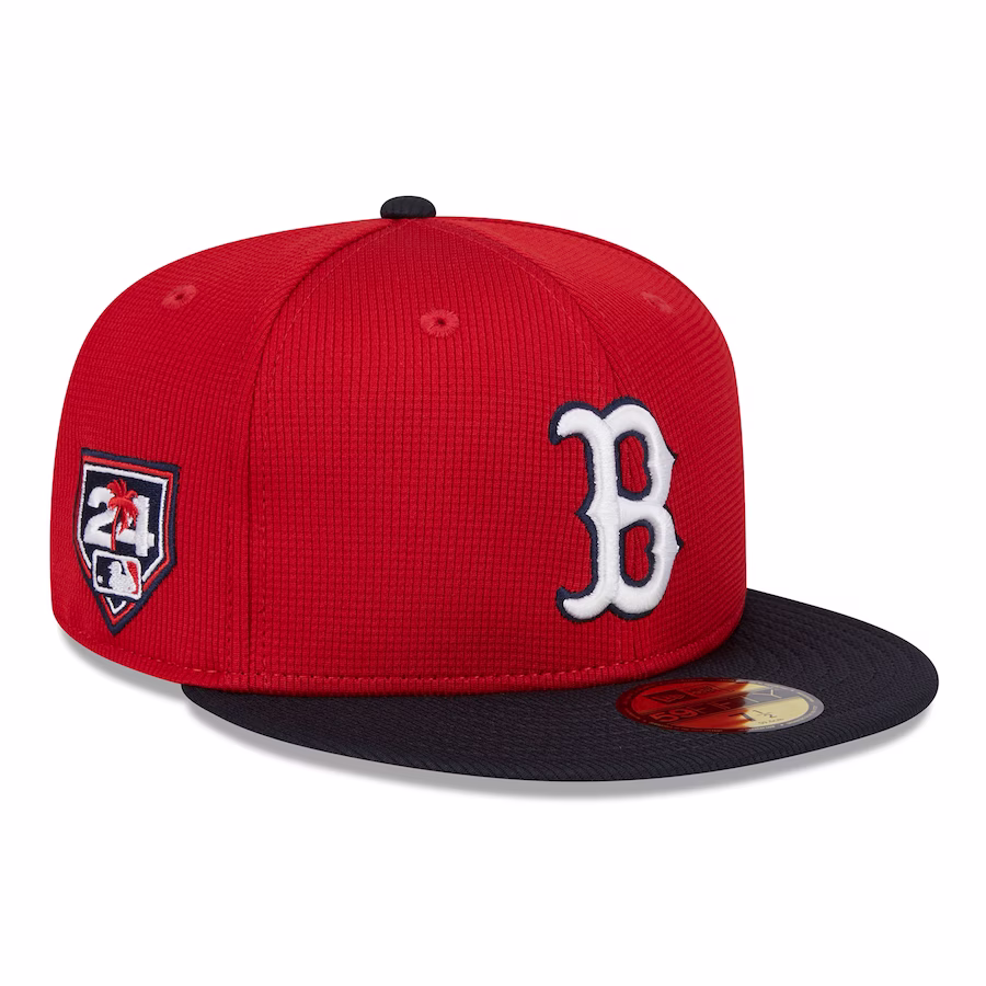
The Red Sox hat is similar to the Braves' look, but the white in the logo is a really deft touch.
7. Texas Rangers
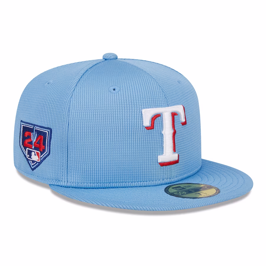
The Rangers used a similar baby blue from one of their alternate uniforms, which works just as well here as it does during the regular season.
6. Detroit Tigers
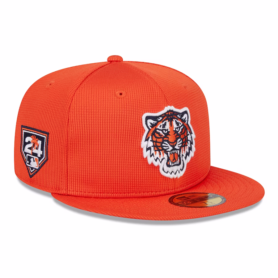
The Tigers jumped from 15th on our last list with a strong design that accentuates the imposing logo.
5. Chicago Cubs
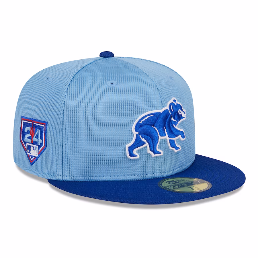
The Cubs grade out well yet again as they continue to make the smart decision to highlight the bear, combined with a sleek two-tone blue cap.
4. Toronto Blue Jays
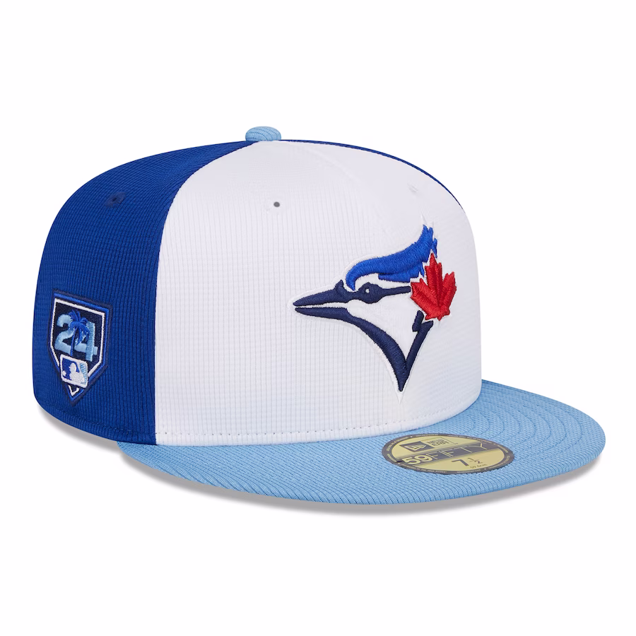
The Blue Jays make a big jump from No. 25 on our last list, thanks in part to a shift from a dark blue design to a cap that utilizes all of the franchise's colors.
3. Arizona Diamondbacks
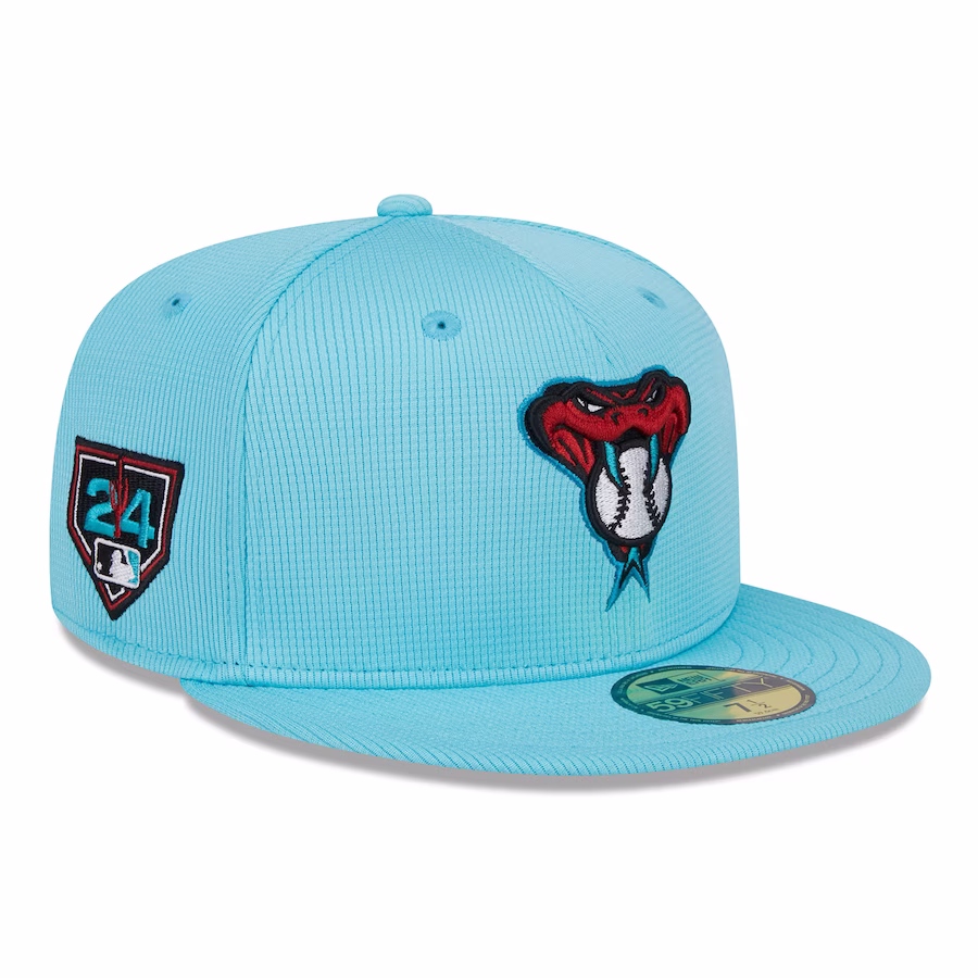
The snake logo remains one of baseball's best and works very well in tandem with the light blue on the rest of the cap.
2. Cleveland Guardians
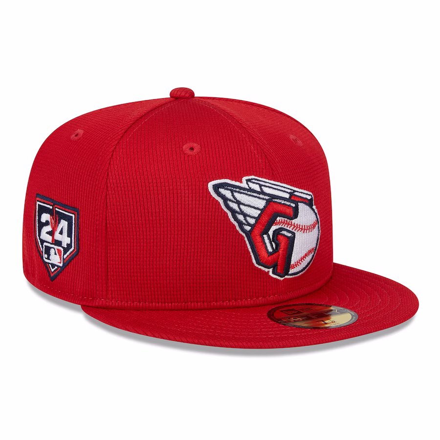
The logo alone is good enough to have the Guardians near the top of the list.
1. Washington Nationals
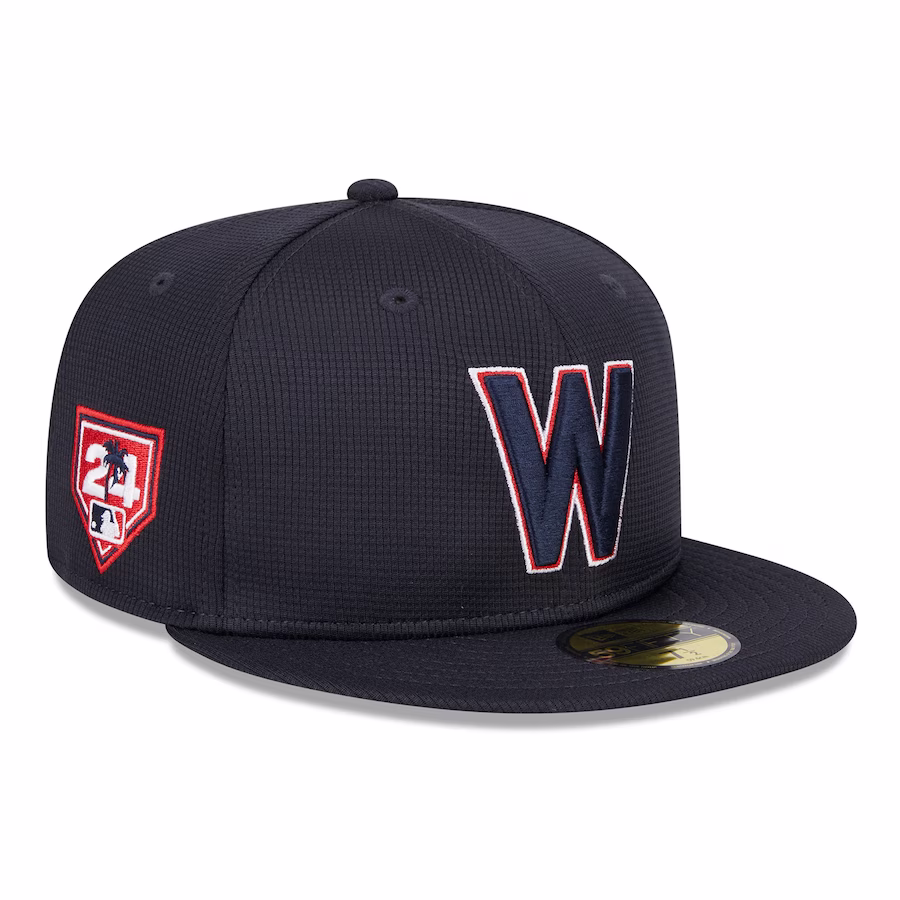
The Nationals recently announced an overhaul of their regular-season uniforms and have also showcased a very simple yet appealing design for the 2024 spring caps.


