From clean, iconic designs that look like they came straight off a Paris runway to kits that miss the mark, we're breaking down the highs and lows of World Cup 2026 attire.
Best 😍
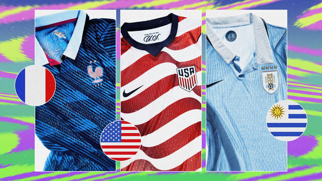
1. France
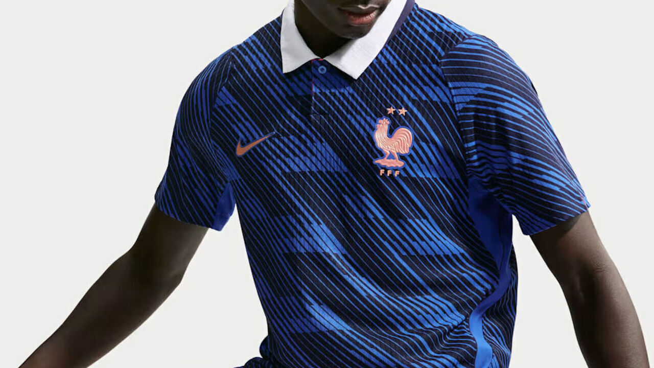
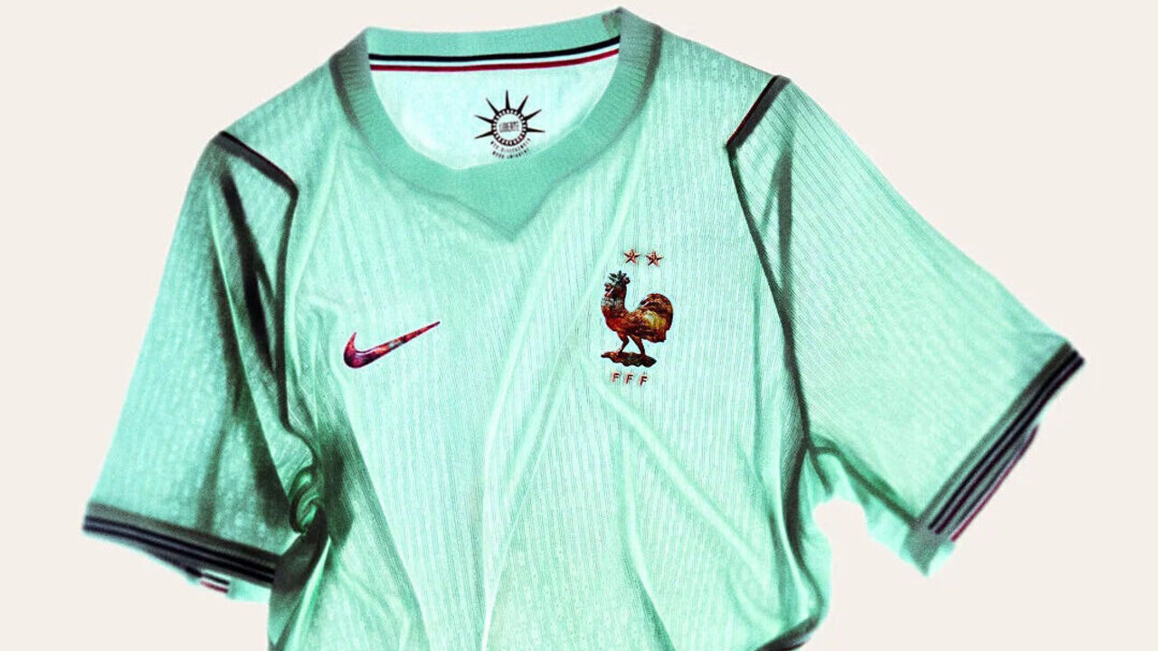
No one should be surprised to see the fashion capital of the world produce two more bangers. While France's primary kit is a timeless, tasteful update that's elevated by a deliciously classy collar, it's the second kit that steals the show. The mint green color is inspired by the Statue of Liberty, a gift from France to the United States in 1886 to commemorate the two nations' friendship. The metallic copper badges and tricolor cuffs are lovely.
2. Uruguay
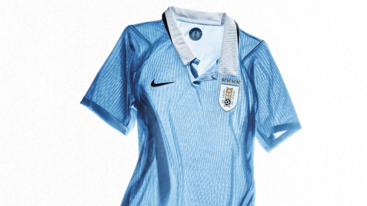
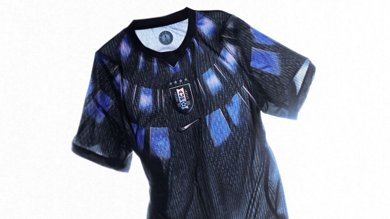
You simply can't look bad in sky blue, and we prefer Uruguay's retro and restrained approach to the color over Argentina's gradient-forward design. Uruguay's exceptional second kit only boosts the ranking. The indigo design pays homage to the inaugural World Cup in 1930, won by La Celeste at home. The shirt's patterning could represent armor and a desire to defend that legacy, but it also evokes the Estadio Centenario's design.
3. Curacao
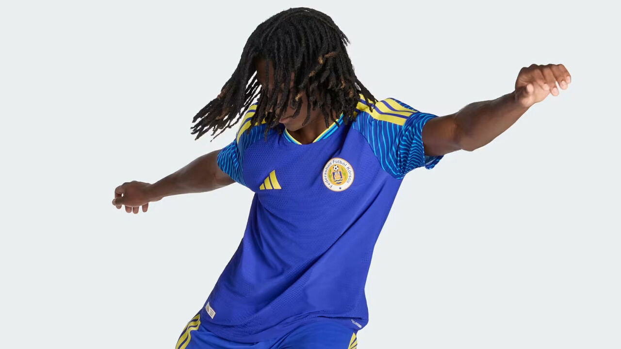
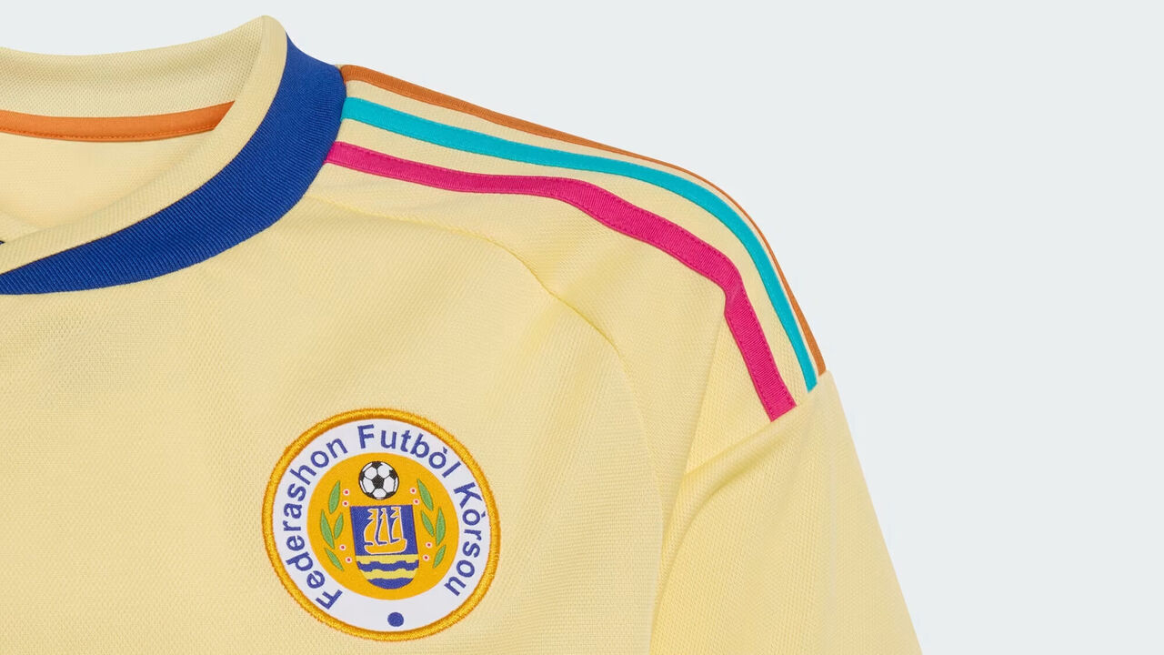
Noticing a theme yet? It's the truly inspired second kit that lands World Cup debutants Curacao in our top three. This pale yellow shirt with accents in pink, turquoise, and orange feels like a tropical breeze.
4. United States
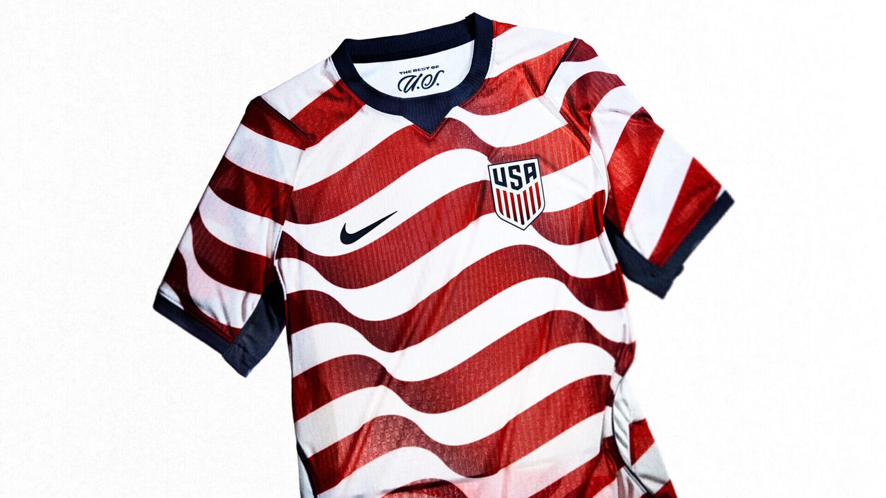
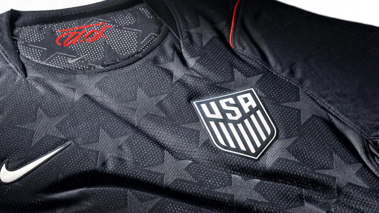
USA on a list of best-dressed at the World Cup? Surely we can't be serious! Oh, but we are. Christian Pulisic and Co. will look not only respectable but downright stylish in patriotic primary kits that put a fresh spin on the Americans' home look as hosts in 1994. The navy second kit, adorned with subtle stars, is sleek. We appreciate that there was no attempt to modernize 1994's infamous "denim" away kit.
5. Brazil
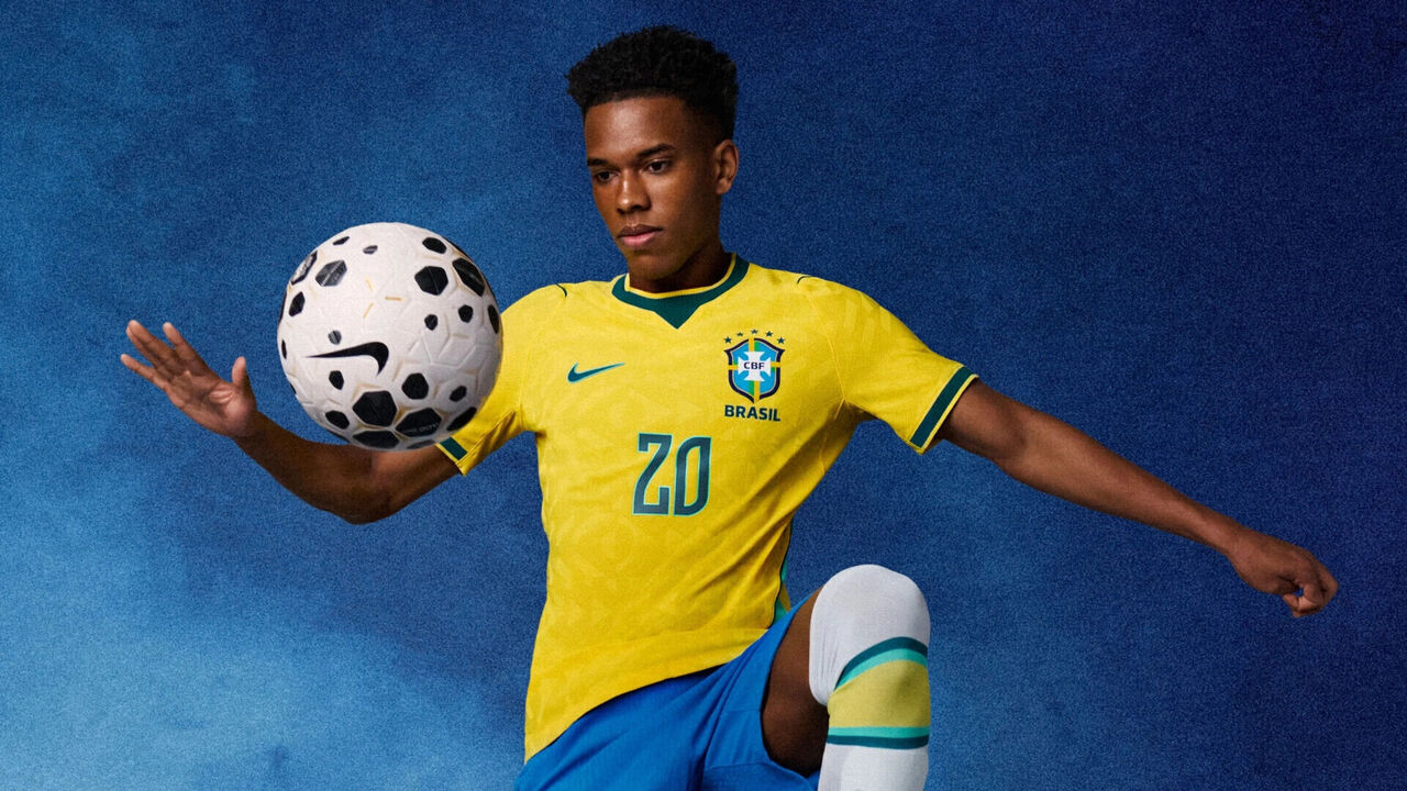
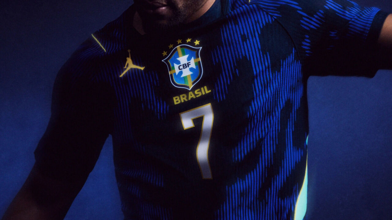
It's very hard for Brazil to look bad in yellow with green trim over blue, and there's nothing to nitpick in the fine details of this year's primary kit. The splotchy second kit, designed in collaboration with Jordan Brand, draws inspiration from the patterns and prints of Brazil's predatory animals. Notably, this one eschews the Nike swoosh for the iconic "Jumpman" logo.
6. Japan
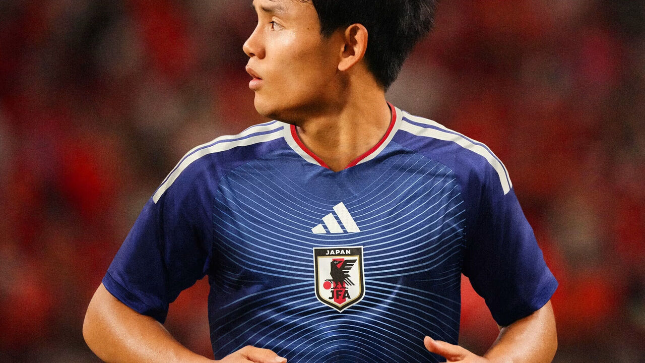
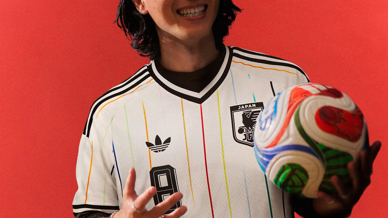
Though there's nothing exceptional about Japan's primary kit, the Samurai Blue earn top marks for their pinstriped second option. The 11 stripes symbolize the players on the pitch, plus a 12th red stripe in the middle to represent the heart of Japan. Unfortunately, Japan is scheduled to wear blue for all three group stage games, so we may not get a good look at its best duds.
7. Belgium
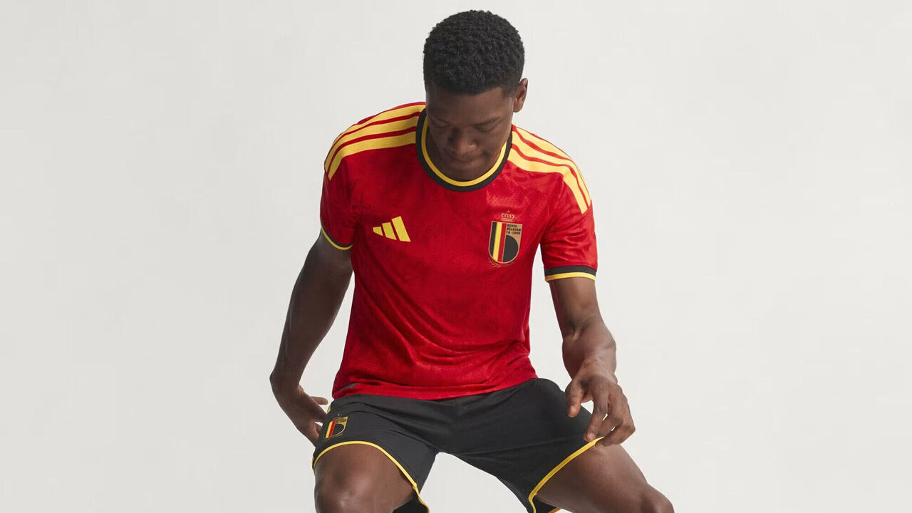
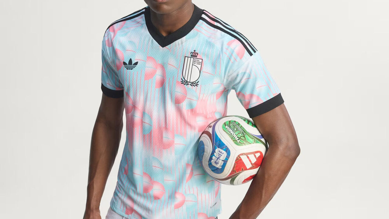
Belgium's primary kit is clean and classy, leaving room for the second strip's far more playful approach. The pastel pink and blue design is a tribute to Belgian painter René Magritte, a leading figure in the surrealism movement. Inside the collar, the inscription, "Ceci n'est pas un maillot" ("This is not a shirt") references the famous 1929 painting La trahison des images. Cheeky.
8. Germany

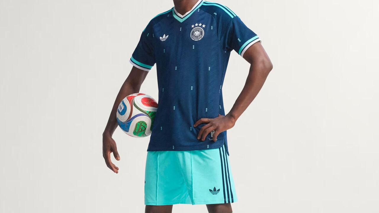
Perennially near the top of kit rankings at any given World Cup, the Germans have produced yet another triumph with their primary kit. It simultaneously feels modern and retro, understated and bold. We're not nearly as excited about the secondary look, featuring a dark blue base rarely worn by the four-time World Cup winners and seemingly inspired by little more than "what about blue this time?"
9. Norway
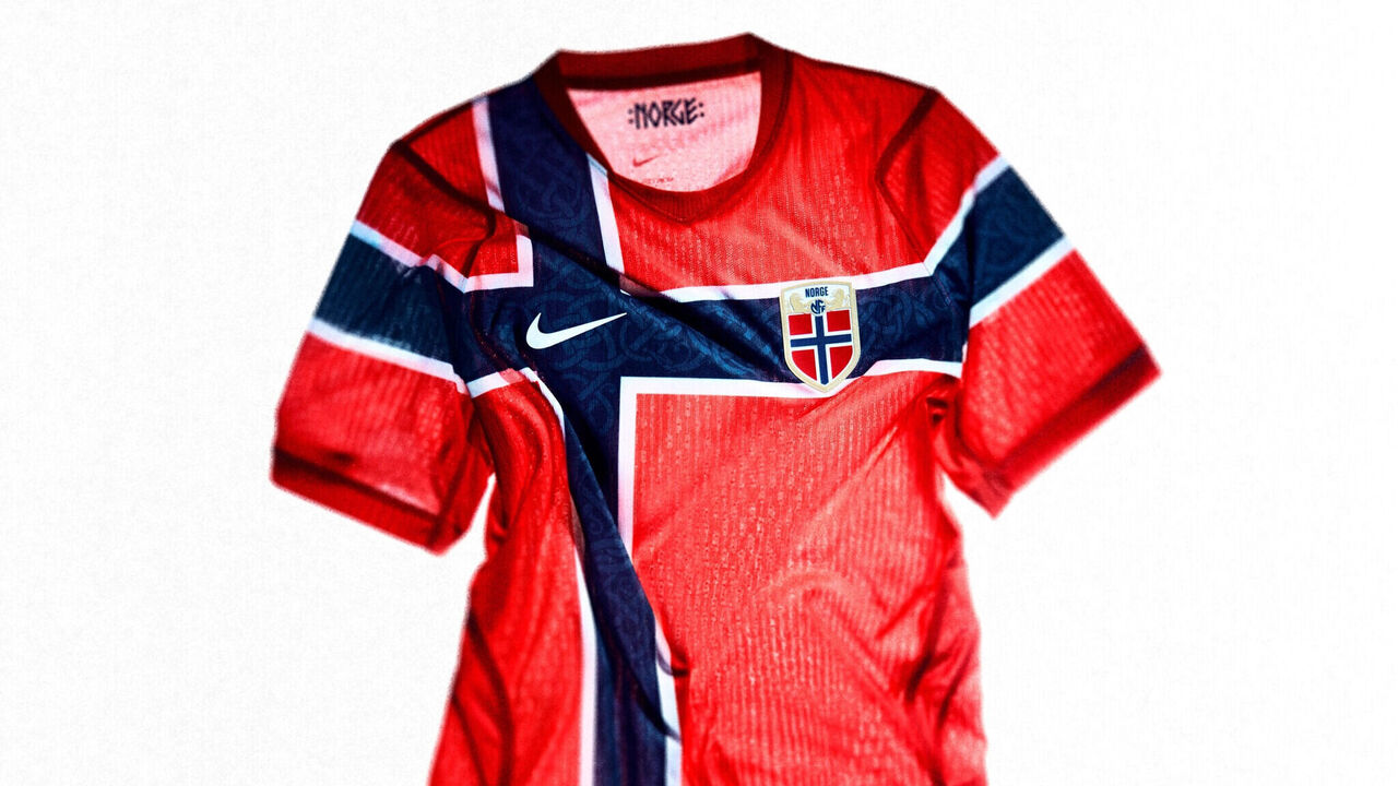
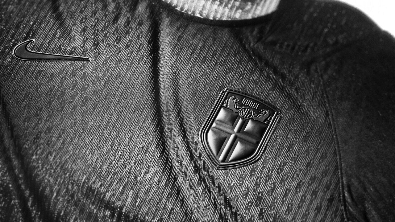
Black is a polarizing color in sports uniform circles. While it certainly produces fearsome looks, it can also lead to a homogenizing and desaturating effect that can be rather boring. Whether Norway's use of the color is effective is up to the beholder, but one certainly can't say the designers didn't go all-in. The trim and badges are as black as the base, and the only glimmer of light in this darkness will be the player's name and number, which FIFA requires to be legible.
10. Paraguay

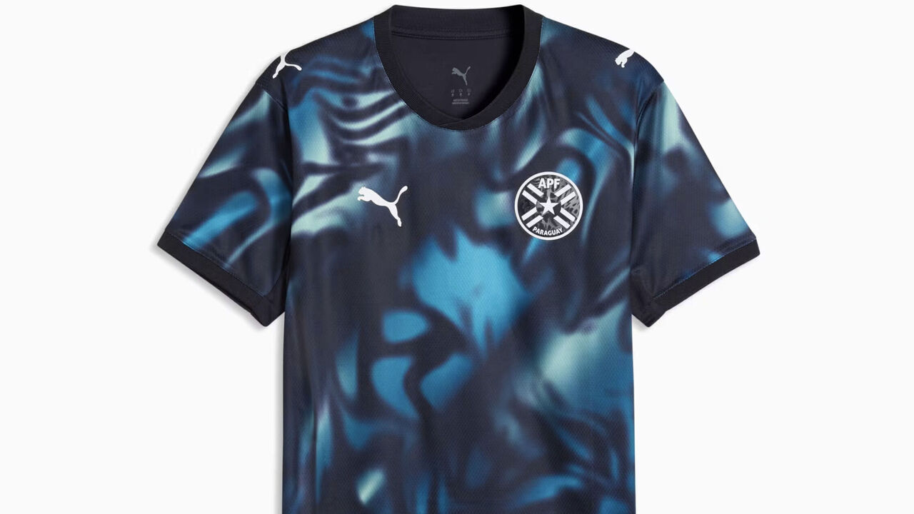
These are the only kits in our top 10 not manufactured by Nike or Adidas. Paraguay's primary and secondary looks are both worthy of acclaim for their inventiveness and dynamism.
Worst 🤮
1. Switzerland (away)
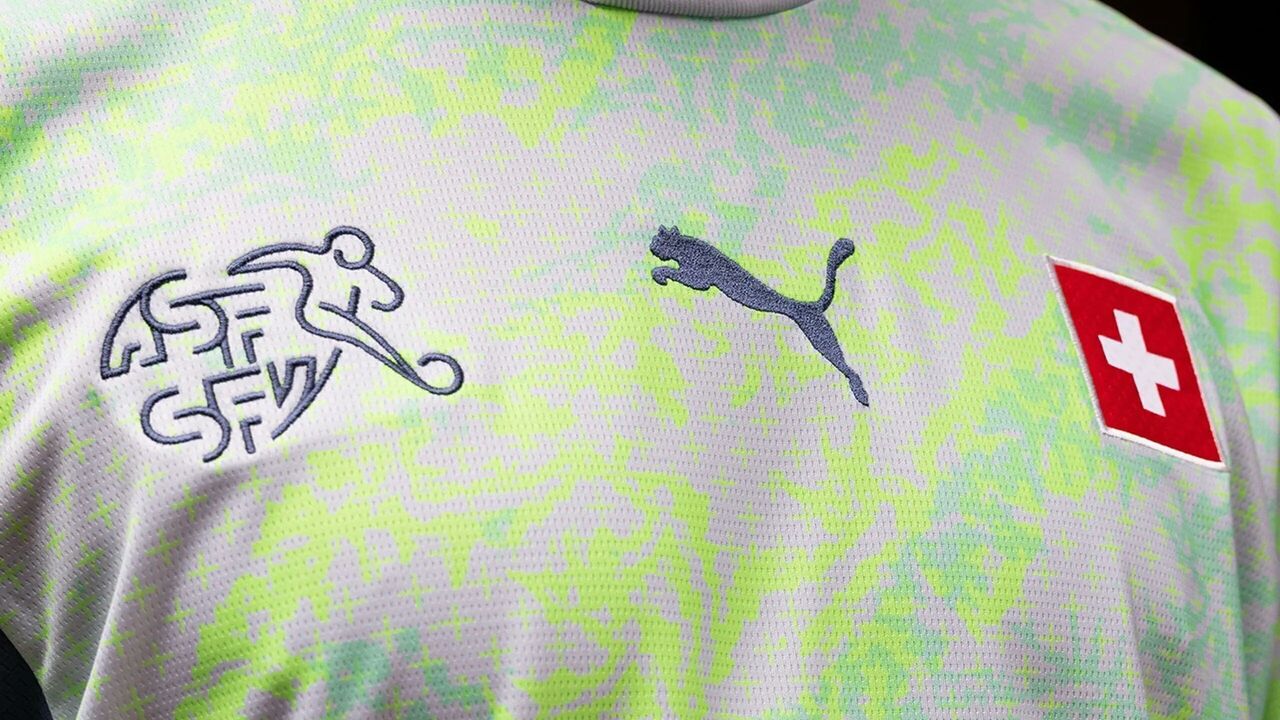
This one looks like someone got hold of a highlighter marker and scribbled all over a blank kit template. Yuck.
2. Australia (away)
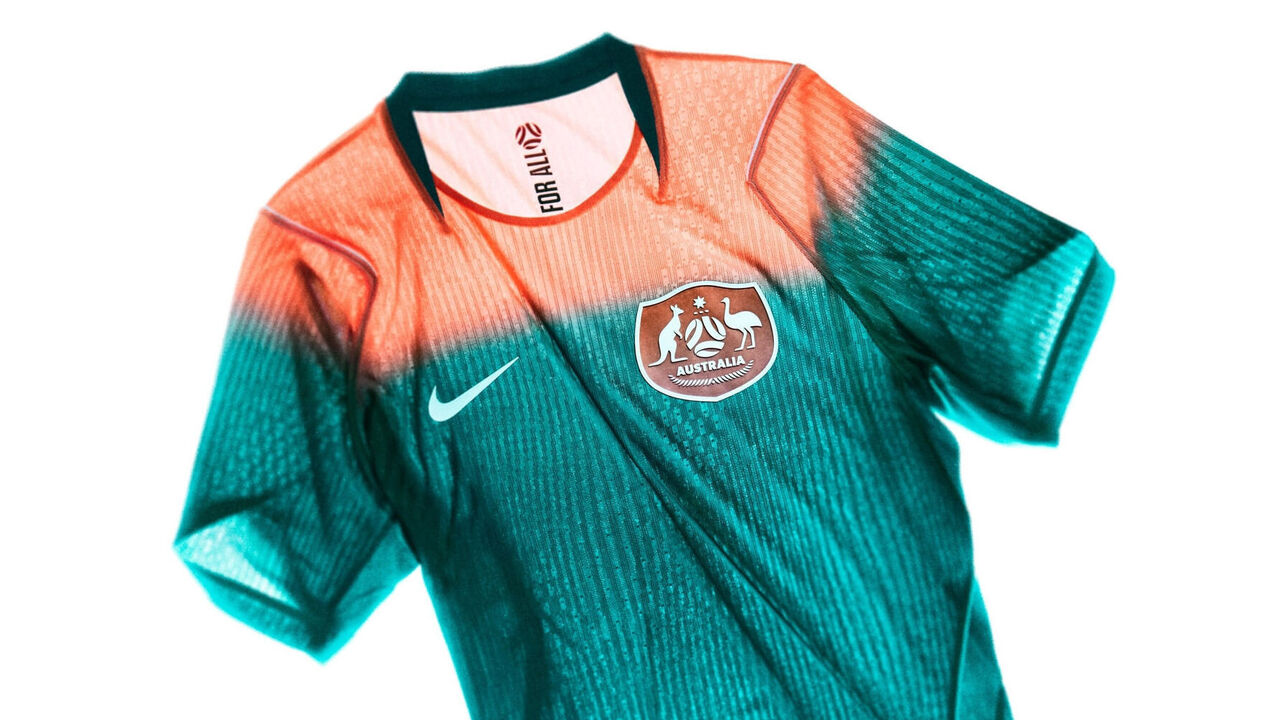
This two-tone gradient design is said to be inspired by the colors of the sunrise over the Australian outback, but we're just not sure it worked. It looks like someone dipped this kit in bleach.
3. Uzbekistan (home)

The subtle mosaic pattern, mixed with unnecessary blue piping, just doesn't work here.
4. Tunisia (away)
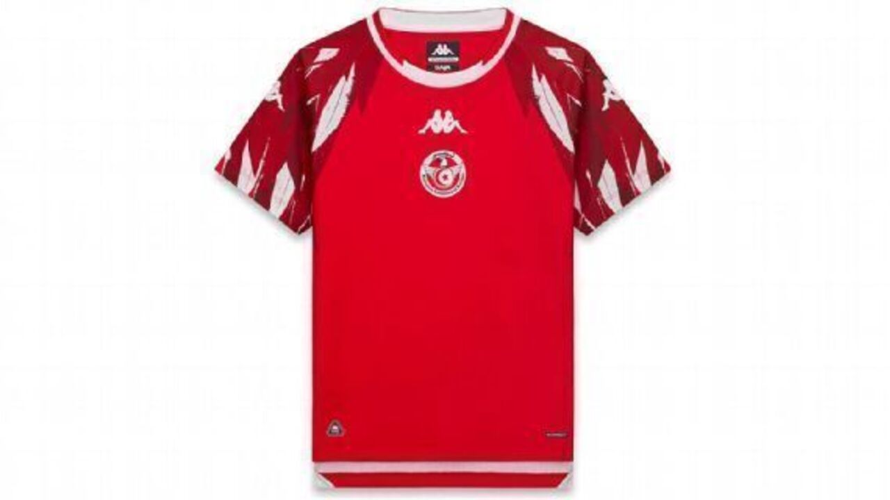
What exactly is going on with the sleeves? Are those supposed to be feathers? This design probably needed a second pass.
5. Jordan (home)
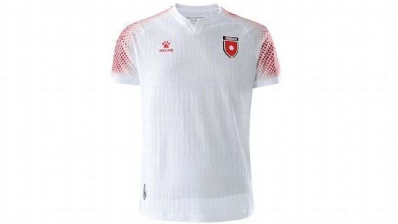
It's hard to look more create-a-team than this.


