Welcome to the theScore's NHL logo countdown. This list examines logos that date back to the inception of the Original Six and includes the main emblem for all 32 current teams, 11 clubs that moved or changed their name, and seven whose logo has undergone a significant redesign. Only primary ones were considered.
The five-part series concludes with the top 10 on Friday. Let's continue with Nos. 40-31.
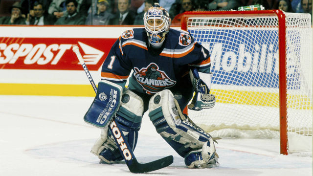
40. New York Islanders (1995-97)
There's no in-between for the Islanders' "Highliner" era: You're either fully on board with the nostalgia or you can't shake the feeling of staring at a box of fish sticks. Regardless of where you stand, the incorporation of teal deserves props for at least being creative.
39. Atlanta Flames
For whatever reason, Atlanta's flaming "A" doesn't quite work as well as Calgary's flaming "C." The colors definitely pop, but the design lacks inspiration and doesn't hold up when it's not crested on a jersey.
38. Carolina Hurricanes
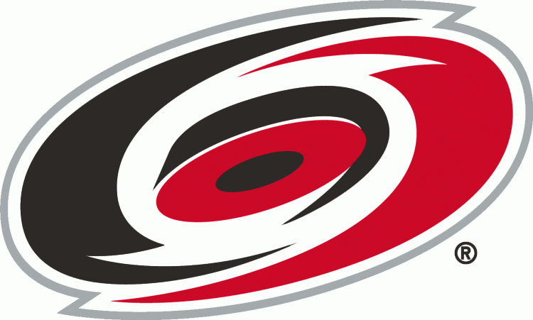
Realistically, how many ways can a hurricane be artistically depicted? Carolina would likely tell you that options are limited, as the club has rocked this underwhelming swirly design as its primary crest since relocating from Hartford in the late '90s.
37. Florida Panthers
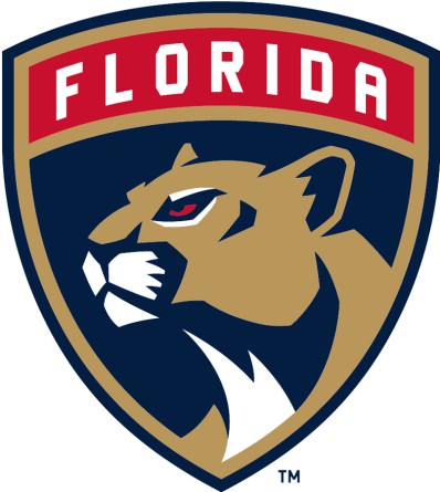
The Panthers downgraded when they switched to this logo for the 2016-17 season. The old one was much more intimidating and ferocious.
36. Arizona Coyotes
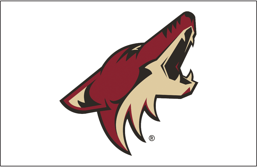
The desert colors are slick, but the logo itself is literally just a Coyote head. For an organization that used to own one of the most artistic and unique looks in hockey, the Coyotes' modern crest is very dull.
35. Nashville Predators
There are all sorts of animal predators to choose from, so why a saber-toothed tiger? Apparently, a fang and foreleg bone of one of these prehistoric beasts was found in a cave just below the entrance of Nashville's old First American Center 26 years before the team's unveiling in September 1997. The logo is certainly fierce-looking, but it's somewhat lacking in creativity.
34. Atlanta Thrashers
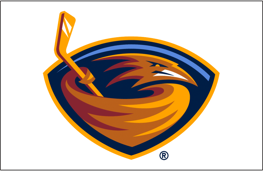
The brown thrasher is the state bird of Georgia and was the inspiration behind Atlanta's team name and logo. The bird is described as aggressive and defensive, an identity the Thrashers surely hoped to replicate.
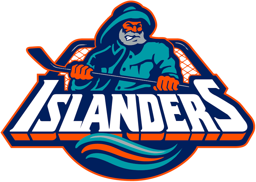
33. New York Islanders
The Islanders' original logo is easily better than the aforementioned Highliner one. The map of Nassau and Suffolk counties is a nice touch behind the New York-sized "NY," and incorporating a stick and puck is always a nice touch.
32. Vancouver Canucks
The orca breaching out of the water is a tribute to British Columbia's West Coast heritage, and presenting it as a "C" ties things together very nicely. The contrasting shades of blue also work well, and while it's not the best logo the organization has dawned, the Canucks don't have to worry about rebranding for the foreseeable future.
31. Los Angeles Kings (1967-75)
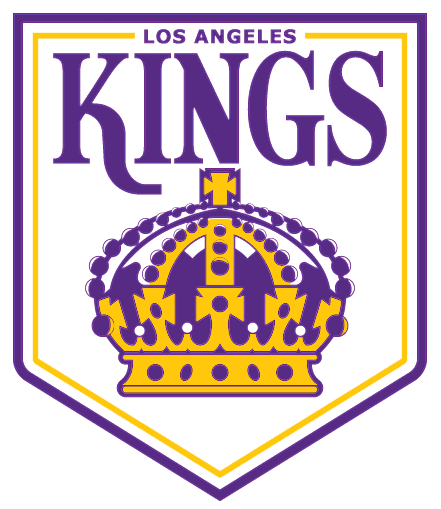
The Kings seem unlikely to shift away from their black and silver color scheme anytime soon, but we love the purple and gold. It's far more exciting and unique. This team logo, which never appeared on the front of a jersey, ranks 10 spots higher than Los Angeles' current one. Perhaps it will return in an alternate uniform someday.


