Welcome to the theScore's NHL logo countdown. This list examines logos that date back to the inception of the Original Six and includes the main emblem for all 32 current teams, 11 clubs that moved or changed their name, and seven whose logo has undergone a significant redesign. Only primary ones were considered.
The five-part series concludes with the top 10 on Friday. Let's begin with Nos. 50-41.
50. Anaheim Ducks
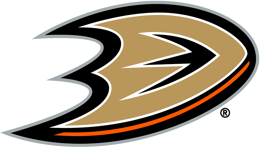
Anaheim pulled off perhaps the biggest logo downgrade in NHL history when it shifted out of the Mighty Ducks era. Gold and orange is a bizarre color combination, and an infusion of black and silver simply doesn't work. Whenever the Ducks update their logo again, perhaps it would be wise to actually include, you know, a duck.
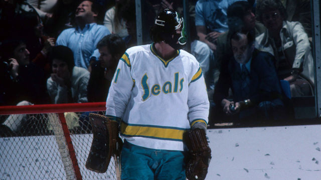
49. California Golden Seals (1970-76)
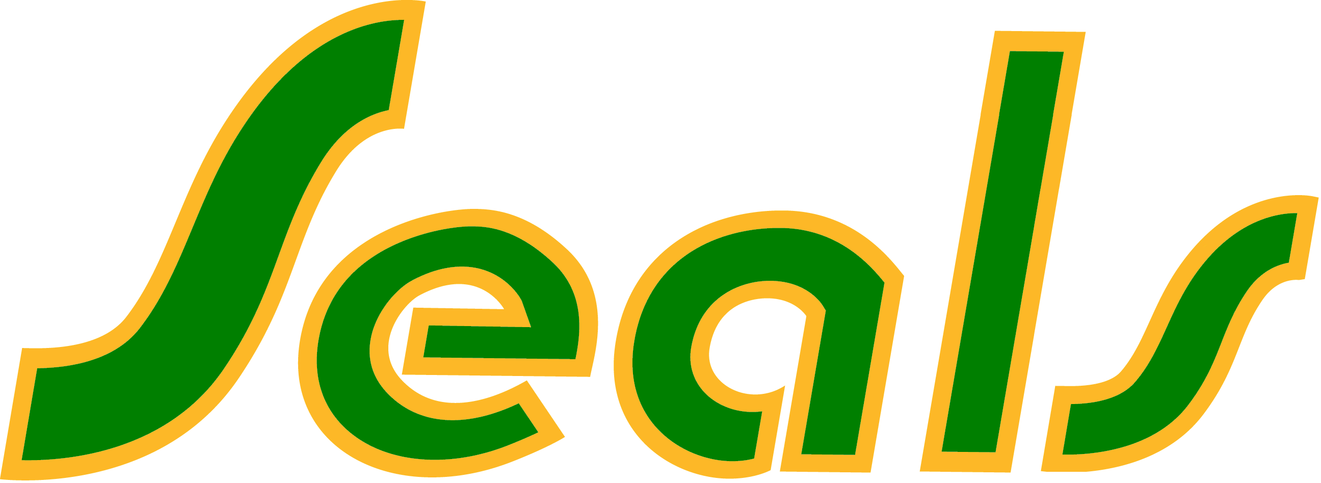
Initially named the California Seals, the team was purchased by Oakland Athletics owner Charlie Finley in 1970 and renamed the Bay Area Seals. After just two games, the club re-branded to the California Golden Seals and switched its colors to green and gold to match those of the MLB's A's. The colors simply didn't work this time around, and the font could have been more aesthetically pleasing.
48. Columbus Blue Jackets
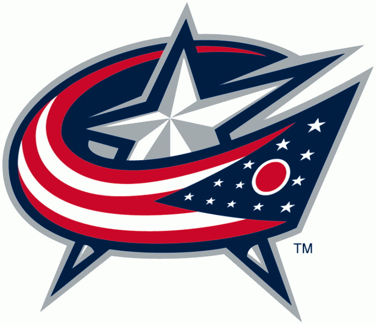
The Blue Jackets' current logo is simple and serves its purpose, though it doesn't exactly stand out. It was used as an alternate logo beginning in 2003 but became the primary one in 2007. It incorporates the Ohio state flag wrapped around a star, paying homage to the team's roots in patriotism.
47. Cleveland Barons (1976-78)
The Cleveland Barons were born when the California Golden Seals relocated to Ohio in 1976. New city, new name, but yet another underwhelming branding decision. The crest was outdated even for the '70s, and the lack of creativity certainly didn't help market the team. The Barons' existence was short-lived, as the club merged with the Minnesota North Stars after just two seasons.
46. Tampa Bay Lightning
Since their inception in 1992, the Lightning have gone with a simple bolt for their logo. It went through a couple of minor tweaks, but the club completely updated the logo and the team's primary colors to the current design ahead of the 2011-12 season. It certainly doesn't push any boundaries, which prevented it from placing higher up the list.
45. Dallas Stars
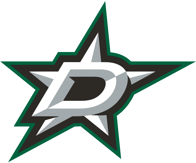
It's safe to say the Stars organization left all of its best looks in Minnesota. Dallas' current logo is rather simple and uninspiring, and for a city so full of life, it fails to tell much of a story. Perhaps it's time the club considers at least bringing back its look from the Mike Modano era.
44. Columbus Blue Jackets (2000-07)
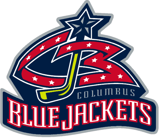
The Blue Jackets' old primary logo is better than the current iteration but was nothing to write home about. If Columbus is planning a rebrand anytime soon, it can leave this one behind. We want the cannon!
43. Kansas City Scouts (1974-76)
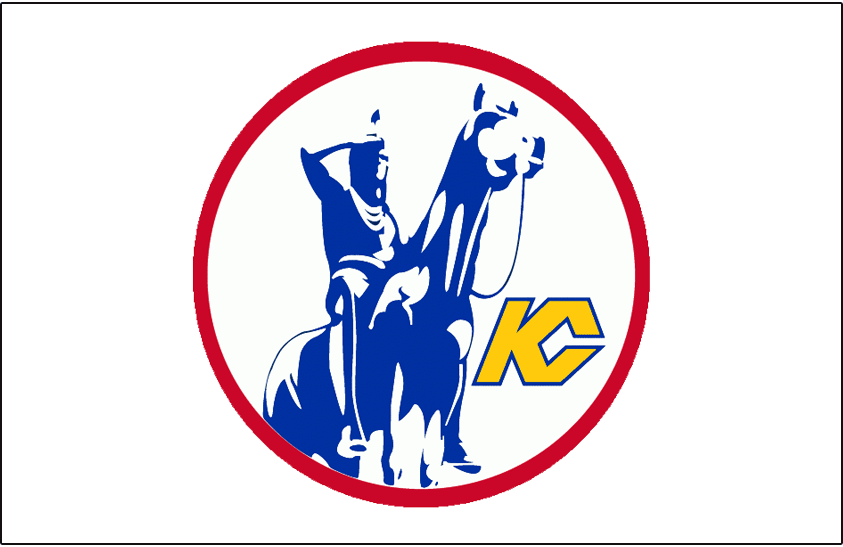
NHL hockey didn't last long in Kansas City, and the Scouts' logo was a neat idea that was executed lackadaisically. The design is an homage to The Scout, an iconic statue located in Penn Valley Park that overlooks downtown. It's certainly a unique look, but it feels incomplete due to a lack of detail.
42. Washington Capitals
The Capitals' emblem is aesthetically pleasing but falls far short of its potential. The colors pop and the stars are an excellent touch, but wordmark logos appear lazy and leave a lot to be desired. With a little bit more imagination, Washington could have one of the better logos in the league.
41. Los Angeles Kings
The Kings have undergone more logo changes than most teams but have donned the current crest since 2011. It incorporates the team's famed crown emblem from the past, but the design is basic overall. While it's not very flashy, the black and silver color scheme helps get the job done.