Another year, another deluge of alternate jerseys coming to an NBA arena near you. Like last season's collection, this batch features some clear standouts - some great, some good, and some ... not so good.
Here's a look at the 29 City Edition jerseys for 2019-20, from the cream of the crop to the downright abhorrent (the Memphis Grizzlies, proudly rocking their teal Vancouver throwbacks a number of times this season, do not have a City uniform).
1. Portland Trail Blazers
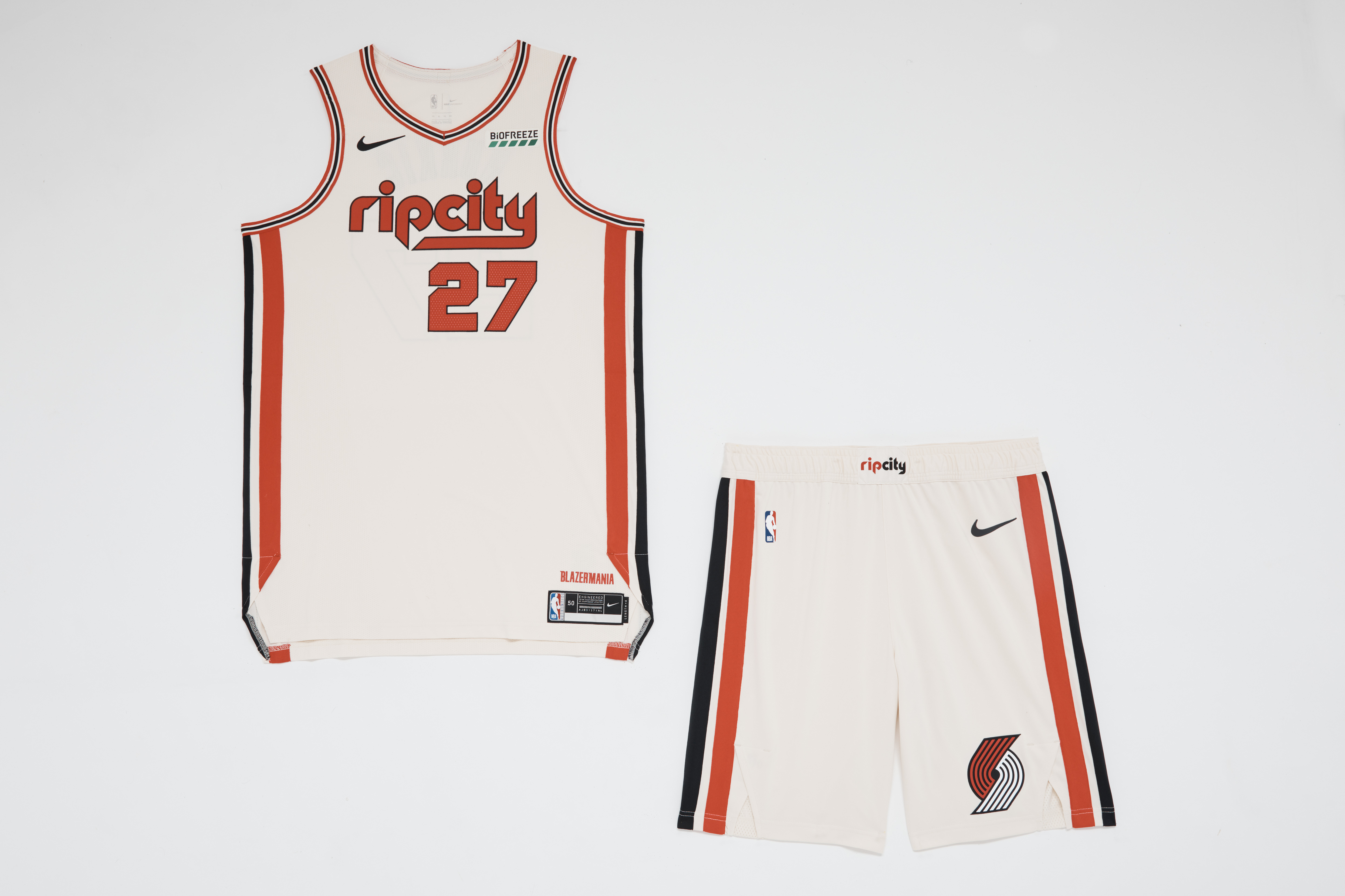
Everything works with the Blazers' new duds, designed to celebrate the team's 50th-anniversary season. The "ripcity" wordmark is a wonderful centerpiece and the eggshell white does double-duty, giving the ensemble a retro feel while allowing the black and red accents to pop. A-plus.
2. Miami Heat
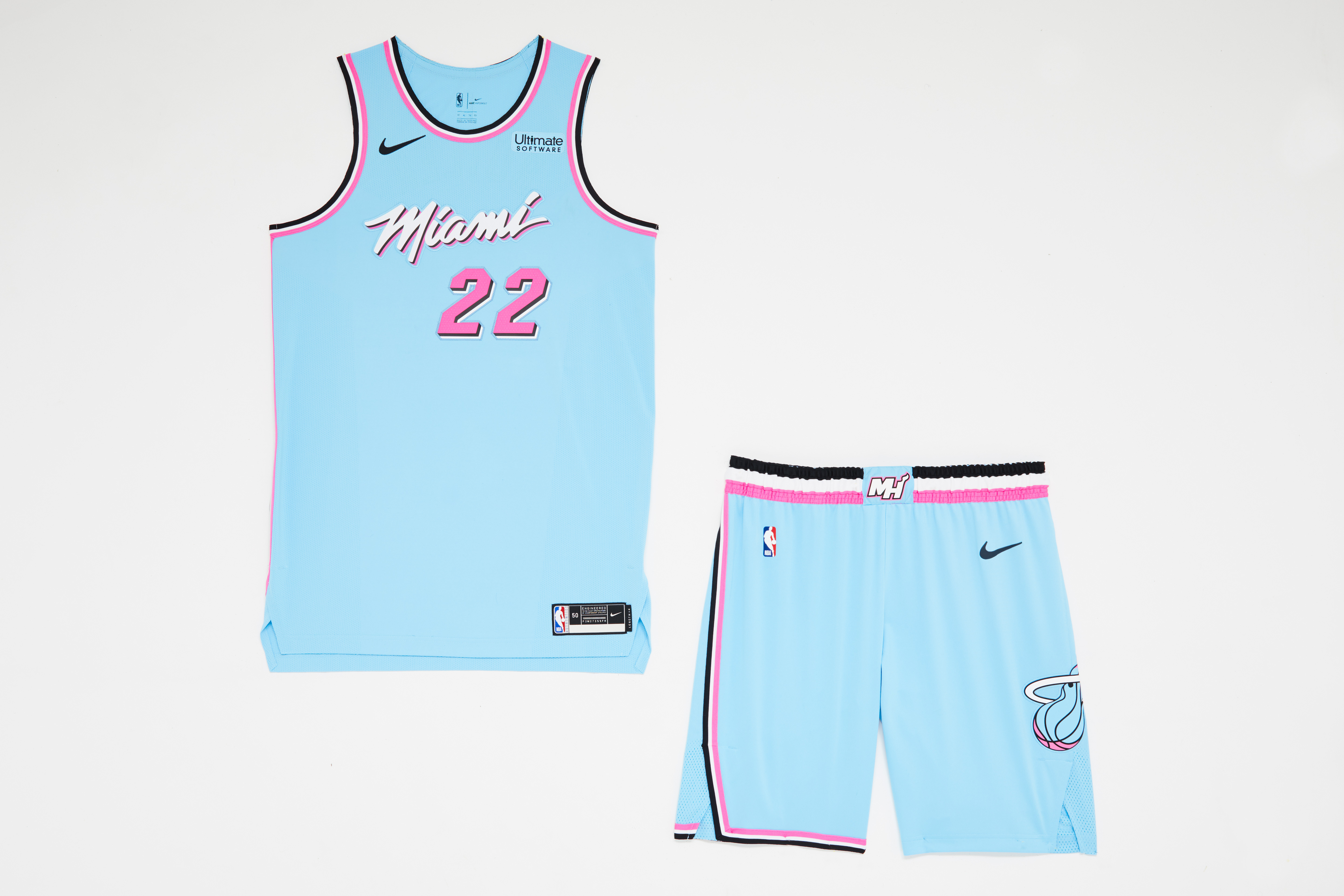
With the Heat already giving us pink-, white-, and black-based variations of this colorway, the baby blue is the next - and perhaps final - permutation. Like its siblings, the latest "Vice" look is just fantastic, embodying the spirit of Miami with a look completely unique in NBA history.
There's a case to be made that these should be the Heat's primary colors moving forward.
3. Cleveland Cavaliers
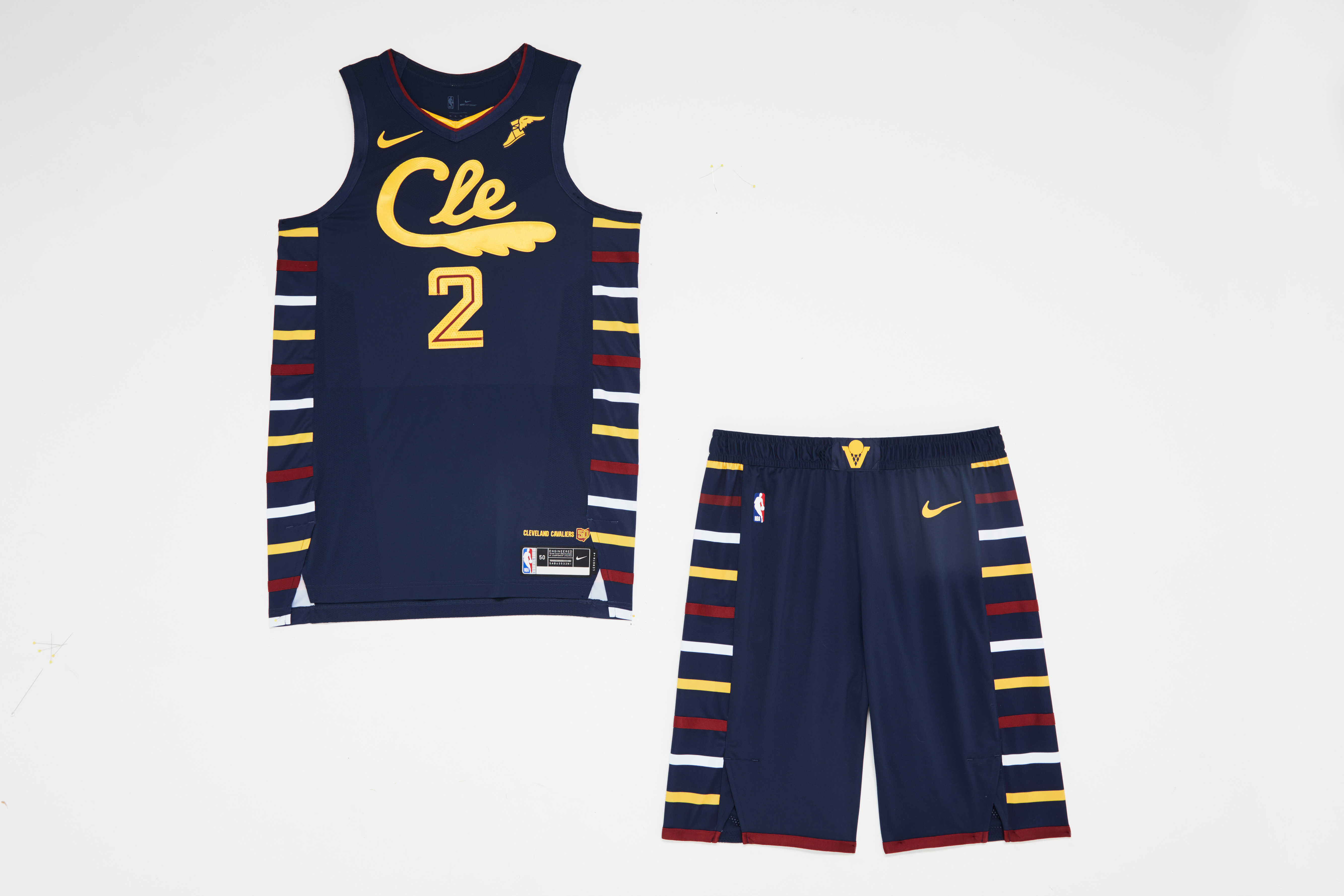
This jersey is a keeper. The tri-colored ribbing, featuring a subtle nod to the Cavs' sky-blue unis of yesteryear, is sufficiently spaced out to prevent a cluttered look. The "Cle" wordmark with the feather elevates what might have otherwise been a standard block-letter design, which plagues a number of lesser looks this year.
4. Denver Nuggets
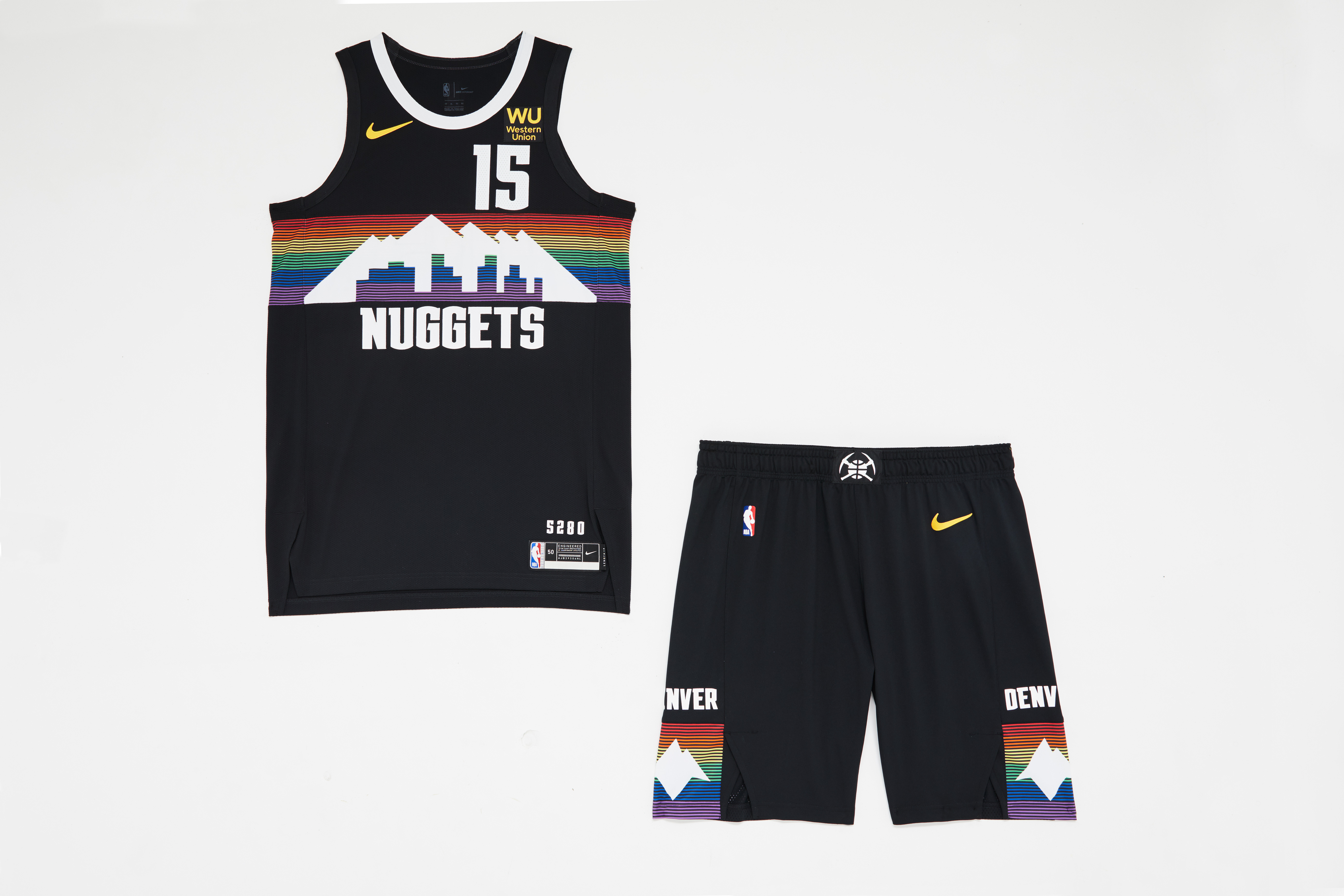
Yes, everyone loves the Nuggets' rainbow mountain motif, but simply swapping out last season's white base for a black one is a slight downgrade. The darkness swallows up the color just a bit too much.
5. Philadelphia 76ers
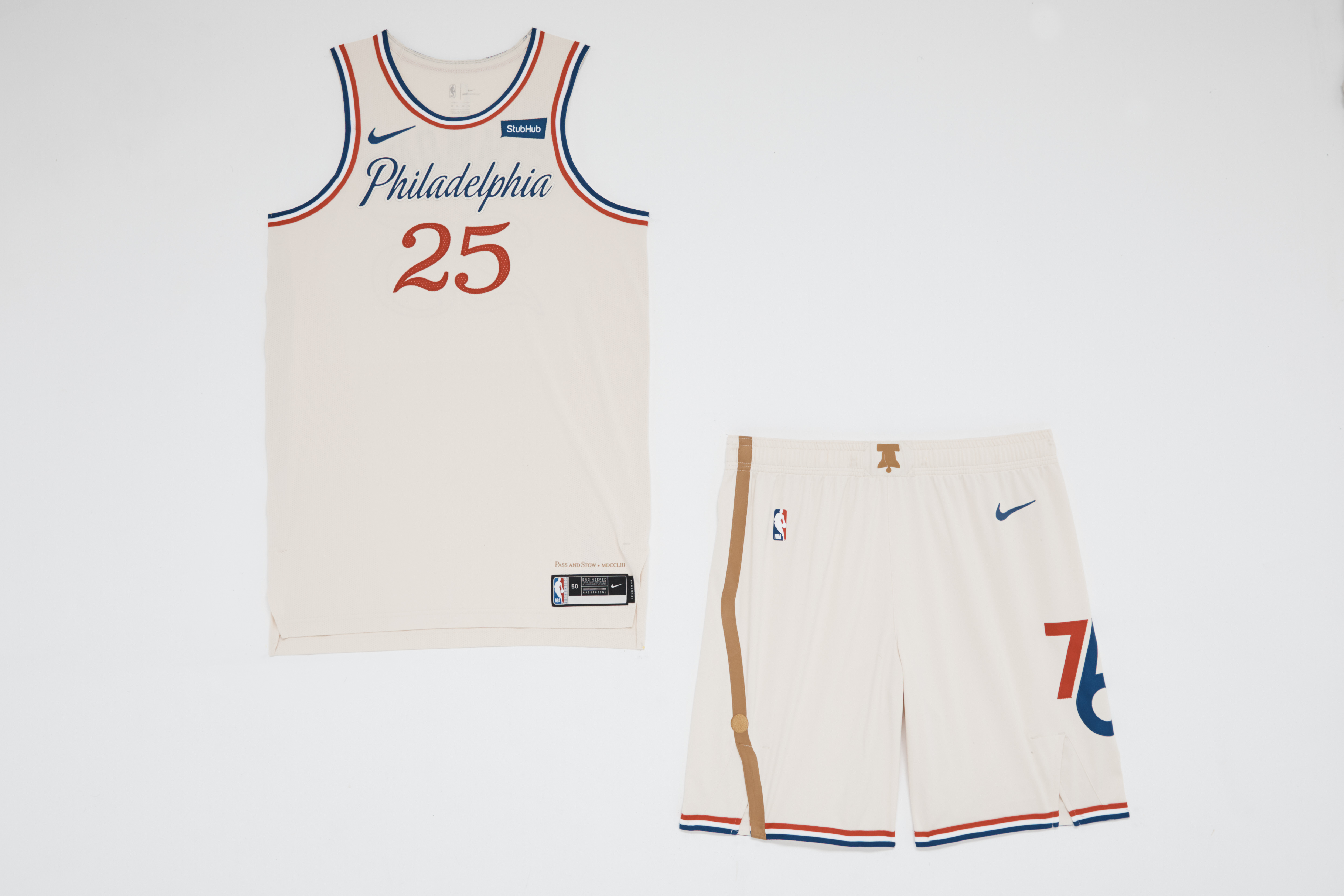
Another smart use of off-white to give the base some depth. Given its primary color scheme and the wealth of history tied to the city, it's hard for Philly to screw this up. The asymmetrical crack down the right short leg evoking the Liberty Bell is a nice touch.
6. Washington Wizards
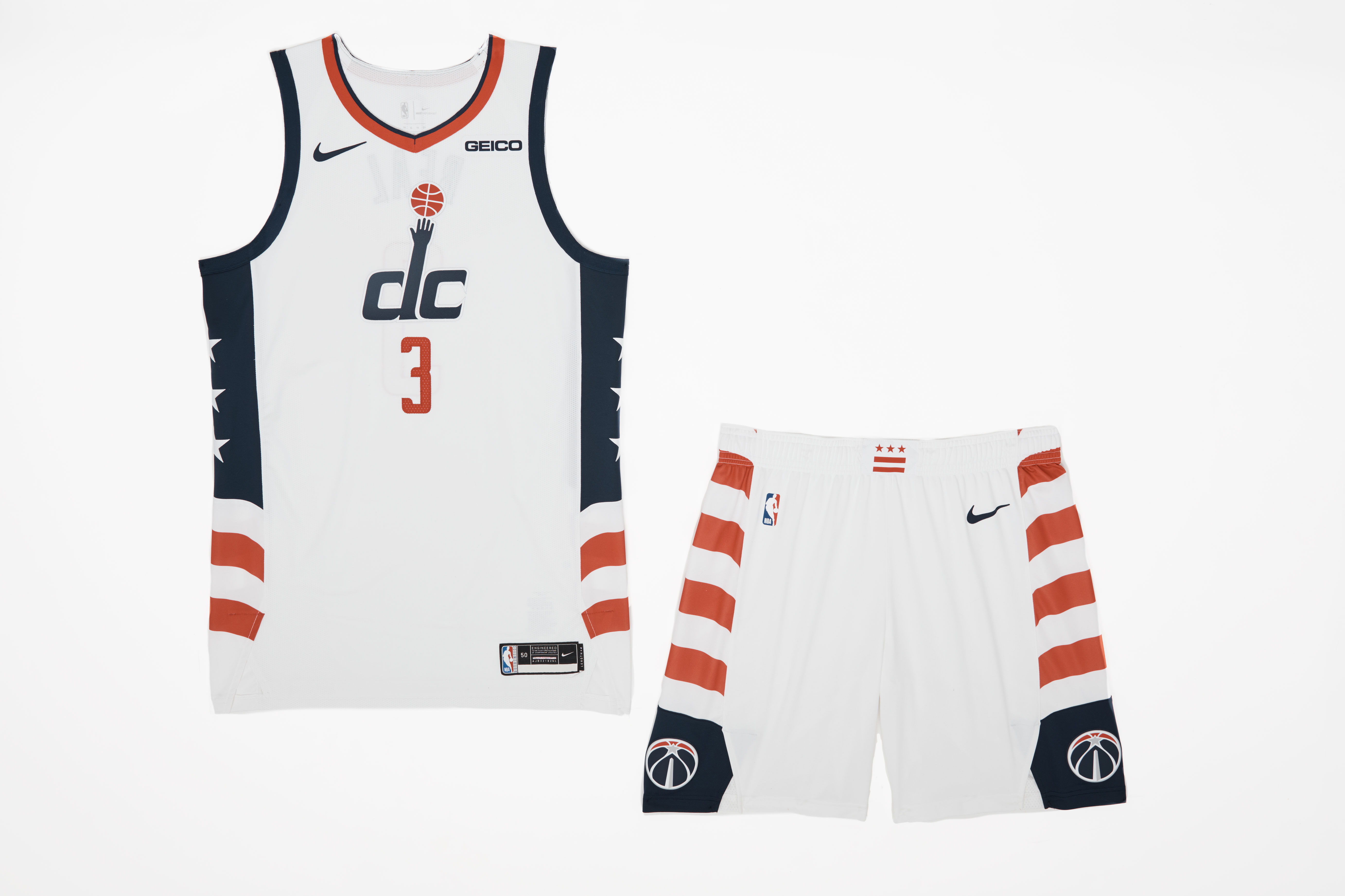
U.S. Flag Code purists will roll their eyes, but the stars-and-stripes side paneling is an easy win; a localized version of national team jerseys. But will we ever see an actual prestidigitator incorporated into the Wizards' branding again?
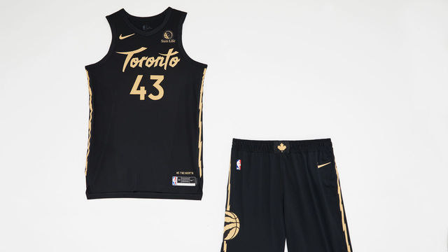
7. Toronto Raptors
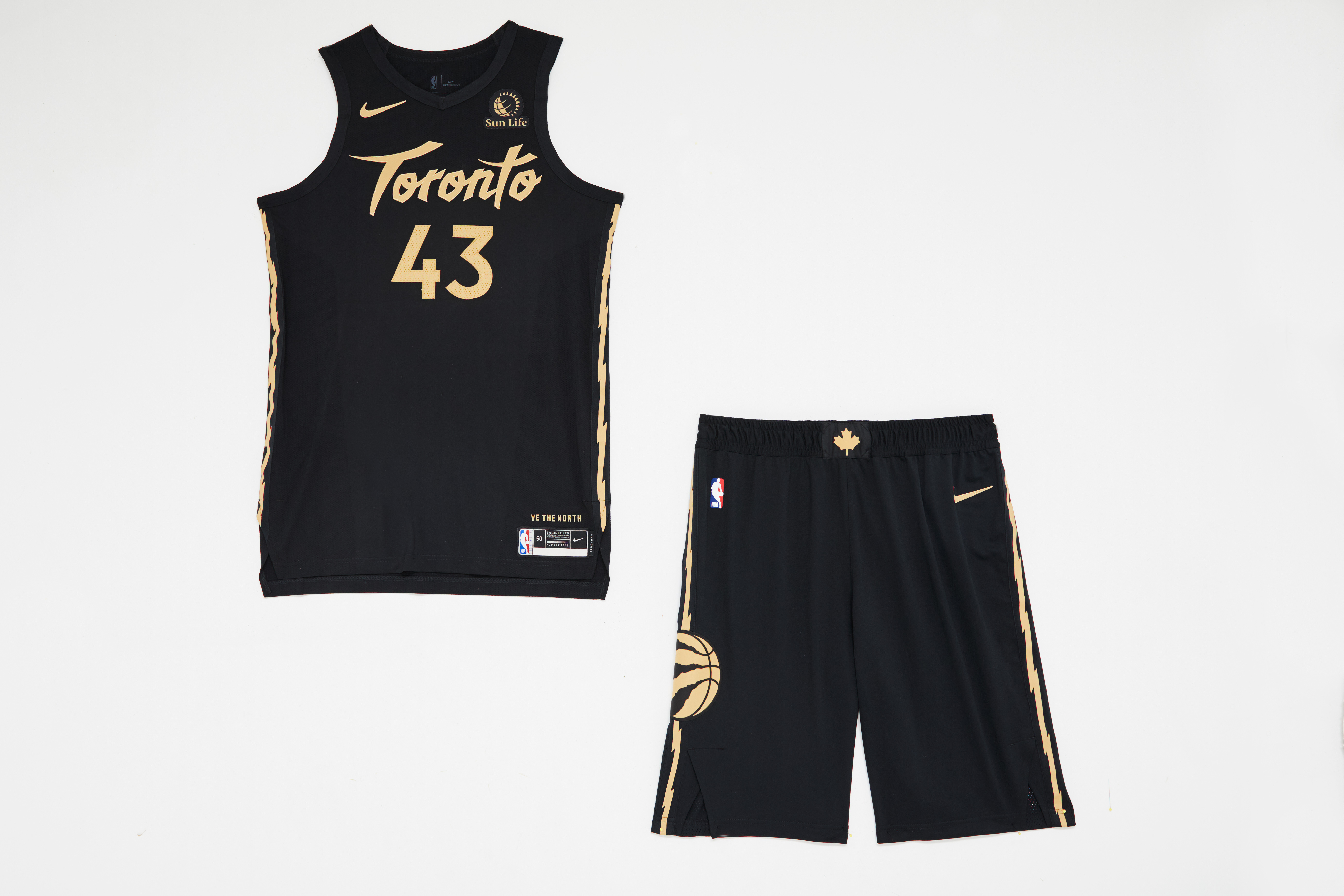
Old meets new in the Raptors' latest nod to their partnership with Drake's OVO brand. The font, the jagged stripes on the sides of the jersey and shorts, and the triangles above the nameplate hearken the team's prehistoric beginnings. The black-and-gold color scheme, meanwhile, gives a nod to Toronto's more recent successes.
8. Utah Jazz
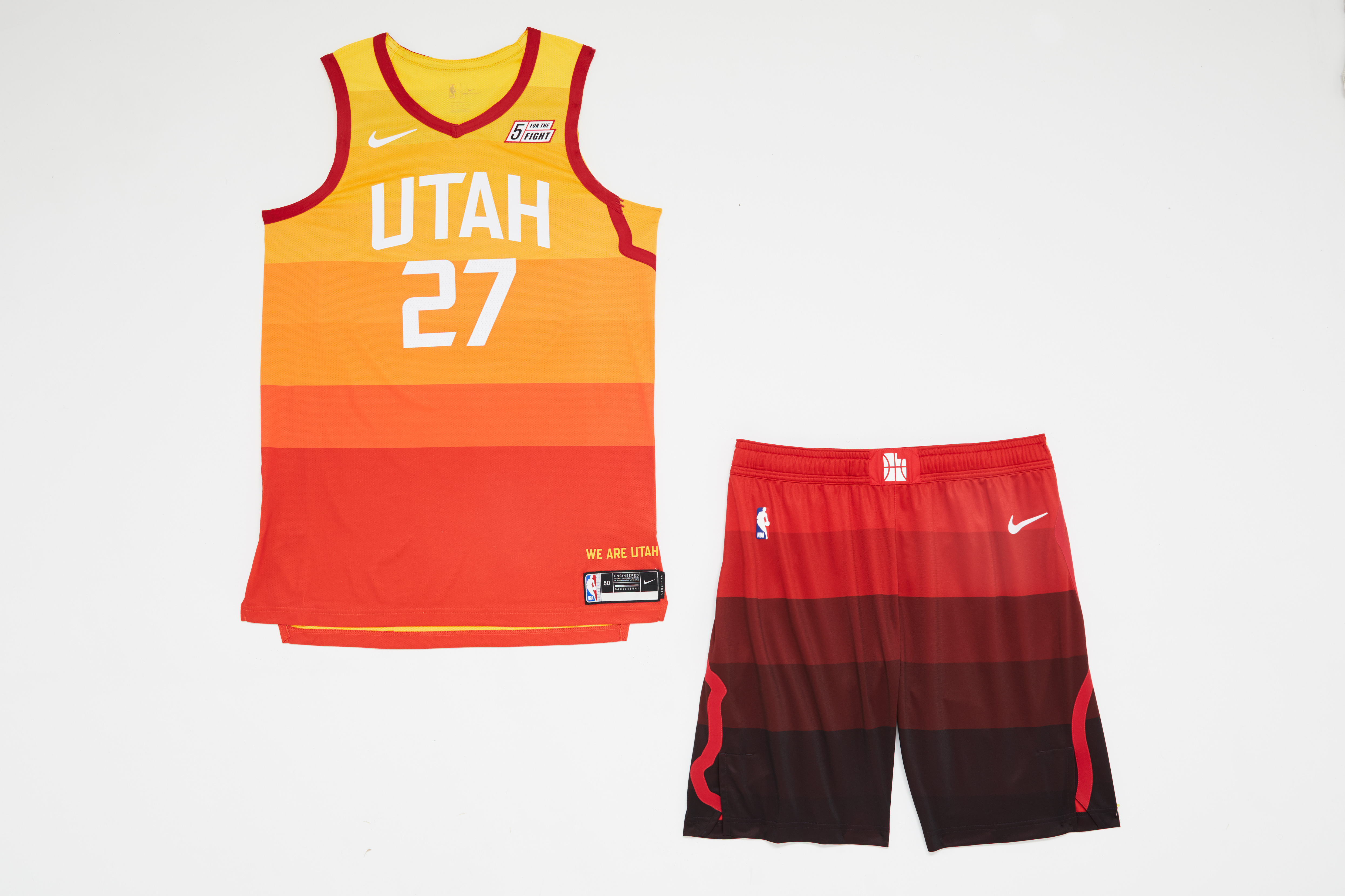
The Jazz apparently see no reason to mess with a good thing, bringing back their landscape-inspired, color-blocked look for a third tour of duty. Bless them for showing restraint.
9. New Orleans Pelicans
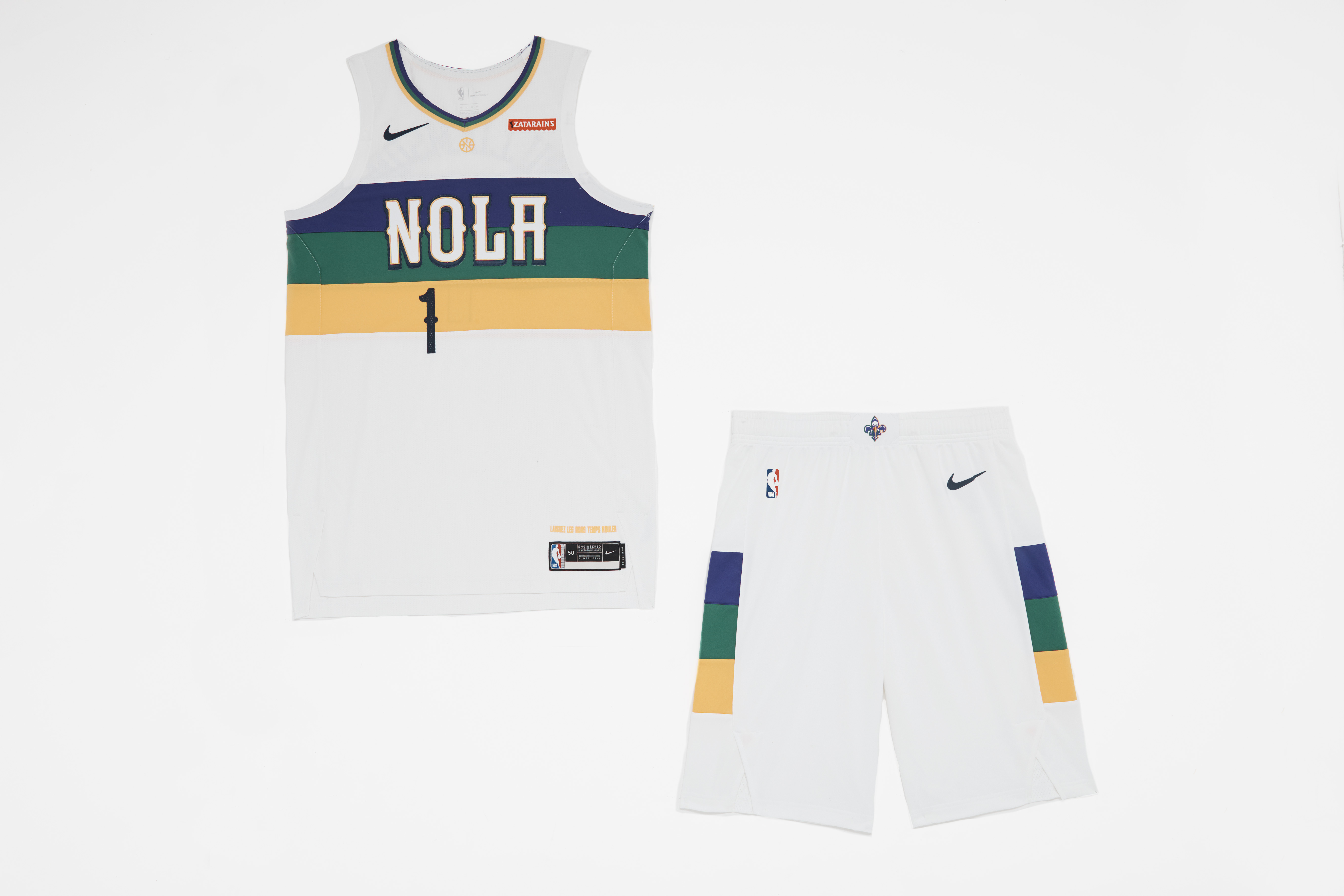
Ditto for the Pelicans, who bring back their Mardi Gras alternate for a second straight year.
10. Brooklyn Nets
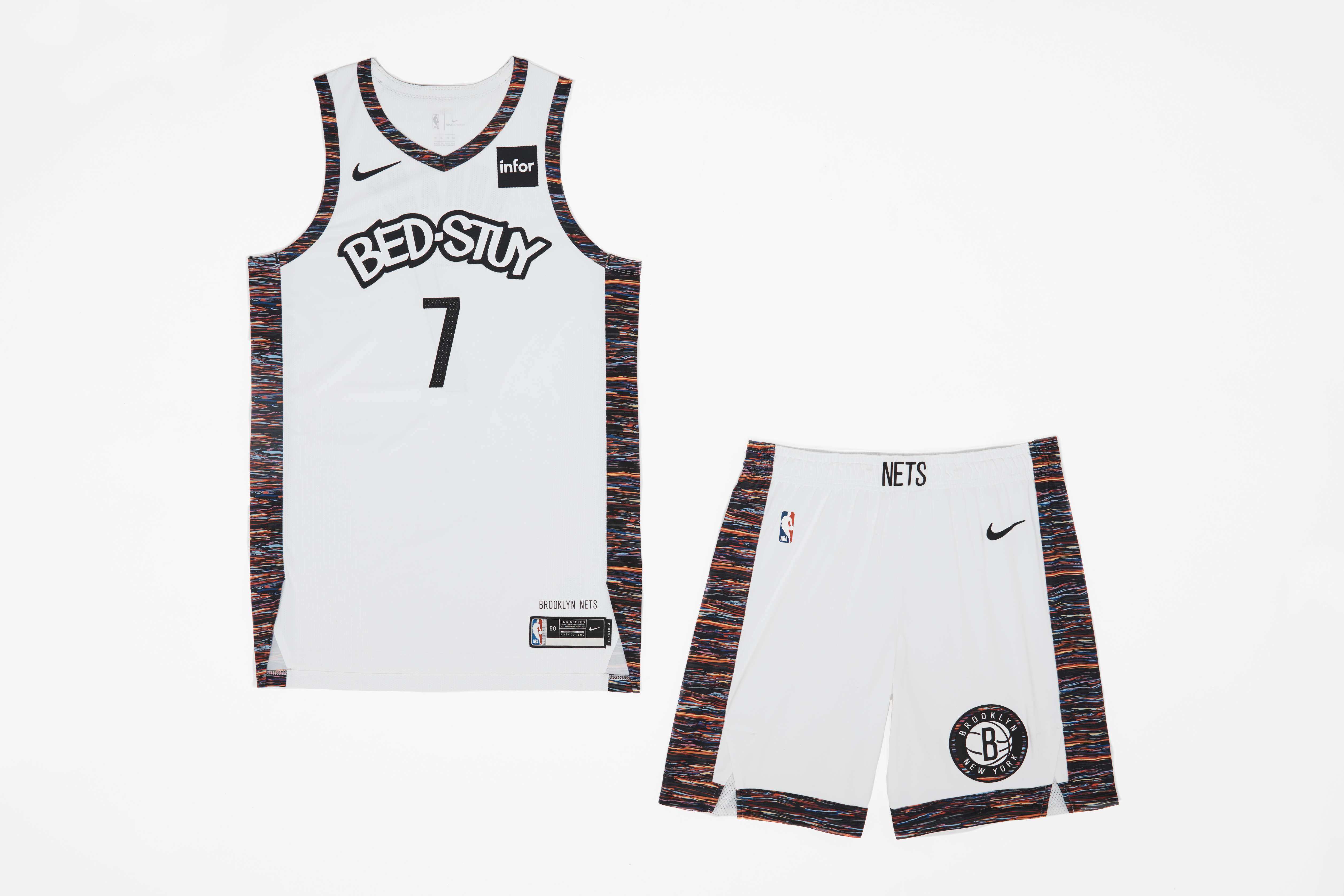
The white base lets the Coogi-inspired Biggie-inspired rainbow trim really shine, but the Nets probably should've kept last year's clean "BROOKLYN" wordmark rather than the cartoonish "BED-STUY." Graffiti loses its underground edge when it's appropriated for mass production.
11. Detroit Pistons
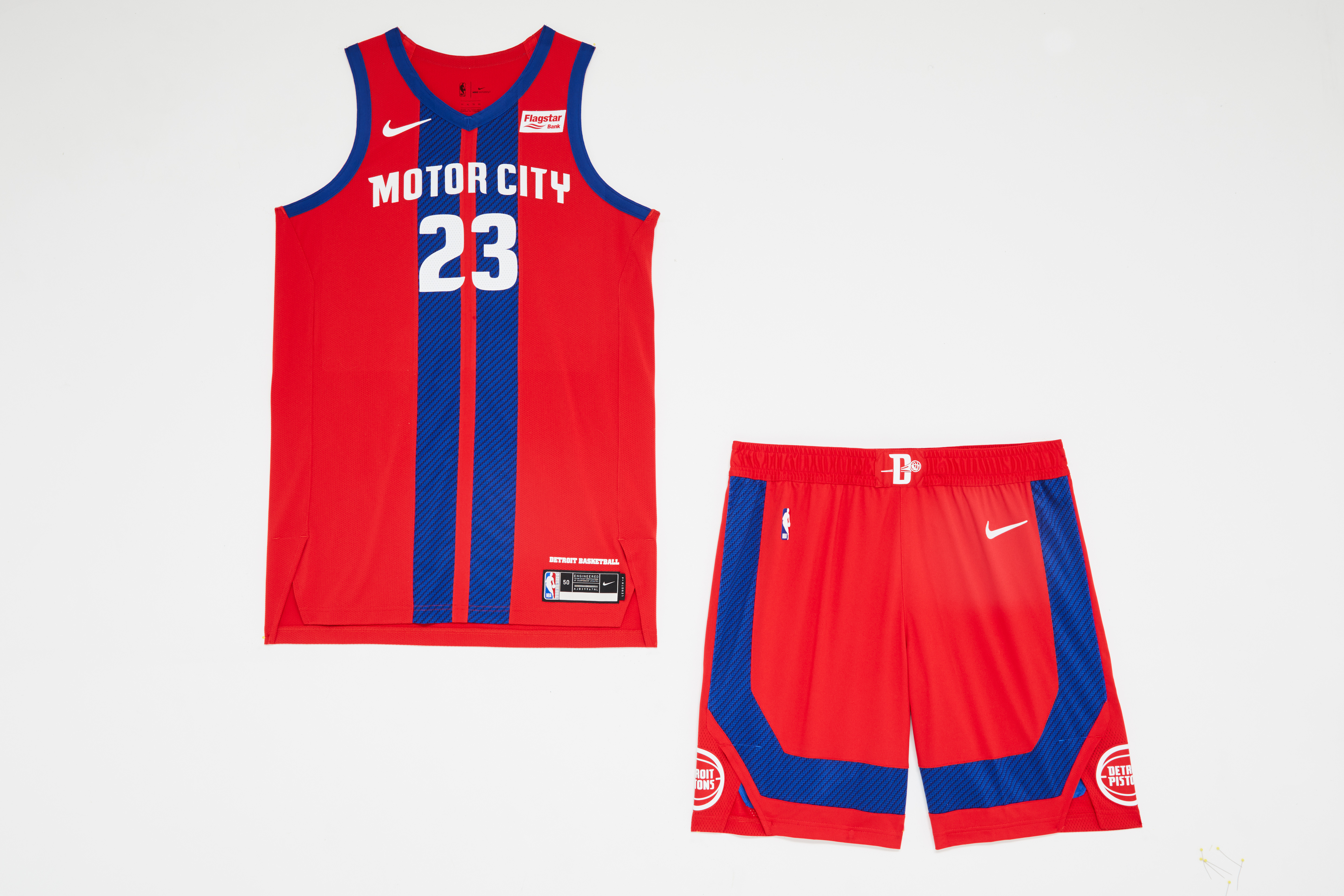
Swapping out last year's monochrome, asphalt-inspired scheme for a brash red-and-blue, muscle-car look is a reminder that you don't need to abandon a good idea after an initial setback.
12. Los Angeles Lakers
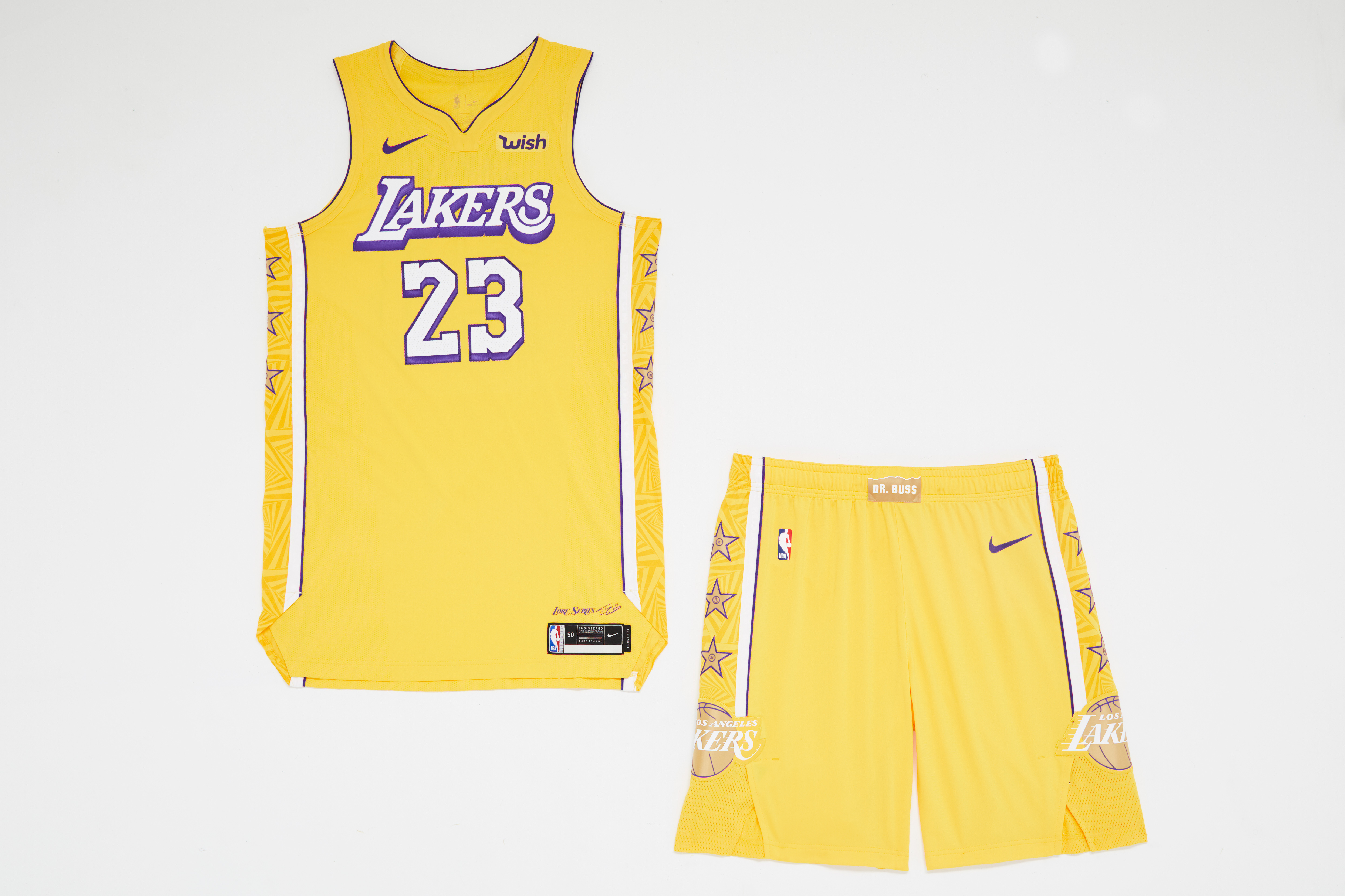
Thankfully, the Lakers have retired last year's Magic Johnson-inspired purple pinstripes in favor of a more conventional look that ostensibly pays homage to Shaq. The "vortex-like panels (are) inspired by his impossible-to-defend spin move," touts a release. OK, sure. The team's retired numbers in the stars on the sides of the jersey and shorts are interesting, but they make the uniform a little busier than it should be.
13. Milwaukee Bucks
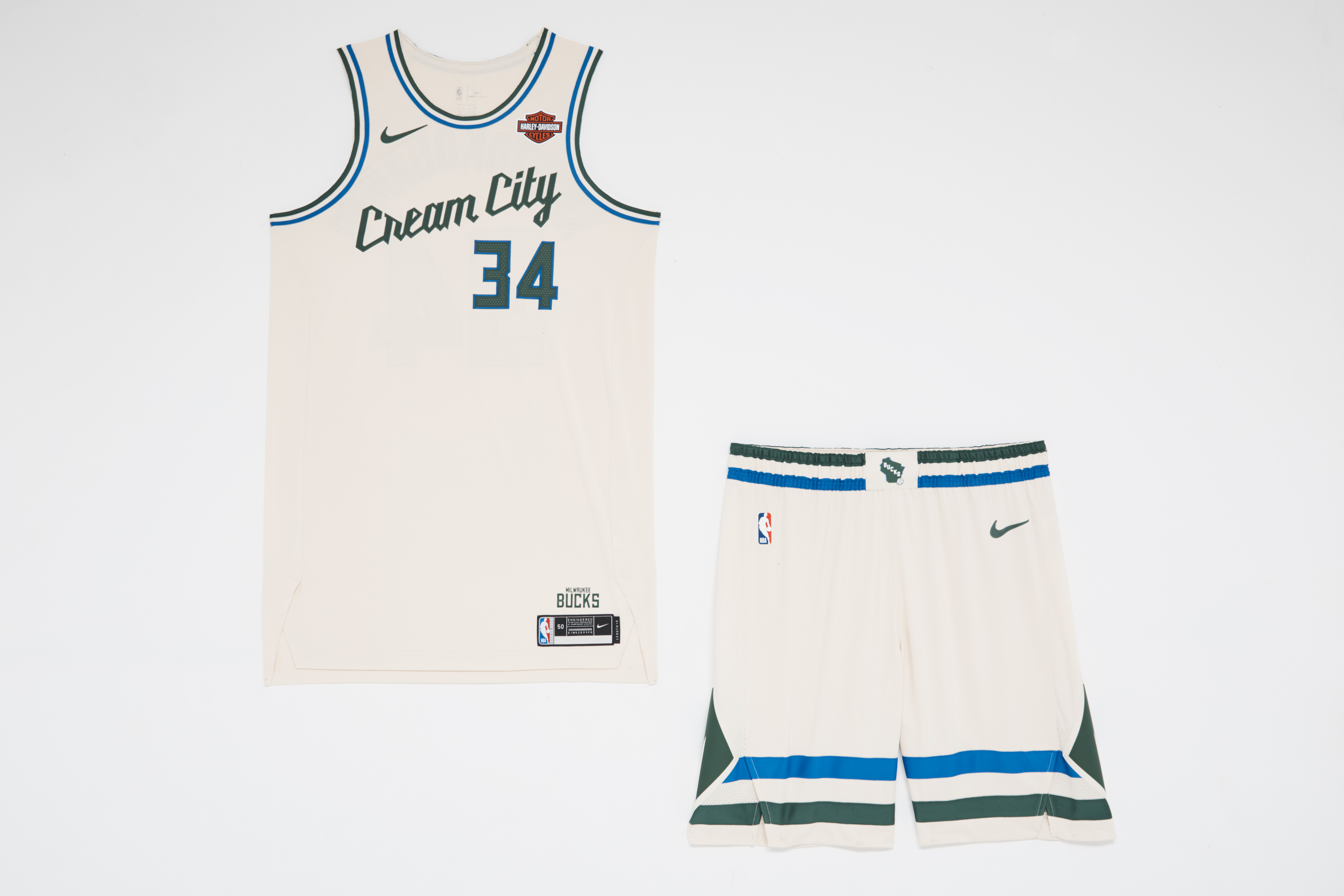
Are Milwaukeeans proud of hailing from the "Cream City?" The creamy colorway gives the green and blue accents space to shine, but the nickname is lactose intolerance-inducing - and the sole reason this smooth uniform doesn't rank higher.
14. Houston Rockets
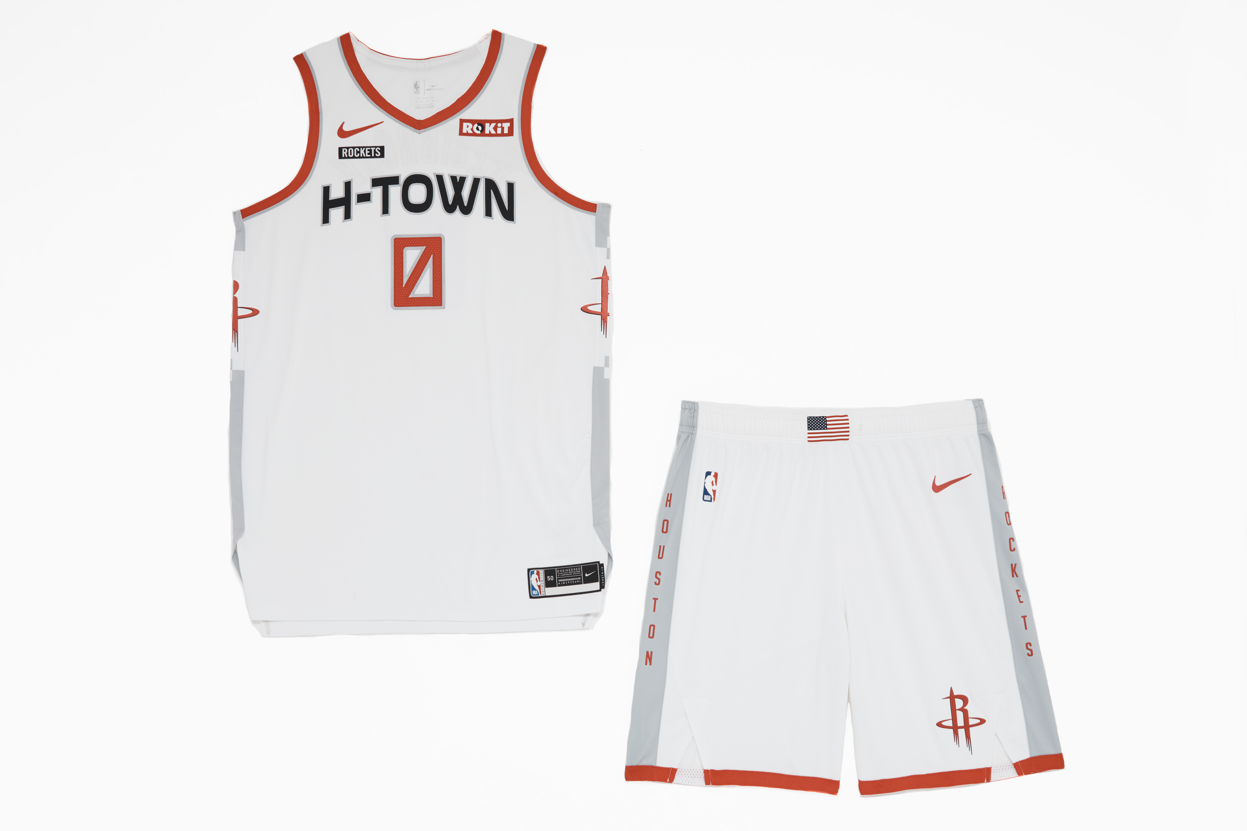
You can see what the Rockets are trying to do here with a kit evoking an astronaut's spacesuit. But it feels like it's missing something - it needs a bit more texture or detail. The shorts, with the U.S. flag on the beltline and red trim on the bottom of the sleeve, may be the best part.
15. Indiana Pacers
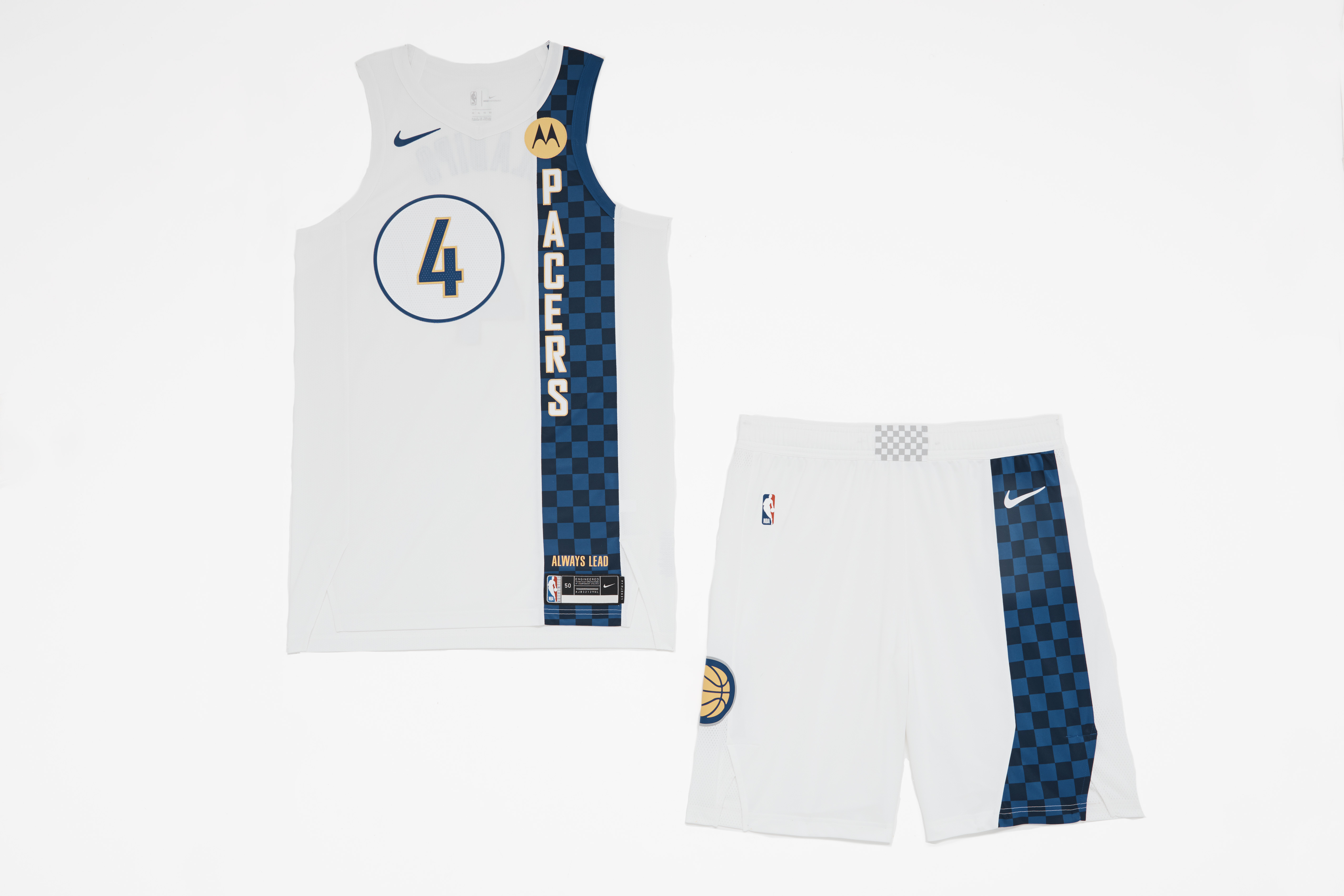
The Pacers went with a tweaked version of their 2017-18 City Edition jerseys, erasing memory of last season's drab, overly gray outfit. The asymmetrical checkered paneling is a fitting nod to the city's racing heritage, but it's a little too reserved to make a lasting impact.
16. Golden State Warriors
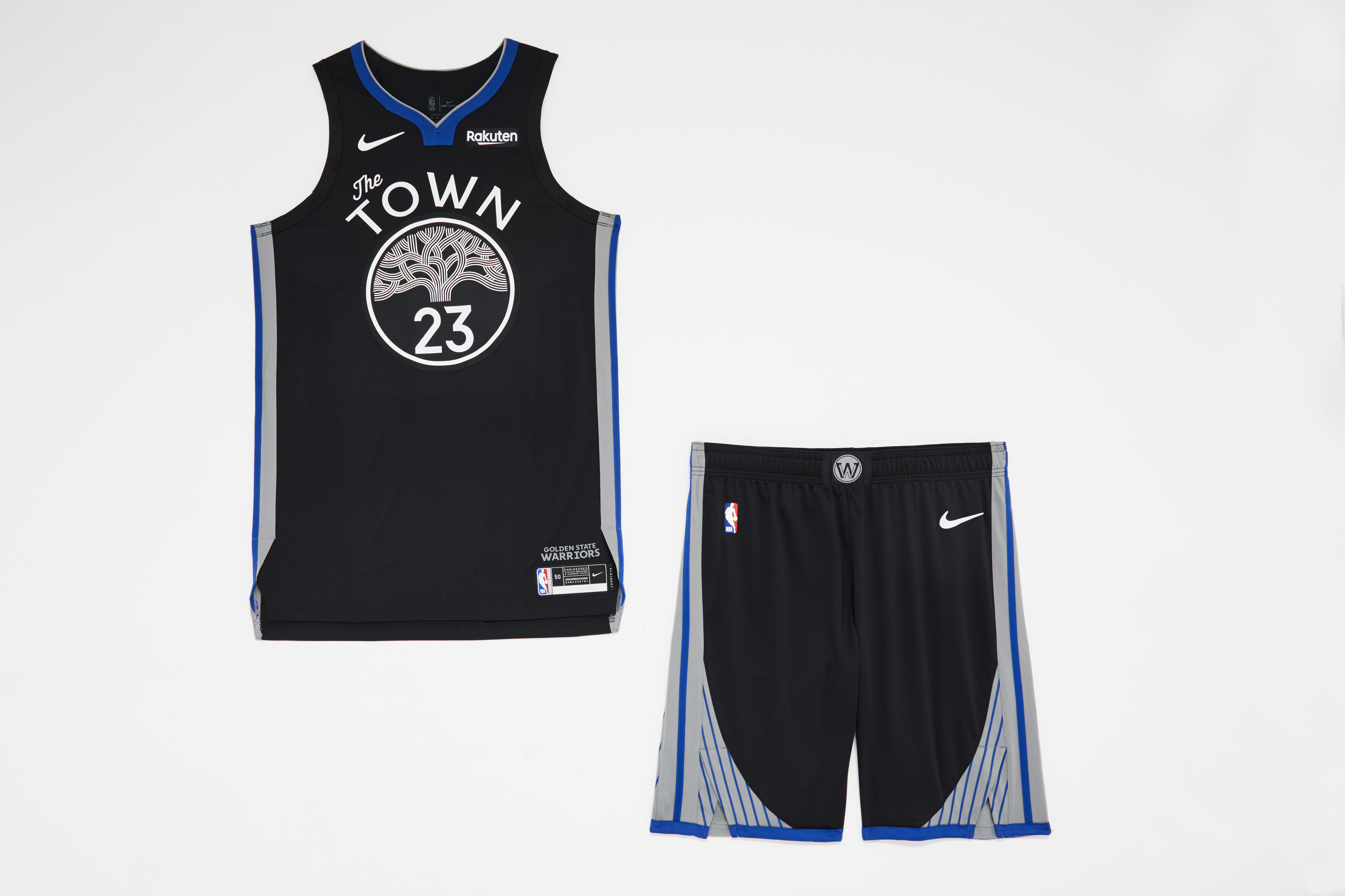
The Oakland tree logo does a lot of heavy lifting here. According to the NBA, the "black background signifies the team's strength and intensity." It seems likelier that black is simply a base color the team hasn't deployed yet; far superior versions of "The Town" jersey have boasted bright gold and dark blue bases.
17. Phoenix Suns
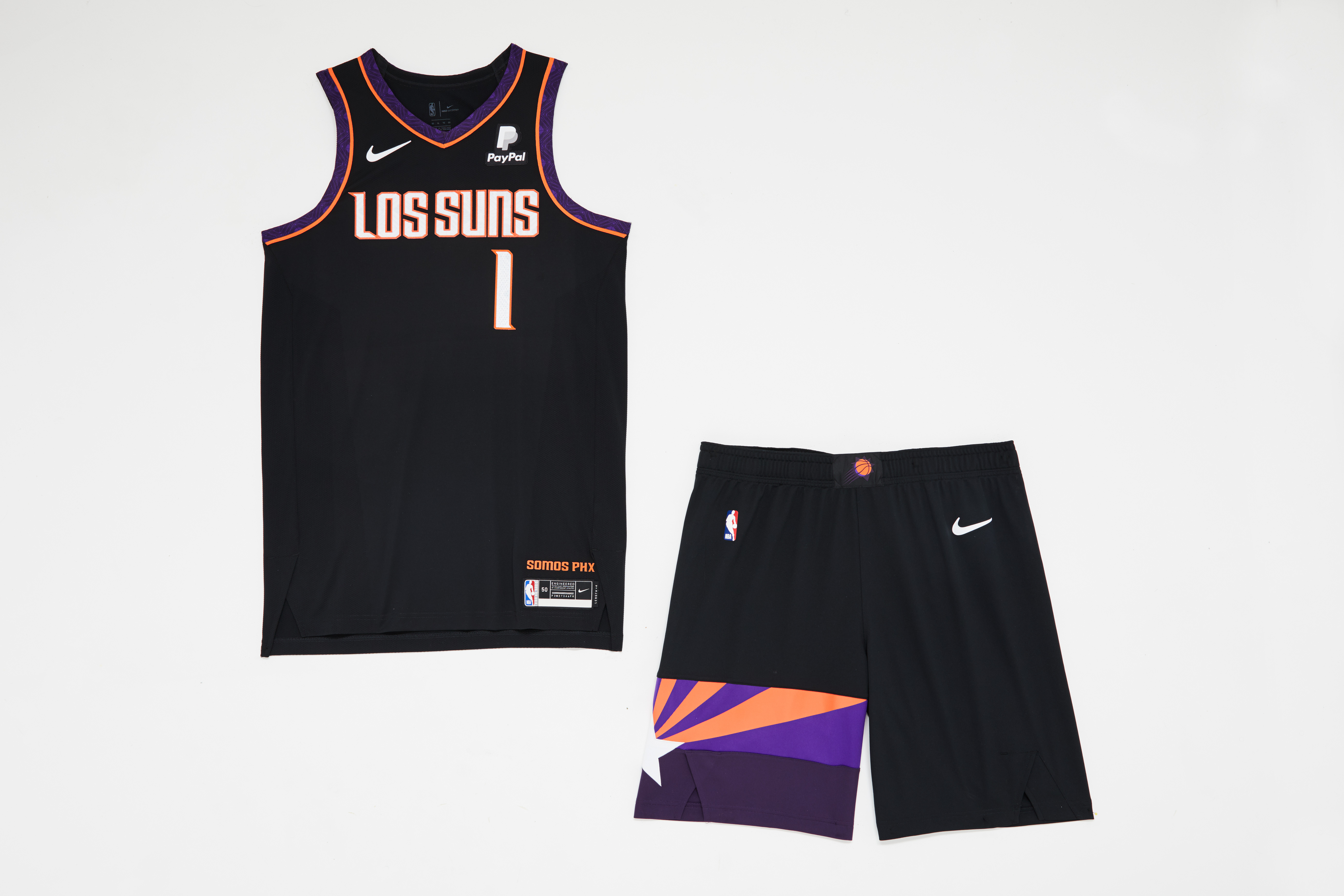
"Los Suns" should evoke some southwest spice. Instead, there's little cause for excitement in the upper half of the jersey.
These shorts are great, though, providing a much-needed splash of life with the sunset motif. Why couldn't they put that on the jersey?
18. New York Knicks
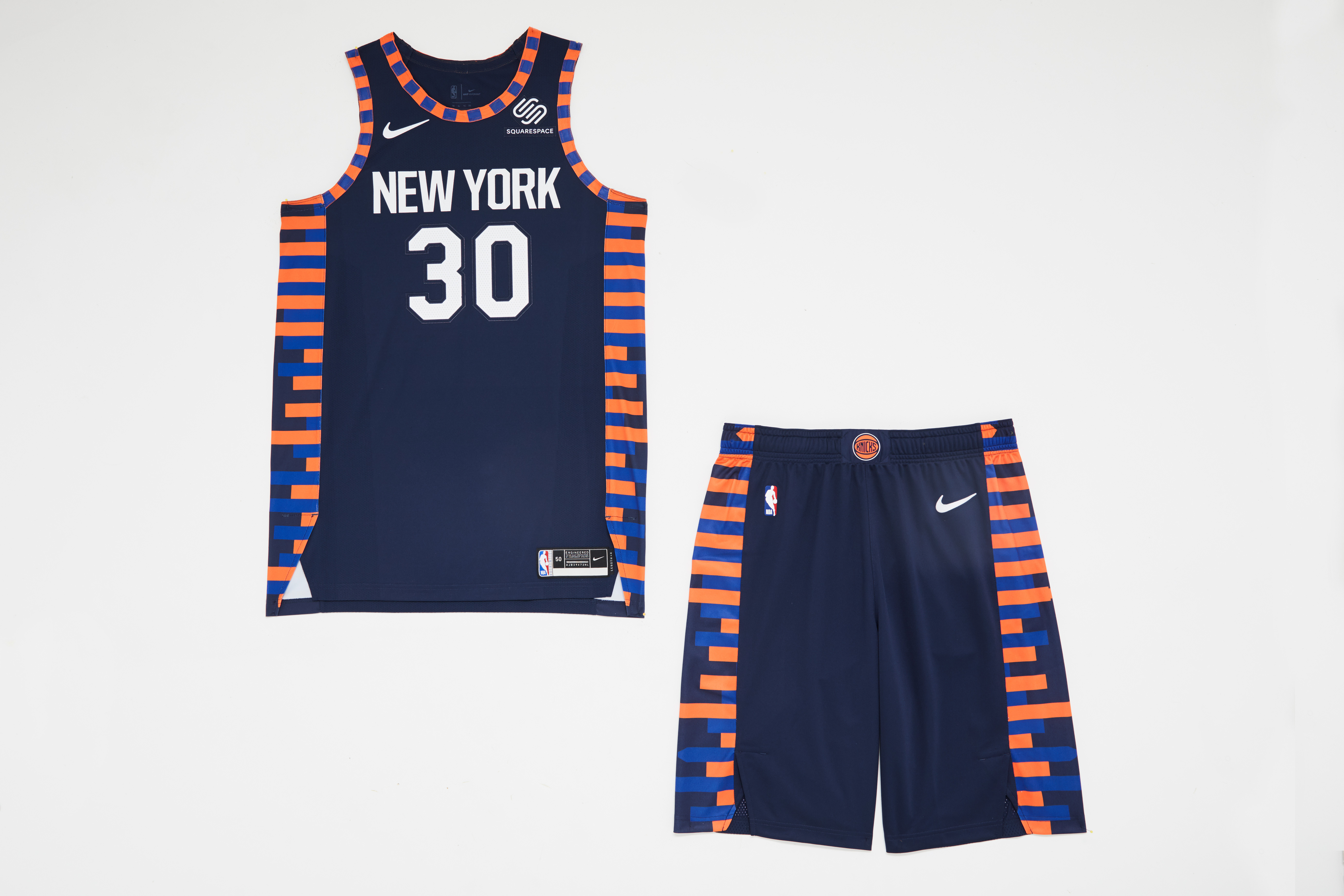
Here's what I wrote last year about this look's 2018-19 debut:
The horizontal stripes of varying lengths down the sides of the jersey represent New York's skyline. It's a nice thought, but ultimately finds a way to come off both messy and mundane.
The stripes are aging better than expected but still seem lackluster, especially considering how the Cavaliers pulled off a similar flourish this season to much better effect.
19. Los Angeles Clippers
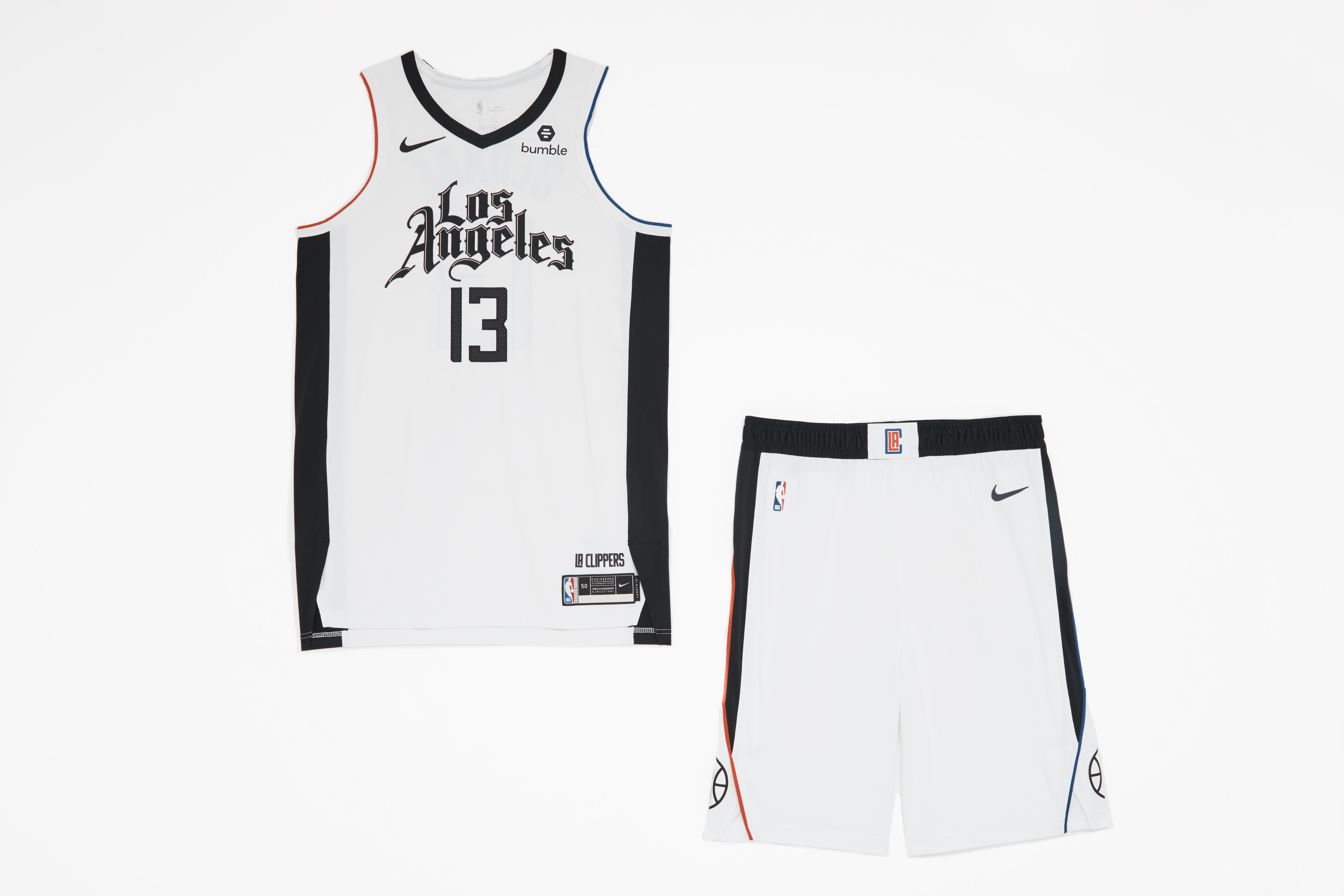
Give the Clippers credit for trying to carve out their niche in L.A., but the "Chicano" font deviates so drastically from the team's branding that it winds up looking like a generic jersey you might find in the discount bin at Dick's Sporting Goods.
20. Atlanta Hawks
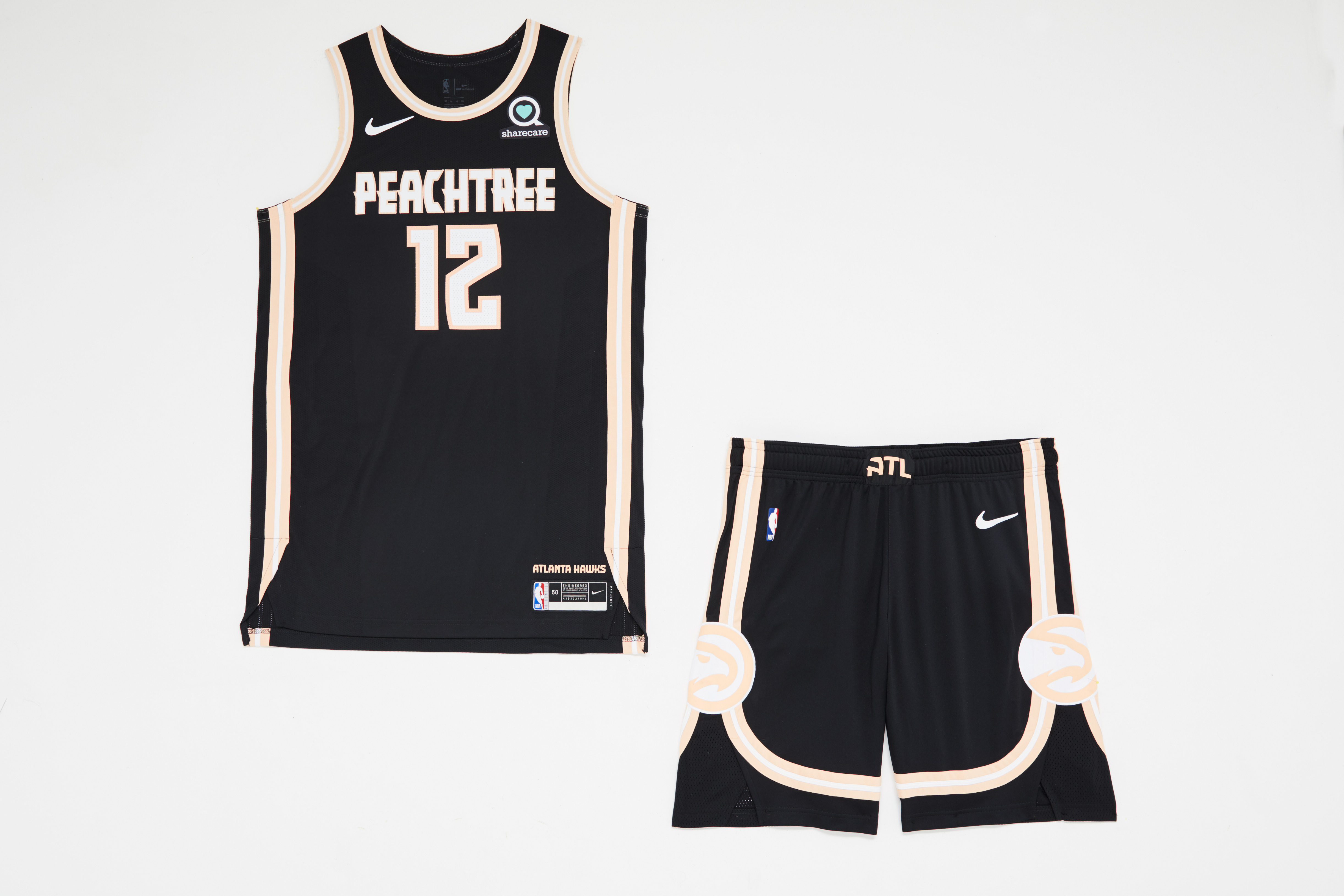
This is a noble attempt to bring peach to the NBA's color spectrum, but like so many entries in a world infatuated with black alternates, the softness of the accents is lost. It would've been interesting to see the Hawks pair peach with a more natural partner like coral red or pastel green. If the Heat can make hot pink and electric blue work, why can't Atlanta make peach its own?
21. Sacramento Kings
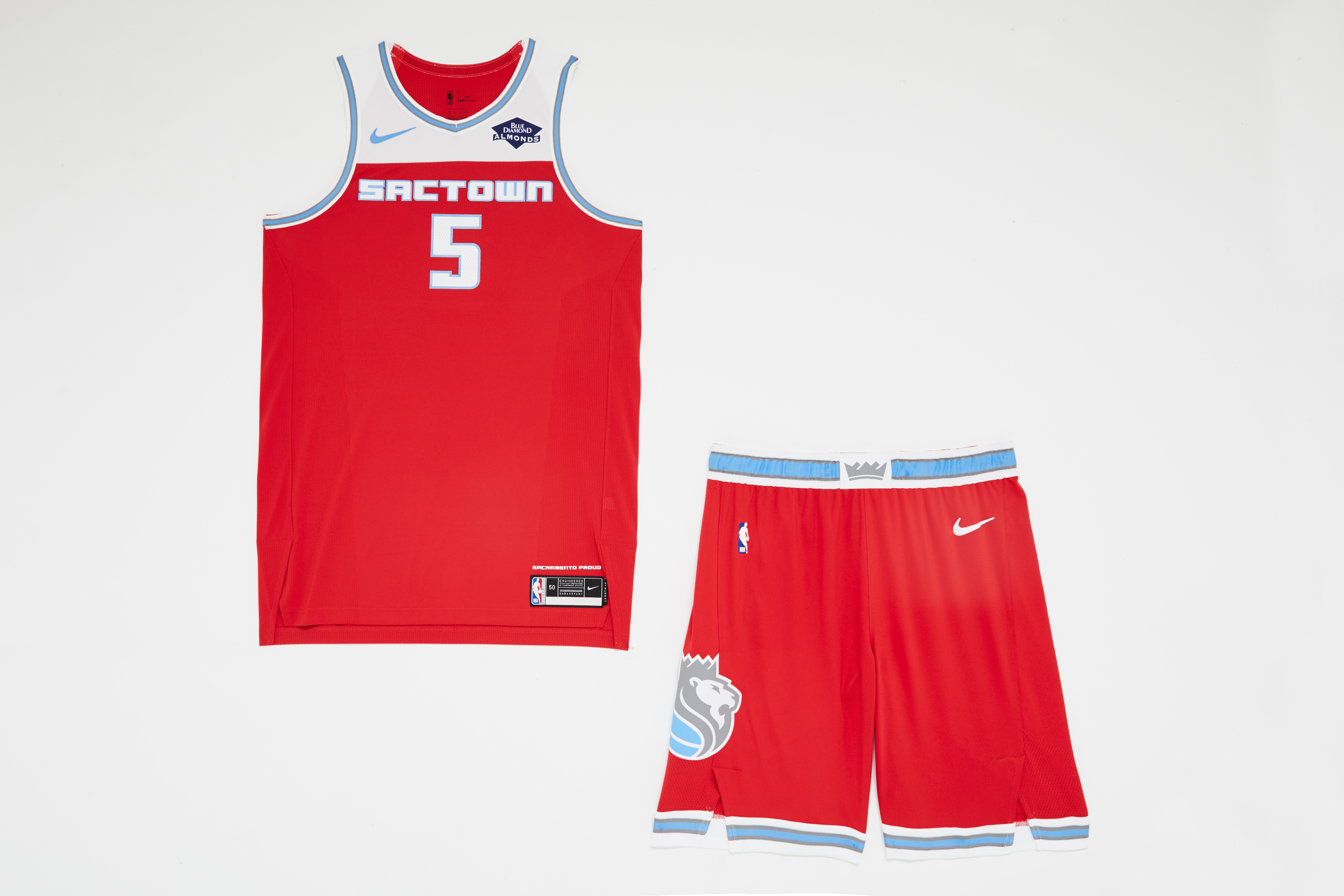
The colors have flipped from last year's uniform and its baby-blue base. The mostly unbroken red is a little overwhelming, lacking the contrasting shades across the torso that make this year's Pistons' City Edition work.
22. Chicago Bulls
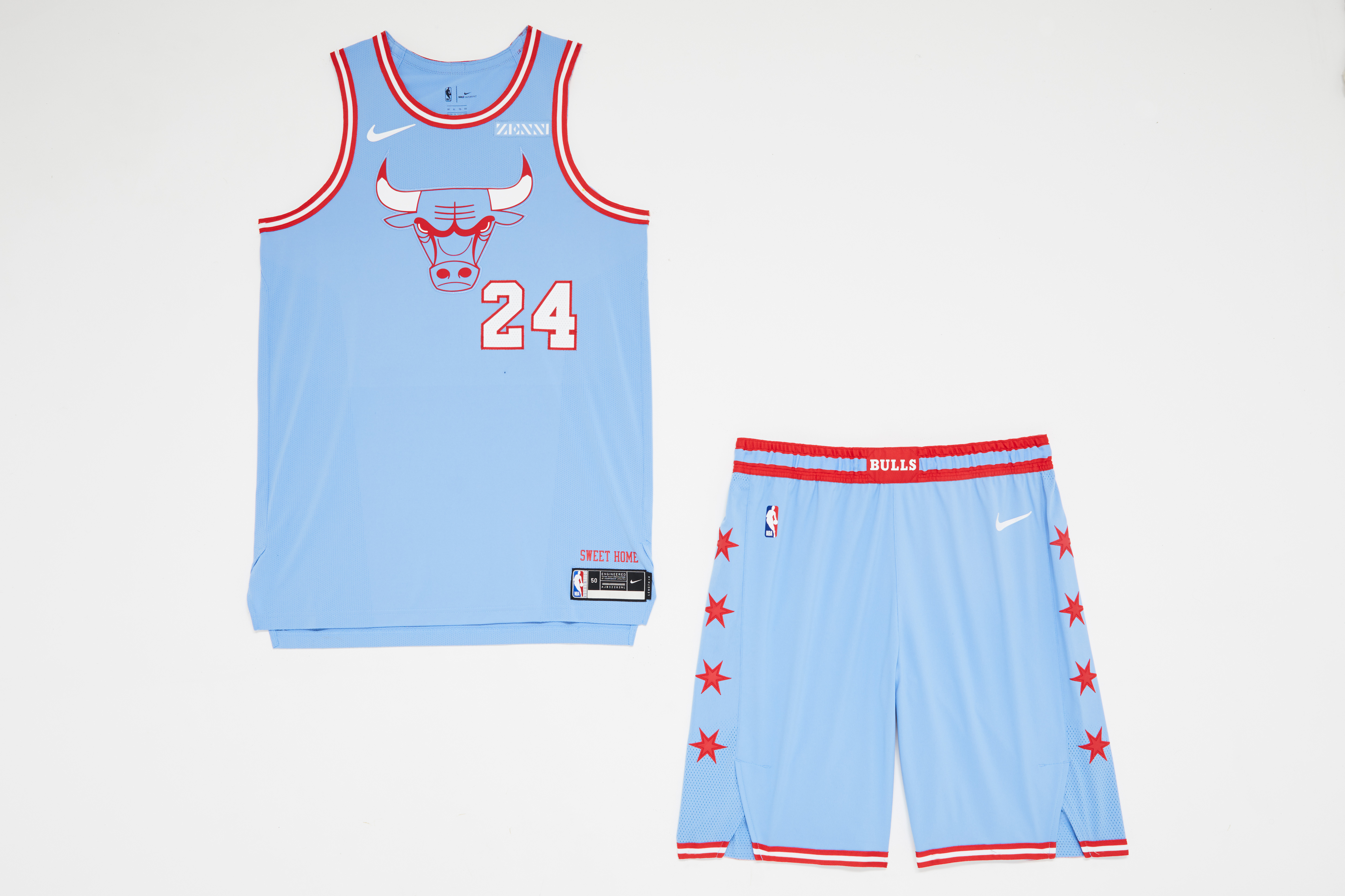
The Bulls' look falls into a similar trap as the Kings': too much of a good thing. Firetruck red and baby blue is usually a winning combo. But without something to balance the richness - more white, for instance - the look becomes the visual equivalent of eating an entire bowl of only the marshmallows in Lucky Charms.
The blue also mitigates much of the logo's ferocity, reducing the bull to something akin to Paul Bunyan's Babe the Blue Ox.
23. Boston Celtics
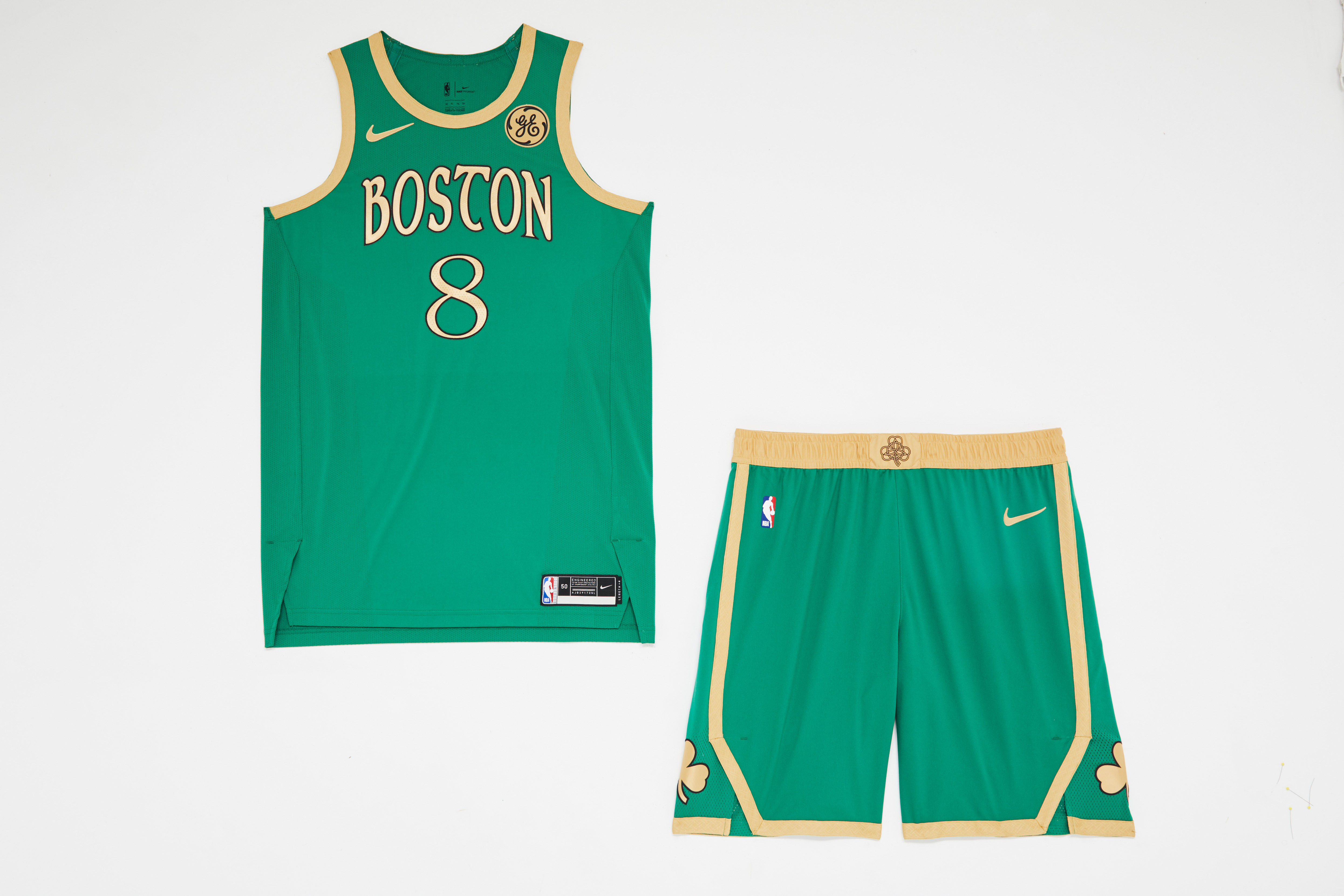
These are just unnecessary. The Celtics possess one of the most iconic looks in sport. Anything other than the status quo is going to come up short, even an earnest attempt to evoke Boston's Irish heritage. In a vacuum, these are inoffensive, but historical comparisons to the team's usual look are unavoidable.
24. Orlando Magic
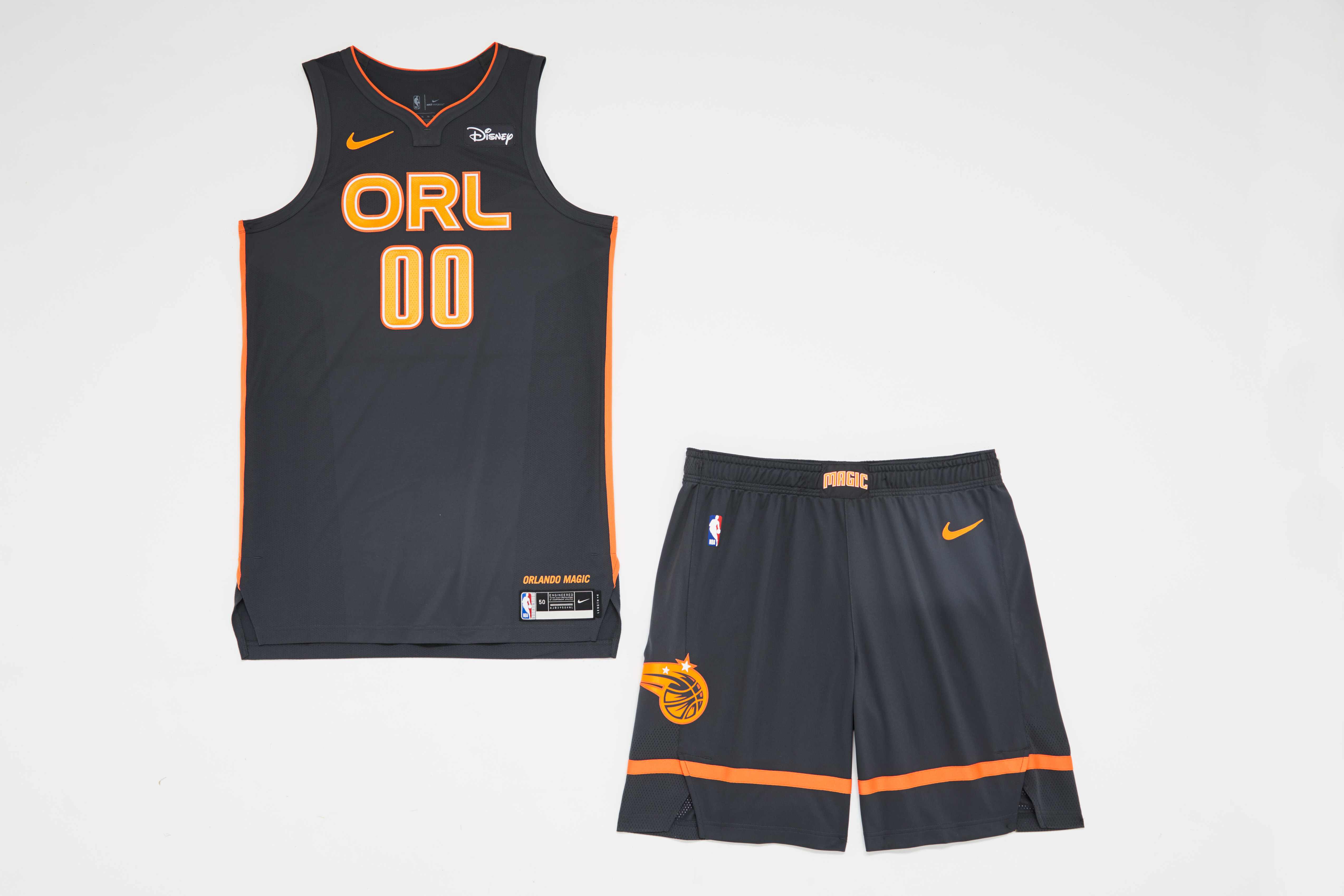
If the Hawks can try to make their state food part of their identity, can't the Magic do the same? They probably could've have leaned more heavily into the orange motif. Why not turn the "O" in "ORL" into an orange? Why not go full-on Tampa Bay Buccaneers creamsicle?
25. Minnesota Timberwolves
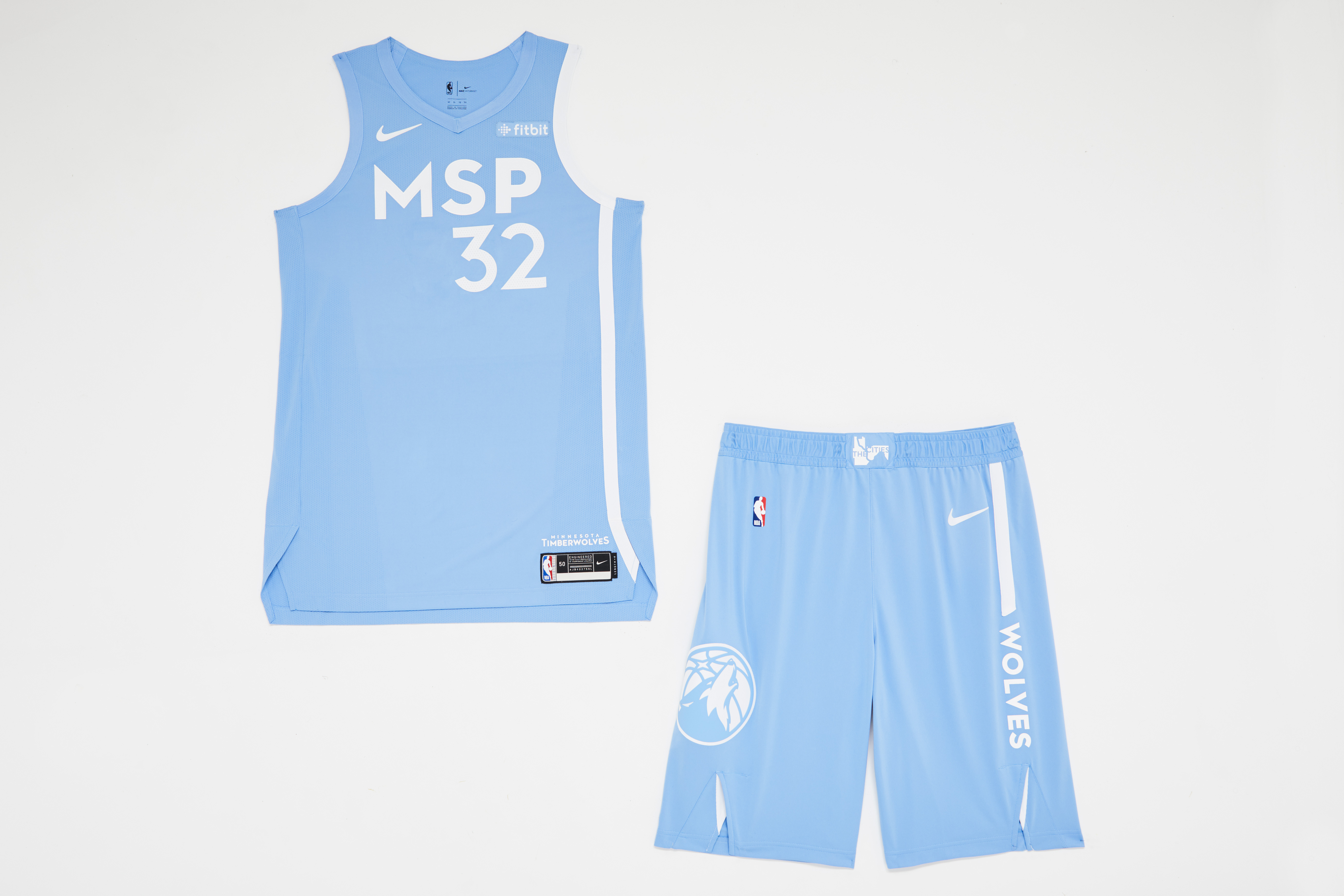
Paying homage to both Minneapolis and St. Paul? Great thought - except the Timberwolves are late to the punch on several fronts. The Lakers wore "MPLS" throwbacks two seasons ago with the same baby-blue base, but they elevated the look with gold lettering. Compared to last season's raucous Prince uniforms, this year's alternate is more like a lullaby.
26. San Antonio Spurs
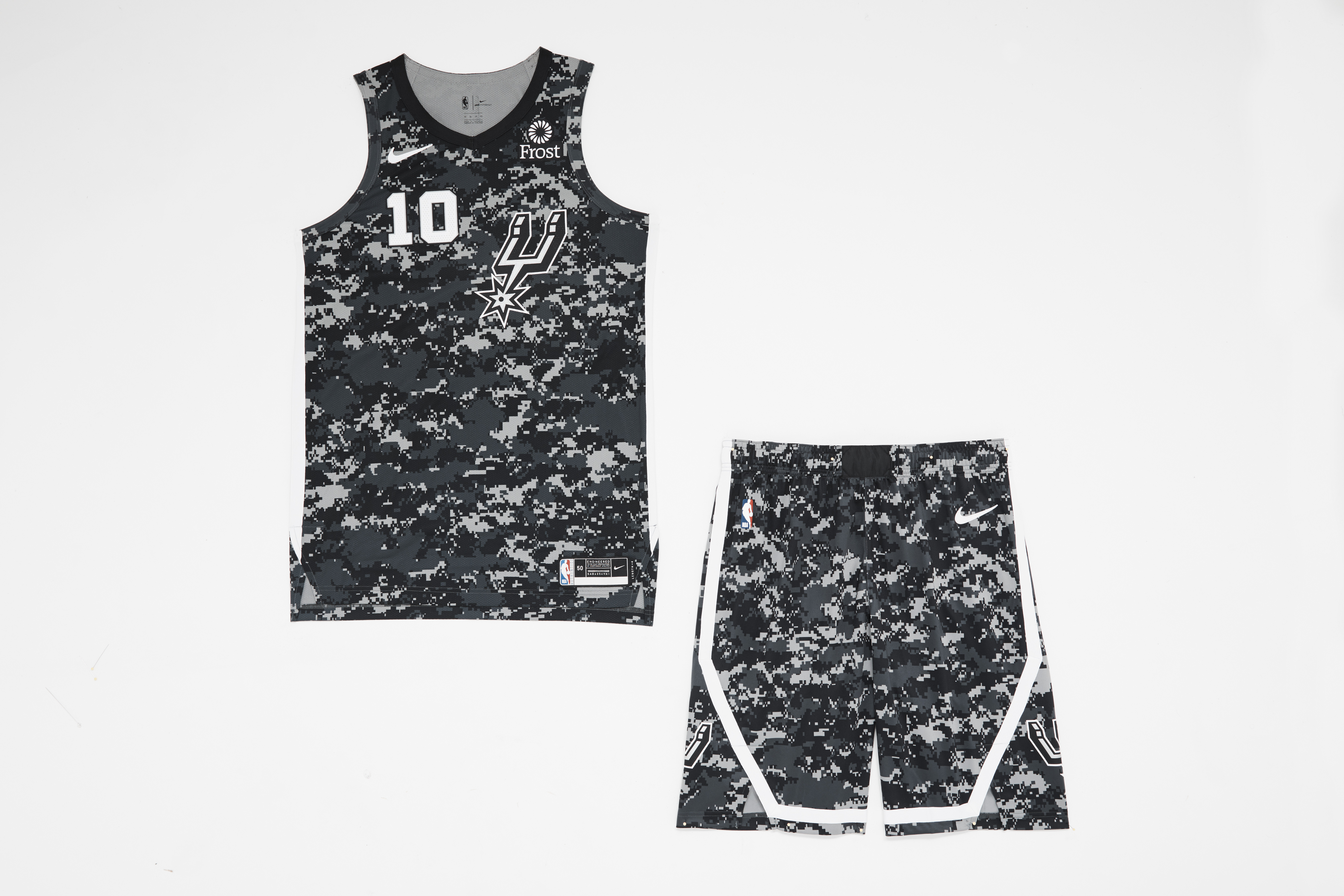
The Spurs once again refuse to participate in the festivities, trotting out the same camouflage print 'fit they've touted for years. Ho-hum. If ever there was a season in which the lauded Fiesta colorway should've been deployed, it was this one, with the team struggling to live up to its multi-decade standard of stoic excellence.
27. Charlotte Hornets
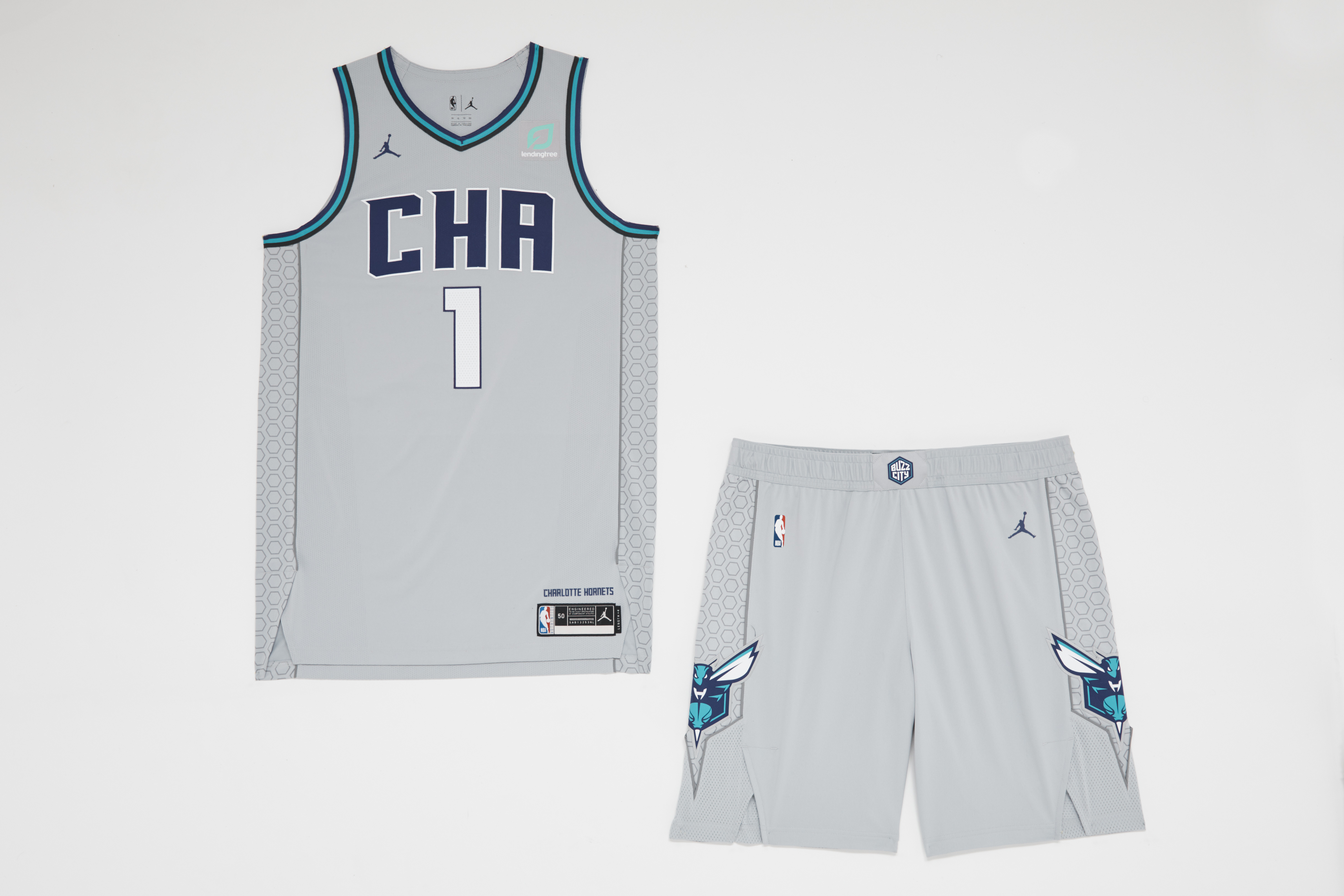
Abbreviated block letters on a gray base is an unfortunate combo. Luckily, the Hornets' go-to teal-and-purple jerseys have more than enough swagger to make up for these milquetoast alternates.
28. Oklahoma City Thunder
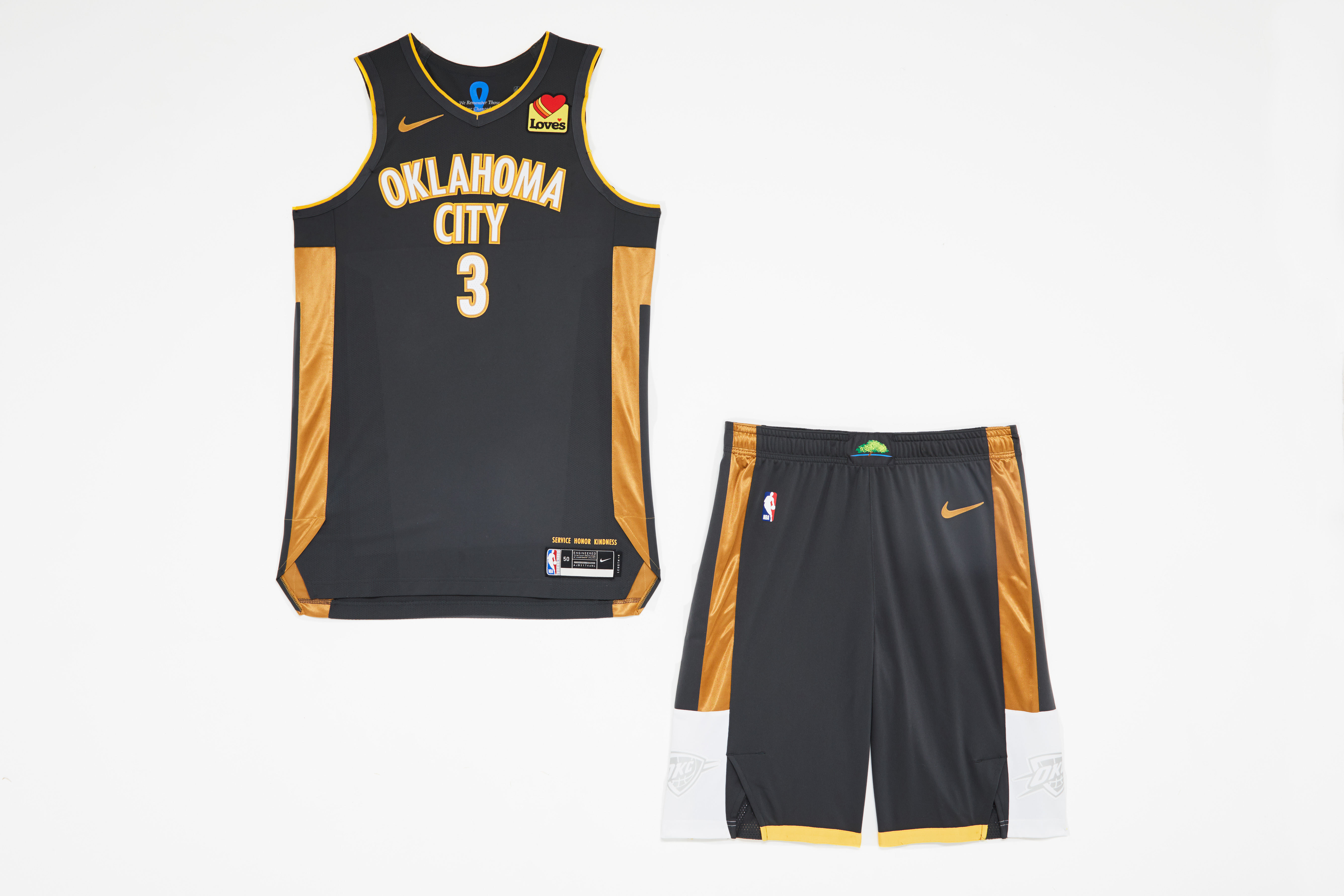
Paying tribute to the lives lost in the Oklahoma City bombing is noble, but the execution of this theme just doesn't work. The gold blocks extend from below the armpit to above the knee - but oddly, not to the very bottom of the short sleeves. It doesn't seem connected.
29. Dallas Mavericks
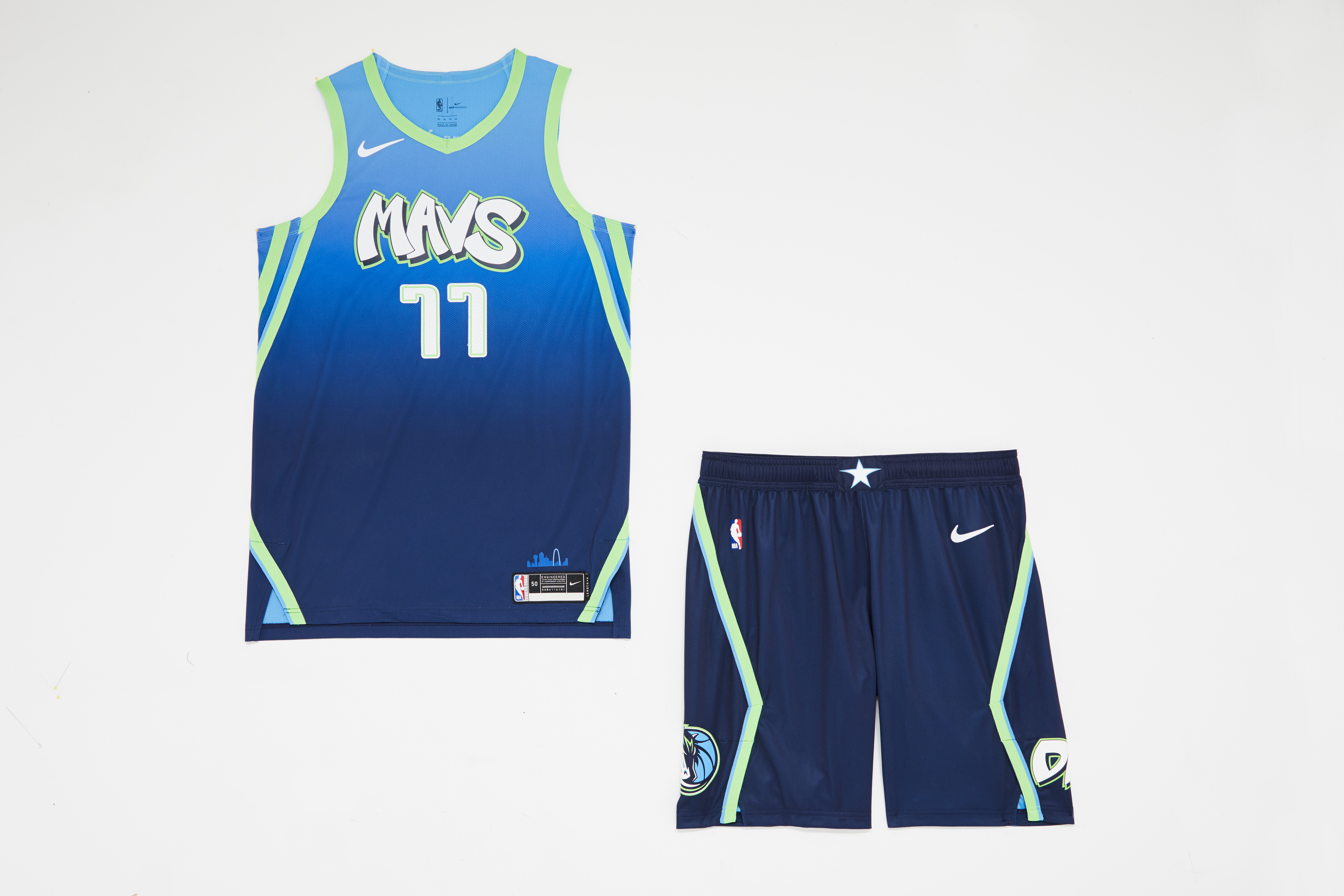
It's as if the Mavericks allowed each player on the roster to choose one aspect of this jersey. Graffiti font with lime-green drop shadow. A base grading from light to dark blue. Diagonal piping along the sides - again, lime green. Five distinct logos and patches on the shorts. It's all so garish.


