"If you look good, you play good." - Deion Sanders
theScore is counting down the 100 best uniforms in sports history, with a new post every weekday until May 15.
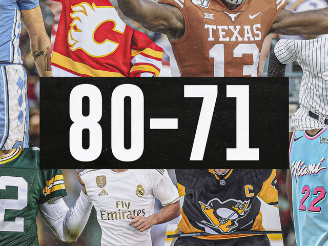
100-91 | 90-81 | 80-71 | 70-61 | 60-51
50-41 | 40-31 | 30-21 | 20-11 | 10-1
80. Barcelona (2014-15)
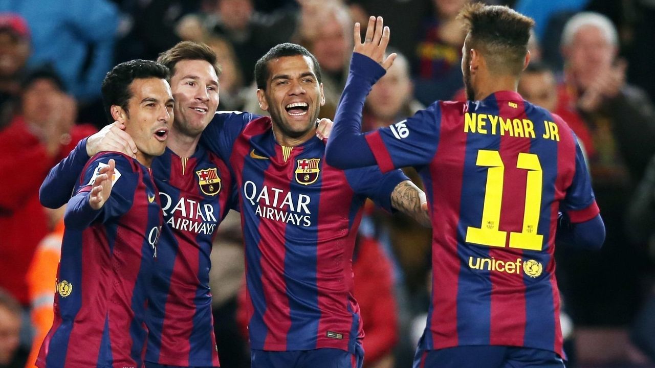
Red and blue is the most common color scheme in sports, but the Spanish giants are among the originators, having worn those colors since the club's foundation in 1899. Barca's vertical striped shirts are now recognized around the globe. The team has gotten a little too loose with its template in recent years while chasing merchandise dollars, even sporting hooped shirts in 2015-16, much to the dismay of fans. Give us the 2014-15 version of Barca's home kit, which was just about perfect with its simplicity.
79. Philadelphia Phillies (current)
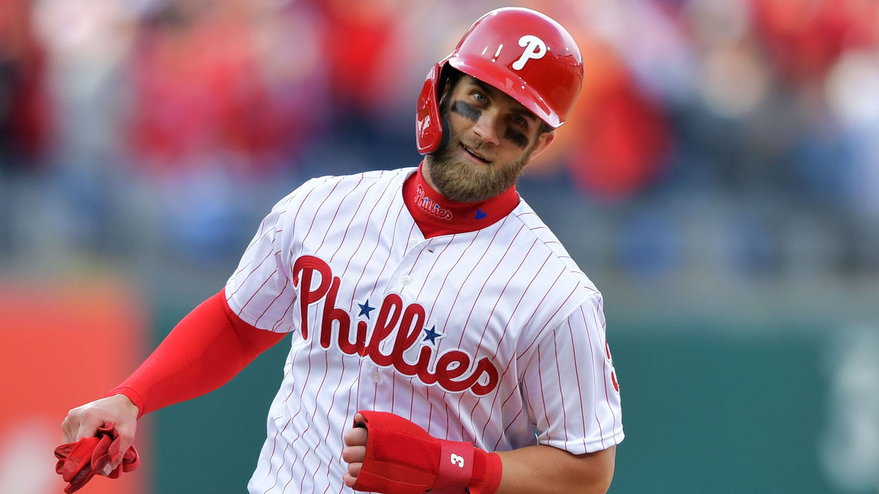
The Phillies' home uniforms have largely been untouched since the '50s, and we don't see any reason to ever make significant changes. The font used across the front is one of the best in sports, and while multiple teams feature pinstripes, Philly is the only one that uses red.
78. Auburn football (current)
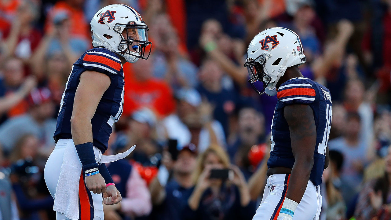
College football has seen some ambitious uniform ideas over the years, but Auburn has stuck to a simple and effective design. Bright orange stands out nicely on the navy base, and opting for the university logo rather than using a tiger in a conference where three teams share the same nickname helps build an effective identity.
77. San Francisco Giants (current)
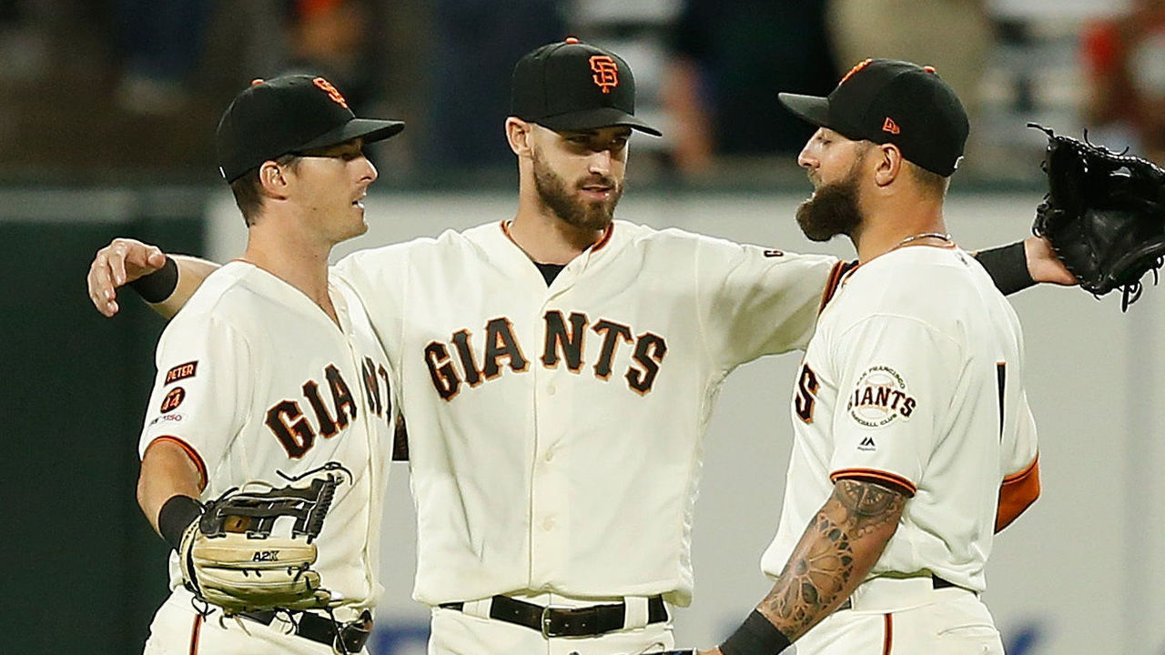
The Giants are one of the most storied franchises in MLB, and they look the part. With no names on the back, no numbers on the front, and a small logo on the sleeve, San Francisco nails the minimalist style. The "Giants" wordmark on the jersey and the interlocked "SF" on the front are perfect. Not to mention, the off-white base for the home uniform is absolutely beautiful.
76. Denver Nuggets (1980s)
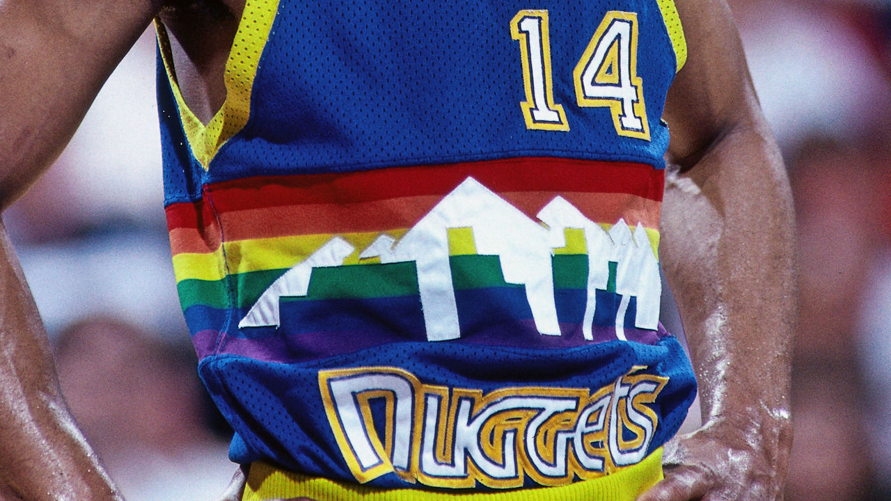
The Nuggets' early-1980s overhaul brought about an entirely new look for the franchise - one that will live on forever as one of the most audacious in the history of sports design. The rainbow backdrop with the Denver skyline and the Rocky Mountains was a masterclass in creativity, and it hasn't been matched by the franchise in many redesign attempts. Is it over the top? Maybe. But we love the boldness.
75. Buffalo Sabres (1980s)
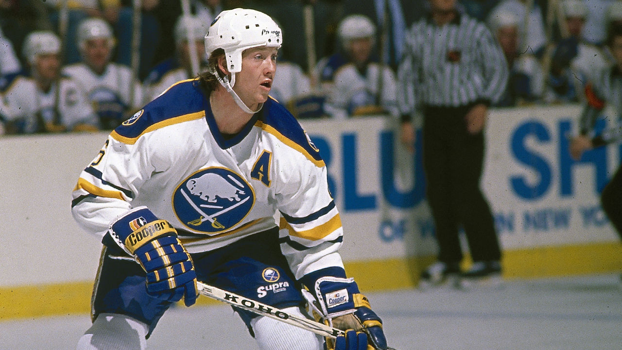
Royal blue and yellow is the ultimate look for the Sabres, who've strayed away from their best uniform design for far too long. The logo featuring crossed swords and a charging buffalo has made a triumphant return in recent years, but the classic elements of the original uniform were missing. Thankfully, that's scheduled to change for the 2020-21 season.
74. Oregon football (2018)
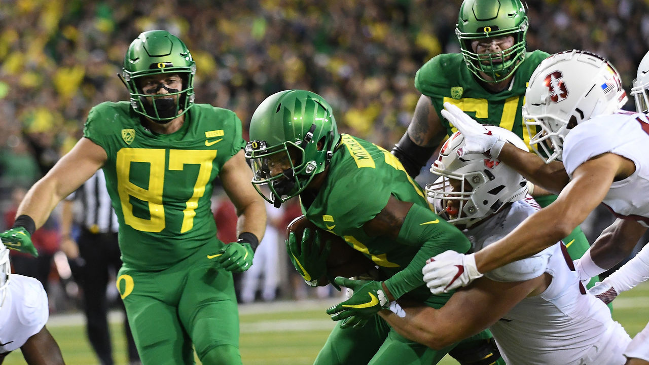
The Ducks have worn literally dozens of different uniform combinations over the last few decades, cementing their place as the most innovative sports team on the planet when it comes to aesthetics. Not all of the combinations were winners, and everyone has a personal favorite, but the all-green look with a satin-finished winged helmet that was sported in 2018 was a particularly appealing combo.
73. Pittsburgh Penguins (current)

The Penguins made the switch from "Las Vegas gold" to "Pittsburgh gold" - aka yellow - in 2016. What a difference a few shades make. The Pens' digs instantly went from drab to vibrant, and they ought to remain that way from here on out. In the city of black and yellow, no team should wear anything else.
72. Buffalo Bills (current)
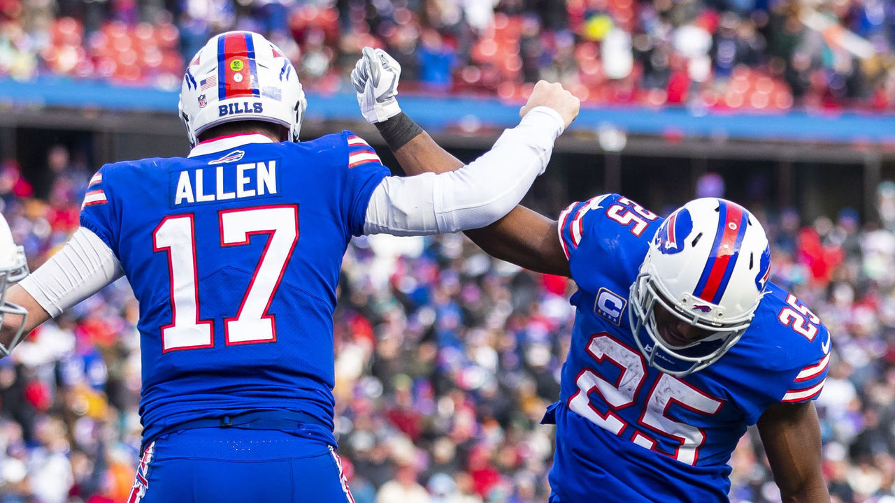
Many Bills fans have a soft spot for the red helmets of the team's Super Bowl era, or the "standing buffalo" logo of the O.J. Simpson era, but the best this team has ever looked is right now. The Bills' throwback-inspired set is tasteful and includes just enough unique quirks (like the red helmet stripe, which widens at the back to mimic the shape of the red slash on the team's logo) to stand as a modern classic.
71. Philadelphia Eagles (1970s)
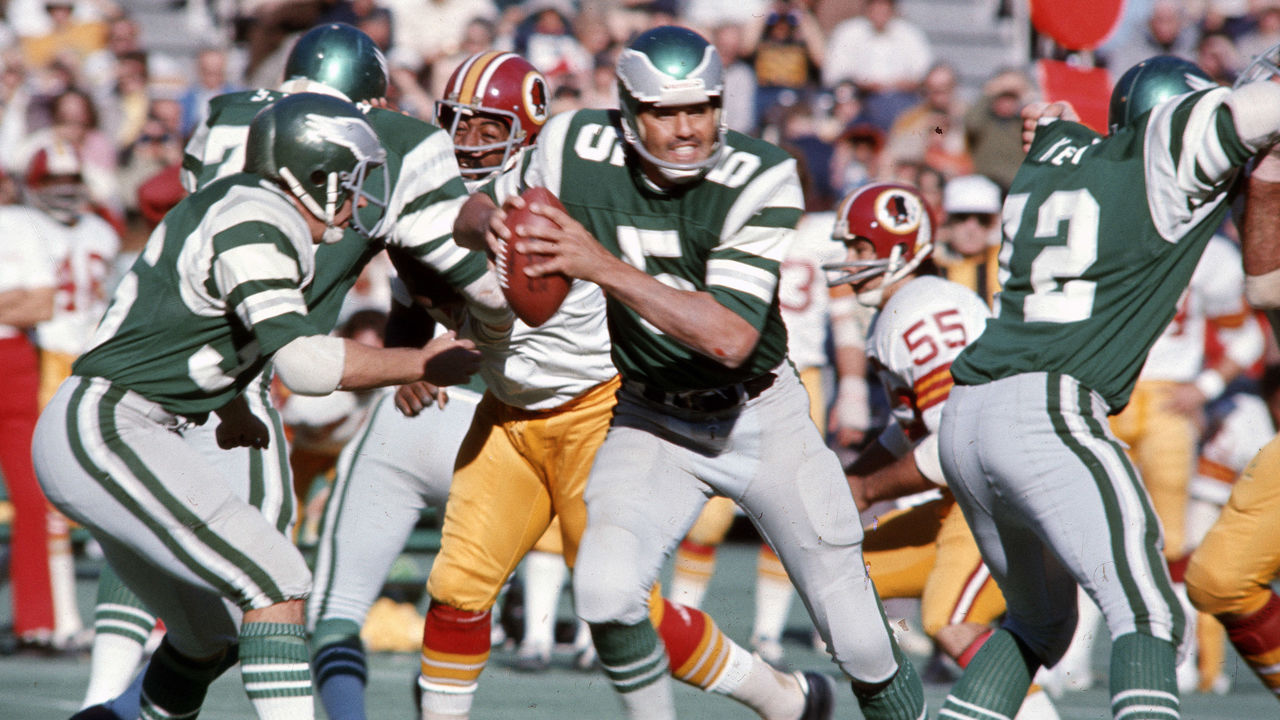
It is blasphemy for the Eagles' beloved Kelly green uniforms not to rank higher on our list? Perhaps, but in truth, there's not a ton that sets this uniform apart beyond that gorgeous color. The wings on the helmet are a little undefined (the representation on the Eagles' current midnight green helmets is superior). The 1970s jerseys with sleeve stripes are preferable to the much plainer 1960s version, which was worn by the Eagles as a throwback in 2010.
