
Teal and purple, radical re-designs, alternate uniforms. That's the '90s in a nutshell from a branding perspective.
When it came to uniform design in the 1990s, for the first time ever it was more about what the kids in the stands would wear, what the fans would shell out their hard earned bucks for, than what would look best on the players or honouring the traditions of the franchise.
Teal
The fad, color wise, during the 90s was teal. Purple was also quite prevalent (including some teams using both purple-and-teal at once - double trendy!) but teal is what we all remember. It was new, it was everywhere, and it sold merchandise.
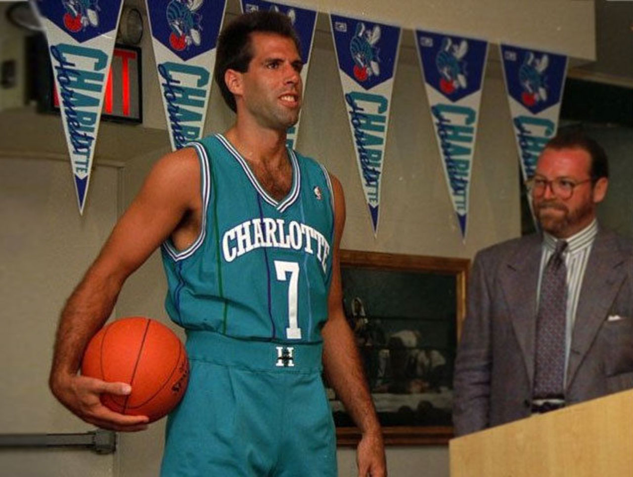
While the Miami Dolphins were the first to wear a shade of teal, introducing it back in the '60s, it was the Charlotte Hornets who are really responsible for what was about to come. The Hornets unveiled their teal and purple look in 1988 and quickly soared to the top of the NBA's merchandise sales charts, easily beating out other equally unsuccessful and equally new franchises in Miami, Minnesota, and Orlando.
The sports marketing world took notice. Suddenly teal-clad expansion clubs were popping up everywhere.
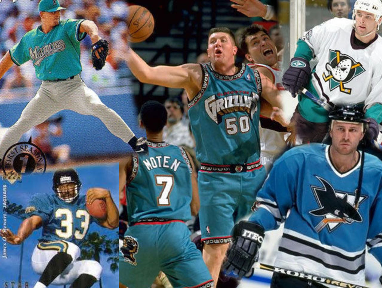
Hockey's newest team, the San Jose Sharks, jumped on the teal bandwagon with their inaugural uniforms in 1991; baseball first went teal with their expansion team, the Florida Marlins, in 1993. Hockey countered later that year with the Anaheim Mighty Ducks in both purple and teal while the NFL took their first expansion teal shot with the Jacksonville Jaguars two years later. The NBA raised their expansion teal game with the Vancouver Grizzlies in 1995, and the MLB finished things up with the Arizona Diamondbacks, relatively late, in 1998 (but wearing a purple-and-teal identity introduced during the height of the craze in 1995).
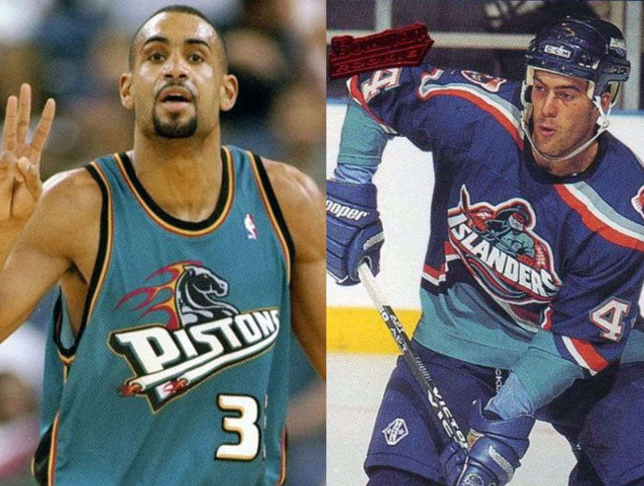
Quite the expansion teal-a-palooza, but this teal trend wasn't limited to just the new teams. Actual established clubs with history and bonafide traditions also made the swap. None was more unexpected and jarring than the Detroit Pistons in 1996, shedding their "Bad Boy"-era look, the forever blue-and-red color scheme for a eyebrow-raising combination of teal, black, burgundy, and gold. The Philadelphia Eagles, New York Islanders, Seattle Mariners... teal, teal, and "hey look!" even more teal.
Wanted to make a quick dollar? Switch to teal. That spot on Gorbachev's head? Teal!
Of all these teams who went to teal in the 90s, most discarded it quite quickly. Others, such as the Hornets, Mariners, Jaguars, Eagles and Sharks all currently have it in their color scheme - the Hornets disappeared altogether for a bit while the Jaguars, Mariners, and Sharks almost scrapped it completely before finally bringing it back. The Eagles, meanwhile, like to pretend theirs is actually "green". Everyone else dropped it shortly after initially adopting it. The very definition of a fad - suddenly it's everywhere and then just as quickly, it's forgotten.
Alternate Uniforms
Perhaps the biggest change to the uniform landscape during this decade was the addition of alternate uniforms. When the 90s began none of the big four leagues were seeing teams actively utilize the alternate jersey, by the end all but the NFL had embraced this new revenue stream full-on.
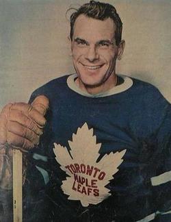
Alternate uniforms had been used in the past, the 1940s Boston Braves wore a shiny satin alternate uniform in order to look better when playing under the lights. In that same decade the NHL's Toronto Maple Leafs created an alternate crest using red stitching instead of blue to make the team name really pop in color photos. But it never really took off like we know it today until the early 1990s.
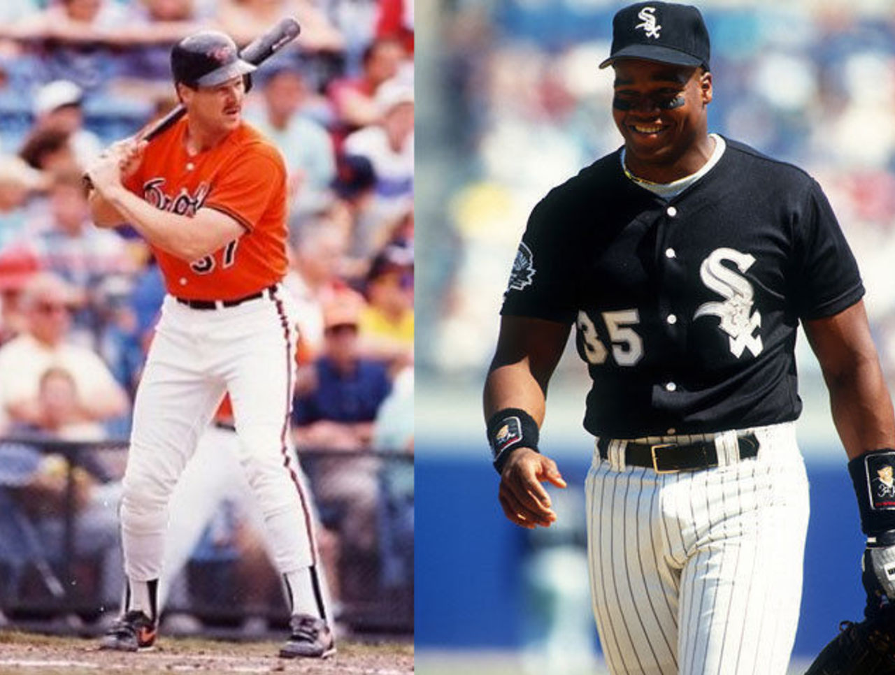
At the start of the decade only one team had an alternate uniform, just one, throughout the big four leagues. That team was the Baltimore Orioles, the Orioles had worn an orange alternate jersey off-and-on since 1987. Fairly impossible in the world of 2014 to imagine that just one club in all of sports had anything other than a home or road jersey.
One season later the Chicago White Sox became the second baseball team introduce an alternate jersey when they added a black one as part of their new identity, two more MLB teams followed in '93 by way of the expansion clubs in Colorado and Florida, before an all-out explosion in 1994 saw seven more clubs add a third uniform option. The alternate uniform era was officially here and here to stay.
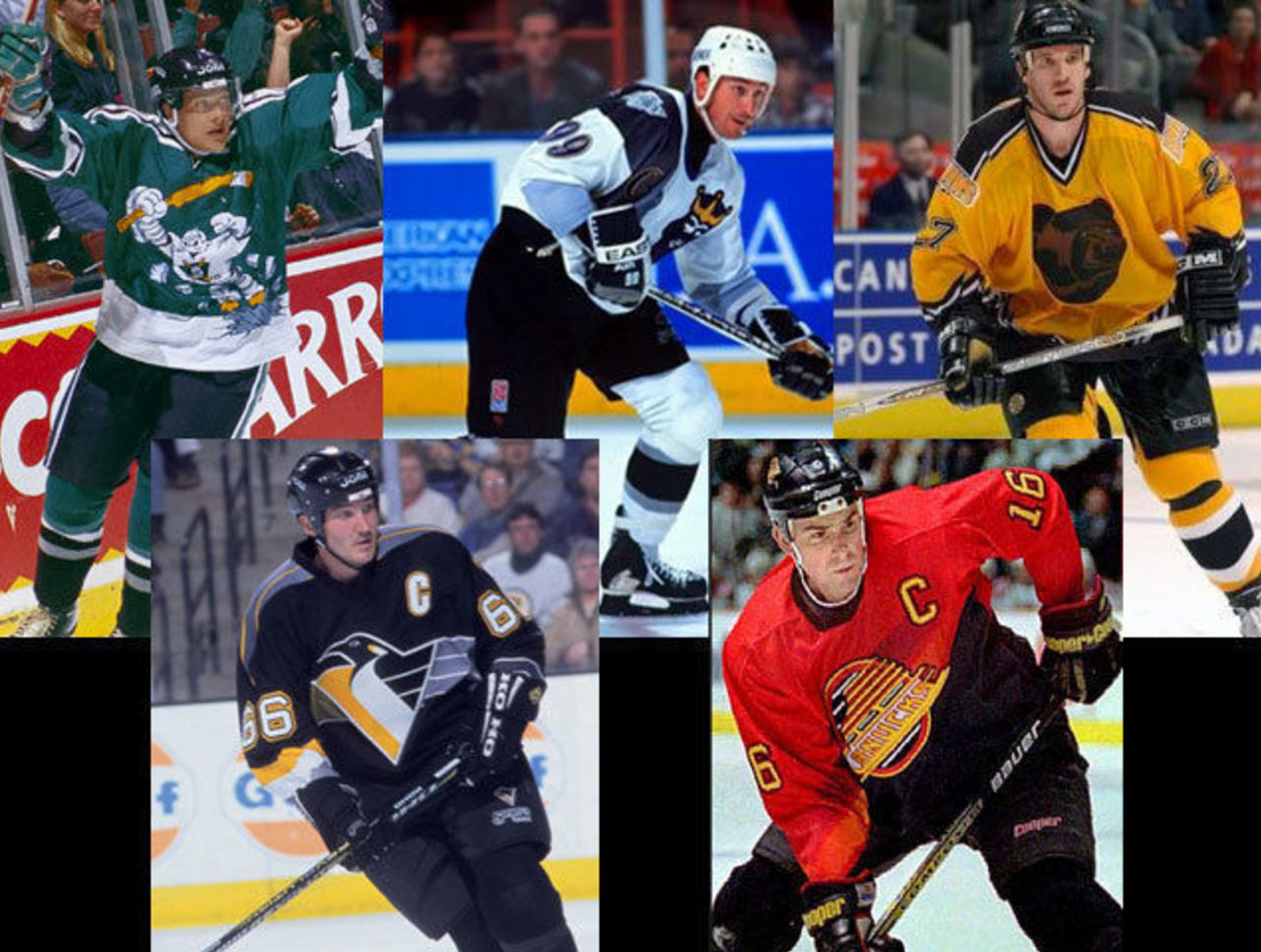
In 1995-96 the NHL made the alternate uniform option available when five teams - Anaheim, Boston, Los Angeles, Pittsburgh, and Vancouver simultaneously announced their intentionally unconventional looks. We saw duck-masked mascots busting out of chests, "Burger King"-inspired gradient sashes, and what became known around my circle of friends as "Winnie the Pooh's" pyjamas. Like baseball this list grew and grew year after year.
Here in the good ole '10s, nearly every single team in the big four uses at least one alternate uniform, some teams have multiple alternate uniforms. Don't like it? Blame the '90s... that or consumers. Whichever.
Radical Re-designs
What's the quickest way for a team to make money in the merchandise game? Winning! Right. But when your team has absolutely no shot (or they do and you want to make even more revenue) you just completely re-design your logo and uniforms.
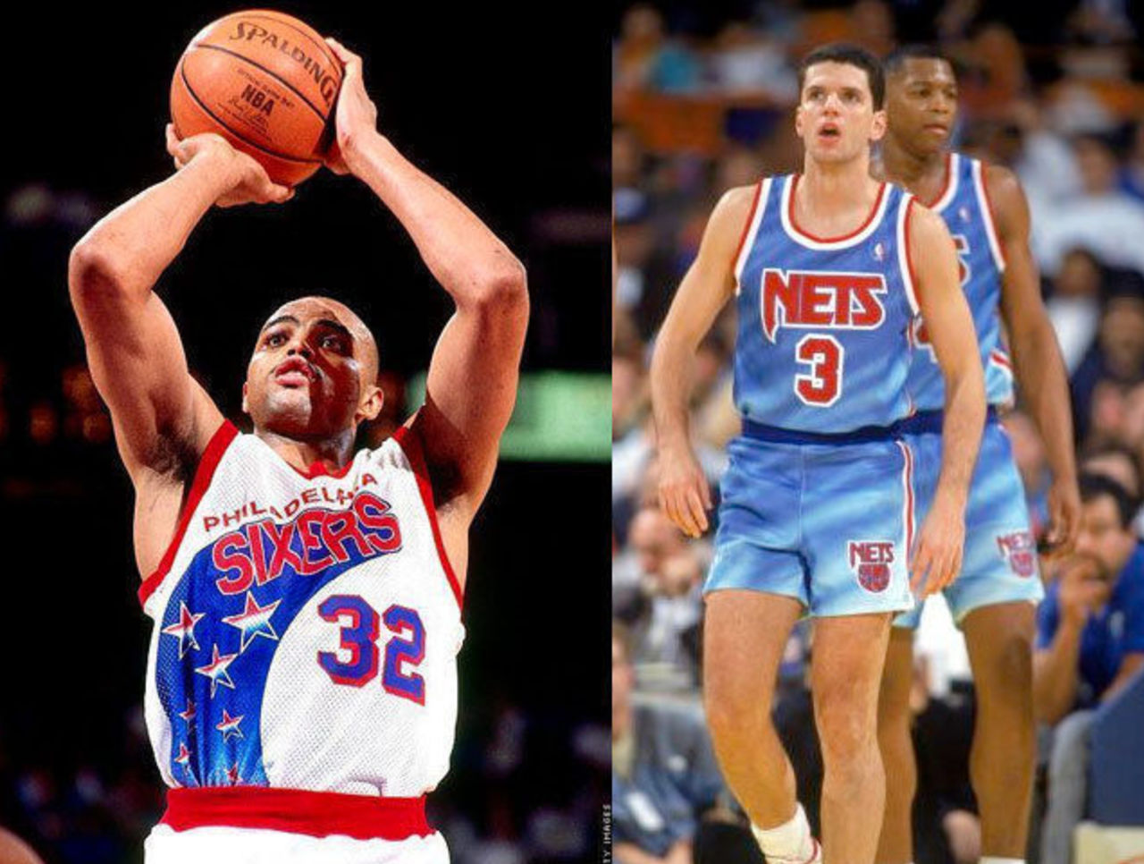
This was most apparent in the National Basketball Association, a league who was suddenly without it's top star and needing something, anything, to get attention back to them from the young, impressionable youth out there.
For the better part of their first 50 seasons every NBA team uniform followed the same basic formula. Plain jersey shirt, team name across the chest, player number centered neatly below. Yes, we saw the odd exception with the Golden State Warriors and Buffalo Braves of the '70s, and the Nuggets in the '80s but 99% of the time the basic formula was all we saw... and then, the 90s happened.
The New Jersey Nets kicked things off with a tie-dyed jersey at the beginning of the decade, the 76ers followed up with a streak of stars flying up the side of their uniform, Phoenix added a giant basketball sun across their chest, the Cavs included a wave of blue (for some reason)... and this is when things were just getting started!
In 1995-96 we saw the Atlanta Hawks, Houston Rockets, Milwaukee Bucks, and the expansion Toronto Raptors all add giant logos to the front of their jerseys, almost as if they were hockey uniforms, with the player number now shrunk and tucked away into the corner. The Utah Jazz added a mountain range and the Detroit Pistons went with a giant flaming horse. Complete identity overhauls also hit the 76ers, Kings, T-Wolves, SuperSonics, Warriors, and Bullets (who were suddenly known as the Wizards).
What's a tradition? In the mid 90s there was no such thing.
Slowly most of these radical changes were reversed. The giant logos on the jerseys were completely eliminated league-wide by 2003 (players *hated* them), the Jazz, Pistons, 76ers, Sonics (before relocating) and Warriors all eventually reverted to their old color schemes and branding, while the Wizards still retain their new name but now wear the colors and uniforms of the old Bullets.
Hockey went through the same thing, the Islanders and Capitals, for example, both radically re-designed in 1995, both went right back to their original colors rather quickly. That same old story.
The 1990s was the ultimate decade for falling victim to fad/trendy design in sports, the 70s and 80s had their powder blues and pullovers, the 00s had "let's add black just because", but the 90s takes the cake. And while I look back on it now and say to myself, "what were they thinking?!", I can't be overly critical, this was the decade I became a fan of sports logos and uniforms, surely the new designs had something to do with it - it was because of all the changes going on that made a place like a sports logos website (which I started during the mid 90s) seem like a good idea.
So, thank you '90s! Your horrible design made watching a game a little more interesting (for better or worse), you introduced a wide array of new, different colors to the otherwise bland red-or-blue dominated sports landscape, and bonus... since you're retro now this even allows for a more colorful option when it comes to those throwback uniform games. We're not limited to boring 1950s vs. boring 1920s anymore, bring on the giant logo'd basketball uniforms for a game or two (because anything's better than those sleeves, amiright?!)


