
For some NHL clubs, the news that the NHL will be limiting teams to just two jerseys next season is a blessing in disguise.
Teams will reportedly be limited to one home jersey and one away jersey. This means several clubs will be forced to do without some sharp threads, while others will now thankfully be done with uniforms that had no business making the rounds in the first place.
Here are three alternate jerseys we won't miss next season:
New York Islanders
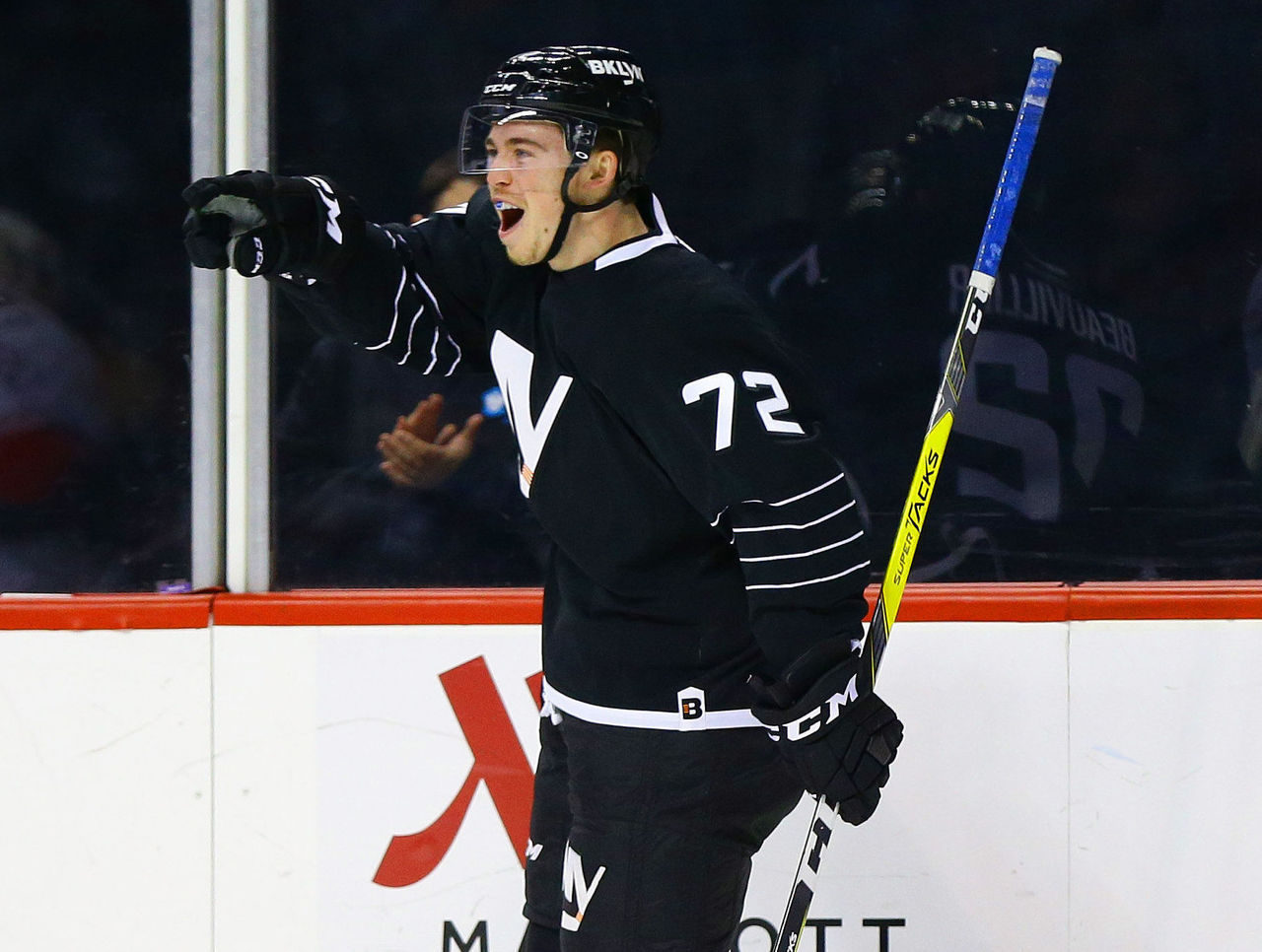
This jersey has nothing to do with the team's color scheme, doesn't share the same logo, and has no significant features. The Islanders current third jersey is a head-scratcher, to put it nicely.
The Islanders alternate is more bizarre than it is bad. It comes off as a lazy design with nothing appealing about it. Besides their questionable third jerseys that were worn between 2011-2014, it is also the only uniform that has ever featured black in team history.
It's an eyesore and for a team struggling to rediscover its identity in Brooklyn and - lets be honest - these jerseys certainly don't help.
Columbus Blue Jackets

The biggest flaw with the Blue Jackets current third jersey is that their traditional home and away versions are far and away better.
The Blue Jackets have been repping their alternates since 2010 and, while in comparison to the other uniforms on this list, it is not nearly as bad, but it is still very forgettable.
The jersey tries to play homage to the 1857 Napoleon cannon, but the fact is they already have such a cannon firing after every home goal, which means it's not necessary on the uniform.
Once again, this jersey has little to match the team's color scheme, including a complete lack of any red, plus it resembles the Winnipeg Jets jerseys.
Tampa Bay Lightning
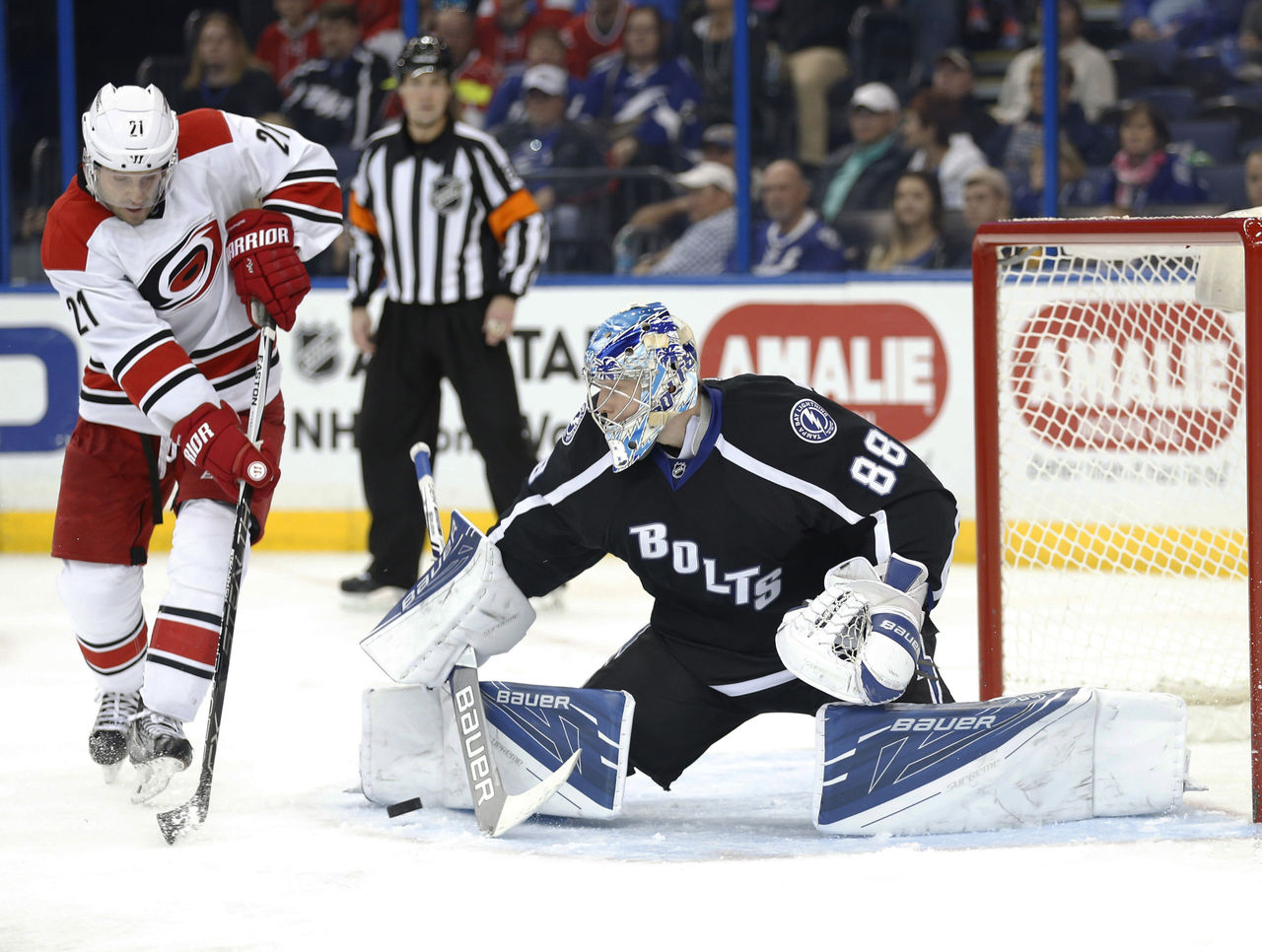
It's fitting that the Lightning's third jersey reads "Bolts," because it's a bit screwy.
Similar to the Islanders jersey, the Lightning third jersey is bizarre given there's no black in the logo.
Sure, in the past, the team donned black, but that was when there was black in the team's logo - though very little. When the team decided to simplify their logo back in 2011, they should have done the same with their color scheme.
The simple reading of "Bolts" once again comes off as lazy and uninspired. The team has tried hard to nail down a concept with six changes to their jersey since 2001, but their easiest fix could be to just rid themselves of their current alternates.
Honorable Mention
Anaheim Ducks

The Mighty Ducks logo is fantastic, but the fact that it sits upon a very bright orange means the luster and nostalgia of the former namesake is lost.


