On the fall day in 2017 when they started the research for their NHL history book, sports logo experts Chris Creamer and Todd Radom embraced some Canadian tropes.
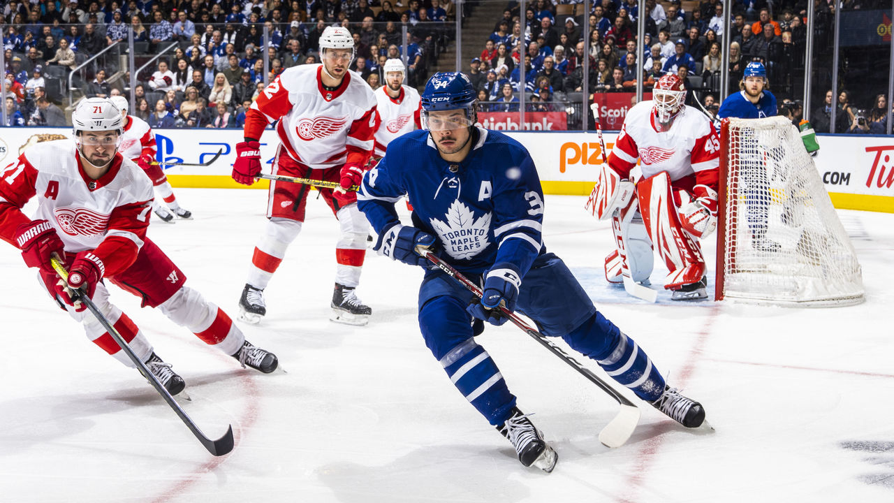
They went to Tim Hortons. They listened in the car to The Tragically Hip, the band that sang about Bill Barilko and Bobby Orr. They checked out vintage jerseys and century-old game programs at the Hockey Hall of Fame's suburban Toronto resource center. They watched the Maple Leafs skate and later bought last-minute tickets to the club's home date with the Detroit Red Wings, landing reasonably priced seats in the lower bowl at center ice.
Radom was visiting from out of town, and after the game, Creamer led him to Wayne Gretzky's restaurant near the arena for poutine. As the bill arrived, they glanced across the room in time to spot a celebrity: Walter Gretzky, hockey's most famous dad and a restaurant regular, leaving for the night in his signature red letterman jacket.
"We took that as a sign," Creamer recently told theScore. "This is the right path we're going on here."
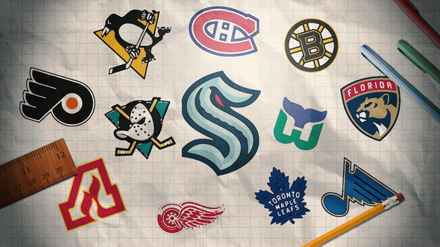
Three years on, Creamer and Radom are the co-authors of "Fabric of the Game: The Stories Behind the NHL's Names, Logos, and Uniforms," a coffee-table offering published Tuesday through Simon & Schuster. True to the title, their book is a one-stop resource to learn how 47 NHL franchises - current, relocated, defunct, and even the roster-less Seattle Kraken - were named and outfitted.
The authors recount the saga of the Montreal Wanderers, the charter NHL team that took its name from British soccer, played six games in 1917, lost its home arena in a fire, and promptly folded. They celebrate the advent of outdoor games, the ideal setting for throwback uniforms. They chronicle the excesses of the 1990s when the Mighty Ducks of Anaheim's Disneyfied original jersey - featuring splashes of purple, teal, yellow, silver, black, and white - set league sales records. The Maple Leafs and Red Wings are in the book, too, forever sporting blue and red as models of sartorial consistency.
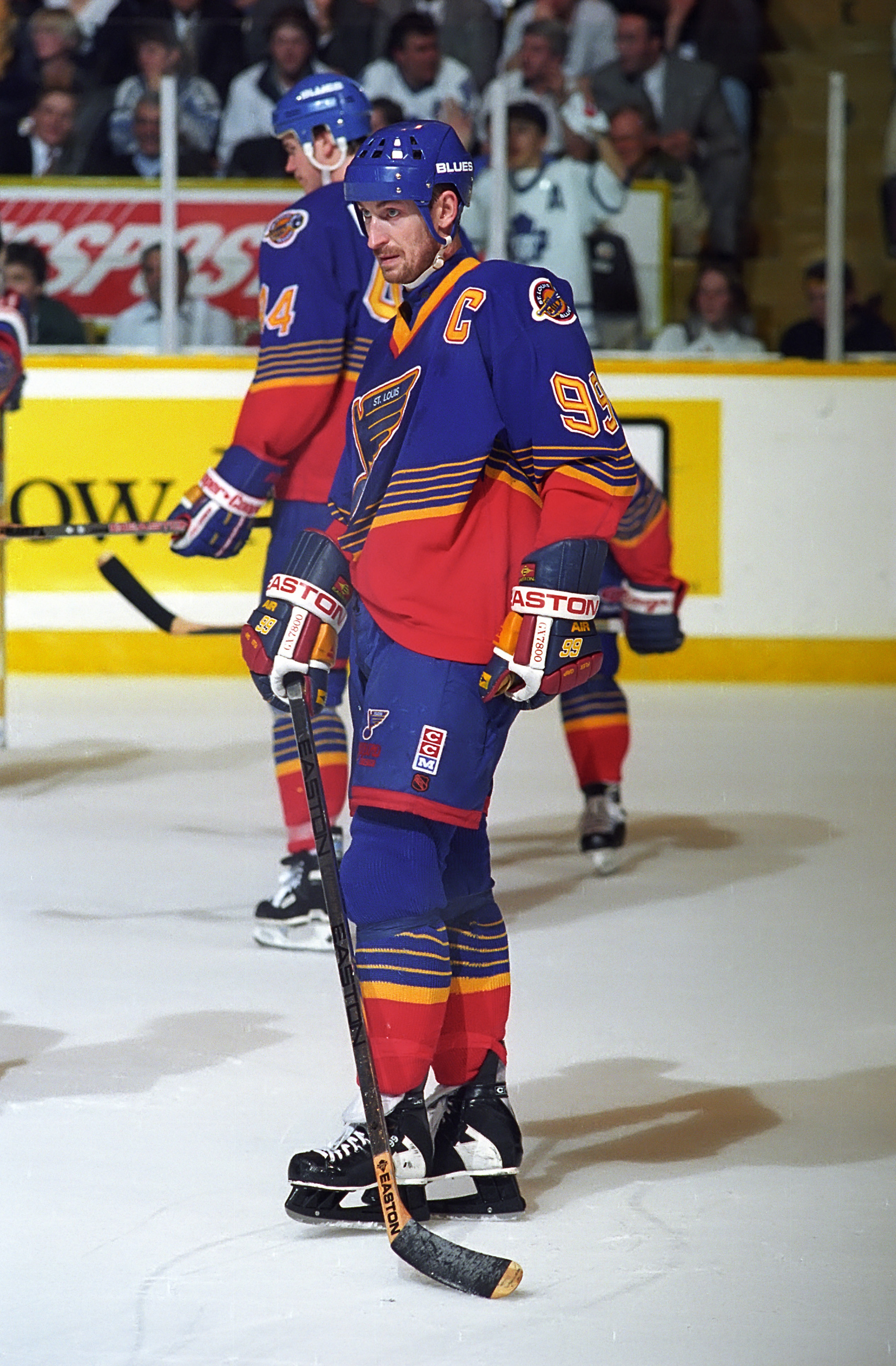
Walter Gretzky is a bit player in Creamer and Radom's narrative; he garners a shoutout in the acknowledgments for his presence at the restaurant on that formative day. Naturally, his son is a central character. In words and photos, proceeding through each team alphabetically, the book recalls Wayne Gretzky rocking blue and orange for the Edmonton Oilers in his first NHL season, the LA Kings' new silver uniform on the day he was traded in 1988, and the Blues' red-tinged garb during his stint in St. Louis in 1996. (Seriously, the '90s were a trip.)
The origin stories Creamer and Radom tell form a definitive account of the subject, something Creamer, the Toronto-based editor of SportsLogos.net, wishes he could have read as a kid.
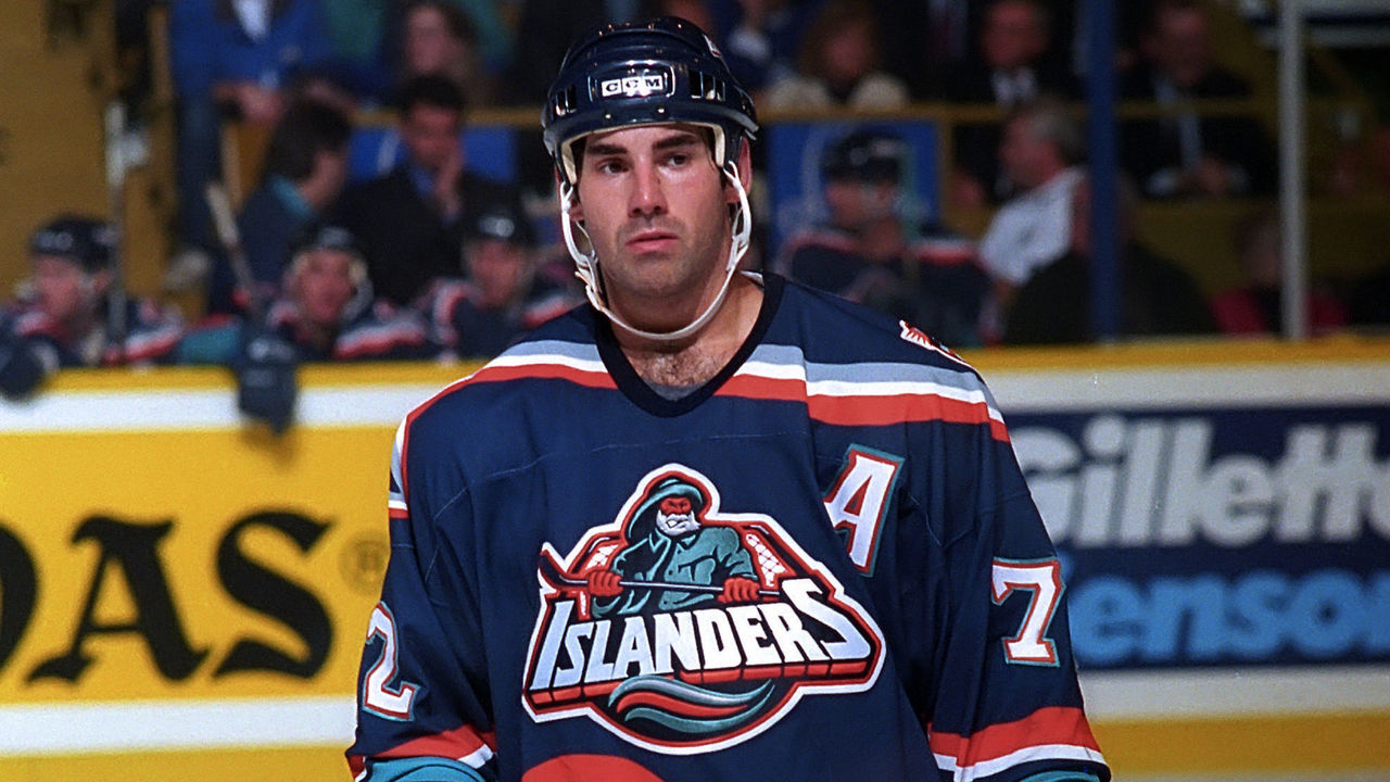
To find exhaustive historical detail, he and Radom plumbed newspaper articles dating as far back as 1909, when the Montreal Canadiens were created and New Jersey farmers banded together to hunt the Leeds Devil, the fabled fiend whose namesakes now play in the Metropolitan Division. They interviewed executives who thought up more recent designs, from Colorado's mountainous "A" to Minnesota's tranquil wilderness scene to the Islanders' ill-fated fisherman logo of the mid-'90s.
Clearly, some looks are cleaner and more memorable than others. The concept itself, the authors suggest, is what's distinctive, charming, and timeless.
"NHL hockey, in particular, you think of the sweater. We have this history of very bold, big crests that instantly communicate what they're trying to communicate," said Radom, an accomplished graphic designer. Style specifications, he explained, complicate jersey design in other sports: buttons in baseball, big numbers in football, the smaller surface area in basketball. Those constraints don't apply to hockey, maximizing the chance a jersey - through the front emblem, vivid color, and connective striping - will come to be indelible.
"The hockey sweater, in my estimation," Radom said, "is the most complete uniform in sports."
If NHL logos are so alluring, it only makes sense they spawn myths, inspire cult followings, and provoke visceral debate. "Fabric of the Game" addresses all of those notes. Creamer and Radom set the record straight about the Boston Bruins' abiding spoked "B." True: Developed to honor the club's 25th anniversary in 1949, it's the rare specialty mark that evolved into a primary logo. False, as far as they can tell: It represents an old nickname for the city of Boston, "Hub of the Universe."
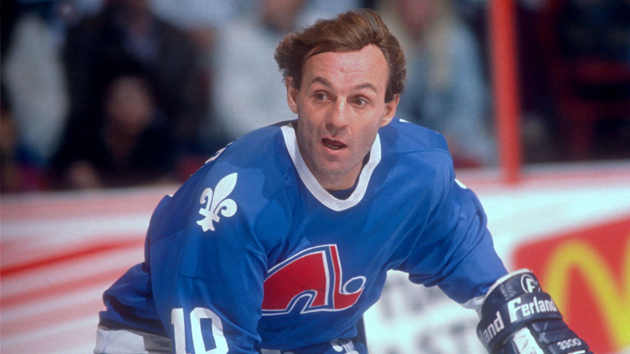
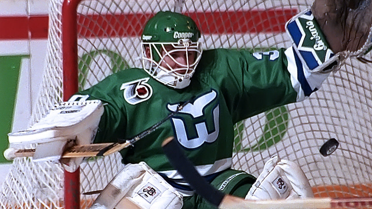
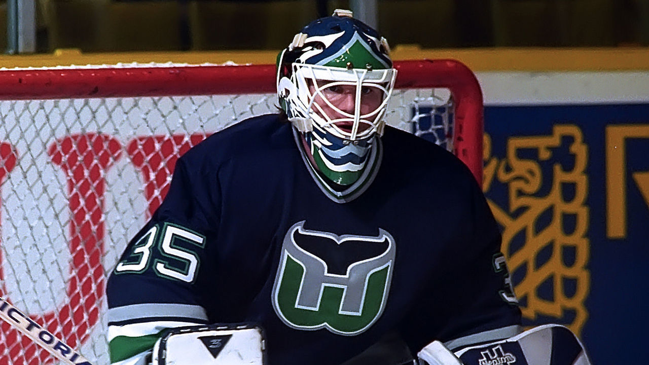
Creamer and Radom break down the elements of forsaken yet fondly remembered logos, including the Quebec Nordiques' classic insignia: the igloo-resembling red "N" originally sketched by a local teenager and accompanied by white fleurs-de-lis that evoke the provincial flag. The book lauds the simplicity of the Hartford Whalers' whale tail - and laments the team's 1992 decision, championed by general manager Brian Burke, to inject silver into the mark, alerting the eye to the implicit "H" in the middle.
The book also explains how all 47 teams were named. A few themes recur in those stories.
Intriguing inspirations: This category accounts for New Jersey and Seattle deriving identities from mythic creatures. For the Mighty Ducks latching on to the popularity of a certain Disney film. For Panthers ownership seeking to highlight the plight of Florida's endangered state animal. Did you know the Tampa Bay Lightning, according to Phil Esposito, were named during a storm? Or that a wartime bootlegger told an early Vancouver owner to name his team after Johnny Canuck, Canadian cartooning's answer to Captain America?
"Who would have thought that the Canucks' identity began with a guy who was illegally peddling alcohol back in the 1940s?" Creamer said.
Misadventurous anecdotes: Think of the 1967 expansion team that cycled through six names in 11 seasons: California Seals, Oakland Seals, Bay Area Seals, San Francisco Golden Seals, California Golden Seals, Cleveland Barons. Think of the Calgary fan who, following the Flames' 1980 move from Atlanta, tried to enter the team's nickname contest but instead mailed their utility bill. Think of Chicago brass declaring in 1986 that the name should be Blackhawks, not - as had been the case for 60 years - the Black Hawks, nor any other kind of bird.
Names that didn't stick: Columbus, the birthplace of the Wendy's fast-food chain, would have been home to the "Frostys" had burger magnate Dave Thomas gotten his way, Creamer and Radom write. For a time, the Avalanche's original owner, Charlie Lyons, purportedly wanted to rename the Nordiques the Rocky Mountain Extreme. Before the Predators took the ice in Nashville, Gary Bettman had to spike the name "Edge," the moniker of a shaving gel once sold by the SC Johnson conglomerate, the family business of owner Craig Leipold's wife Helen.
Even Original Six names weren't always sacrosanct. Chicago almost became the Yankees in 1937, befitting ownership's short-lived plan to ice an all-American lineup. Detroit played four NHL seasons as the Cougars - honoring the roots of the club's first players, who were acquired from a defunct British Columbia team of the same name - until it became painfully evident Michiganians couldn't pronounce the word. Was it "Cow-gars"? "Cowg-ders"?
"I kept finding example after example from different newspapers in the late 1920s alluding to this," Radom said. "It was hilarious."
Book projects have firm deadlines, but NHL designs are fluid, which is why "Fabric of the Game" omits mention of some recent wardrobe changes. The Dallas Stars' neon, Texas-shaped alternate logo seems to jibe with trends Creamer has noticed around the league: the shift to adopt bright, captivating color schemes and ensure logos appear sharp at any scale, on jerseys and Twitter hashtags alike. Why are the Ottawa Senators resurfacing the 2D centurion? The book has evergreen wisdom to share, if not a specific answer: Throwback threads are a comforting reminder of the past.
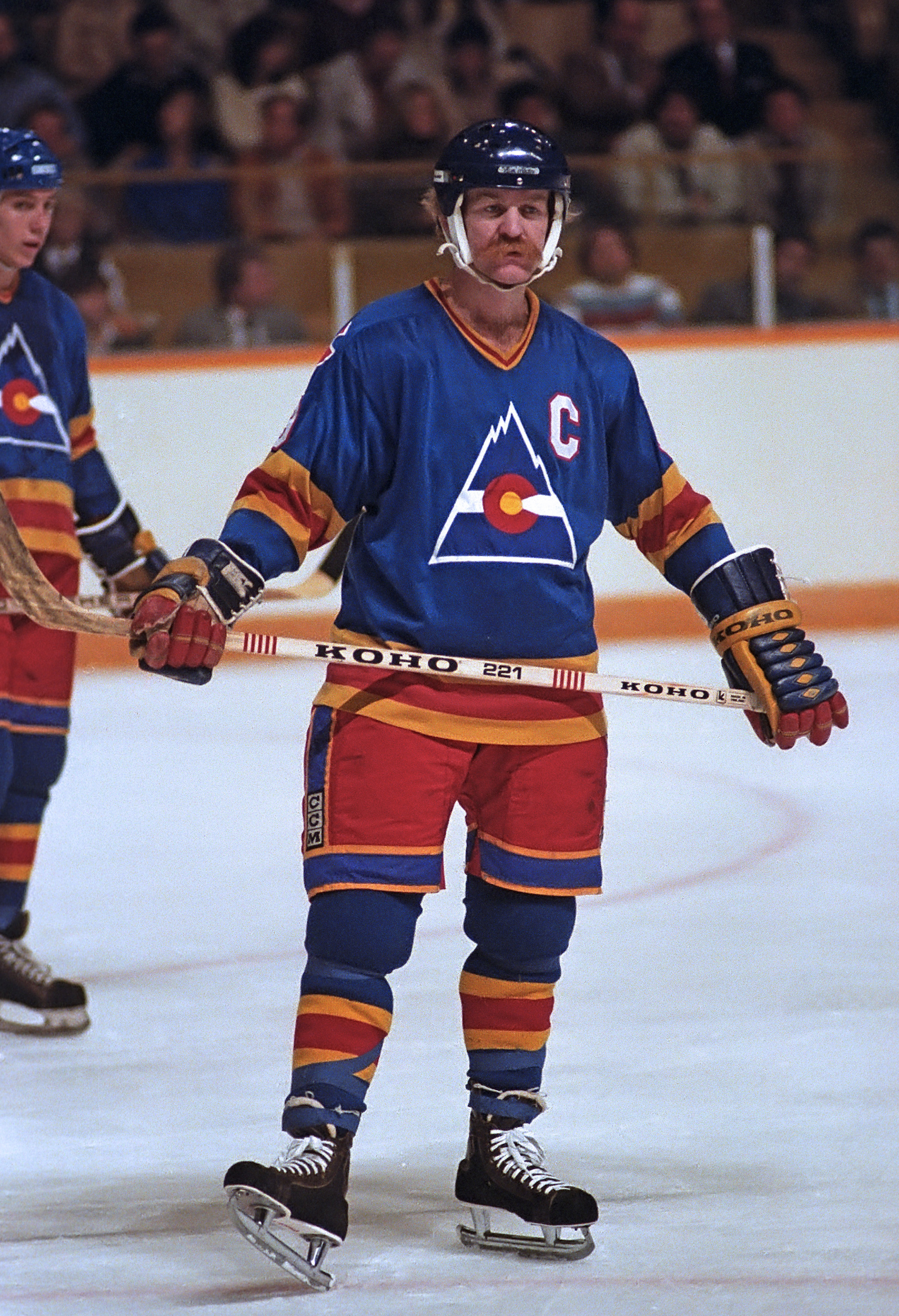
When Lanny McDonald wrote the foreword to "Fabric of the Game," the mustachioed Hall of Famer took the opportunity to visualize the trajectory of his career. For much of the 1970s, he wore Toronto's ubiquitously recognizable maple leaf. The Colorado Rockies' kaleidoscopic look - modeled after the state flag - was far flashier. Raised in Alberta, McDonald later joined and eventually won a Stanley Cup with the Calgary Flames, who still don the fiery "C" he adored.
Creamer was grateful for McDonald's contribution. His childhood introduction to hockey came in May 1989, when the Flames beat the Canadiens in six games to clinch that championship. Young Creamer, entranced by McDonald's playoff beard and undeterred by his subsequent retirement, briefly became a Flames fan.
"Iconic is a word that gets thrown around way too often these days. Lanny McDonald is iconic. He looks iconic. His career was iconic. Even today, as the chairman of the board of the Hockey Hall of Fame, he remains out there and iconic," Radom said, summarizing what it meant to the authors to include his name on the cover.
"It elevates us, to wrap it all up. In the (same way as) Walter Gretzky looking after us that night."
Nick Faris is a features writer at theScore.