Ranking the NHL's 100 Greatest Logos: Nos. 40-21
Throughout the month of September, James Bisson and a cast of editors from theScore will share their rankings of the greatest players, teams, and moments in the 100-year history of the National Hockey League. This week's list focuses on the greatest team logos (active team logos courtesy NHL; defunct team logos courtesy SportsLogos.net):
100-81 | 80-61 | 60-41 | 40-21 | 20-1
Voter List
- James Bisson, National Sports Editor
- Josh Wegman, NHL News Editor
- Sean O'Leary, NHL News Editor
- Esten McLaren, NHL News Editor
- Lucas Casaletto, News Editor
- Michael Amato, Senior News Editor
- Craig Hagerman, NHL News Editor
- Lanny Foster, Senior Social Media Editor
- Arun Srinivasan, News Editor
40. Kansas City Scouts (1974-76)
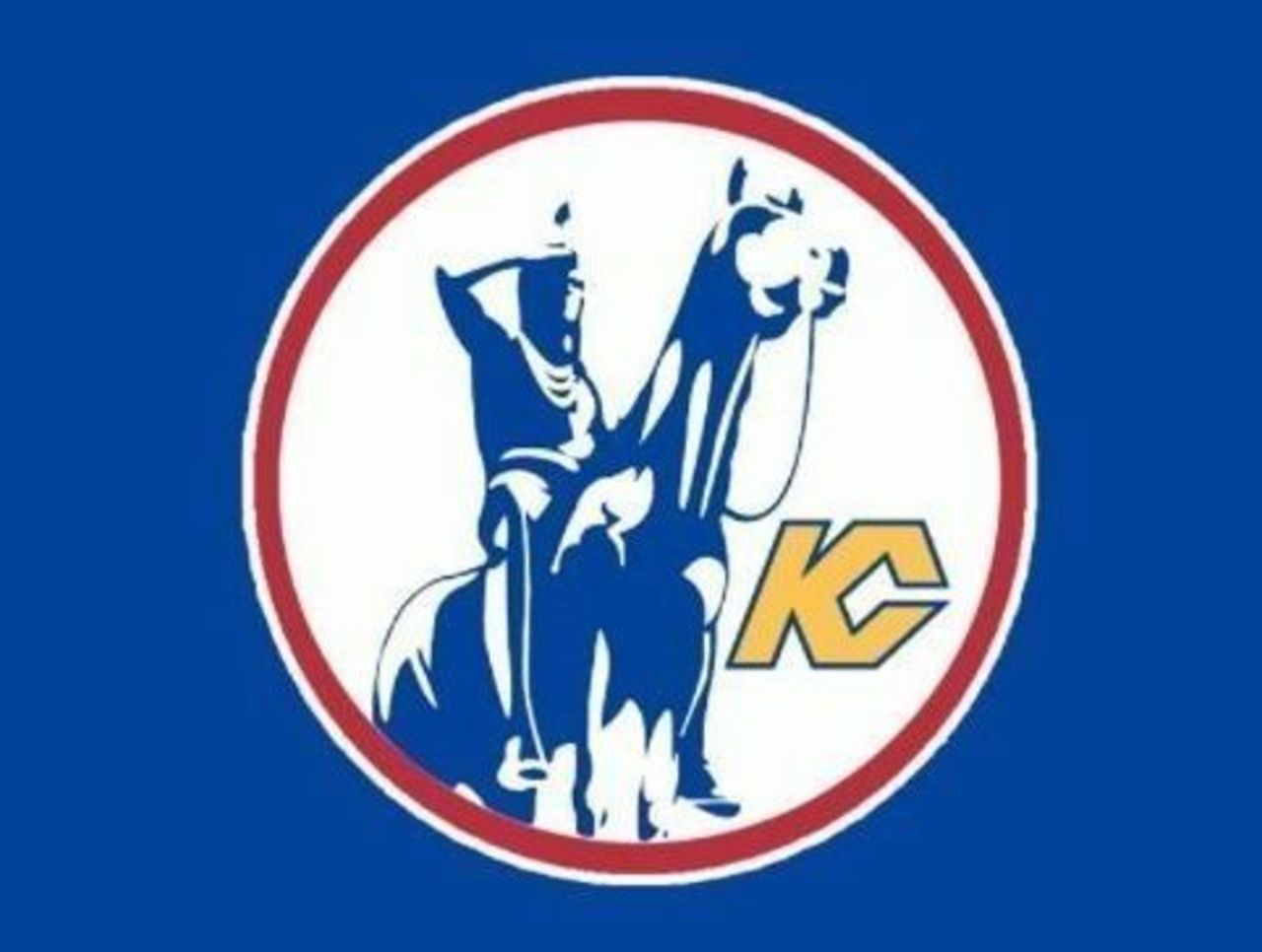
Oh, Scouts, you left us too soon. While the horse-and-rider image looks like something out of an insurance commercial, this does stand out as one of the more interesting logos in NHL history.
39. San Jose Sharks (2008-present)
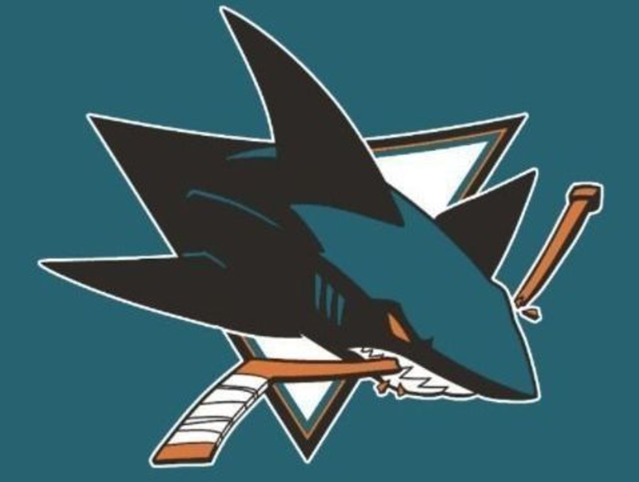
The Sharks made subtle changes to their original logo 16 years after its initial release, and the results were terrific. A leaner, meaner shark highlights a sleeker, less rigid logo. And we love us some teal.
38. Washington Capitals (1974-1995)
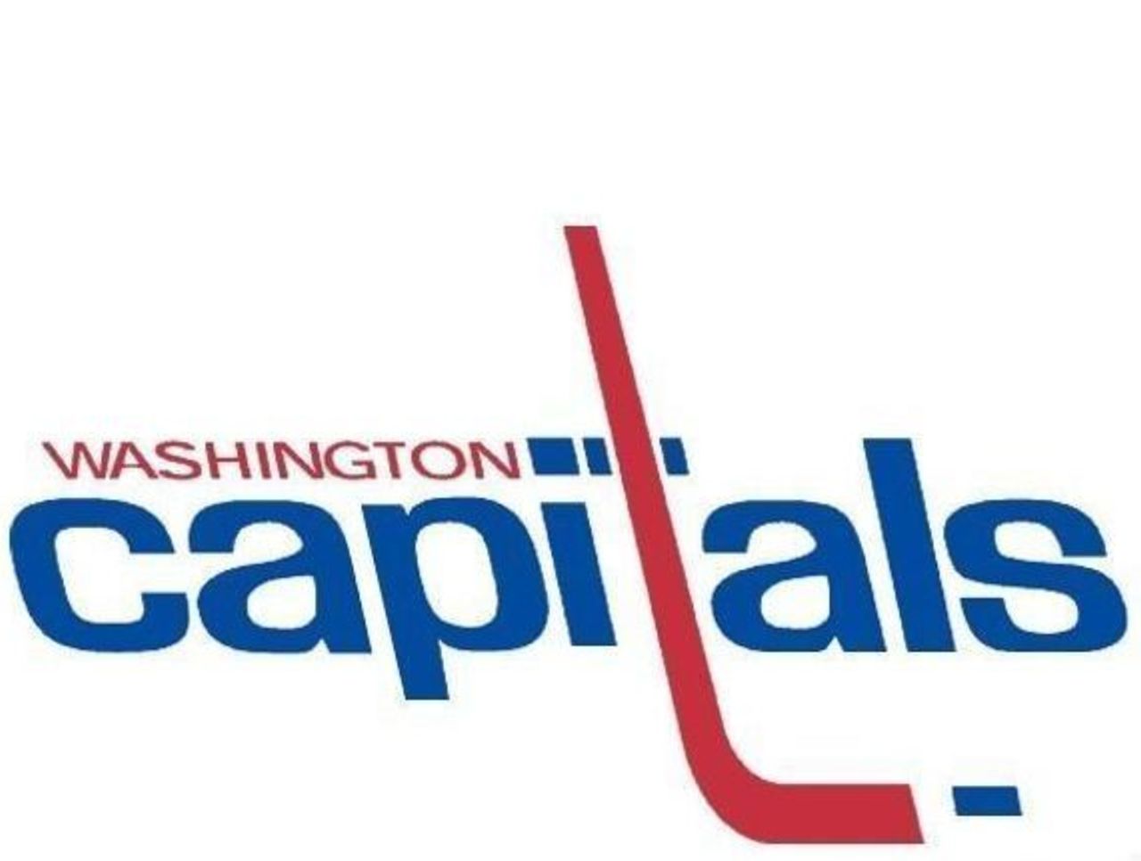
The Capitals' original logo is a thing of beauty. The combination of lower- and upper-case letters is bold, but it works. Add the curved red stick and small blue puck, and you have a simple but impactful design.
37. Mighty Ducks of Anaheim (1995-96)
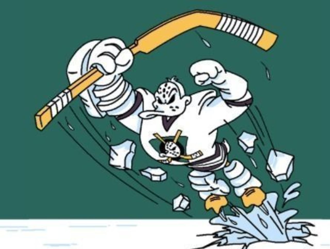
For one magical season in the mid-1990s, the above image actually appeared on Mighty Ducks jerseys. There's just so much to love about this logo. Our favorite part is the Michelin Man-style leg pads.
36. Nashville Predators (1998-2011)
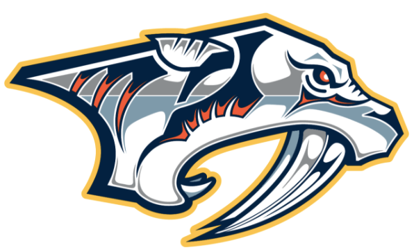
The Predators have tinkered with their primary logo over the years, but none of the future versions compare to the original. Those menacing red eyes and the silver sheen make this one of the best NHL logos of the past 25 years.
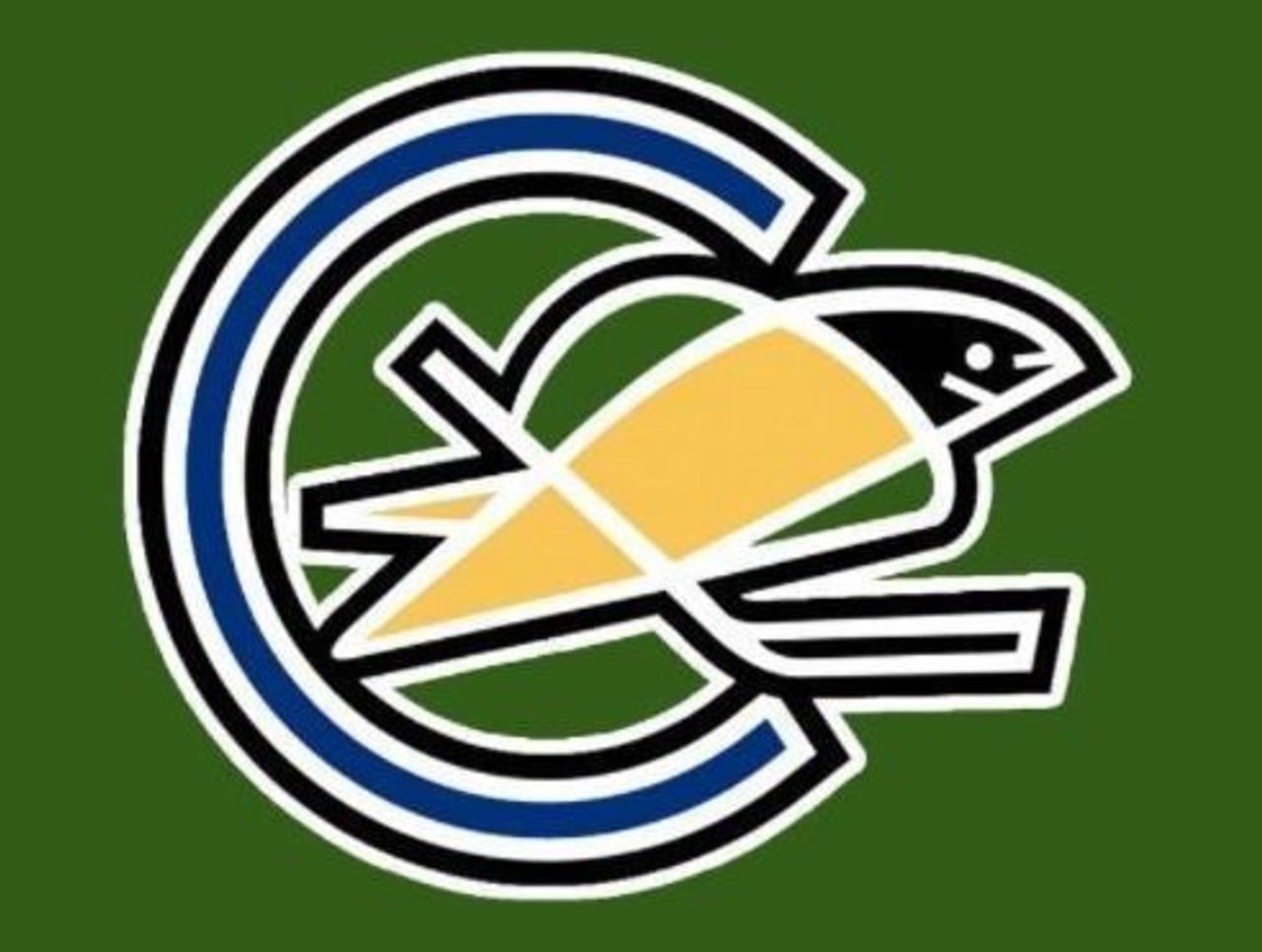
35. Vancouver Canucks (1985-97)
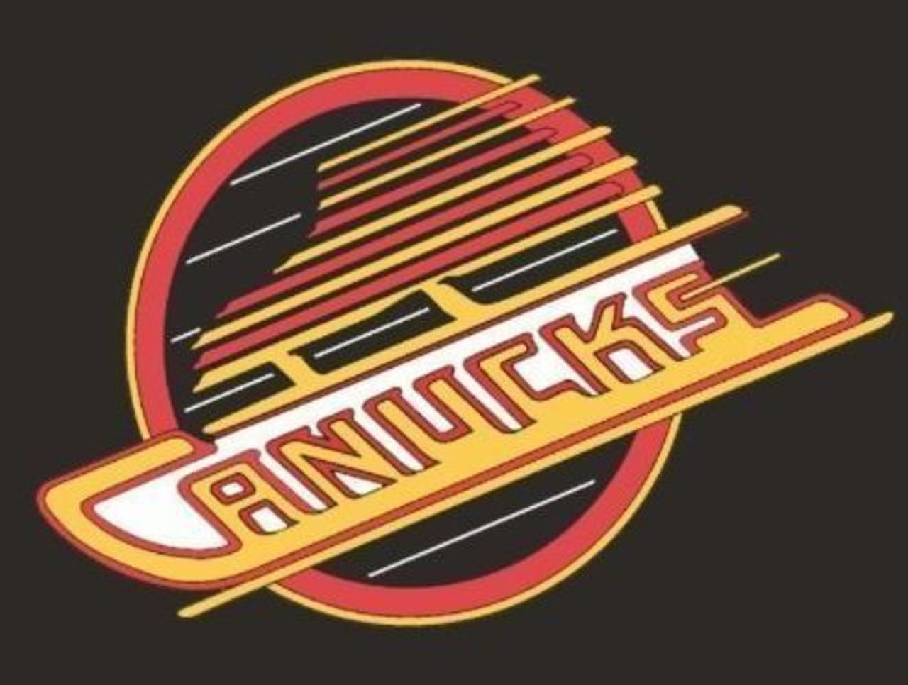
After going with plainer logos for their first 16 years of existence, the Canucks reinvented themselves in a flourish of color and diagonal lines. Two decades after it last served as the primary logo, Vancouver fans still wear it proudly.
34. Chicago Black Hawks (1959-present)
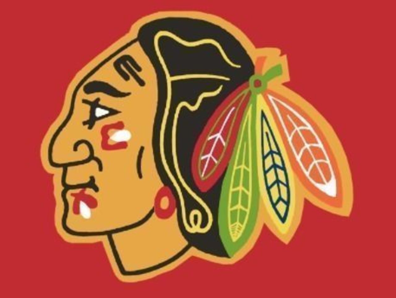
We know it's not for everyone, but there's something to be said for a logo that has adorned Chicago hockey jerseys for nearly six decades. It remains one of the most instantly recognizable logos in professional sports.
33. New York Rangers (2013-present)
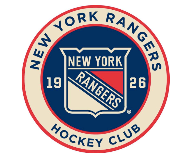
How does a simple decal end up just outside the top-30 logos of all-time? When it looks as good as this. The lettering, logo, and color scheme all harken back to the Original Six days - and do so with understated elegance.
32. Vancouver Canucks (1970-78)
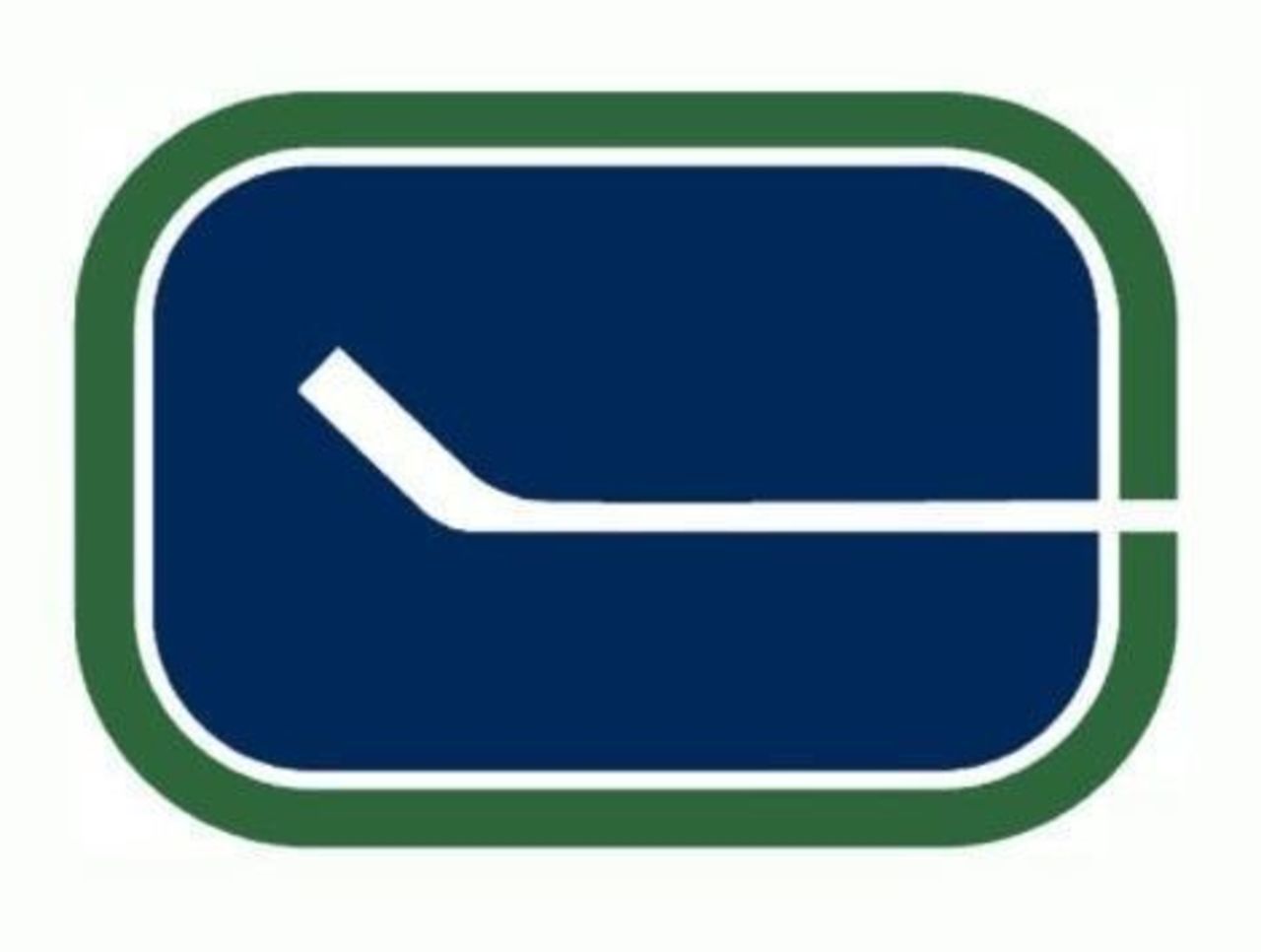
Vancouver's NHL tenure began with the simplest of logos - a white hockey stick in a pool of blue with a green border surrounding it. But you won't find many logos anywhere that look better on a white hockey jersey.
31. New Jersey Devils (1982-present)
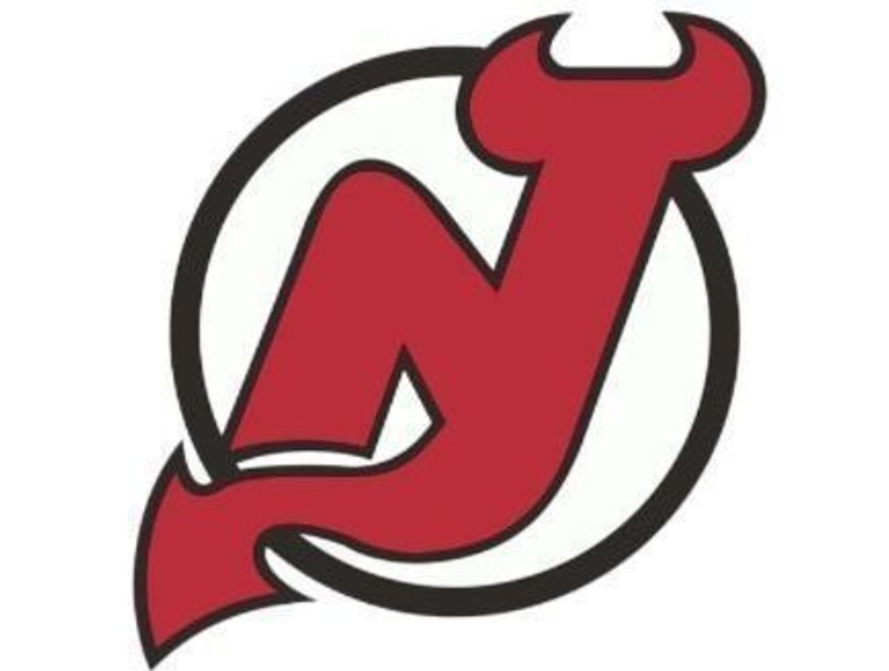
Who needs a secondary logo? Not the Devils, who have gone with the same basic design - with only minor color changes - since entering the league 35 years ago. You couldn't design a more appropriate logo if you tried.
30. Dallas Stars (1994-2013)
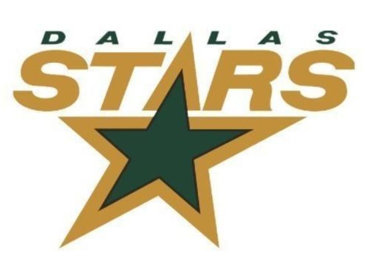
The original emblem was fine, but the Stars decided to make the green a little greener the following season - and stuck with that updated version for nearly 20 years. It's a simple logo, but it's effective.
29. St. Louis Blues (2008-present)
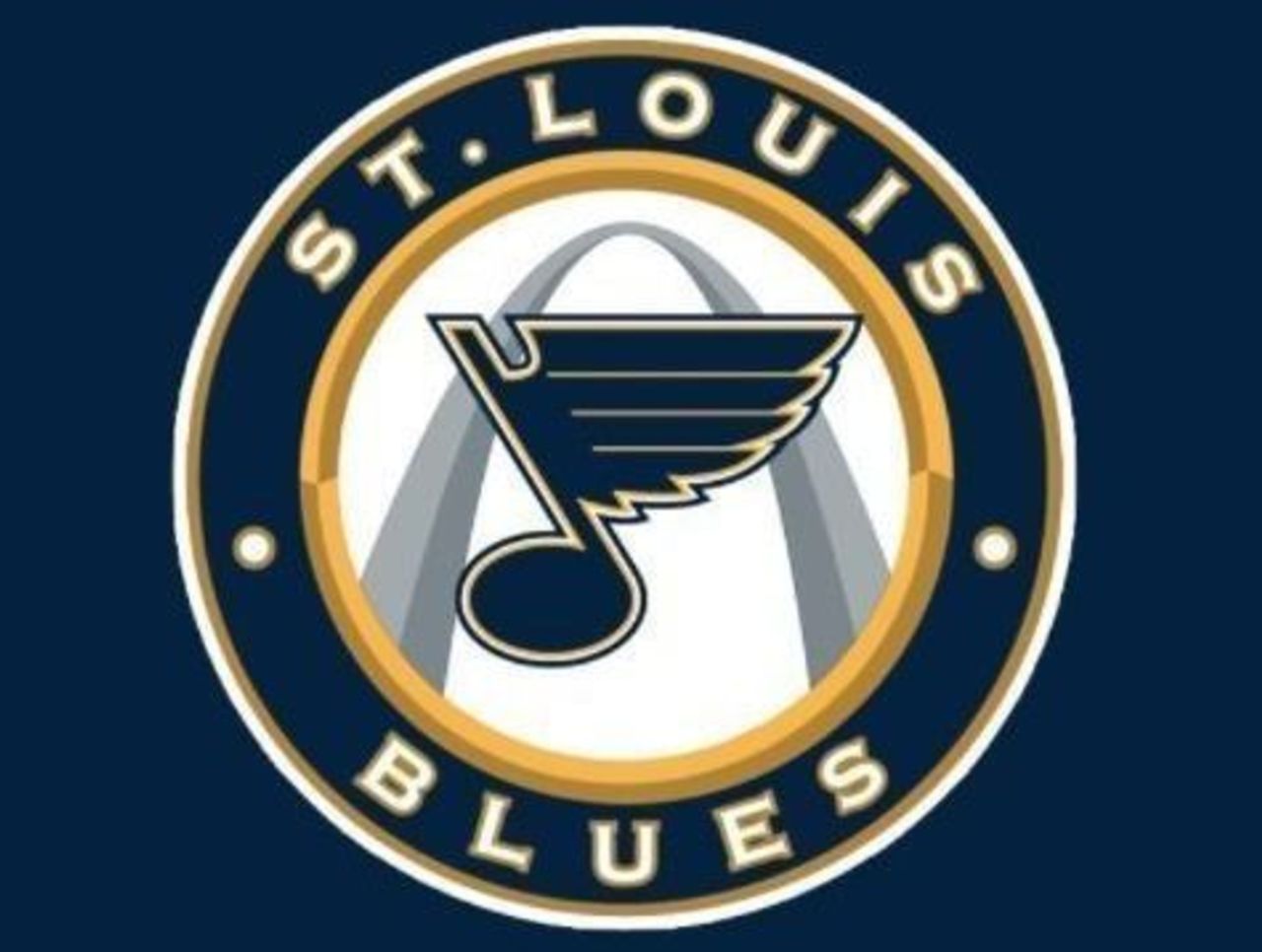
Some circular logo revamps work, and others don't. This one works. With the famed Gateway Arch in the background and the wonderfully designed Blues logo in the foreground, this configuration is a winner.
28. California Golden Seals (1967-68)
The Golden Seals didn't last long, but the memory of that crazy logo will live on in our hockey-loving hearts forever. The black outlines throughout make it feel a little like you're seeing double.
27. Atlanta Flames (1972-1980)
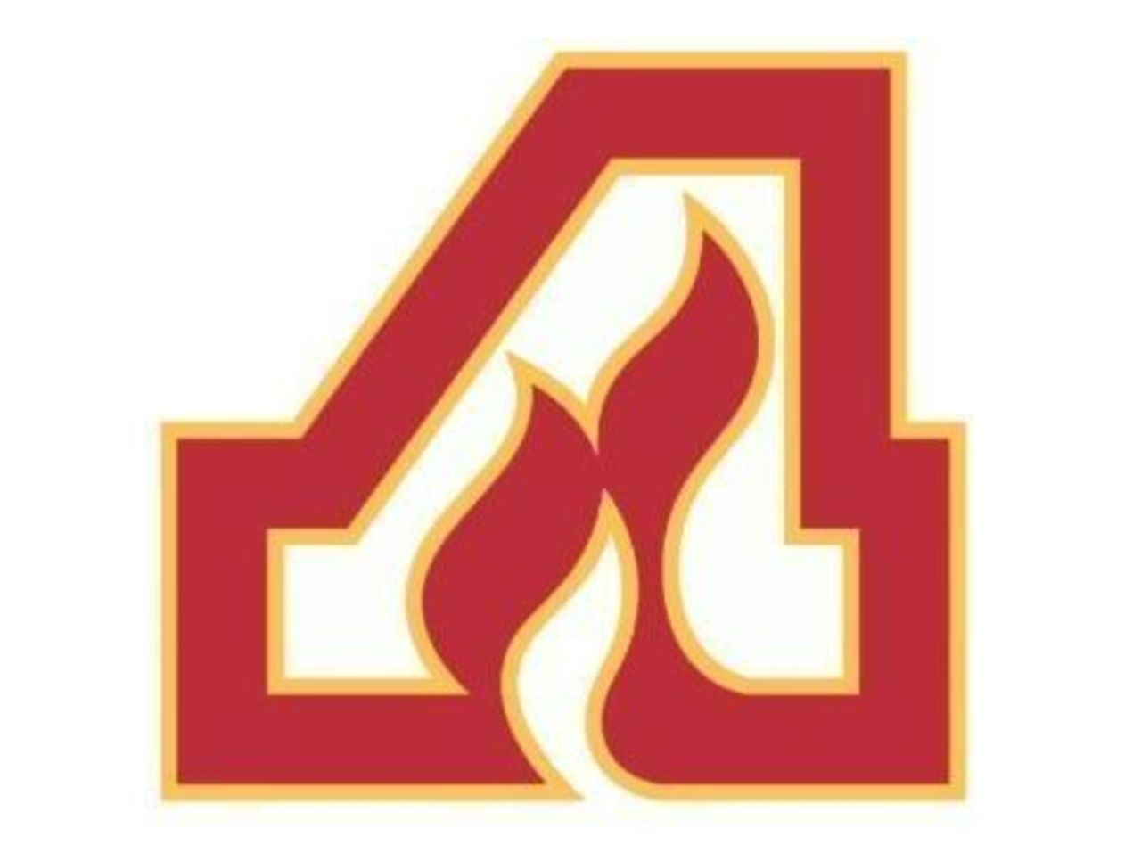
These Flames were predecessors to the Calgary Flames in more ways than one. While we prefer the flaming "C" to the flickering "A", there's still plenty to like here. Orange and red always work great together.
26. Philadelphia Flyers (1967-present)
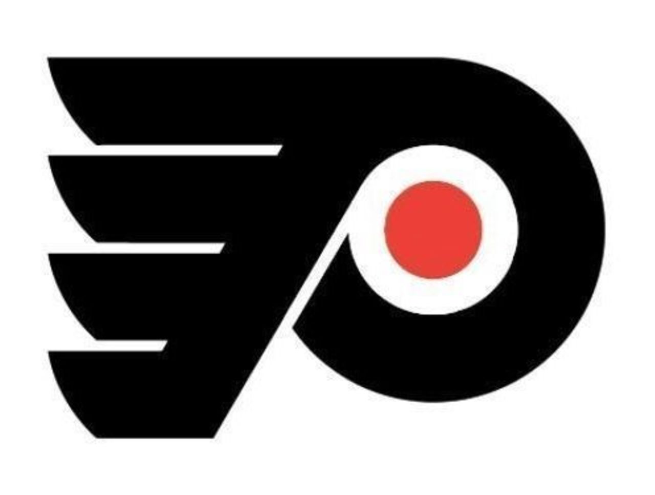
Another team that hasn't tried to fix what isn't broken, the Flyers have only slightly tweaked their orange-eyed P over their half-century of existence. It's easily the best logo on the Philadelphia sports scene.
25. Los Angeles Kings (1967-1975)
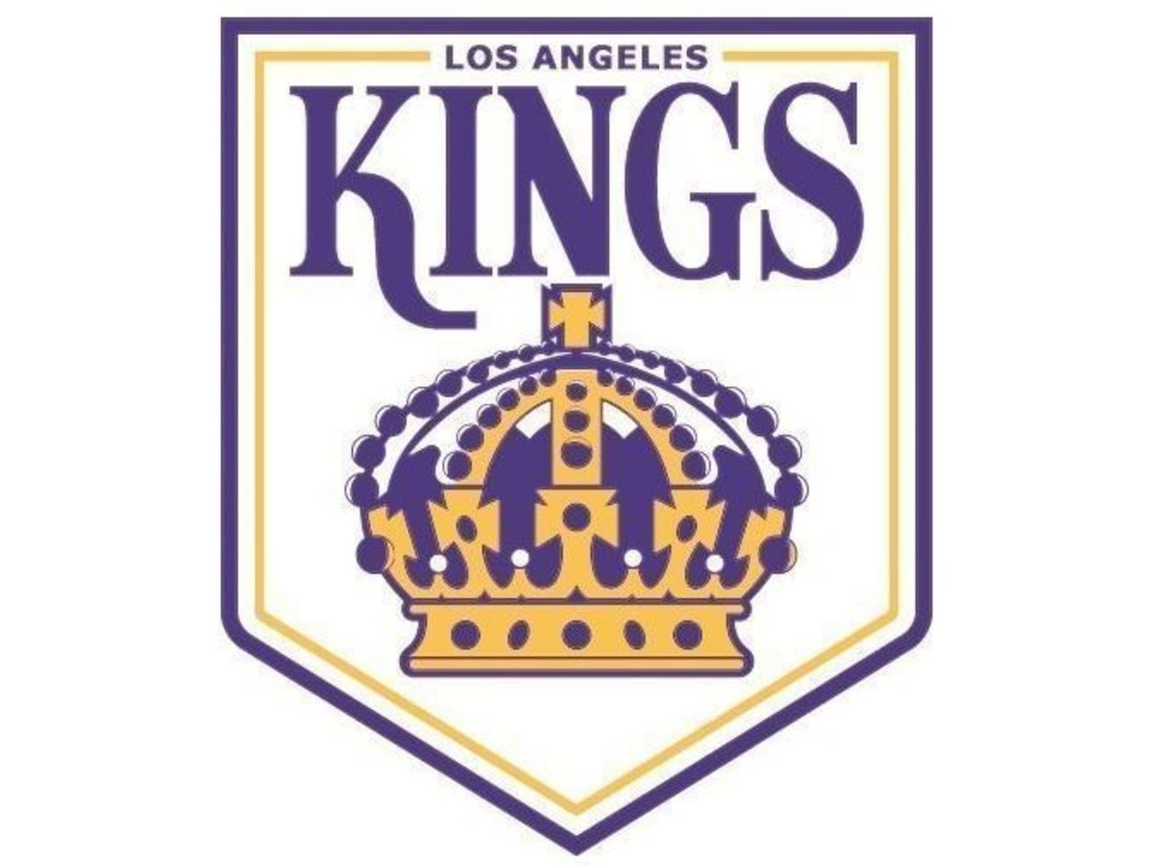
You have to admire the moxie of a team that opts for a banner logo; it looks like something you'd hang from the rafters, like a title pennant. There were none of those for the Kings until the 21st Century, but this logo is a winner.
24. Los Angeles Kings (1975-87)
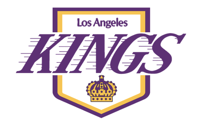
As much as we like the logo above this one, the Kings' second shot at a banner-centric logo is just a little bit cooler. The tilted font, combined with those purple speed lines, give it more of a hockey feel.
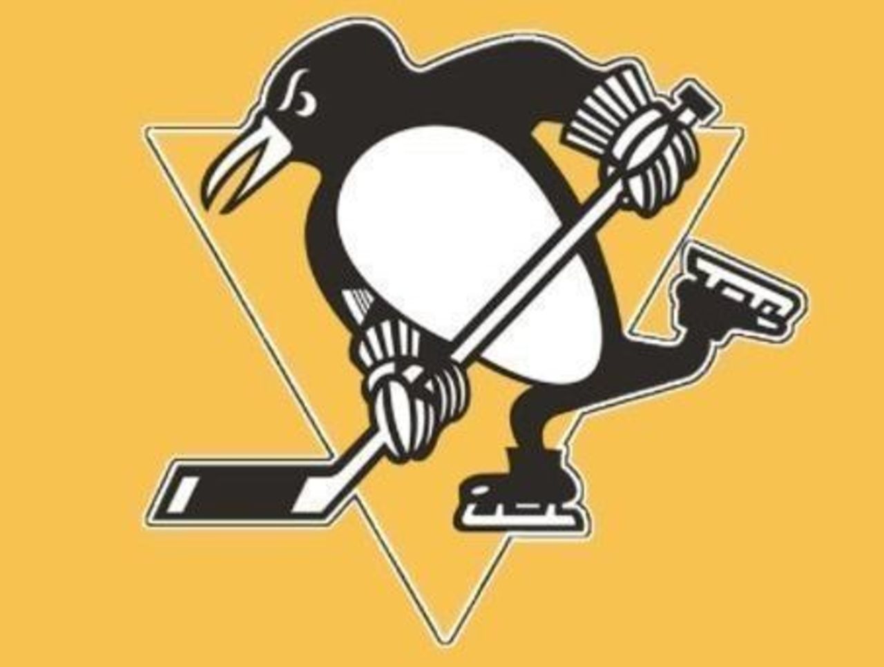
23. Pittsburgh Penguins (1972-1992)
This logo screams hockey. Cold-weather animal? Check. Multiple pieces of hockey equipment? Check. And give the Pens credit for sticking to the black-and-gold scheme that has become the trademark of Pittsburgh sports.
22. Hartford Whalers (1972-1985)
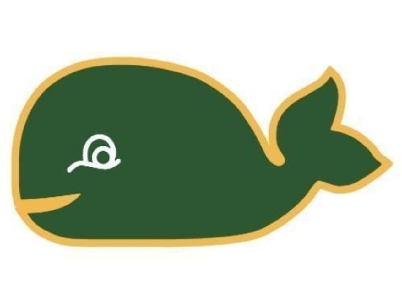
The Whalers gave hockey fans such joy - not necessarily with their play, of course, but with their logos. The actual alternate logo has the letters "ERS" at the end, which would make them the "Whaleers." But we digress.
21. Toronto Maple Leafs (1967-2017)
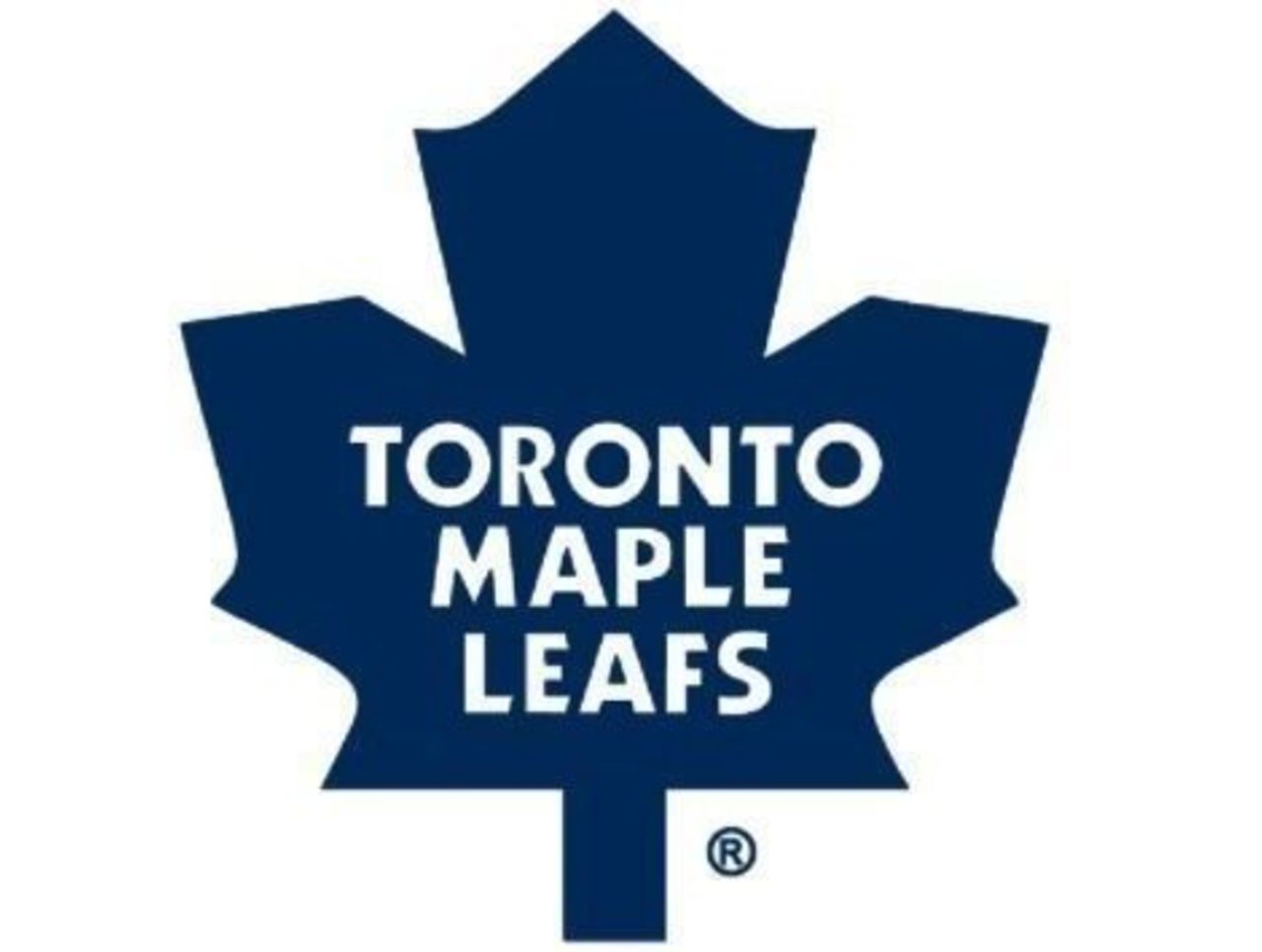
You can't blame the Maple Leafs for reaching back into the past last year after rolling with a more angular leaf design for the previous 50 years. After all, this logo didn't see a single Stanley Cup final appearance.
(NHL logos are used with permission and are courtesy of the National Hockey League.)