Ranking the NHL's 100 Greatest Logos: Nos. 100-81
Throughout the month of September, James Bisson and a cast of editors from theScore will share their rankings of the greatest players, teams, and moments in the 100-year history of the National Hockey League. This week's list focuses on the greatest team logos (active team logos courtesy NHL; defunct team logos courtesy SportsLogos.net).
100-81 | 80-61 | 60-41 | 40-21 | 20-1
Voter List
- James Bisson, National Sports Editor
- Joe Ross, Vice-President, Content
- Josh Wegman, NHL News Editor
- Sean O'Leary, NHL News Editor
- Esten McLaren, NHL News Editor
- Craig Hagerman, NHL News Editor
- Michael Amato, Senior News Editor
- Lanny Foster, Senior Social Media Editor
- Lucas Casaletto, News Editor
- Arun Srinivasan, News Editor
100. Philadelphia Quakers (1930-31)
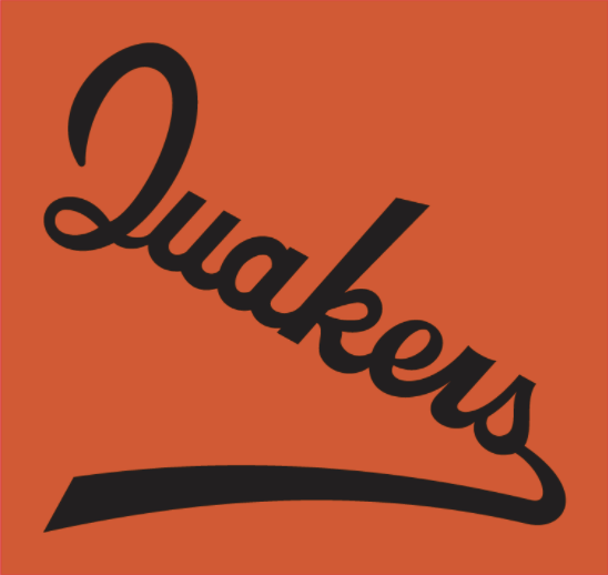
The Quakers didn't grace the NHL for long, but you have to like the orange-and-black configuration that predated the Flyers' primary color scheme by nearly four decades.
99. Quebec Bulldogs (1919-20)
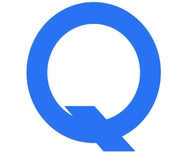
This "Q" didn't stand for quality. The final version of the Bulldogs' famed single-letter logo adorned the jerseys of a team that went just 2-10 for a fourth-place finish in the four-team league.
98. Calgary Flames (2013-16)
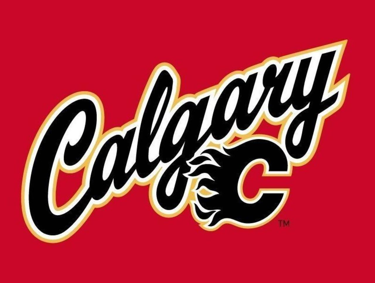
This script/logo combination appeared on the Flames' red alternate jersey beginning in 2013-14. It certainly isn't the worst logo of the bunch, but the lack of creativity is a bit disappointing.
97. Hamilton Tigers (1923-25)
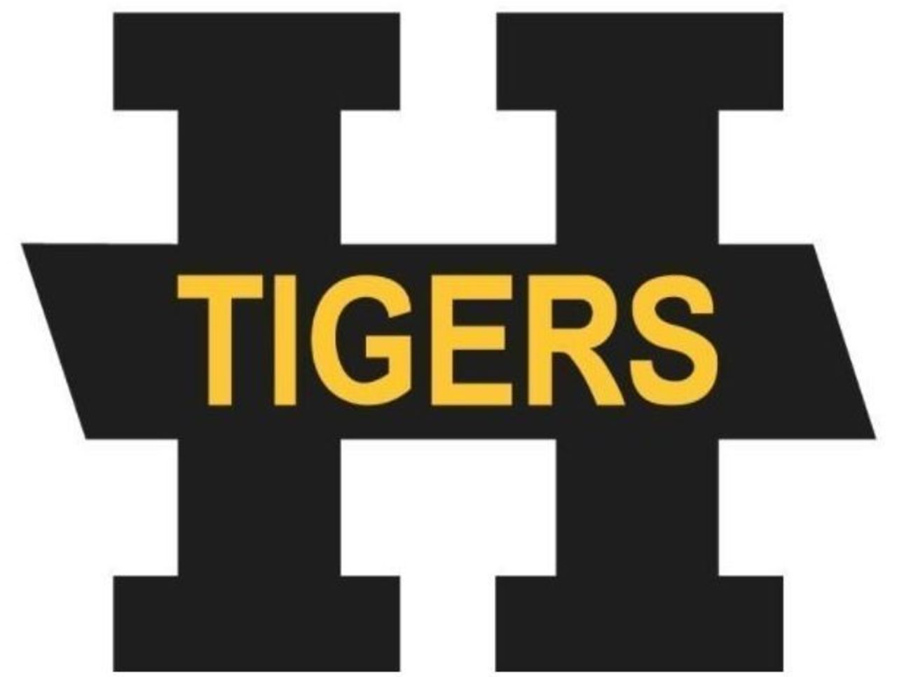
Between the NHL's Tigers and the Tiger-Cats of the Canadian Football League, Hamilton does love its black-and-gold combinations and tabby-related monikers. And hey, the H is better than the Tigers' previous logo.
96. Dallas Stars (2003-06)
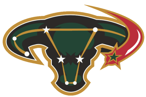
It's unclear why this logo didn't rate better among our panel; it's certainly imaginative, though perhaps fans found the stars a bit distracting. Whatever the case, this emblem didn't have much of a shelf life.
95. California Golden Seals (1971-74)

Oh, to be a fan of the NHL at a time when logos like this were not only acceptable, but revered. It's a pity the Golden Seals didn't stick around longer, if only because it denied us the opportunity to see more of this font.
94. Carolina Hurricanes (2008-present)
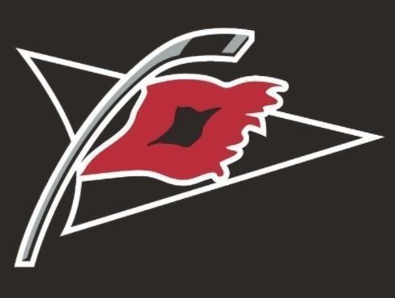
Combining a shiny silver hockey stick with two geographically relevant symbols - a hurricane warning flag and the triangular outline of the Tri-Cities region of North Carolina - makes for an interesting hockey logo. Kind of.
93. Vegas Golden Knights (2017-present)
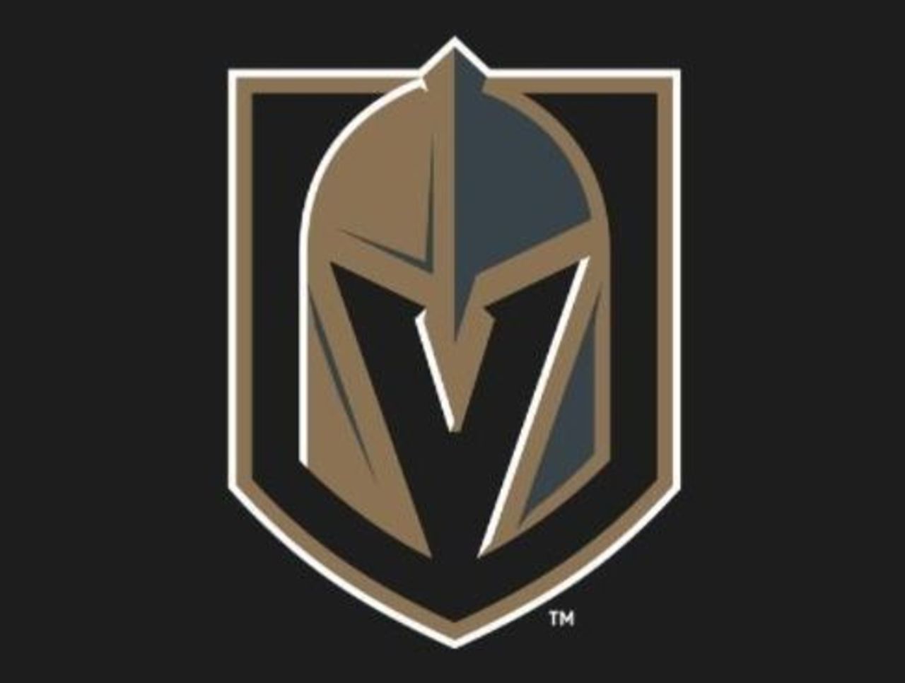
The new kids on the block come in at the back end of the rankings, mostly because there just isn't any history here. But given all that Las Vegas is known for, this logo could have been a whole lot schlockier.
92. Florida Panthers (1993-2009)
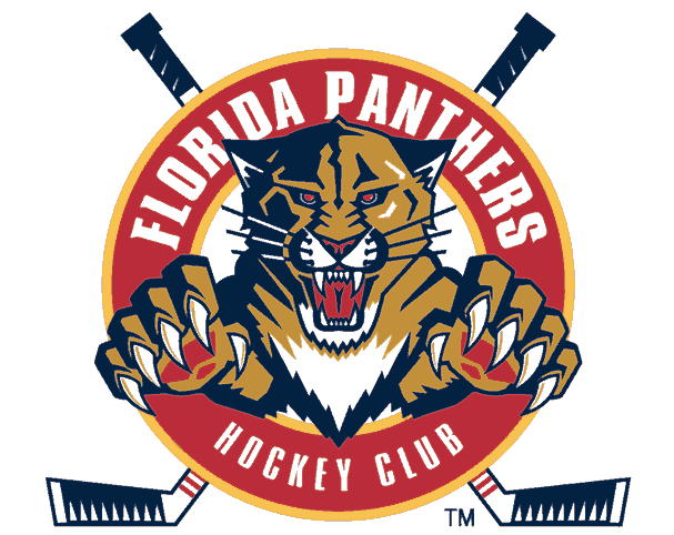
The Panthers have had a whole host of logos over their 24-plus years of existence, and most of them feature this fearless feline in some form or fashion. This version is a little busy, but the sticks are a nice touch.
91. Pittsburgh Pirates (1929-30)
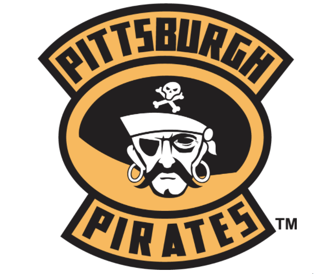
Yarrrrr! Here's another team with a great logo that simply left us too soon - though it's fair to say that two Pittsburgh Pirates professional franchises would leave sports fans confused.
90. Ottawa Senators (2000-07)
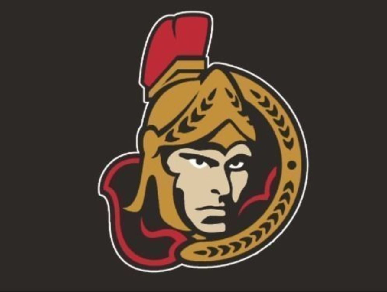
This logo gets a slight nod over the present-day primary version, though there is very little differentiating the two. Although, we doubt this one looks as terrifying with its eyebrows removed as the current logo does.
89. Columbus Blue Jackets (2000-04)
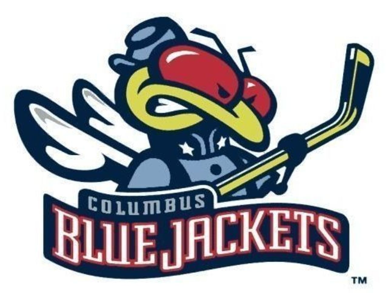
Ah, the grand Blue Jacket mystery. Just what is it? Columbus took the opportunity to clear things up in the early-2000s, slapping some Civil War union garb on its flower-pollinating mascot.
88. Edmonton Oilers (2001-07)

At first glance - and probably second and third, as well - the Oilers' one-time alternate logo looks like a metallic meteor hurtling toward Earth. Consider it a metaphor for how the Oilers played for much of the 2000s.
87. Calgary Flames (1998-2006)
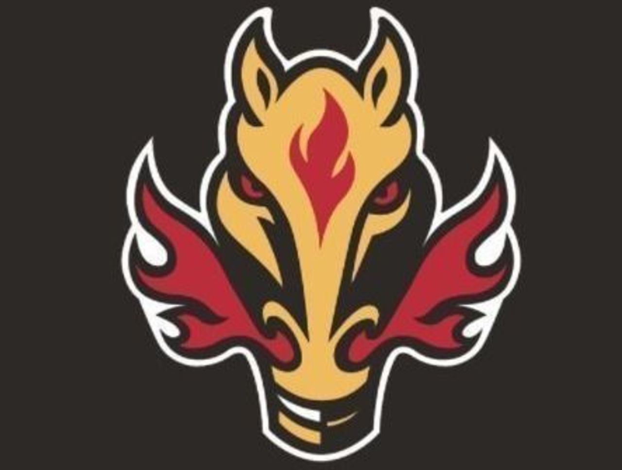
Reaction to this alternate logo was strong - and not in a good way. It's almost always that way when a team strays so far from its original emblem - and where this logo is concerned, you can't get much more different than the flaming C.
86. Ottawa Senators (1910-29)
Don't worry, your eyes - and screen - are just fine. This was what passed for the Senators' "logo" during the team's first 20 years of existence, with the odd world championship crest thrown in here and there.
85. Montreal Maroons (1935-38)

After rolling with a puffy "M" for the majority of their tenure in the NHL, the Maroons opted for a sleeker, more slender option for their final three seasons. This "M" looks more like a university logo, but it works.
84. Atlanta Thrashers (1999-2006)
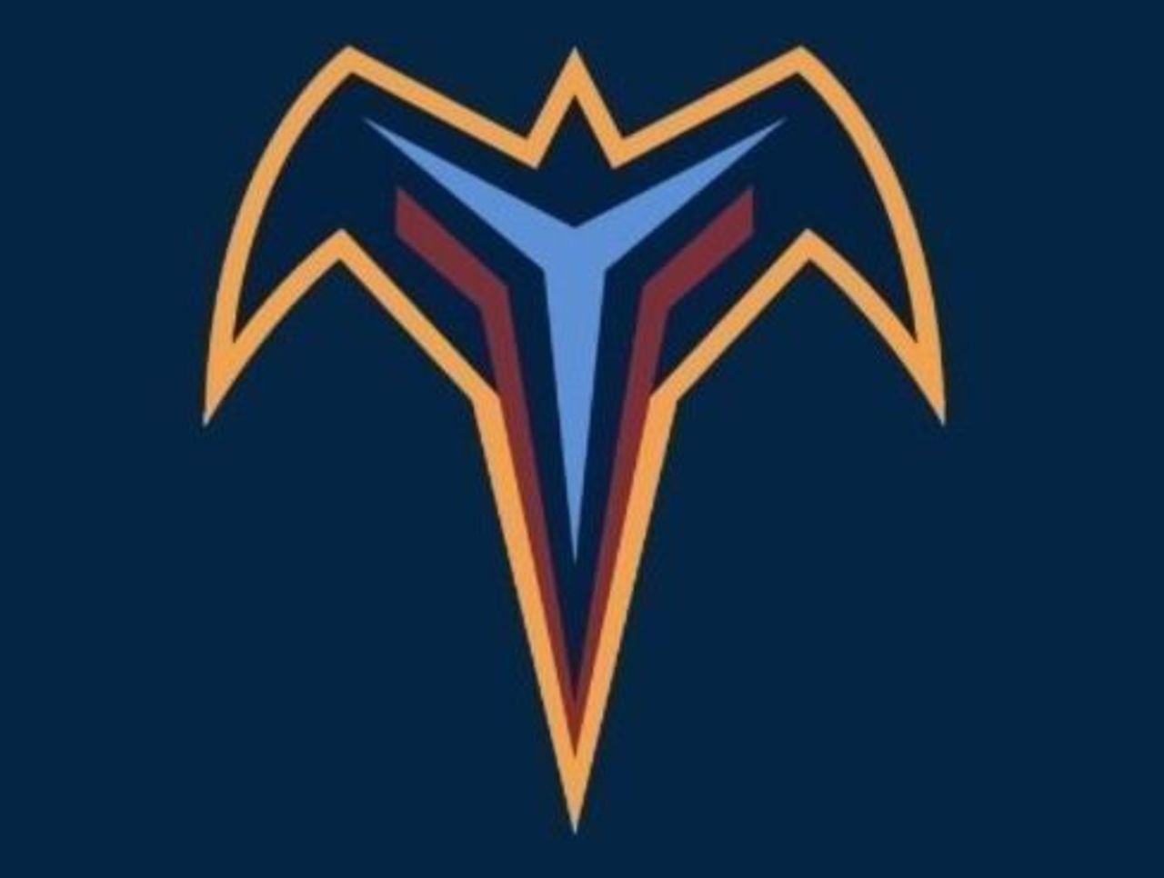
This logo might not look all that interesting at first, but it begins to grow on you once you realize those red lines in the wings are actually sticks. Of course, it's possible you already knew that and still don't care for it.
83. Florida Panthers (2016-present)
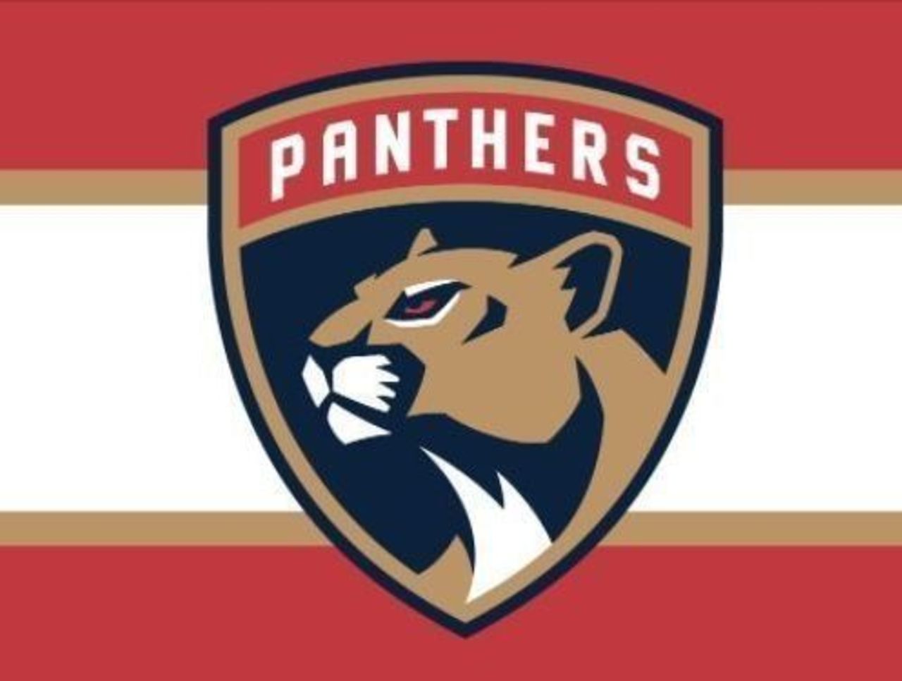
After nearly a quarter-century of bearing its claws for the citizens of South Beach, our Florida Panthers kitty takes on a more subdued pose in the most recent logo update. This has more of a soccer feel to it, no?
82. Minnesota Wild (2009-present)
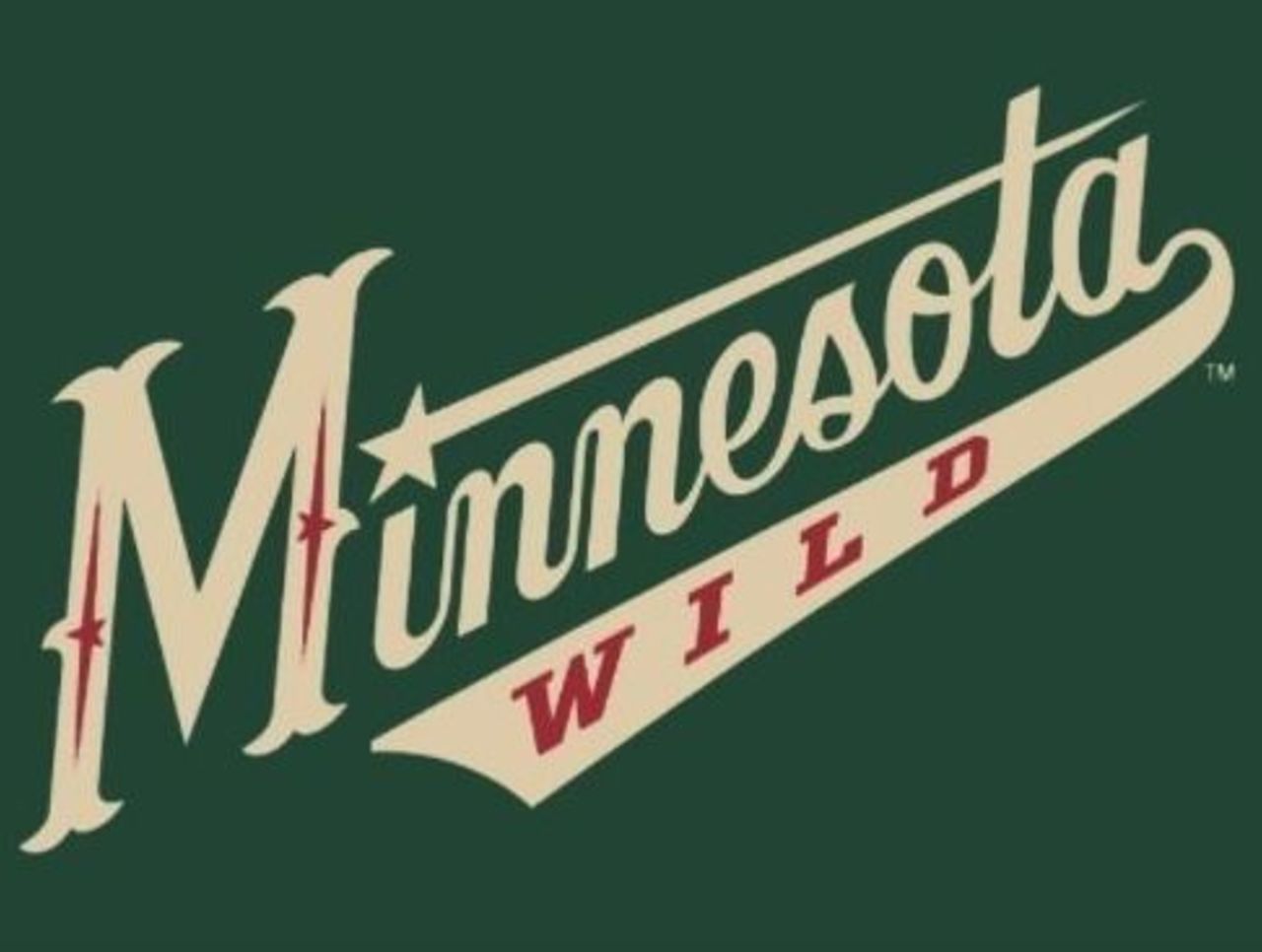
Script logos didn't fare all that well in our rankings, but there's something about the classiness of the Minnesota script that caught our attention. The subtle homage to the North Stars is a nice touch, as well.
81. Tampa Bay Lightning (2007-11)
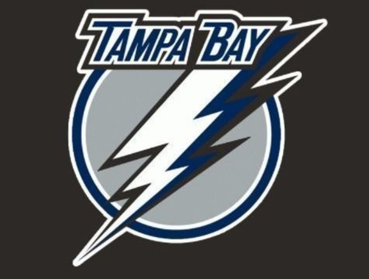
After rolling with that crazy electric font for the first 15 years, Tampa Bay opted for something a little tamer, while also ridding itself of the "LIGHTNING" at the bottom. It would scrap the lettering altogether in 2011.
(NHL logos are used with permission and are courtesy of the National Hockey League.)
HEADLINES
- Stars activate Rantanen off IR
- Assessing most impactful deadline pickups, 8 Norris candidates, more NHL hot topics
- Red Wings get crucial 2 points with win over Atlantic-leading Sabres
- Penn State loses to UMD, ending McKenna's NCAA season
- Oilers, Golden Knights head in opposite directions after playoff-like tilt