With the exception of a few franchises (and the entire "Color Rush" experiment), the NFL's uniforms are aesthetically pleasing. A wide range of colors is represented and there's a satisfying blend of traditional identities and modern looks.
But a few teams trot onto the field in clown costumes every week. We call out the five worst offenders below and offer easy solutions to fix their fashion blunders.
Buccaneers
Problem 1: Numbers look like digital clocks
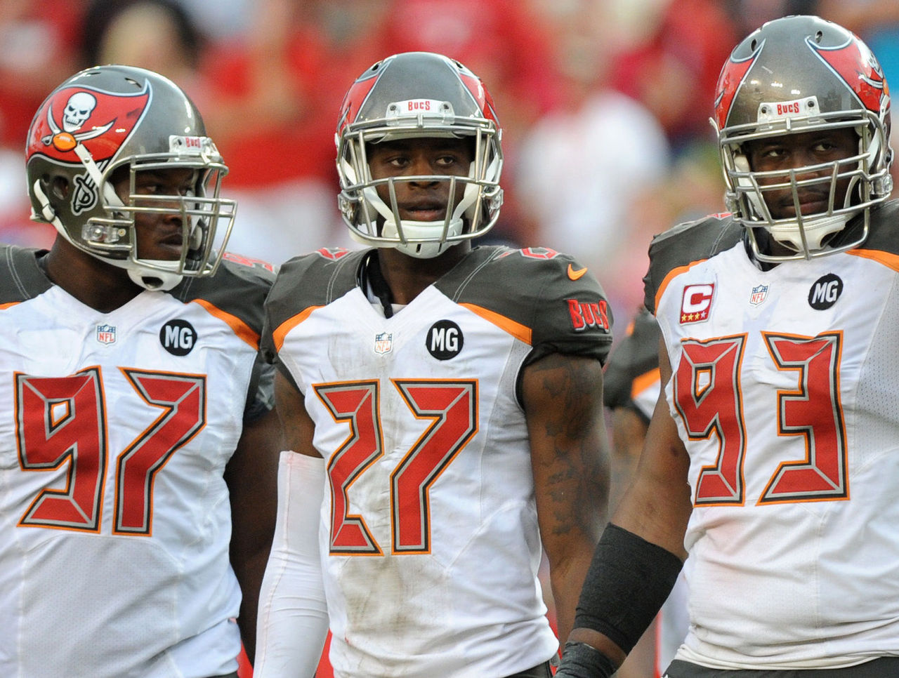
What were the Buccaneers thinking in 2014 when they redesigned their uniforms (which were considered by some to be modern classics) and added this horrific number font? They look like the glowing red digits on a digital alarm clock. How is that supposed to mesh with the team's pirate motif?
Solution: Perhaps a traditional block font isn't right for the Buccaneers' numbers, but almost anything would be an upgrade over what they have now. Surely someone can design a custom font that conveys a swashbuckling feeling rather than the grogginess of an early wake-up call.
Problem 2: Shiny or matte - pick one
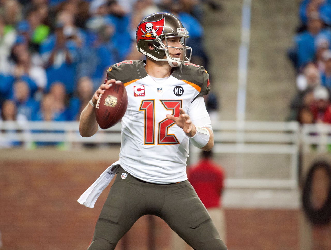
Look at the helmets and pants in the above photo. Do those look like the same color to you? They're both supposed to be pewter. For some reason, one has a glossy finish and the other is flat.
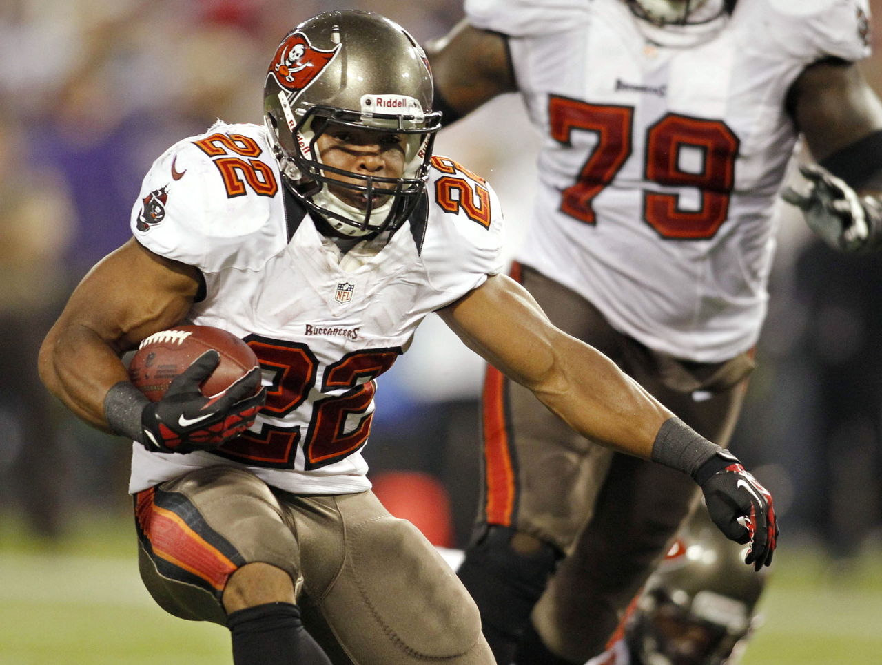
Solution: Add some sheen to the pants. We know it's possible to make shiny fabric because the Buccaneers' old helmets and pants matched:
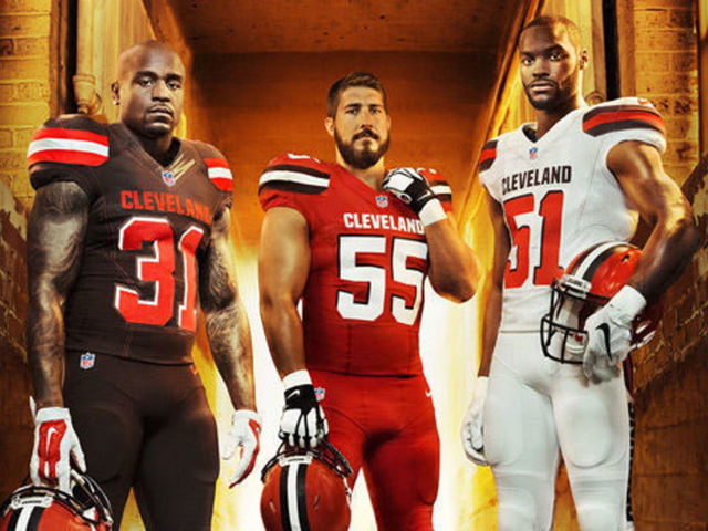
Browns
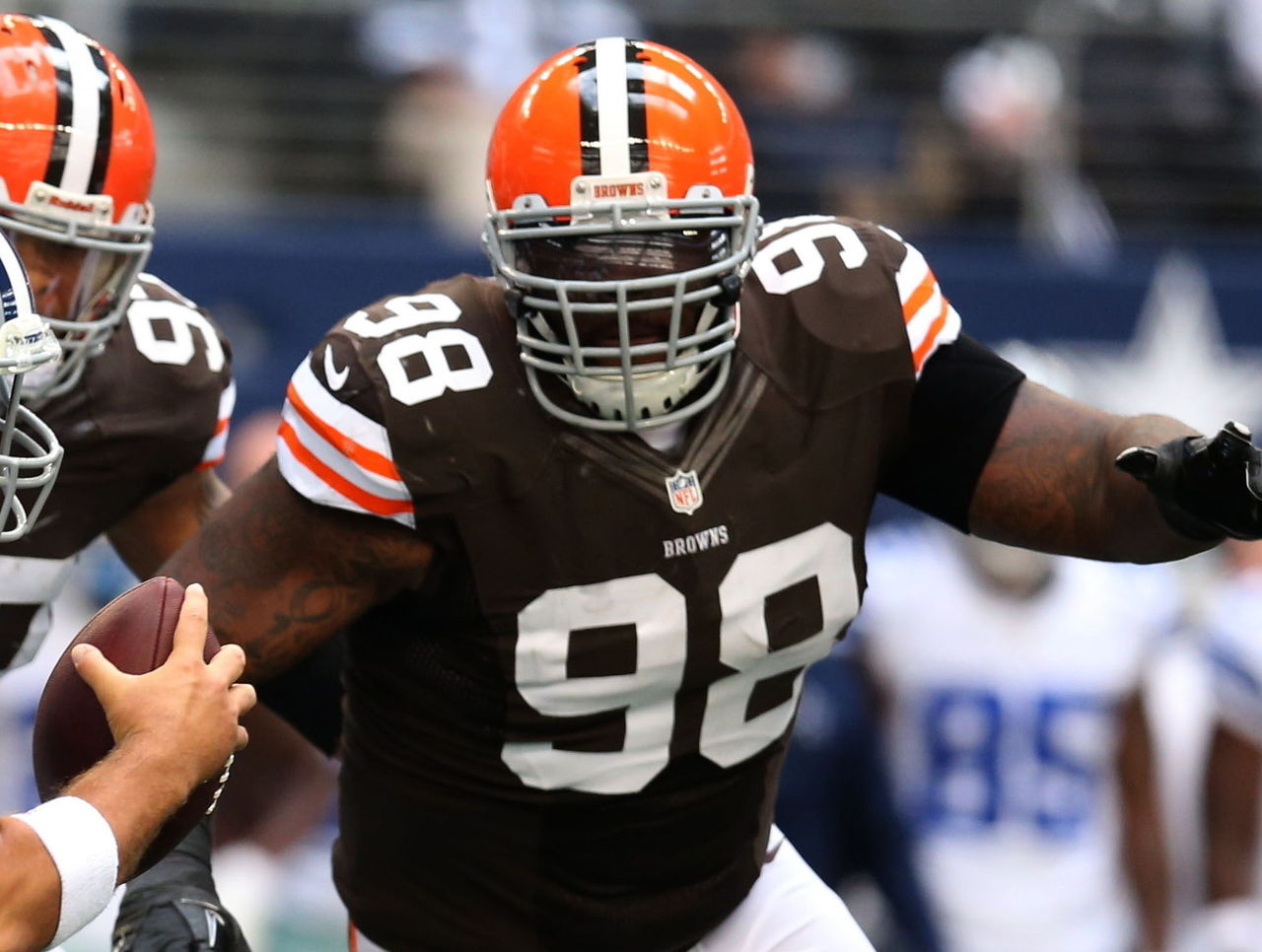
Problem 1: Garish wordmarks
The large "Cleveland" wordmark on the breastplate looks collegiate. The "Browns" running down the leg of the pants looks like, well, something brown that occasionally runs down legs.
Solution: Shrink the wordmark on the breastplate by 80 percent or remove it entirely. Burn the pants and replace them with ones that use a traditional stripe and no wordmark.
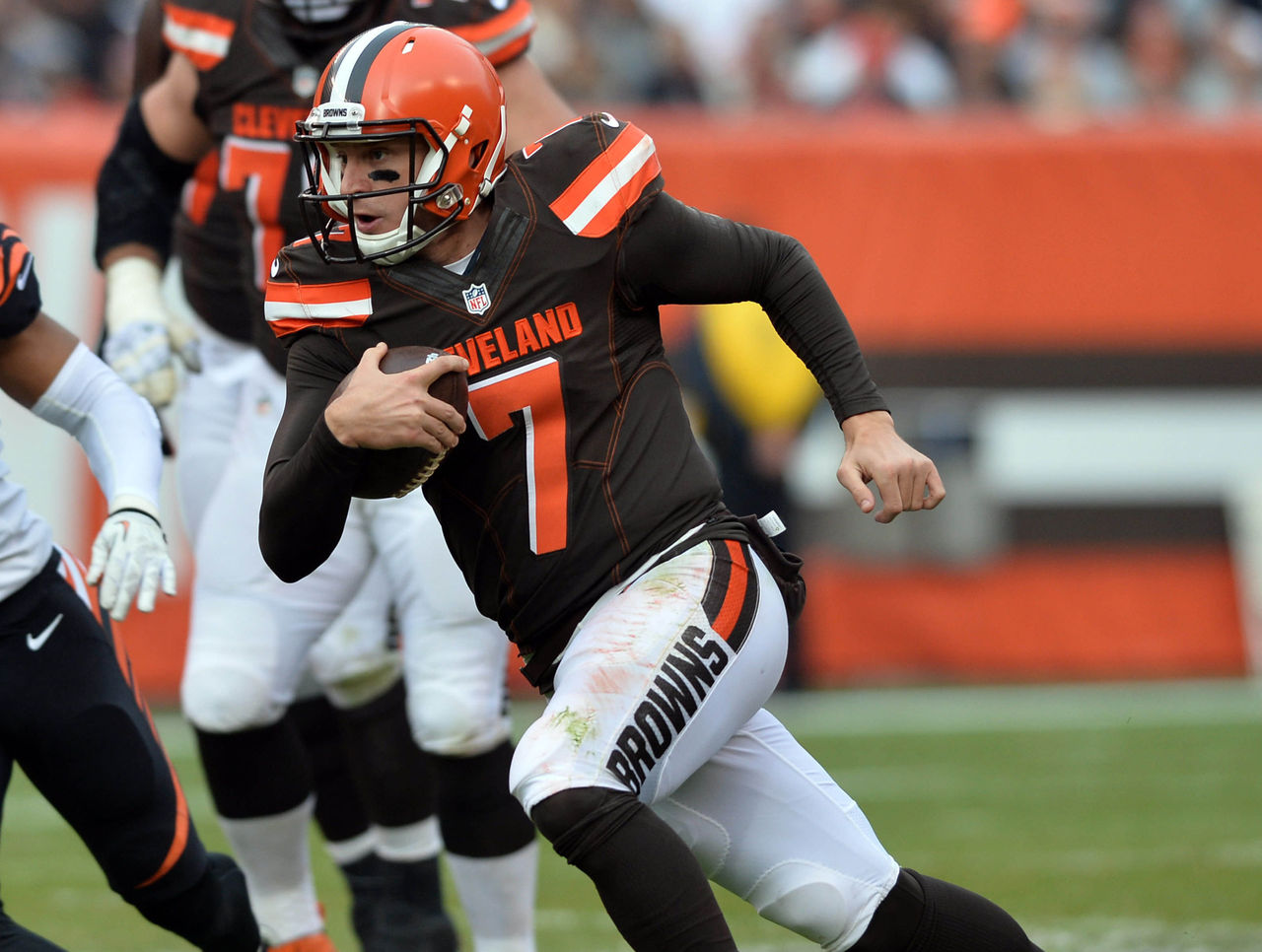
Problem 2: Orange numbers don't pop
Solution: It's not that the Browns' numbers aren't legible. They are. It's just that they're visually boring against a brown background (and that awkward drop shadow isn't helping.) They looked so much better as white numbers with no outline on the Browns' old uniforms. Can we go back to this:
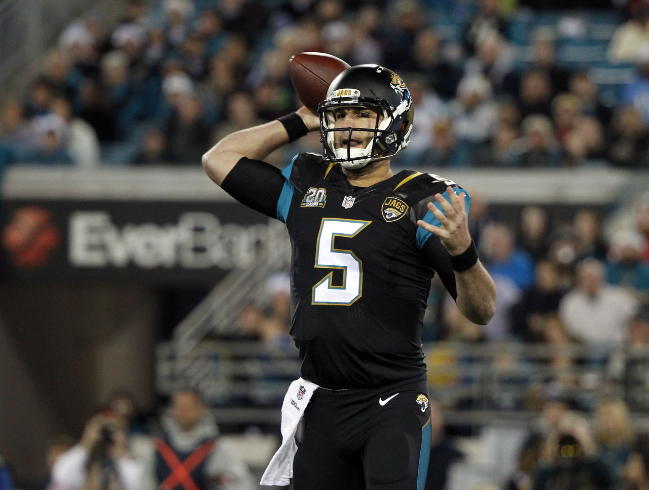
Jaguars
Problem 1: That helmet
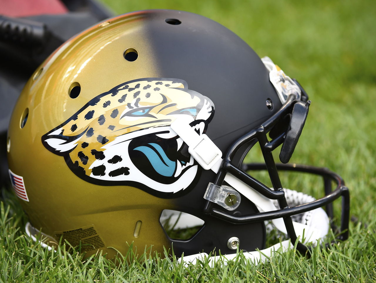
Where do we even begin? When the Jaguars redesigned their helmet in 2013 to make it more unique, they accidentally introduced the worst helmet in football history. The glossy gold and matte black clash badly. What's worse is the Jaguars claim their intent was to make it appear as though the jaguar in the logo is leaping from the shadows. One problem: it's actually leaping into the black.
Solution: Pick either black or gold and stick with it. Even better, go back to the black with metallic teal flakes the team used before introducing its current monstrosities. This was a great look:
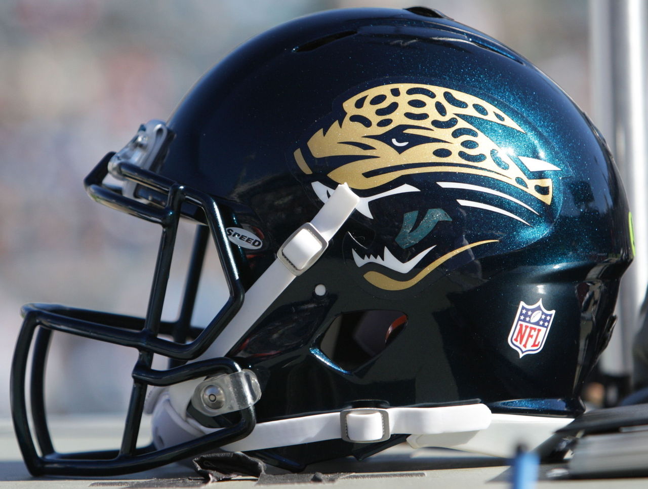
Problem 2: Teal is marginalized
Solution: The Jaguars' original uniforms were both tasteful and unique. Since then, the team has introduced several redesigns (some minor, a few major) that have each pushed the color teal to the sideline. Granted, teal is very '90s. But it's the Jaguars' color and is embraced by most fans. The NFL doesn't need yet another predominantly black team. Bring back the teal.
Saints
Problem 1: Pants look like ballerina unitards
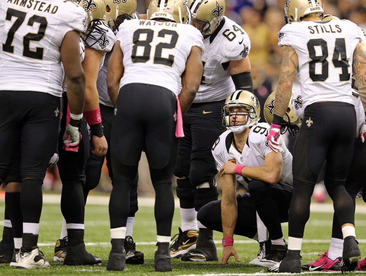
The Saints' combination of stripeless black pants and black socks offers nothing in the way of visual interest. It looks like something a ballerina would wear:
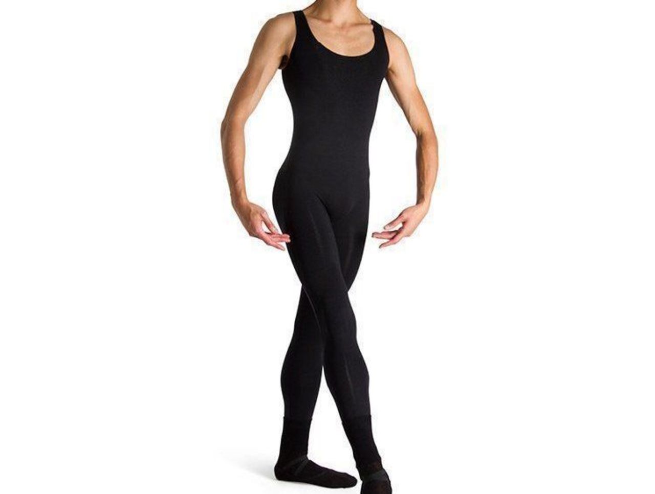
Solution: Add some stripes. Preferably to both the pants and socks. Or just wear the gold pants all the time.
Problem 2: Toilet seat collars
Nike realized its mistake in 2013 and gave every NFL team the option to ditch the ugly collar design it introduced in 2012, which has been compared to a toilet seat. For some reason, the Saints chose to keep the collars.
Solution: Go back to standard collars.
Cardinals
Problem 1: Clash between old-school and modern elements
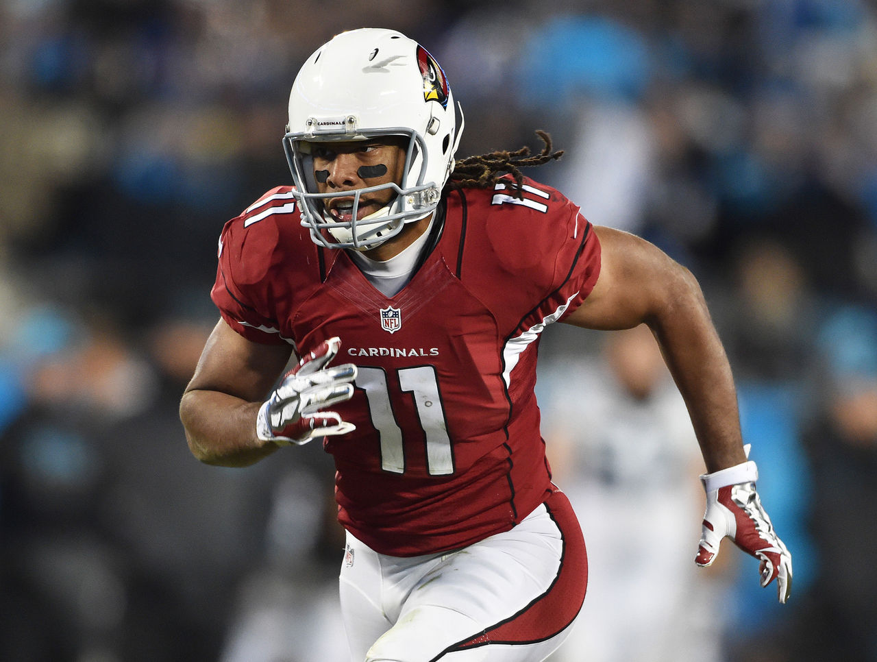
The Cardinals redesigned their uniforms in 2005 and made the ill-advised choice to blend an ultra-modern striping design with an old-school helmet. Gray facemasks are a tricky thing. They work for teams with old-school looks, like the New York Giants and San Francisco 49ers, but they don't work at all for the Cardinals.
Solution: This issue has two possible solutions. The easy route is to swap out the gray facemasks for either black facemasks (which would echo the black piping on the jerseys and pants) or red facemasks. The more complicated path involves redesigning the striping pattern on the jerseys and pants to be more traditional.