Likability Index: Ranking NFL uniforms from best to worst
Welcome to theScore's Likability Index, wherein we rank teams in several completely subjective categories to determine the NFL's most likable team.
- Uniforms
- Fan Experience
- Management
- Players
- Final Verdict
Factors assessed in ranking uniform likability include logo, color scheme, adherence to tradition, unique elements and overall aesthetic.
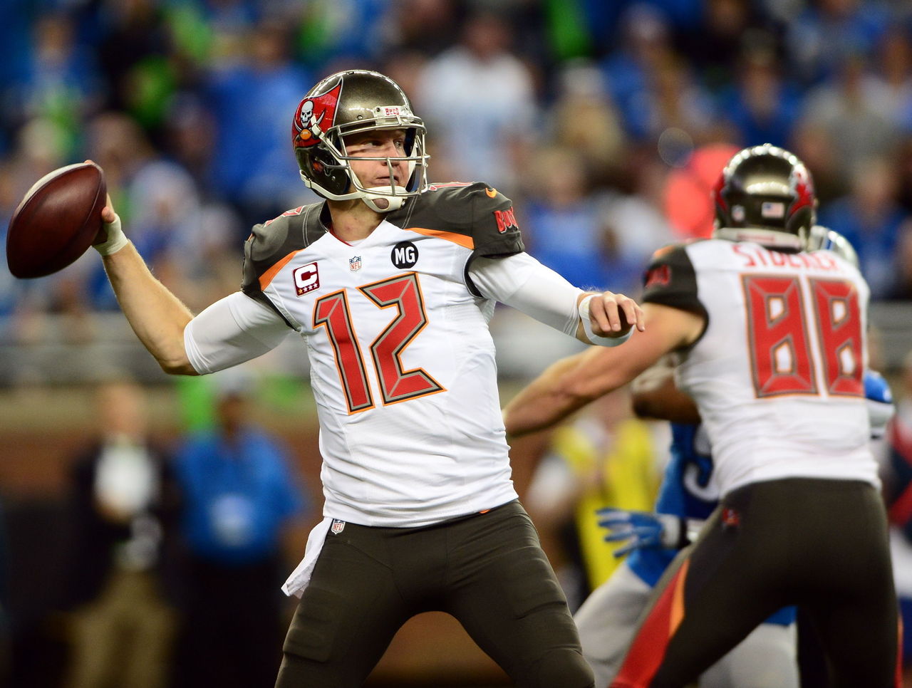
32. Tampa Bay Buccaneers
| Woods | Srinivasan | Wilkins |
|---|---|---|
| 31 | 31 | 32 |
▲ "Creamsicle" throwbacks are a campy classic. Bring them back.
▼ Quite possibly the worst-looking uniforms in all of professional sports.
▼ Orange trim is distracting and does nothing to highlight the pewter and red color scheme.
▼ Glossy pewter helmets don't match flat pewter pants.
▼ Alarm clock numbers are reflective under light. Glowing numbers?!
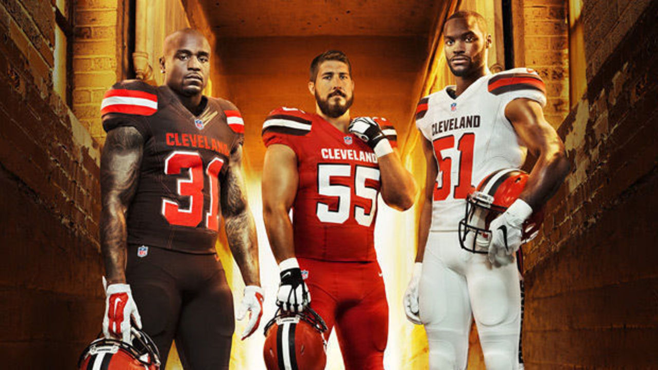
T-30. Cleveland Browns
| Woods | Srinivasan | Wilkins |
|---|---|---|
| 29 | 32 | 31 |
▲ At least the recent redesign didn't ruin the iconic helmets.
▼ The large "Cleveland" wordmark looks completely amateurish.
▼ There is no worse element in NFL uniforms than the Browns’ wordmark on their pants.
▼ All-orange combination is begging to be compared to a traffic cone.
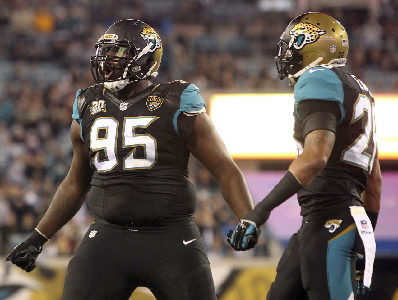
T-30. Jacksonville Jaguars
| Woods | Srinivasan | Wilkins |
|---|---|---|
| 32 | 30 | 30 |
▲ All-black look is intimidating.
▼ All-black is also really dumb under the scorching Florida sun.
▼ Use of teal looks forced.
▼ Half-black, half-gold helmets are the worst in NFL history. Pick a color.
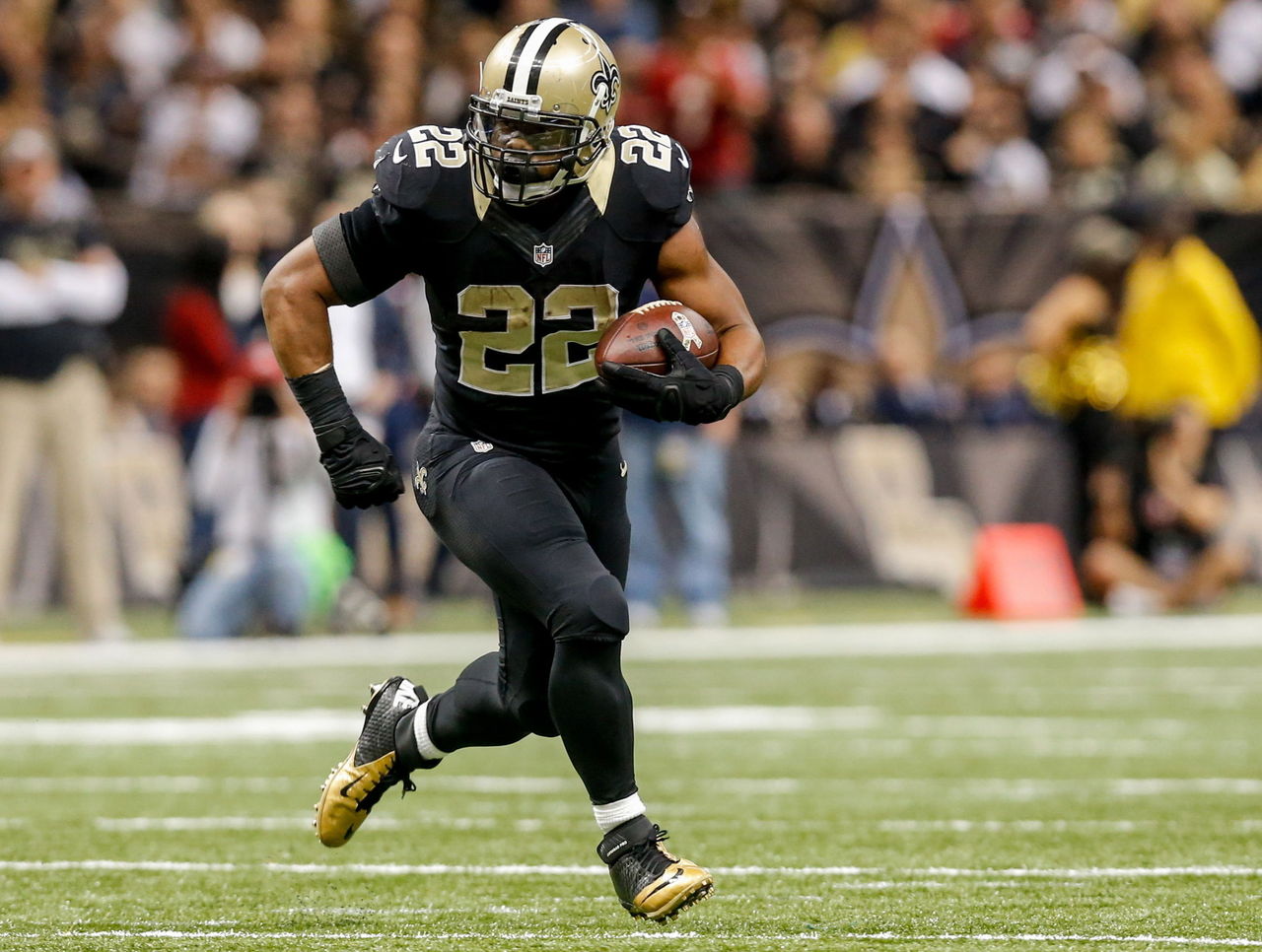
T-28. New Orleans Saints
| Woods | Srinivasan | Wilkins |
|---|---|---|
| 28 | 29 | 25 |
▲ Saints gain points for sticking to the black-and-gold theme for the duration of the franchise's history.
▼ Gold helmet combined with all-black jersey and pants combination looks unbalanced.
▼ Badly needs to be modernized.
▼ What the heck is going on with those collars?
T-28. Tennessee Titans
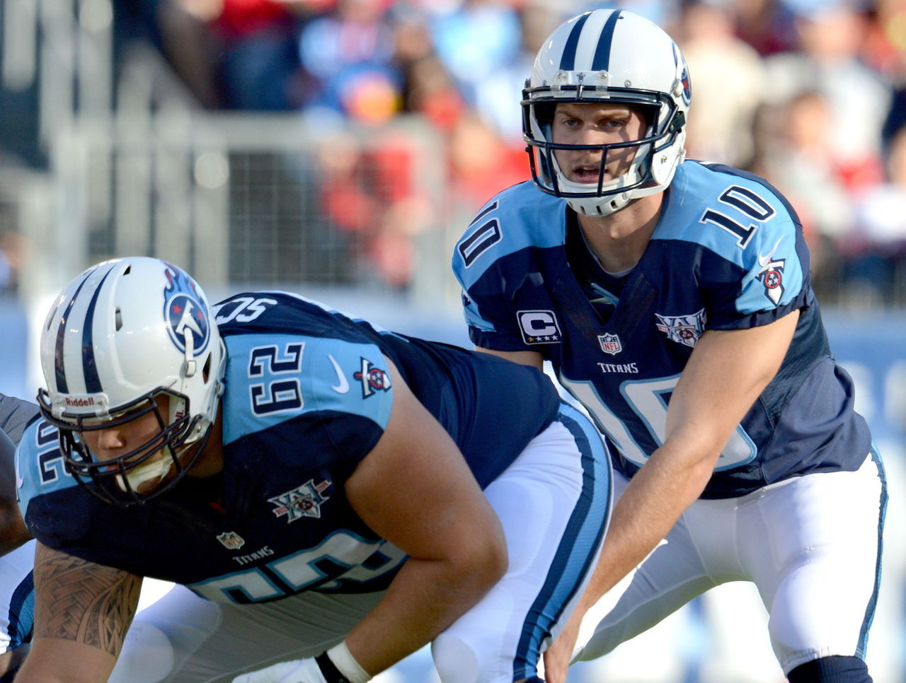
| Woods | Srinivasan | Wilkins |
|---|---|---|
| 25 | 28 | 29 |
▲ Different shades of blue balance each other well in overall look.
▼ Flaming thumbtack logo is among the worst in pro sports.
▼ Shoulder design is almost too basic.
▼ Too much mixing and matching of jersey-pants combinations.
27. Cincinnati Bengals
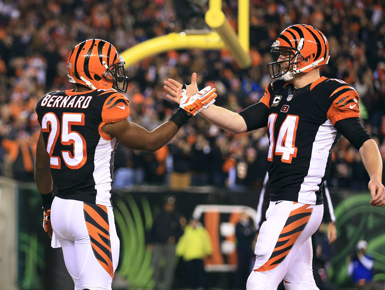
| Woods | Srinivasan | Wilkins |
|---|---|---|
| 27 | 24 | 27 |
▲ Helmet is instantly recognizable.
▼ Way too busy. White side panels are unnecessary.
▼ Number outline is nearly as thick as the numbers themselves.
▼ You can’t put Bengal stripes on everything. Stop it.
26. Arizona Cardinals
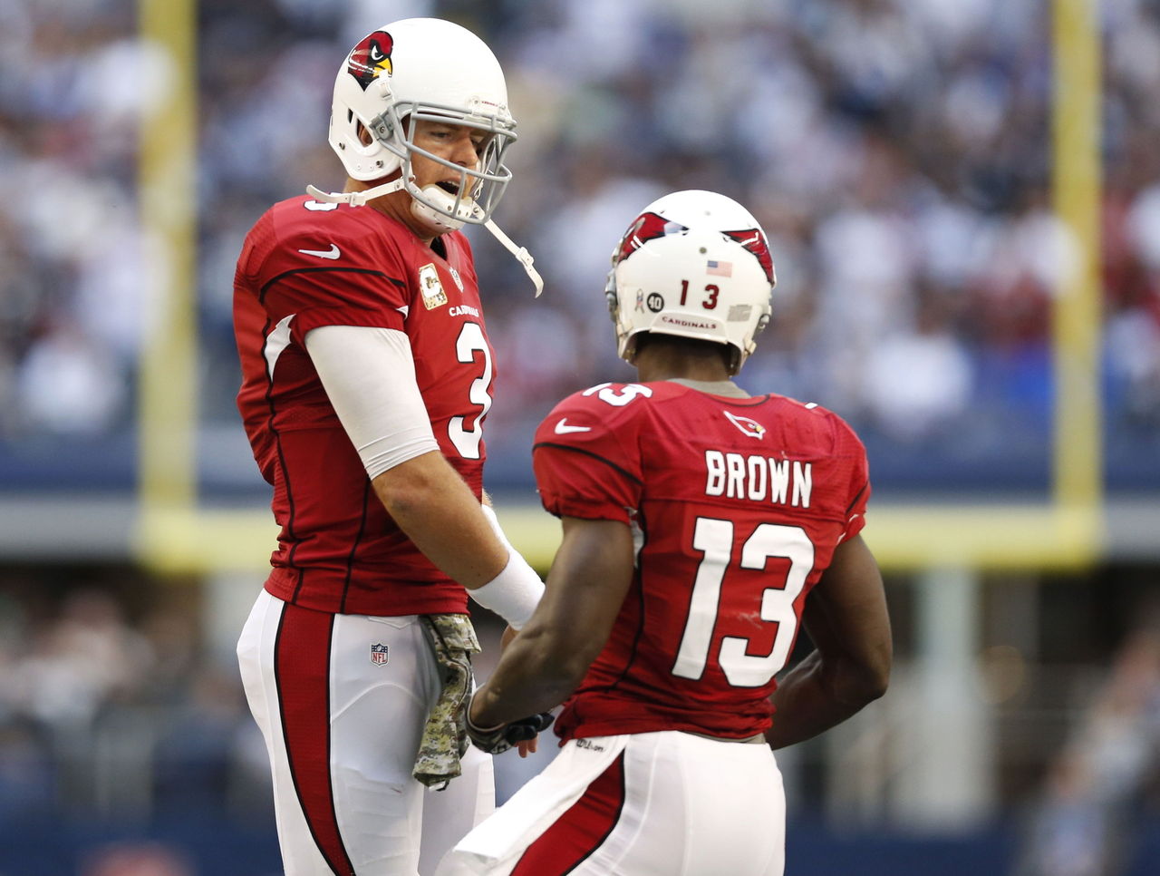
| Woods | Srinivasan | Wilkins |
|---|---|---|
| 30 | 17 | 20 |
▲ Hard to go wrong with red.
▼ Old-school helmet featuring gray facemask clashes badly with ultra-modern uniform design.
▼ All-red combination is an eyesore.
25. St. Louis Rams
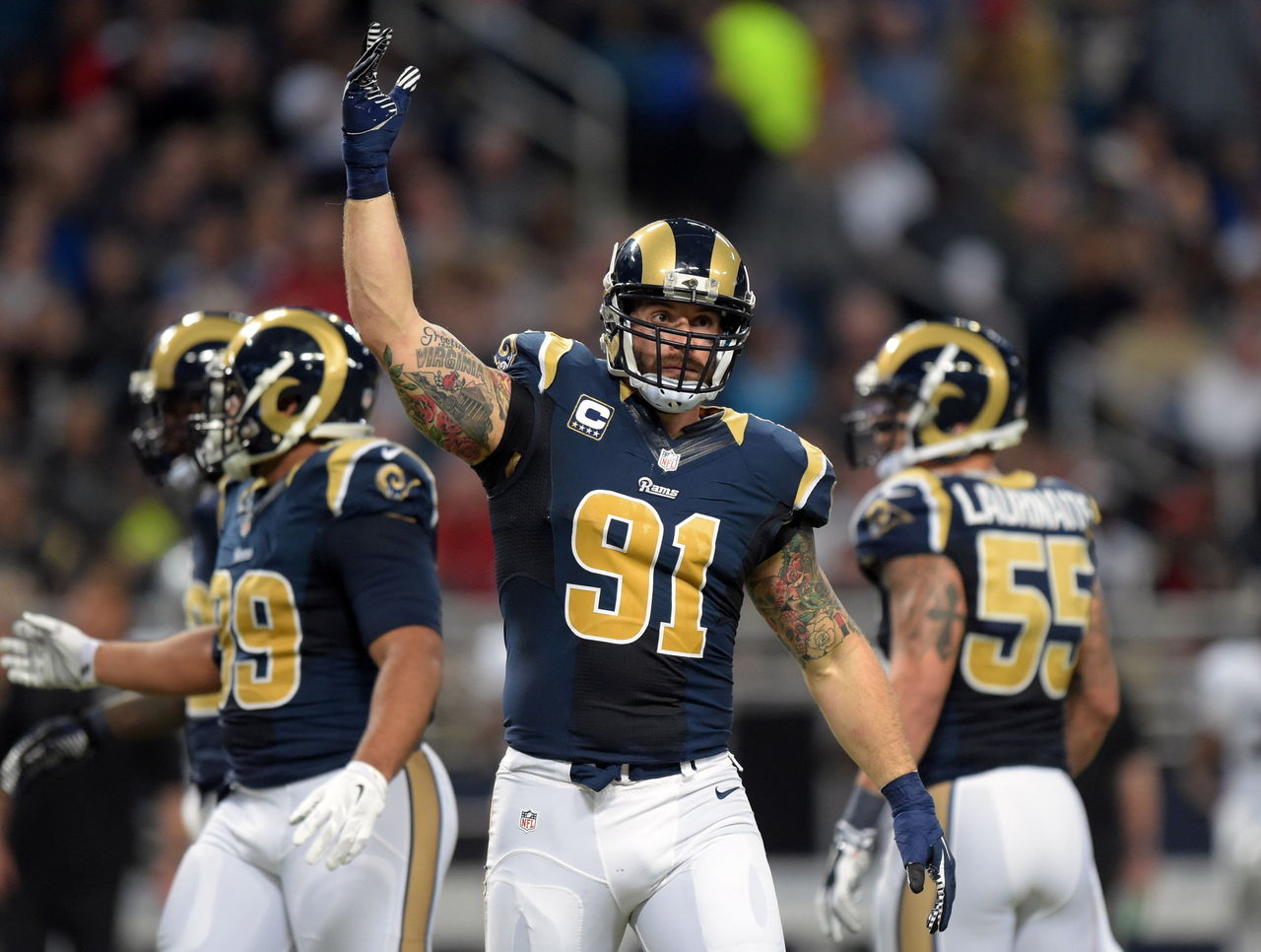
| Woods | Srinivasan | Wilkins |
|---|---|---|
| 17 | 19 | 28 |
▲ Horned helmet looks as good as it did when, in 1948, the Rams became the first NFL team to feature helmet logos.
▼ Royal blue and yellow throwback uniforms are superior to navy blue and gold set.
▼ Bring back the gold pants.
24. Carolina Panthers
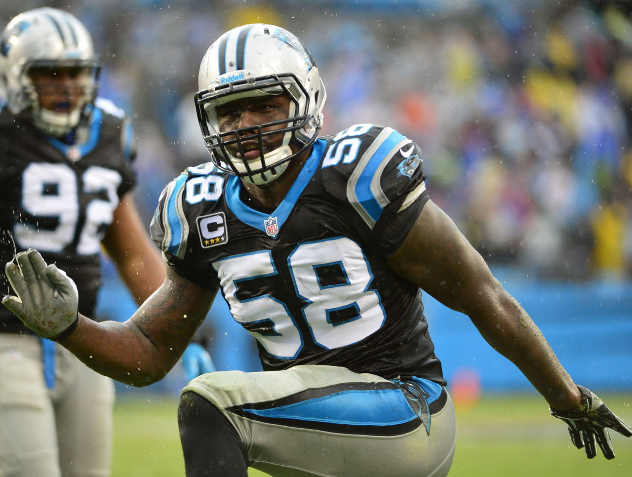
| Woods | Srinivasan | Wilkins |
|---|---|---|
| 19 | 25 | 19 |
▲ Color scheme is rarely used, but makes for an attractive look.
▼ Design hasn’t aged well. Looks very '90s.
▼ What is going on with those bizarre helmet stripes?
23. Washington Redskins
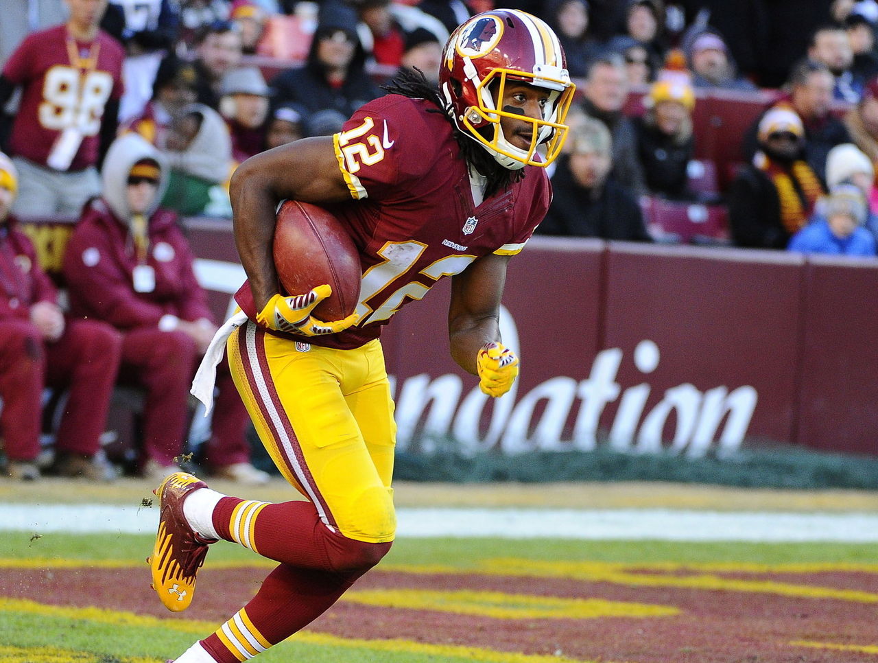
| Woods | Srinivasan | Wilkins |
|---|---|---|
| 14 | 21 | 26 |
▲ Good use of a unique color scheme.
▼ Pants, jersey and helmet all feature different striping patterns.
▼ The logo needs to go.
22. Atlanta Falcons
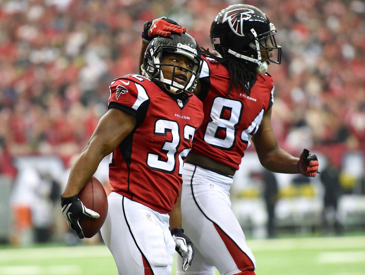
| Woods | Srinivasan | Wilkins |
|---|---|---|
| 18 | 18 | 23 |
▲ Well-designed logo that is still one of the NFL’s best.
▼ Complicated shoulder design is distracting.
▼ Piping as striping already looks dated.
T-20. Detroit Lions
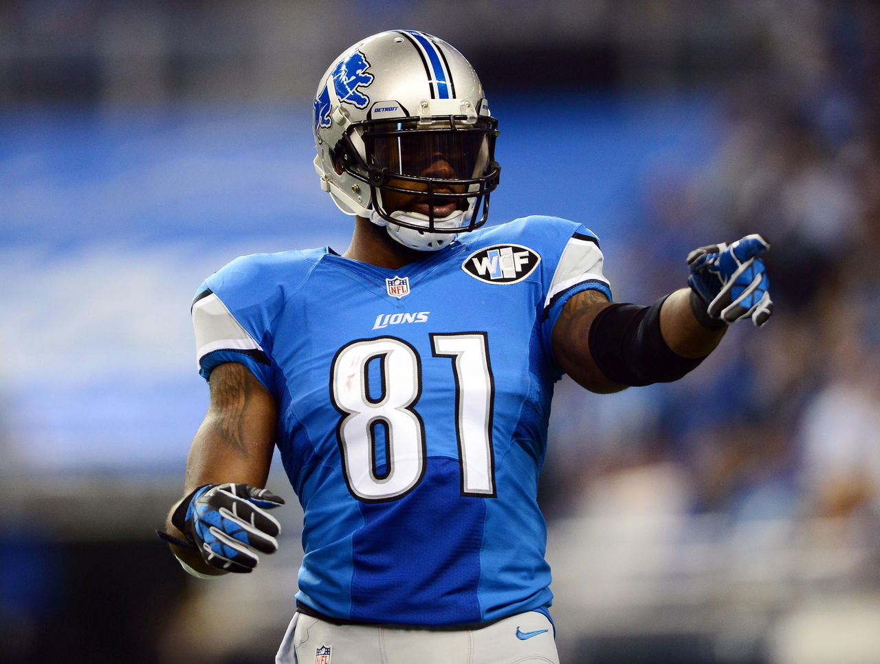
| Woods | Srinivasan | Wilkins |
|---|---|---|
| 10 | 26 | 22 |
▲ Good example of how to modernize a classic design without going overboard.
▼ Silver helmets and pants do nothing to accentuate the light blue home jerseys.
▼ Odd-looking number designs.
T-20. Baltimore Ravens
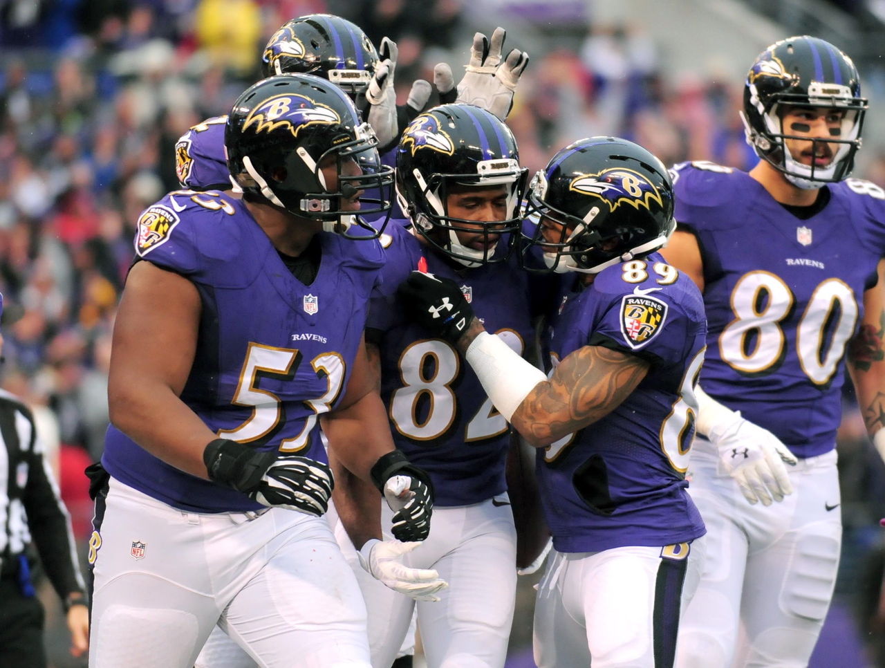
| Woods | Srinivasan | Wilkins |
|---|---|---|
| 26 | 23 | 9 |
▲ One of the few teams that has a strong case for including so much black in its uniforms.
▼ Logo (a raven head with a "B" on it) must be awkwardly edited to work on both sides of the team’s helmet.
▼ Black, stripeless pants with black socks looks like a ballet unitard.
19. Miami Dolphins
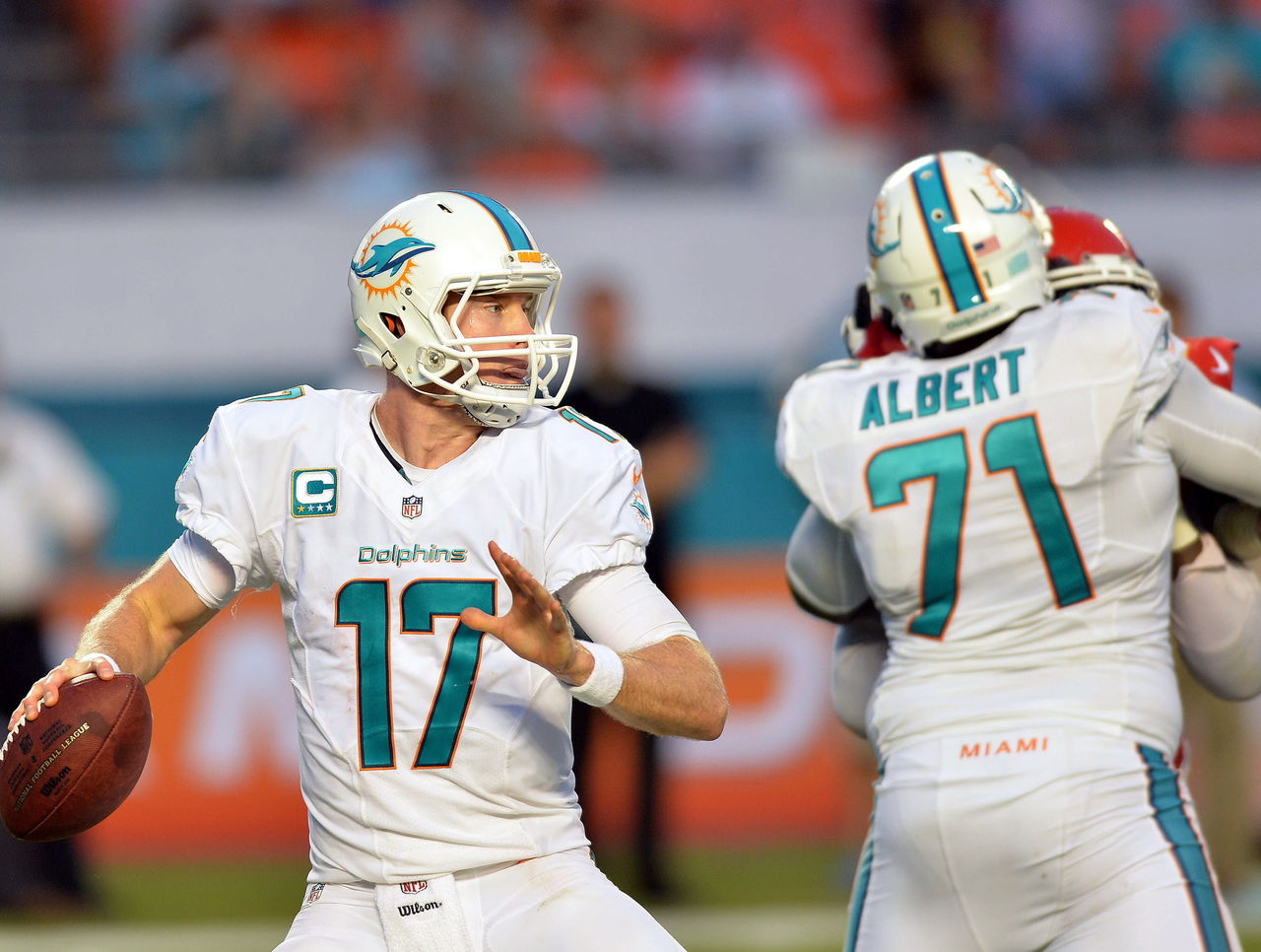
| Woods | Srinivasan | Wilkins |
|---|---|---|
| 21 | 20 | 16 |
▲ Gorgeous color scheme.
▲ All-white combination is among the best in the league.
▼ Redesigned uniforms don’t include enough orange.
▼ All-aqua combination should be burned.
18. San Diego Chargers
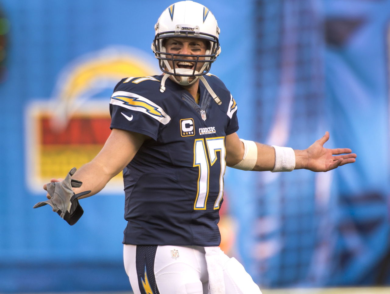
| Woods | Srinivasan | Wilkins |
|---|---|---|
| 11 | 27 | 15 |
▲ Embedding lightning bolts in stripes is a nice touch.
▼ Primary color scheme far less appealing than powder blue alternates.
▼ Bring back the numbers on the side of the helmets.
17. Denver Broncos
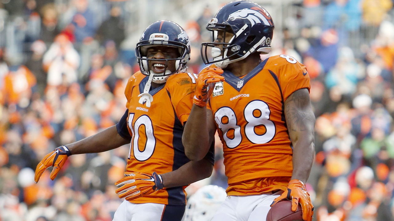
| Woods | Srinivasan | Wilkins |
|---|---|---|
| 15 | 13 | 24 |
▲ Return to orange primary jerseys was a good move.
▲ Helmet design is among the league's best.
▼ Stripes (that look suspiciously like a Nike swoosh) are large and distracting.
▼ Number font looks dated.
16. Seattle Seahawks
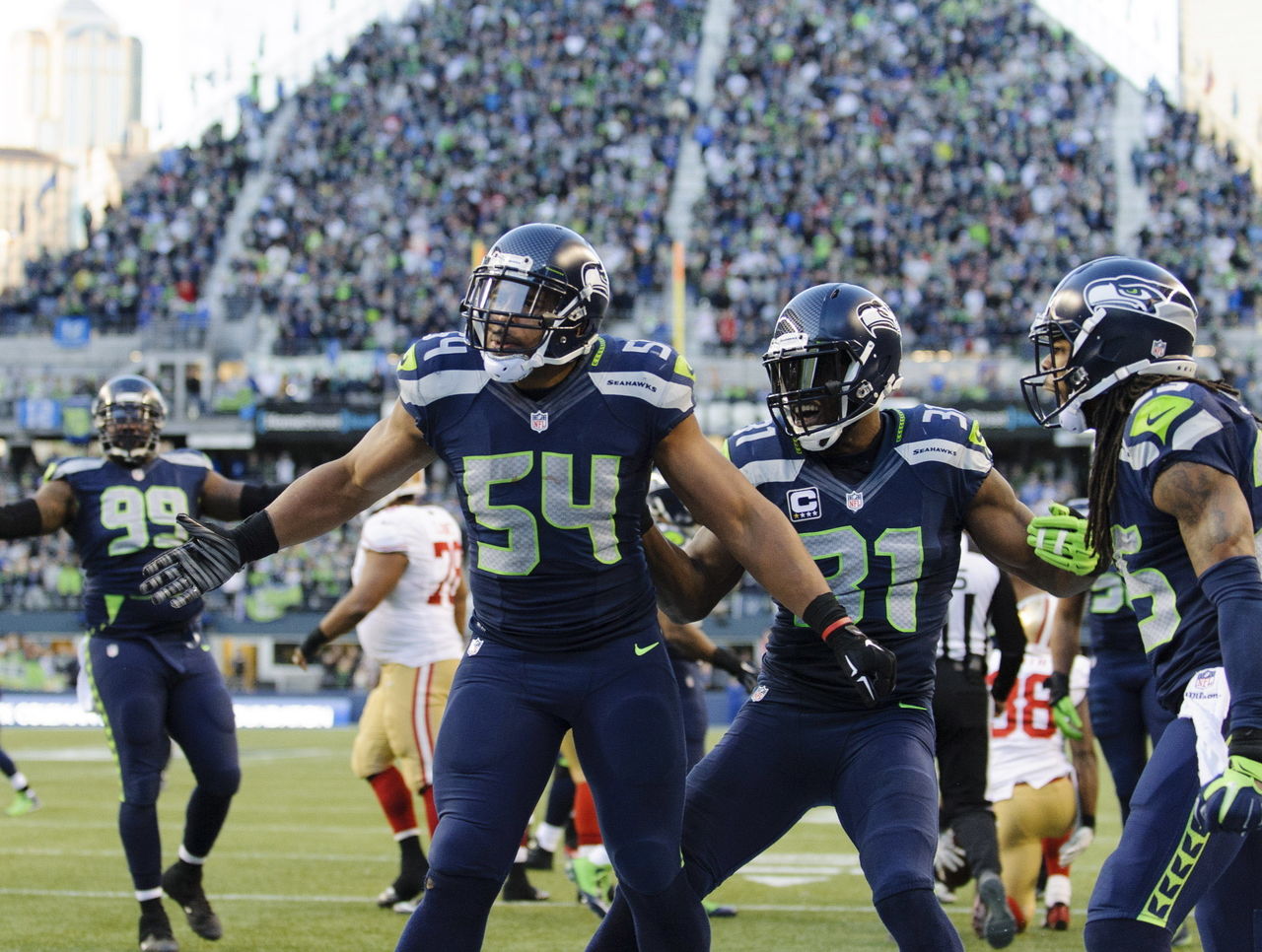
| Woods | Srinivasan | Wilkins |
|---|---|---|
| 22 | 11 | 18 |
▲ A well-executed ultra-modern design.
▲ Use of lime green is minimal, but effective.
▼ All-navy blue combination is superior to road and alternate uniforms.
▼ Gray alternate jerseys just look like dirty white jerseys.
15. New York Jets
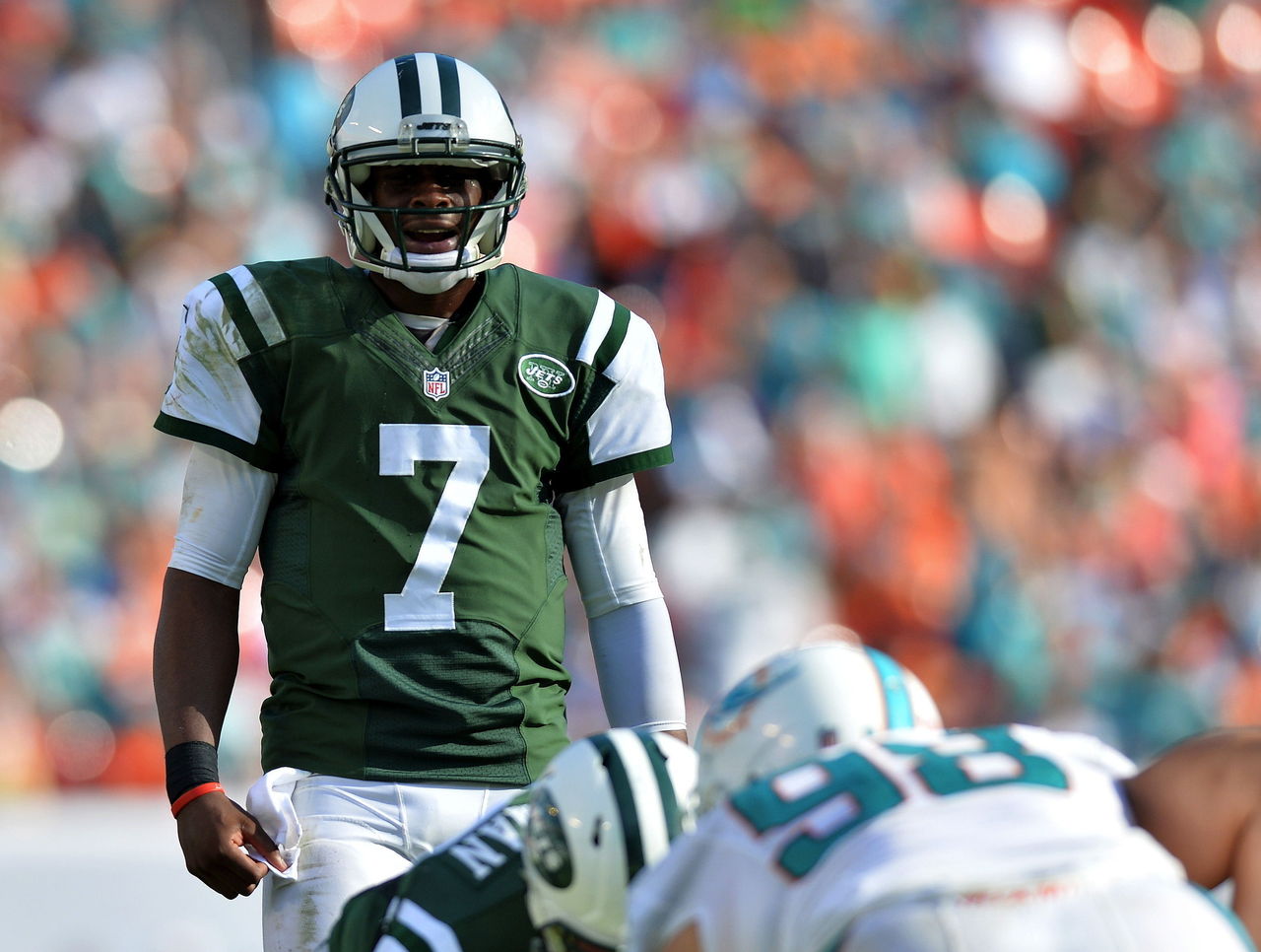
| Woods | Srinivasan | Wilkins |
|---|---|---|
| 23 | 12 | 14 |
▲ Green and white color scheme looks great on television.
▲ Stripes are consistent across helmet, jersey and pants.
▼ Shoulder stripes don’t really work on modern jersey templates.
▼ Logo could stand to be modernized.
14. Kansas City Chiefs
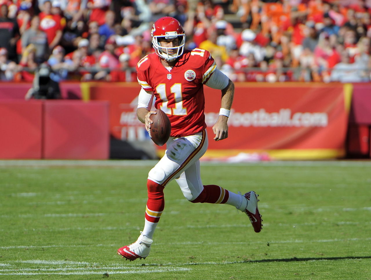
| Woods | Srinivasan | Wilkins |
|---|---|---|
| 20 | 16 | 11 |
▲ A classic look that works in all its variations.
▼ Stuck in the difficult place of not wanting to betray a longstanding design even though it’s relatively boring.
13. New England Patriots
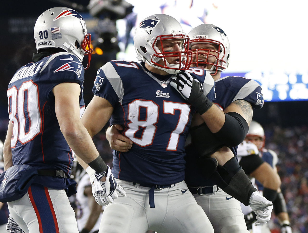
| Woods | Srinivasan | Wilkins |
|---|---|---|
| 24 | 14 | 8 |
▲ Silver shoulder decals and pants seamlessly blend into the overall uniform scheme.
▲ Use of red as an accent color is well-executed.
▼ Uniforms have become associated with winning, which helps to cover up inconsistent striping patterns between home and road uniforms.
12. Houston Texans
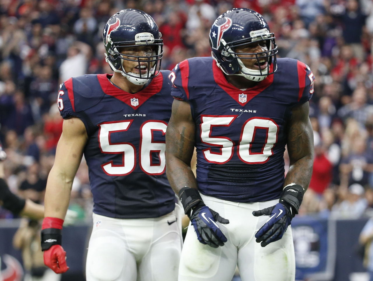
| Woods | Srinivasan | Wilkins |
|---|---|---|
| 16 | 10 | 17 |
▲ One of the best logos in the league.
▲ Red alternate jerseys are very nice (and should perhaps be promoted to primary jersey status). Just don't wear them with red pants.
▼ Gigantic collar completely takes over the front of the jersey.
11. Philadelphia Eagles
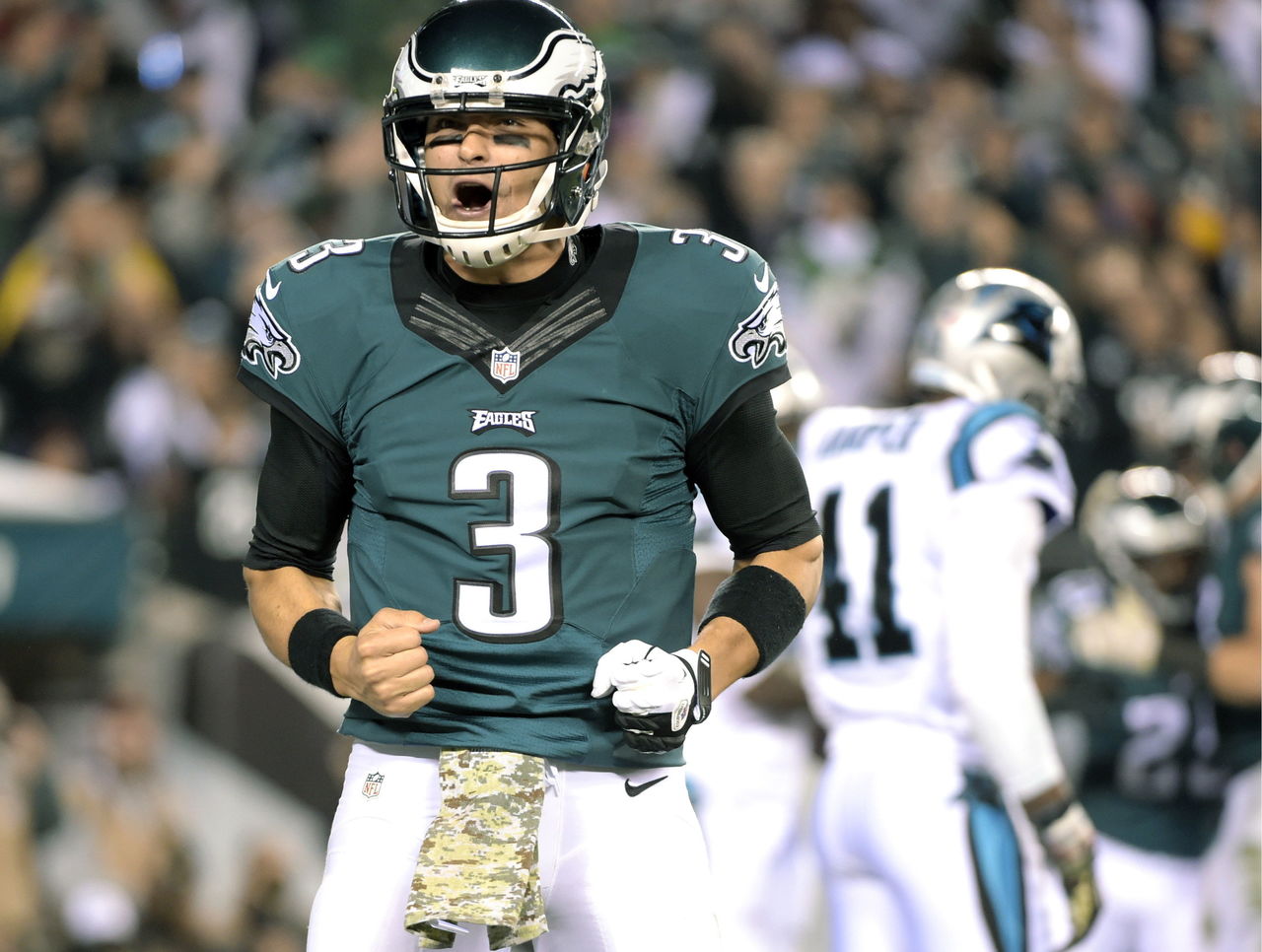
| Woods | Srinivasan | Wilkins |
|---|---|---|
| 12 | 22 | 6 |
▲ Winged helmets are awesome. Jerseys are appealing, if unspectacular.
▼ Just go back to Kelly green, already.
10. Minnesota Vikings

| Woods | Srinivasan | Wilkins |
|---|---|---|
| 9 | 6 | 21 |
▲ Matte helmets look great. Viking horn logo is inspired (even if vikings didn't actually wear horned helmets).
▲ Very appealing color scheme.
▼ Asymmetrical number font only looks good for some numbers.
9. New York Giants
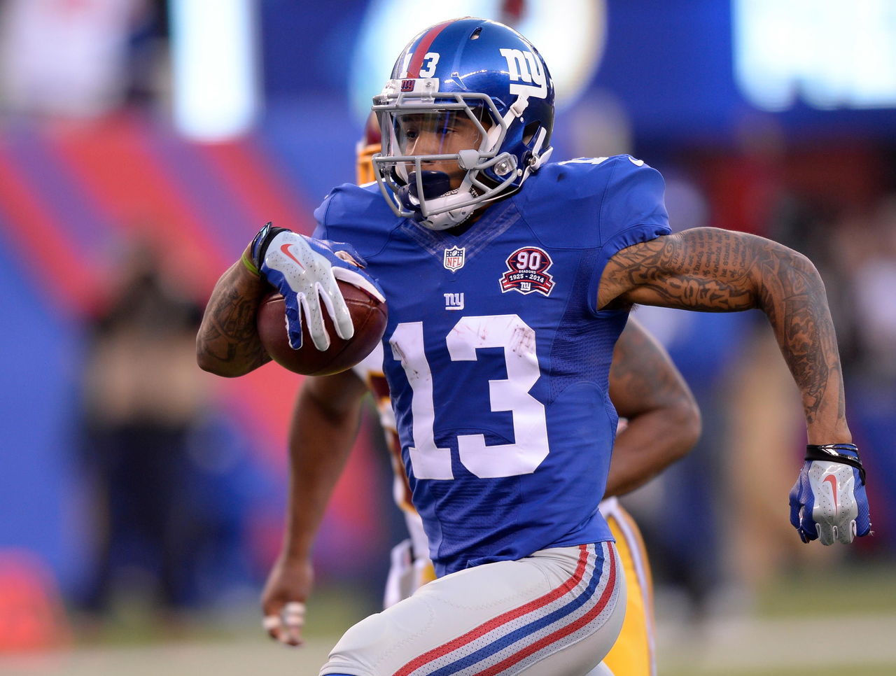
| Woods | Srinivasan | Wilkins |
|---|---|---|
| 13 | 8 | 13 |
▲ Sparkling blue helmets are beautiful.
▲ One of the few teams that can make gray look good.
▼ Why do "Big Blue's" road jerseys not include any blue?
8. Dallas Cowboys
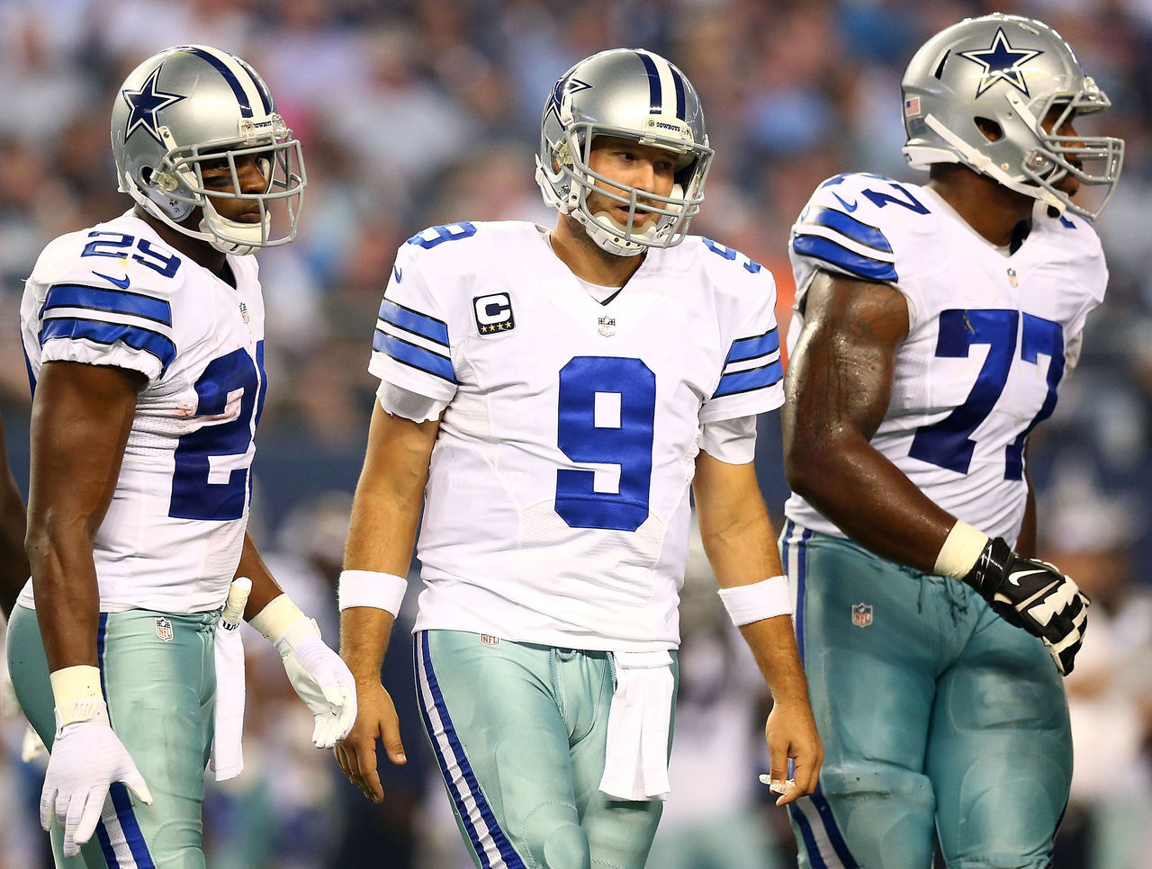
| Woods | Srinivasan | Wilkins |
|---|---|---|
| 6 | 15 | 5 |
▲ Logo is as iconic as any in pro sports.
▲ Wearing white at home is a cool tradition.
▼ Did you know the Cowboys have two different sets of silver pants, one of which has a slightly greenish hue? They do. And it's very weird.
7. San Francisco 49ers
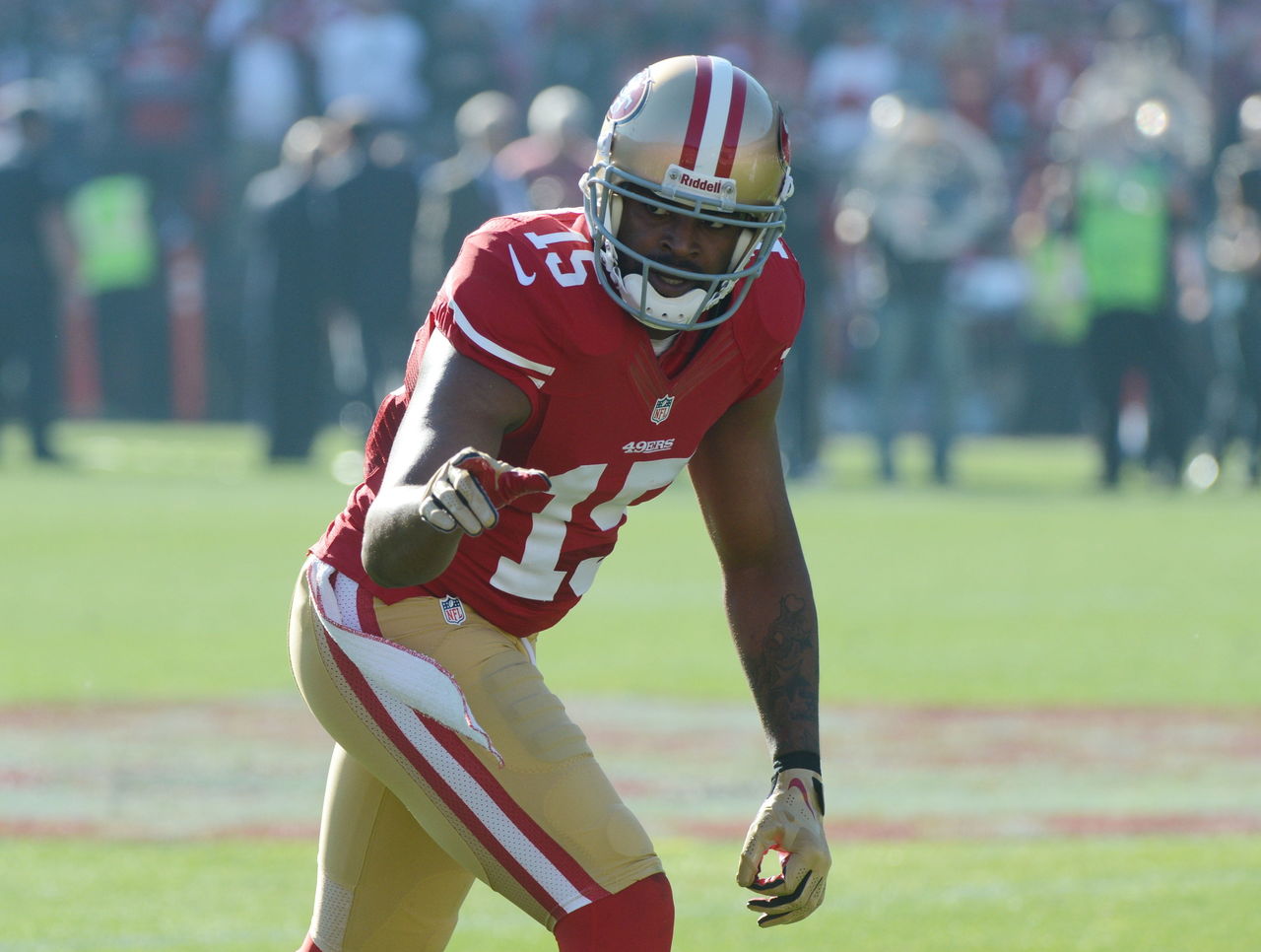
| Woods | Srinivasan | Wilkins |
|---|---|---|
| 2 | 7 | 12 |
▲ Colors sparkle under the Bay Area sun.
▲ Gold pants wouldn't look good on many teams but are somehow pulled off to perfection in this scheme.
▼ New black and red alternate uniform is hideous.
6. Indianapolis Colts
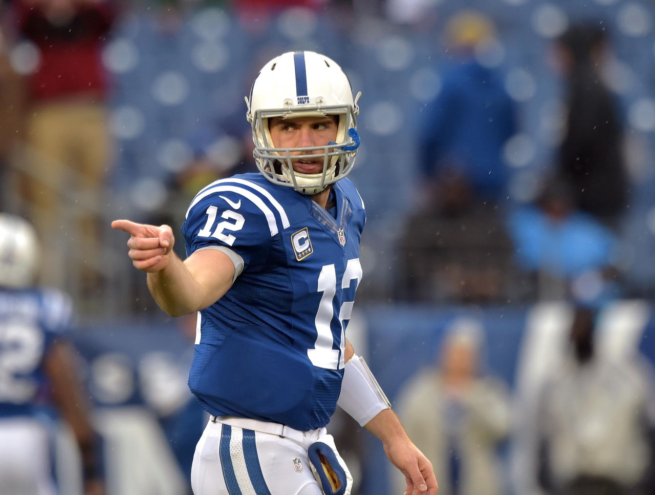
| Woods | Srinivasan | Wilkins |
|---|---|---|
| 7 | 1 | 10 |
▲ Modest color scheme executed to near perfection.
▲ Bonus points for never deviating from a clean, timeless look.
▼ Slightly inconsistent striping. The jerseys and pants feature a double stripe, yet the helmet has a single stripe.
T-4. Buffalo Bills
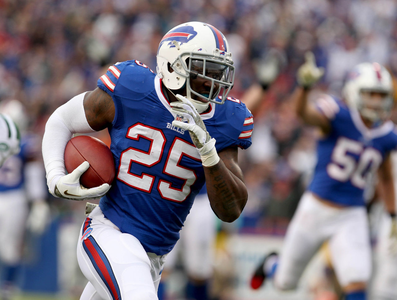
| Woods | Srinivasan | Wilkins |
|---|---|---|
| 5 | 5 | 7 |
▲ One of the nicest "fauxback" designs in sports. Seamlessly blends modern and traditional elements.
▲ There's no better use of the ubiquitous red, white and blue color scheme.
▲ Outstanding helmet design.
▼ All-blue alternate combination is a bit too much.
T-4. Pittsburgh Steelers
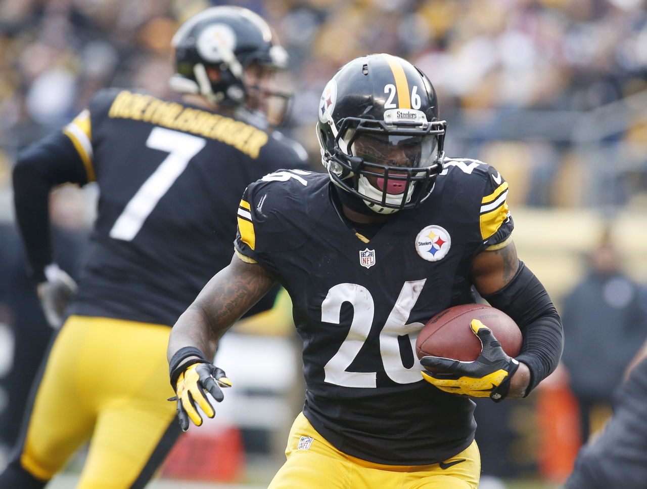
| Woods | Srinivasan | Wilkins |
|---|---|---|
| 4 | 9 | 4 |
▲ Unchanged and iconic, the Steelers' black home jerseys inspire fear.
▲ When your team colors inspire a hit song, you're doing something right.
▲ Logo on only one side of the helmet is a tradition worth preserving.
▼ Italicized number font may not be an upgrade over standard block.
▼ Bumblebee alternate uniforms are unique, but not exactly easy on the eyes.
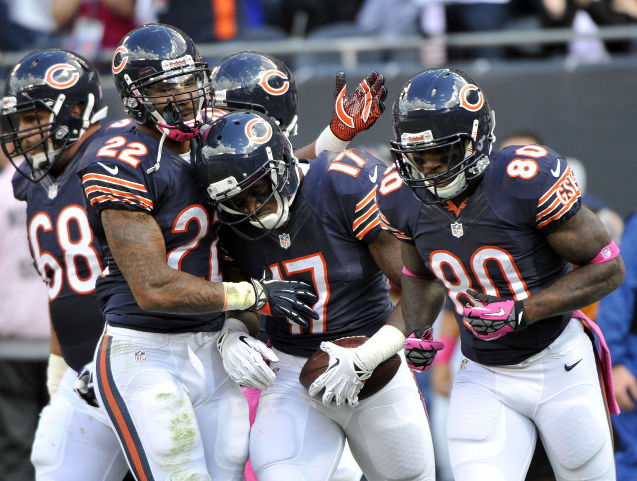
3. Chicago Bears
| Woods | Srinivasan | Wilkins |
|---|---|---|
| 8 | 4 | 3 |
▲ Navy blue and orange combination is one of the best in the NFL.
▲ Stripes are executed to perfection.
▲ Throwback uniforms are always a welcome sight.
▼ Is there a more boring logo in professional sports?
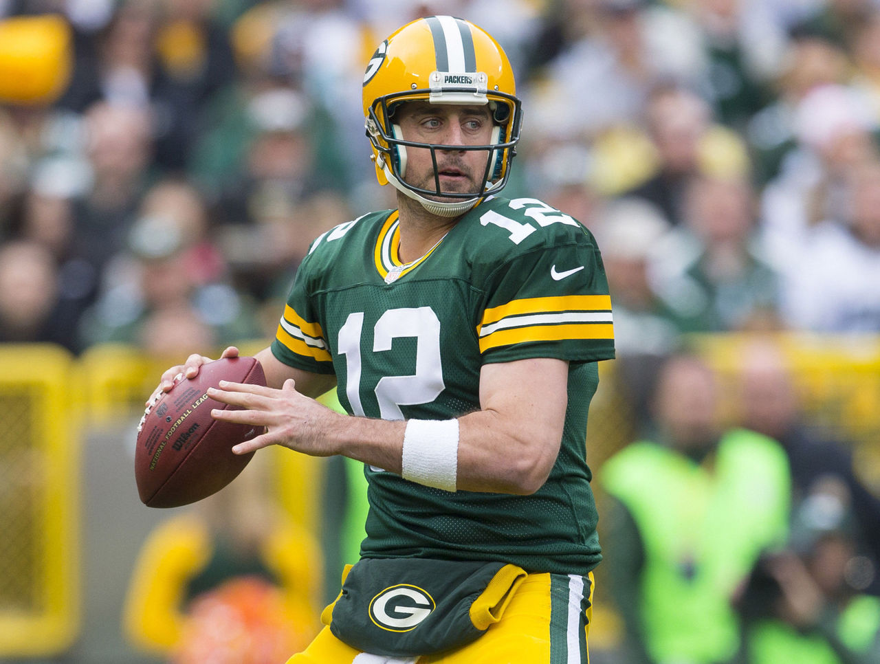
T-1. Green Bay Packers
| Woods | Srinivasan | Wilkins |
|---|---|---|
| 1 | 3 | 2 |
▲ Both Green Bay's home and road jerseys are largely unchanged since the AFL-NFL merger, and this consistency has made the green-and-yellow scheme an iconic look.
▲ Yellow helmets lend themselves to awesome "cheesehead" identity.
▲ Perfectly consistent stripes.
▲ Bright colors pop on both hot summer afternoons and frigid winter nights.
▼ Blue throwbacks (phased out after 2014) are a little goofy.
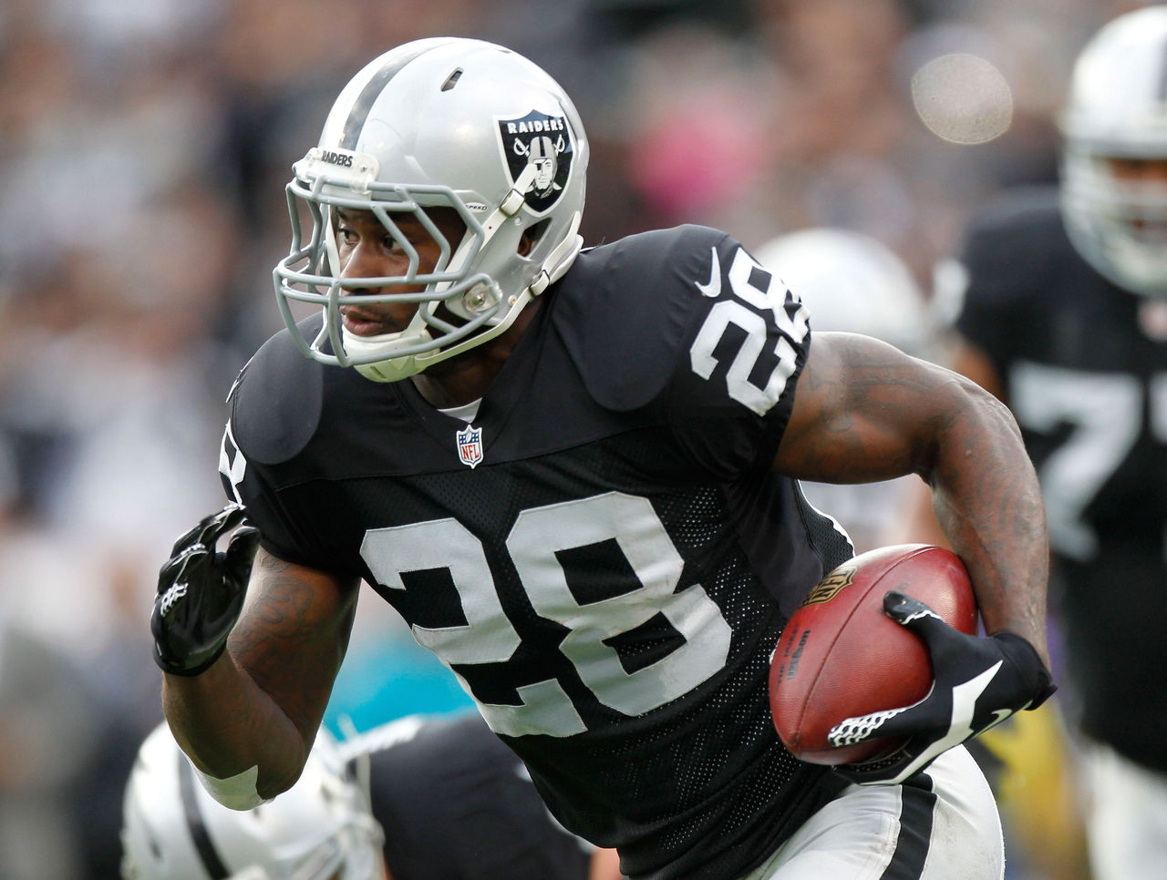
T-1. Oakland Raiders
| Woods | Srinivasan | Wilkins |
|---|---|---|
| 3 | 2 | 1 |
▲ Color scheme is symbolic of the team's patented toughness from the John Madden era.
▲ Every team that introduces an "intimidating" black alternate jersey is just copying the Raiders.
▲ Raiders merchandise was a symbol of hip-hop's rise to prominence, forever cementing its "coolness."
▲ One of few uniforms that has never changed and should never change.
▼ Jerseys have no stripes or wordmark and, thus, no identifying marks. They're just plain, black jerseys.
HEADLINES
- Nuggets claw back from down 20 to beat Spurs with Wembanyama out
- SGA surpasses Wilt's streak of 20-point games in win over Celtics
- Adebayo scores 21 vs. Bucks in follow-up as Heat celebrate 83-point game
- Titans reveal new logo, Oilers-inspired uniforms
- Ducks' Gudas ejected after knee-on-knee hit with Leafs' Matthews