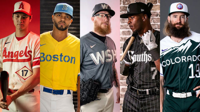
Now that we've seen all 14 City Connect jerseys in action and on the field, it's time to re-rank them all together. Major League Baseball launched seven in 2021, and we ranked them back then. However, with all the new information, let's see where the 2022 ones fit in and if anything has changed for us.
14. San Francisco Giants
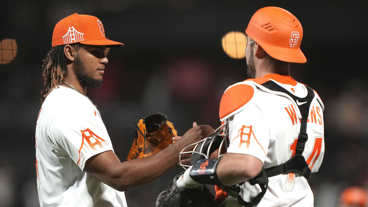
San Francisco is a vibrant, colorful city full of culture and life. It's one of North America's finest cities. And the best the Giants could come up with is a tribute to ... fog? Even the Golden Gate Bridge tribute seems oddly placed and minimized. These jerseys continue to lack imagination and creativity. A city as awesome as San Francisco deserves better.
13. Milwaukee Brewers
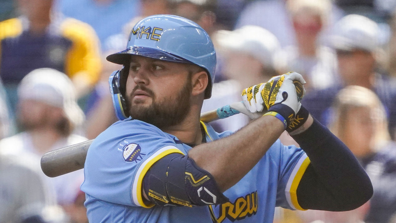
This uniform is saved from being dead last by the tiny shoulder logo that should've been displayed more prominently: the charcoal barbecue that looks like a baseball. It's yet another great little logo for a franchise with a ton of them. Unfortunately, not a single other thing works here, especially the hideous 'MKE' on the hats and batting helmets.
12. Los Angeles Angels
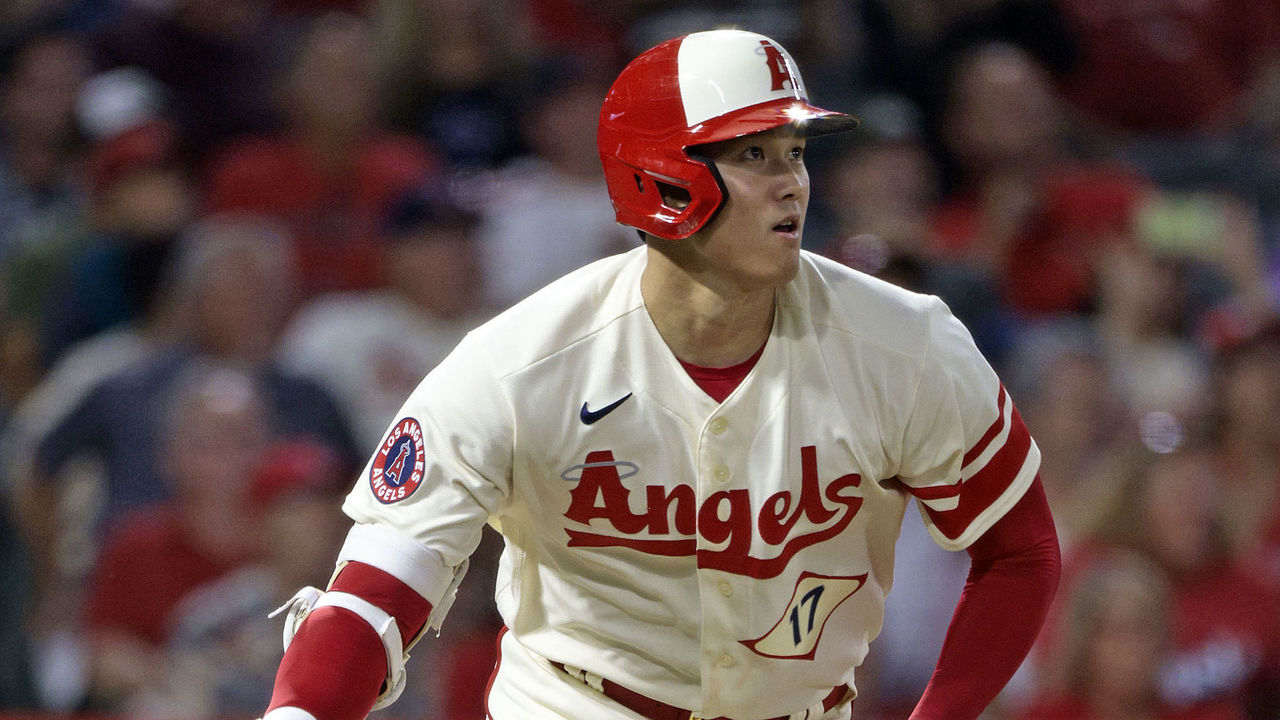
The Angels' uniform pays tribute to Southern California's laid-back surfing life and beach vibes, so choosing a plain white set works in this case. Points are also awarded for the sneaky fish tail at the end of the "s" in Angels, a nod to Mike Trout and Tim Salmon. The two-tone back with the name in red and the number in blue also looks sharp on field. But the rest of this set feels uninspired and bland. Maybe the designers embraced those laid-back SoCal vibes a bit too much while working on these.
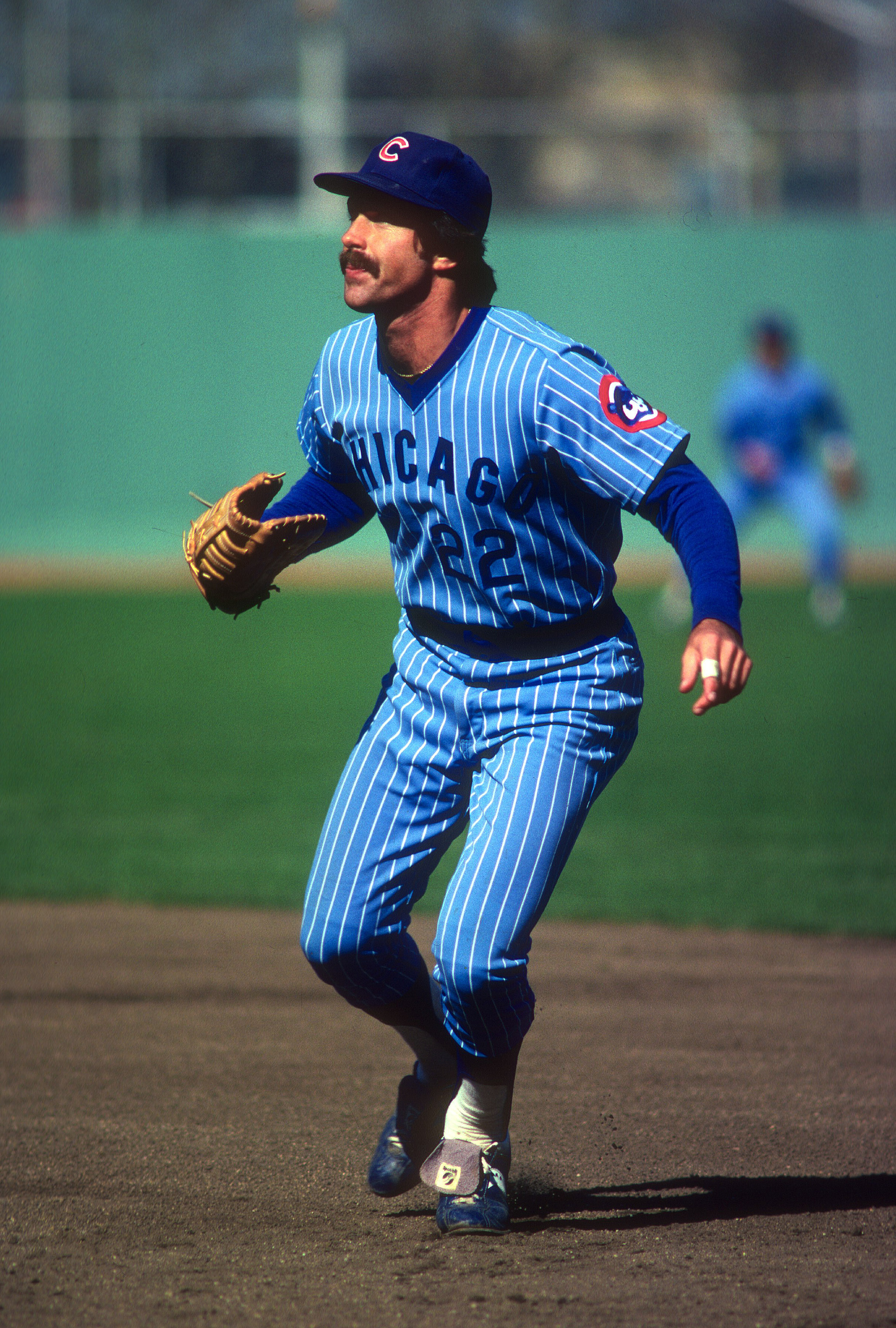
11. Chicago Cubs
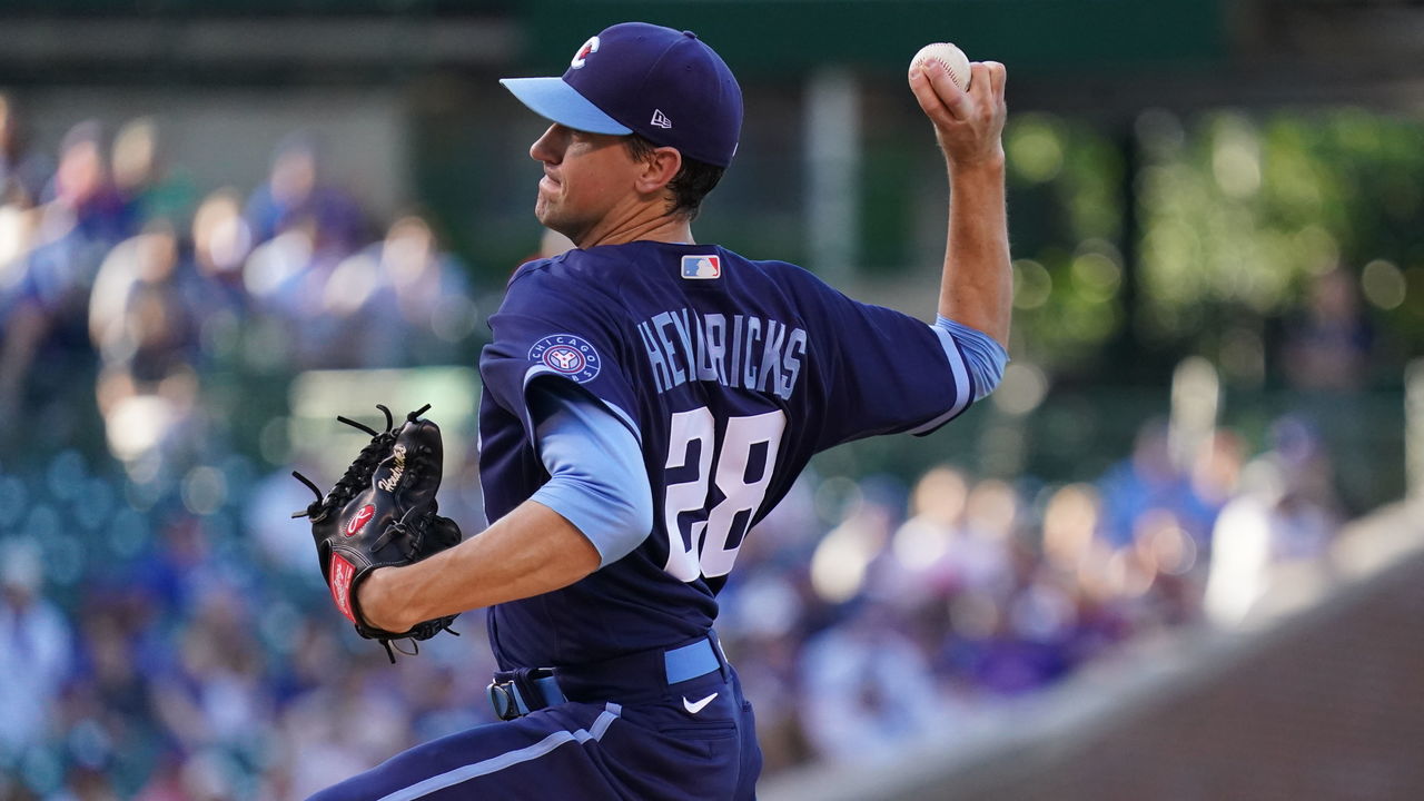
The Cubs doubled down on the blue with their tribute to the neighborhood that took its name from their iconic ballpark. Two shades of blue will always catch the eye, and there's no doubt this set has potential. At the same time, it continues to feel like these uniforms, which debuted last year, are incomplete. Some light blue font or even pinstripes (as an ode to a past gaudy Cubs design) would add a tribute to Wrigleyville's non-stop energy and kick this set into high gear.
10. Los Angeles Dodgers
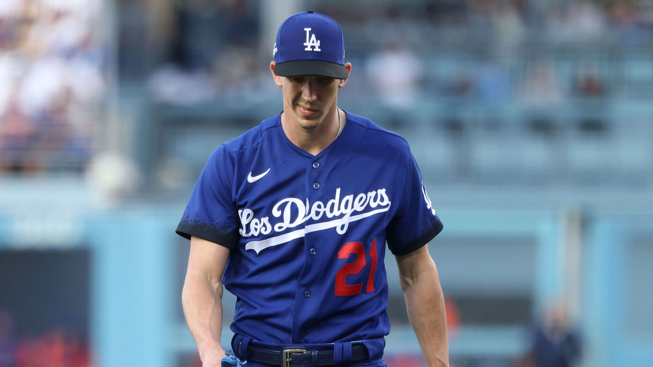
The Dodgers move up the rankings by fixing the worst part about their City Connect uniforms: the hats. Instead of having 'Los Angeles' crammed on there like last year, they went back to the classic script 'LA' and made the bill black. It's a uniform that still leaves you wanting more, but it's a lot sharper now.
9. Kansas City Royals
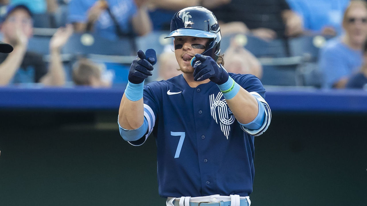
I don't think anyone would disagree that this is a fantastic jersey. The reimagined 'KC' logo with the crown in it looks great, and the two-tone blues are sharp. It just looks a bit too much like every other Royals jersey in history. Choosing fountains to base the design on pigeonholed them into using blues again, so it makes sense. We just wish they went a little bit more off the board.
8. Washington Nationals
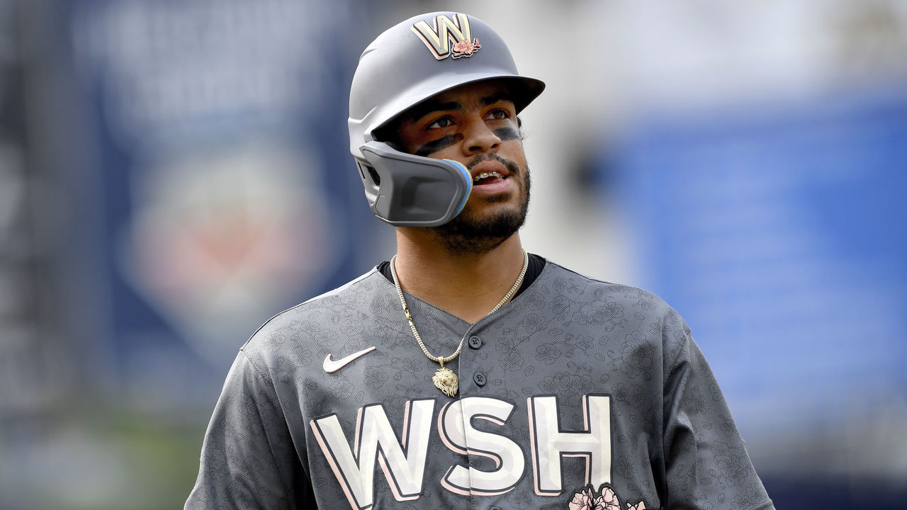
An ode to Washington, D.C.'s iconic cherry blossoms features a distinctive combination of dark gray and pink. The colors of the blossoms really blast off against the gray, and that's why it works. The "W" logo, an homage to Walter Johnson and the original Senators, earns this set some extra points. It's not flashy like some other City Connects. The small details don't show up on field especially well, and the cream pants are a bit boring, but it does the job.
7. Boston Red Sox
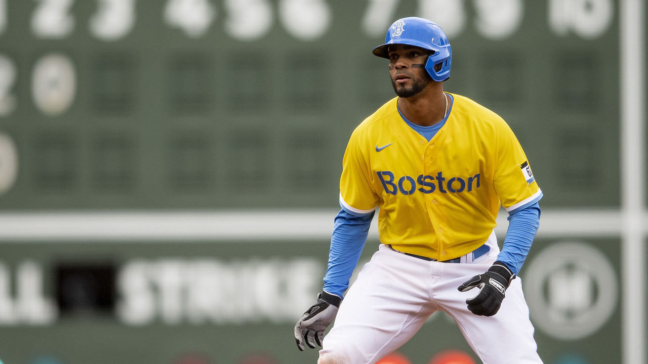
The first team to launch their City Connect, the Red Sox caused a stir by unveiling what pretty much everyone quickly deemed hideous. But now that the assignment has become clearer as more uniforms have been created, these are iconic. We maybe just wish the jersey numbers looked like a marathon runner's pinny number. Lean into it all the way.
6. Houston Astros
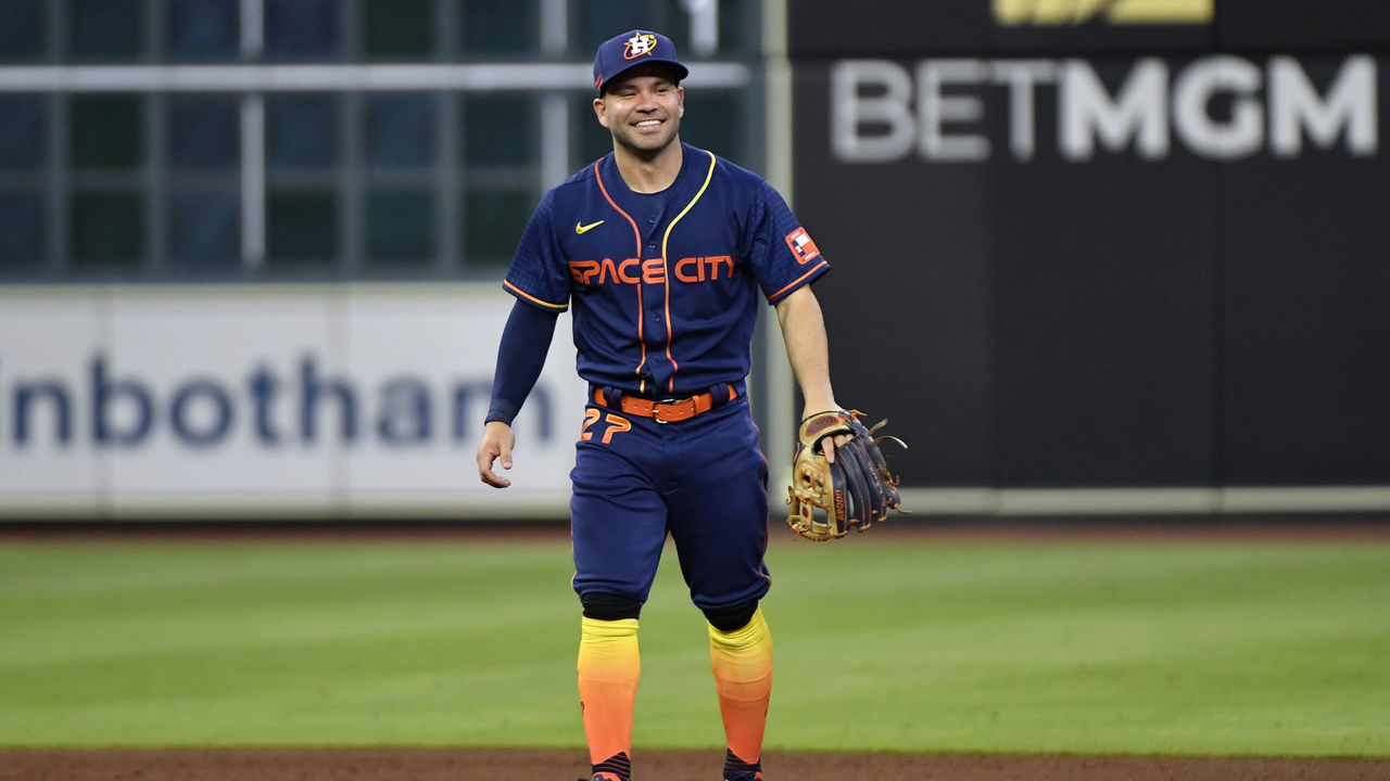
These caused the most dissent within our office, with one writer ranking them as high as second and another as low as 13th. They're kitschy, there's no doubt. But shouldn't a team named the 'Astros' be a little garish? They're in Houston and named after the space program, but they've never really leaned into that identity other than the name. This one finally does, and it's remarkably close to perfect. The hat, the number on the pants, the gradient yellow-to-orange piping, the flame-colored socks, it's just the right amount of cheesy.
5. Arizona Diamondbacks
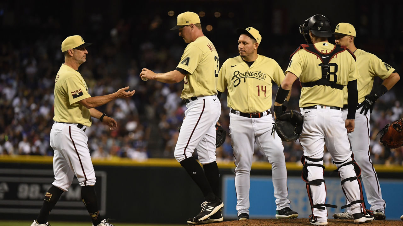
Yes, paying tribute to the desert isn't novel ground for Arizona teams - both the D-Backs and the NHL's Coyotes have previously used "sand" as an official color - but rarely does it pop like this. By reducing the color, the D-Backs' "Serpentines" set ends up as a smooth and beautiful ode to Arizona's desert, as well as the state's large Hispanic population. In this case, simplicity wins.
4. San Diego Padres
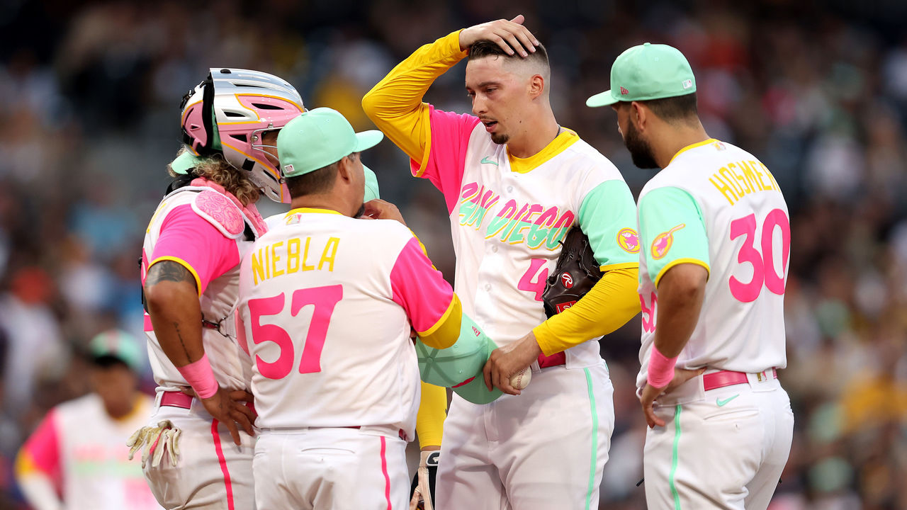
The Padres brought two countries together with their City Connect uniforms, uniting San Diego and Mexico's Baja California. The colorful uniforms are also inspired by San Diego's sunsets and ocean and "two vibrant cultures" on both sides of the border who root for the Friars. This likely wouldn't work if it were any other team. However, these are the Padres, the club that proudly rocked brown and gold until it became iconic. They're the only team that could ever make this uniform work, and it sure does.
3. Miami Marlins
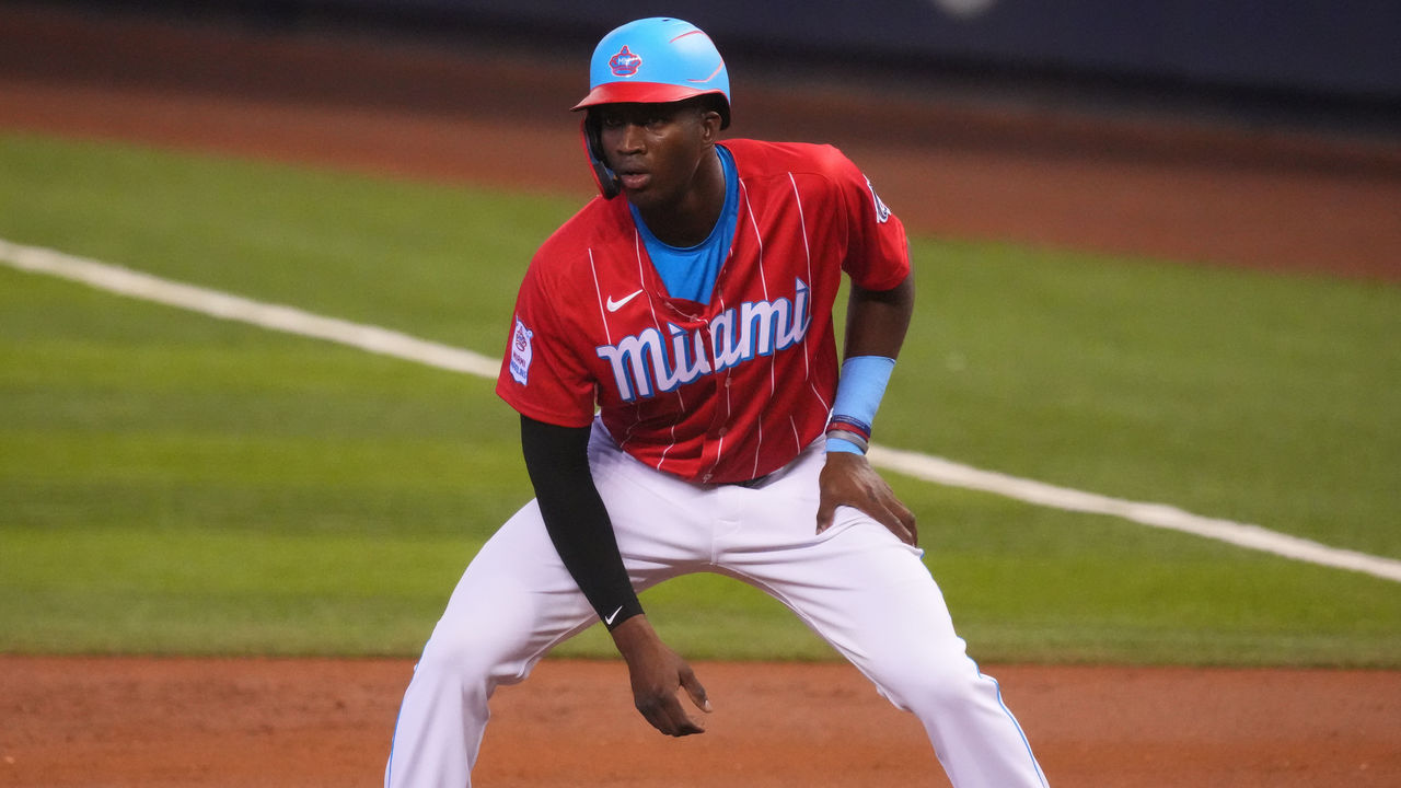
A team in Miami likely could have gone any number of directions, but choosing to pay homage to an old Triple-A club that played in Cuba in the 1950s is perfection. A Heat-like Miami Vice jersey probably would've been a crowd-pleaser, but it's also low-hanging fruit at this point, and the Sugar Kings tie the Marlins more directly to their baseball heritage. The bright blue hat/helmet might be a smidge too much on field, but that's straining to nitpick at this point.
2. Colorado Rockies
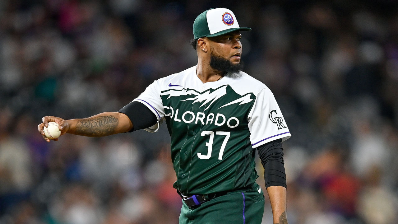
The Rockies hit all of the notes for a City Connect, somehow fitting everything you want without making it look too busy. The hat might be the best one the Rockies have ever had - heck, the whole uniform is probably the best Colorado has ever produced. There are also far too few green franchises in North American sports, making this immediately stand out. And, while we love the green pants with the purple pinstripe down the side, Chad Kuhl wearing white pants with the fit makes us wonder if that's a better look:
#Rockies Chad Kuhl wore this uni for his bullpen today. What do you think? White pants with City Connect jersey. pic.twitter.com/GBvGw3cJsL
— Patrick Saunders (@psaundersdp) June 19, 2022
1. Chicago White Sox
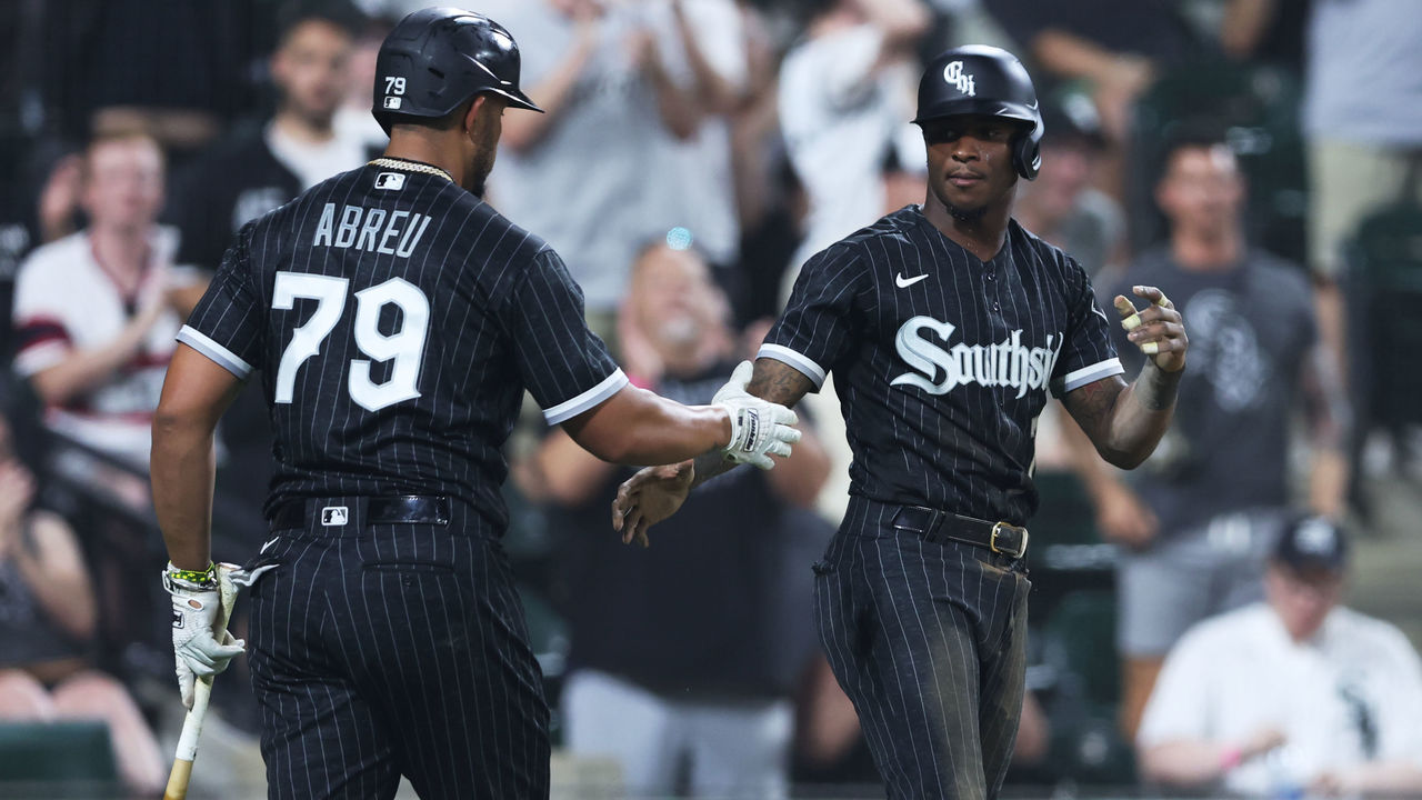
When all is said and done, the White Sox are still the standard. The all-black look is a great fit for a franchise that's often defined by hard work and grit and perfectly represents the South Side of Chicago's tough, blue-collar population. Yes, it's unconventional. But the White Sox have a long history of wearing unique and innovative uniforms, so it works. It's an instant classic that hasn't aged a bit.


