World Cup of Hockey Jersey Rankings
The World Cup is a best-on-best competition, but the NHL's international tournament is also a showcase.
It's an opportunity for the league to market its best and brightest talent while creating and selling new merchandise.
Several squads introduced brand new looks for the event, two of the entries needed logos for the first time, and others made minor tweaks to traditional designs.
Here's how we rate the eight teams' jerseys:
8. Europe
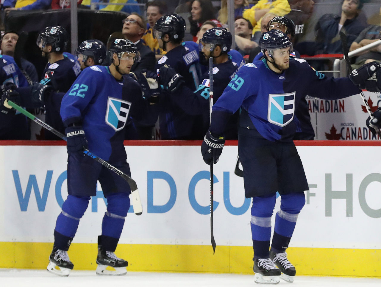
It's hard to come up with a jersey concept for a team made up of players from multiple nations, but that doesn't really excuse Team Europe's sweaters.
The two principal colors don't mesh well, and dividing the jersey down the middle makes it look like it was designed by Harvey Dent.
The shield is a good idea, but the half-E on the right side isn't immediately noticeable because it looks more like a stick and puck when viewing the entire crest.
7. North America

"The North America team is a group of young talented phenoms who will play in black and white under an inclusive badge of brotherhood," the NHL.com release claims.
Brotherhood or not, neither the white, grey, and black road uniforms you see above, nor the black home jerseys are particularly easy on the eyes.
The "N" and "A" on the crest look like a stretched out version of the San Francisco Giants' cap logo. Team North America has been exciting to watch, but its jerseys leave something to be desired.
6. United States
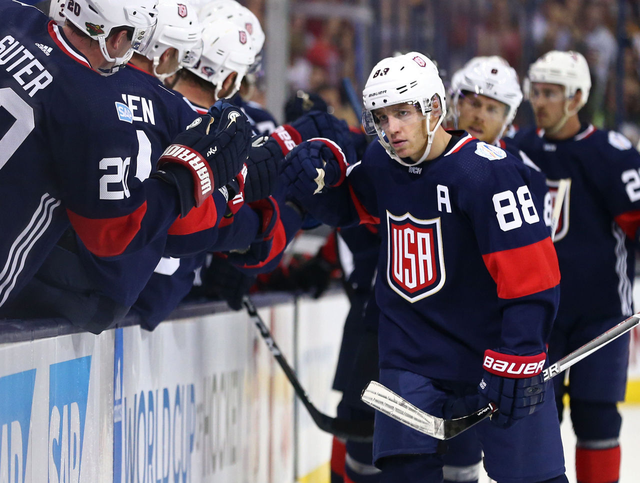
These American jerseys are a bit disappointing, considering how terrific their Lake Placid-inspired sweaters looked in recent Olympics.
The two U.S. World Cup designs are certainly original, but the road uniforms look like they were created in MS Paint, and neither the home nor road jerseys feature national symbols like stars or prominent stripes.
5. Russia
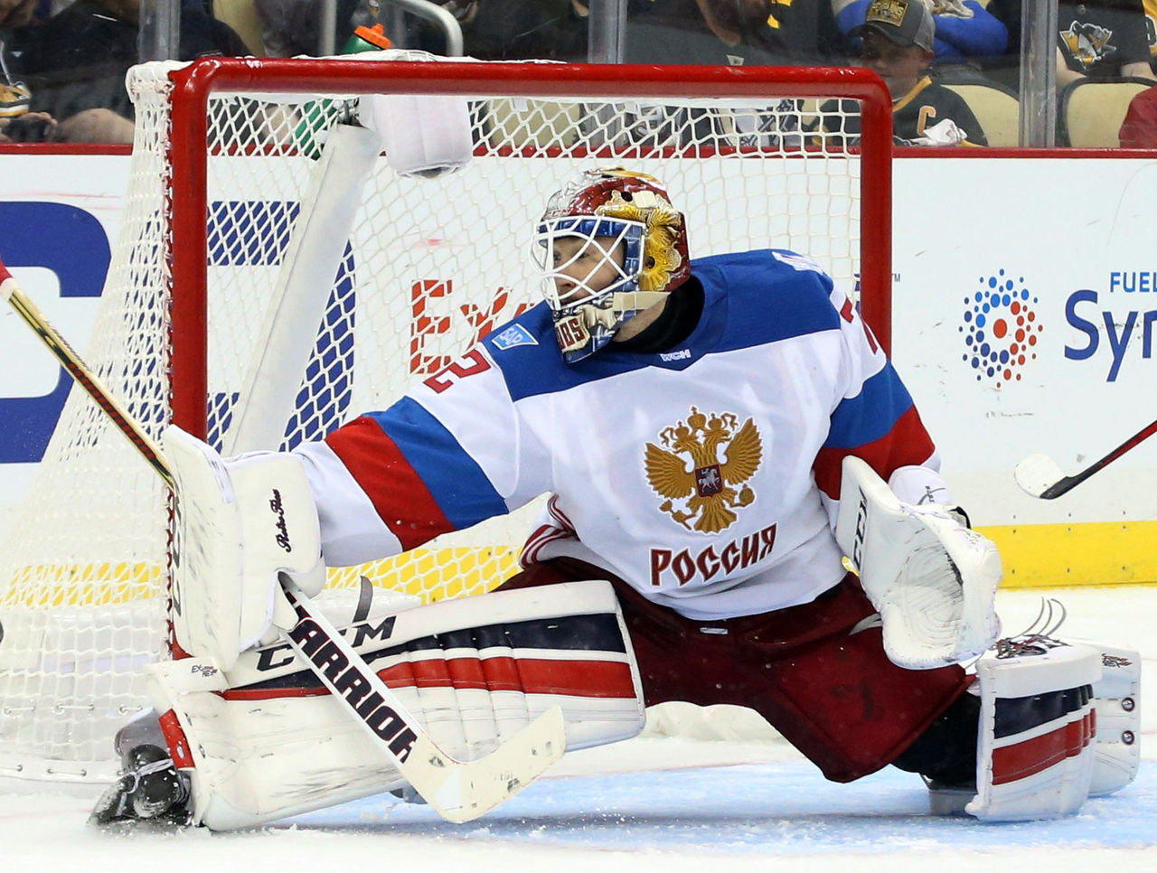
Russia didn't take any risks with their World Cup jerseys, and that's just fine. The double-headed eagle flies proudly on the players' chests, while the blue and red stripes on the sleeves blend with the white base to form the Russian flag.
4. Finland
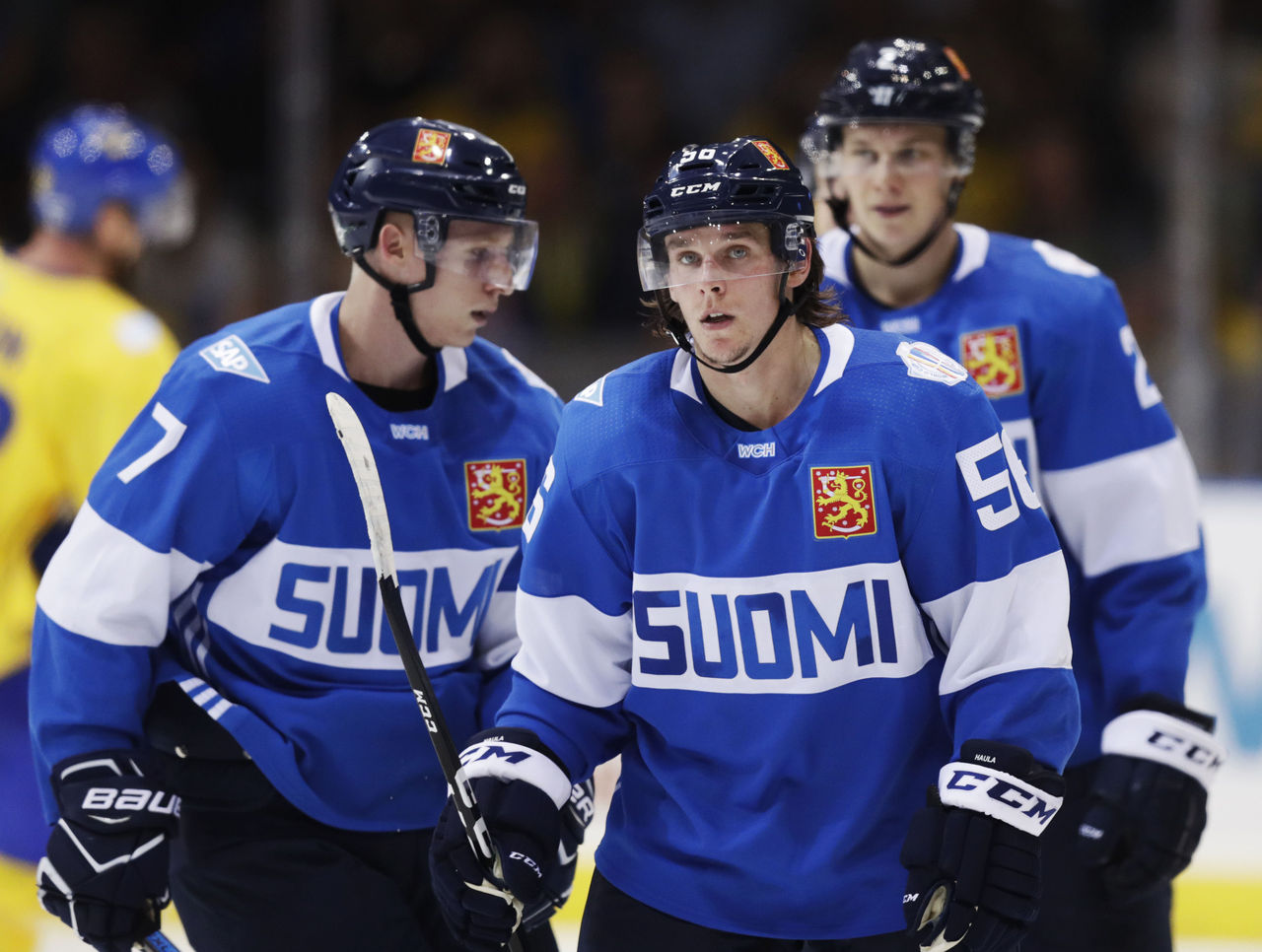
The Finnish home jerseys are slick, with the name of the country in large lettering in blue over a white stripe and the national crest over the heart.
Finland's jerseys aren't typically eye-catching, and its road jersey for this tournament is much more traditional, but this one is creative.
3. Czech Republic
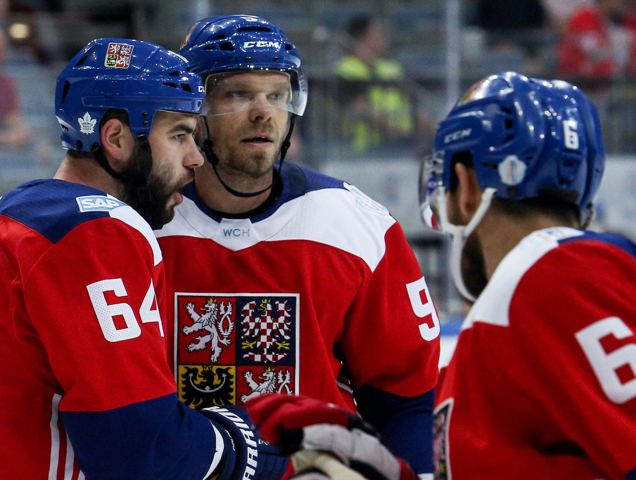
The Czechs' white away jerseys are essentially their traditional look, but their home reds really pop.
The blue and white shoulders match the blue helmets, and the crest on the front blends well with the red background.
2. Sweden
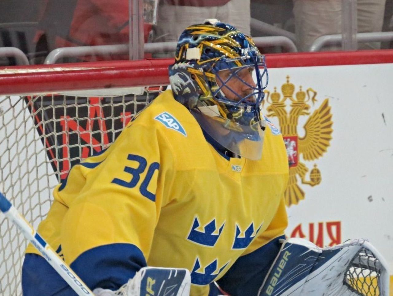
Sweden has one of the simplest designs, and it's not much different from what they typically wear at international competitions.
Still, there's something to be said both for the aesthetically pleasing blue and yellow color scheme, the Tre Kronor (three crowns), and the lack of lettering.
Sometimes, less is more.
1. Canada
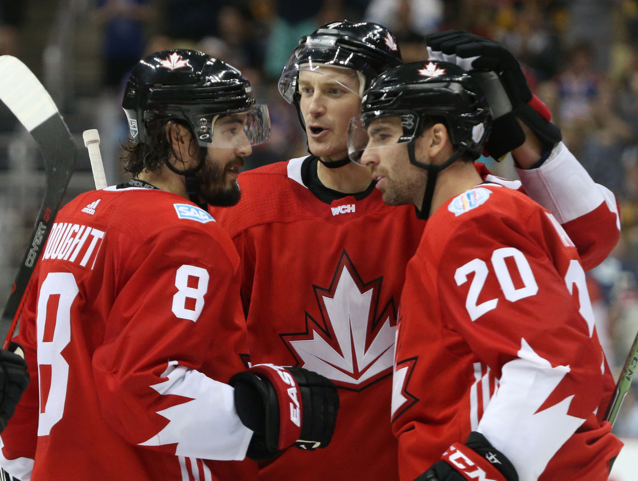
Canada's jerseys are scrutinized by millions north of the border every time they're updated, but there's a lot to like about these.
Much like the Swedish and Czech sweaters, the Canadian jerseys emphasize simplicity while drawing on national symbolism.
There's also an ode to the Canada Cup and Summit Series teams with the white leaves on the sleeves of the home uniforms, and that's a nice touch.
All photos courtesy Action and Getty Images
HEADLINES
- Brewers' Uribe gets 1-game ban for crotch-chop gesture
- Giants' Carter felt need to call out Dart to show he's against Trump
- Bouchard out for remainder of Worlds after Lindgren hit
- Report: Magic hiring Sweeney as head coach
- Robinson didn't break finger in game or practice, Knicks won't 'get into specifics'