2015-16 Premier League home kit rankings
A new season brings new talent to the Premier League, but it also brings new home shirts for fans to wear with pride. Well, sometimes; for every pretty shirt, there's an ugly one.
So, here's how the 20 new shirts stack up before being shown off for the 2015-16 Premier League season.
20. Crystal Palace
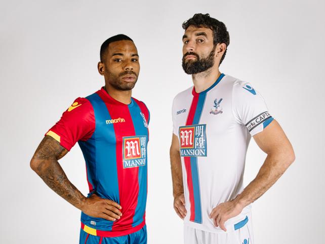
(Courtesy: Crystal Palace)
Something about the shiny fabric and the crayon-red-and-blue colours make Palace's home shirt look like a shoddy knockoff found at a flea market for about £15. That's not a good thing.
19. Liverpool
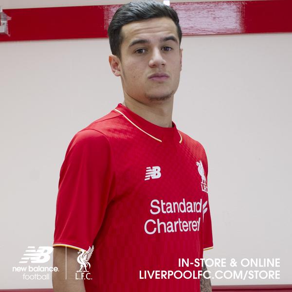
(Courtesy: Liverpool)
This year's Liverpool kits, like last year's, are simply not okay. Remember when Liverpool wore Adidas shirts? Those were the days.
18. Everton
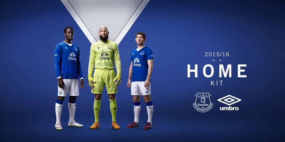
(Courtesy: Everton)
When will Everton drop those atrocious deep-V-neck lines? Not this year, it seems, and so Everton drops down our rankings instead.
17. Norwich City
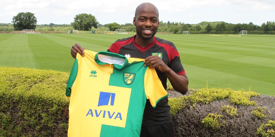
(Courtesy: Norwich City)
Youssouf Mulumbu looks like he likes the shirt. He might be the only one.
16. Leicester City
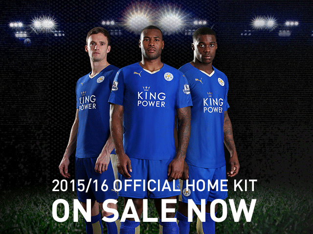
(Courtesy: Leicester City)
Points added for looking like a rip-off of the Italian national team's shirt with a sponsor. Points deducted for looking like a blue T-shirt bought in packs of 10.
15. Sunderland
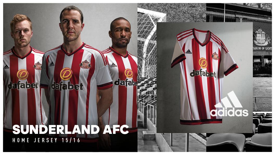
(Courtesy: Sunderland AFC)
Sunderland dropped the heavy black, red, and white tones and went for red and white stripes, which is already terribly overdone. In fact ...
14. Stoke City
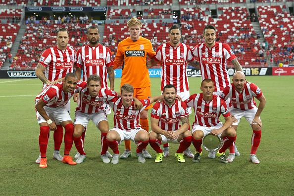
(Courtesy: Stoke City)
... Stoke City did their best Southampton impression with these plain, boring red and white stripes ...
13. Southampton
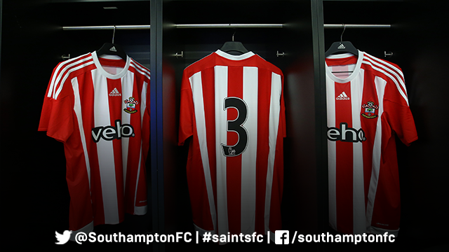
(Courtesy: Southampton)
... and then Southampton did their best Stoke City impression with these equally boring red and white stripes.
12. Manchester United

(Courtesy: Footyheadlines)
This one hasn't officially been unveiled yet, but a U.S. store started selling them early so here it is. It's far too plain to blow us away, but if you're a Red Devil, there won't be any mistaking you. Still, a big club should wear bolder shirts, no?
11. Aston Villa
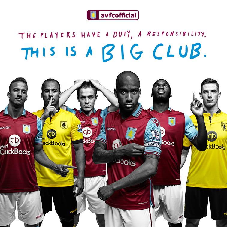
(Courtesy: Aston Villa)
Aston Villa's kits look okay, but if you have to tell your own fans that you're a big club, it kind of defeats the purpose of being in the Premier League. The shirts aren't bad, but they're not great, either.
10. Tottenham Hotspur
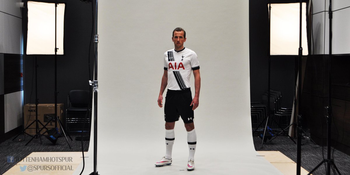
(Courtesy: Tottenham)
Tottenham said they would be keeping with tradition with his year's kits, then revealed a shirt with a sash, something the club has never worn before. But they look nice enough, so we'll let it slide.
9. West Ham United

(Courtesy: West Ham)
West Ham took the throwback look and proceeded to release a kit inspired by its original 1904 shirt. It's a nice classic look, but having "betway" along the front isn't so fun.
8. Chelsea
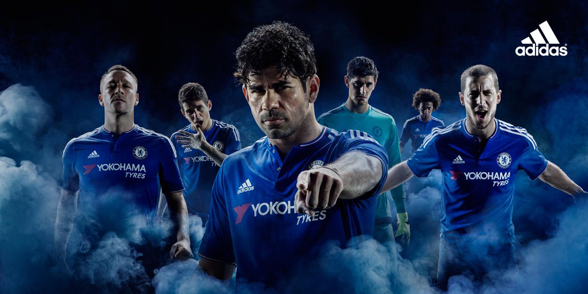
(Courtesy: Chelsea FC)
Chelsea's tag line for this kit was "if it's not blue, it will be" but that didn't stop new sponsors Yokohama from painting a bit of red onto the kit. It's slightly ironic, but Chelsea's plain blues neither thrill nor spill, putting the defending champs out of the top four.
7. Arsenal
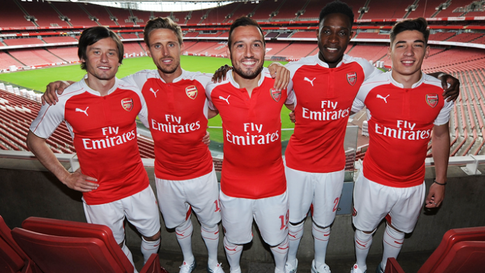
(Courtesy: Arsenal)
Arsenal's vibrant-red and clean-white shirts are simple, classy, and instantly recognizable on the field. This years' offerings from Puma keep in line with the club's colorful history without going over the top, either.
6. Swansea City
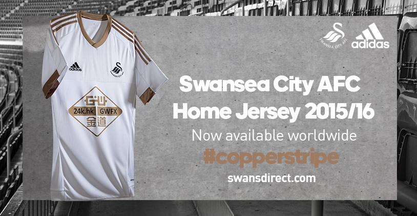
(Courtesy: Swansea City)
Swansea City has entered uncharted territory with these white and copper shirts and, well ... we like 'em. Not sure if that means the team is rusting away or about to shine, so we'll let the players write the rhetoric this season.
5. Watford
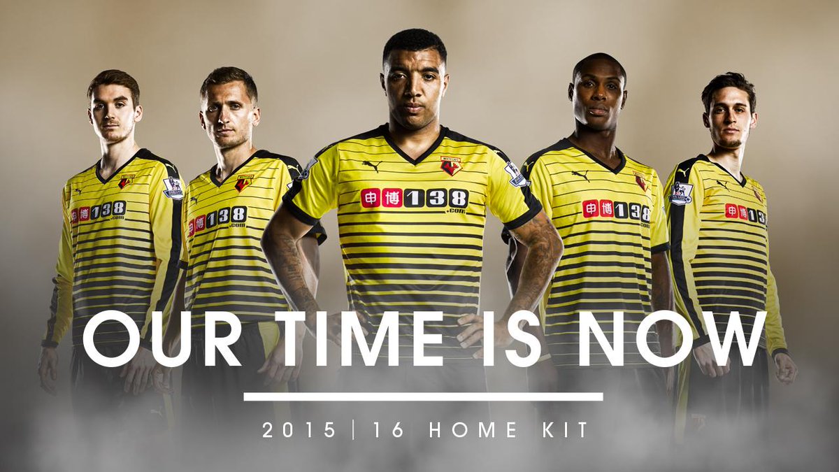
(Courtesy: Watford)
Love it. The Borussia Dortmund look is awesome and there's not enough yellow in the Premier League, so kudos to Watford for going with a bold, horizontal-striped look.
4. Bournemouth
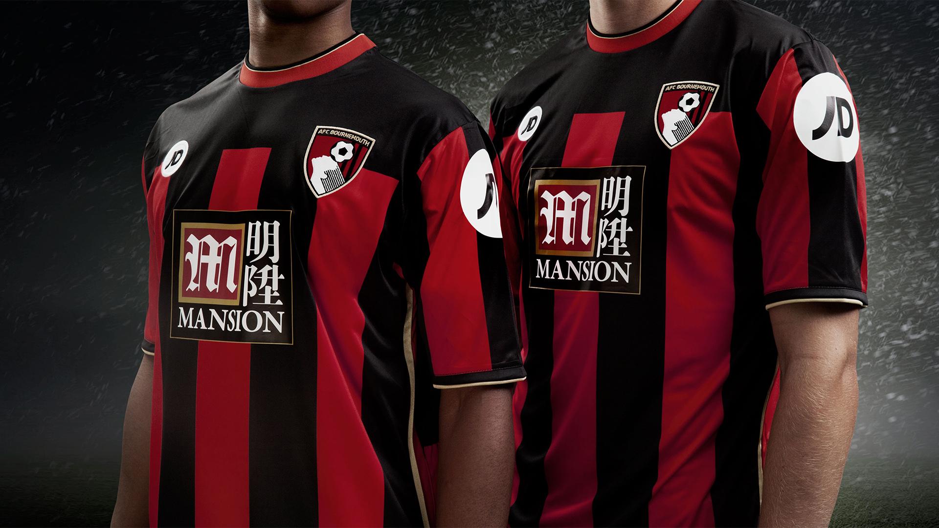
(Courtesy: AFC Bournemouth)
Beautiful from top to bottom, the red and black block-stripe theme goes perfectly with the club crest, and the sponsor logo isn't too bold, either. This kit soars high because of that collar, though. Manufacturers JD should be proud.
3. West Bromwich Albion
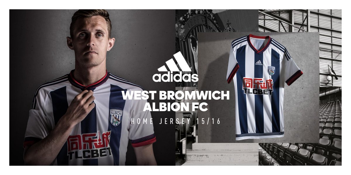
(Courtesy: West Brom)
This one is absolutely gorgeous. The colours, the trim, the collars, and sleeves, all of it comes together perfectly. West Brom may not be contenders in the league but they're certainly contenders in this contest.
2. Manchester City
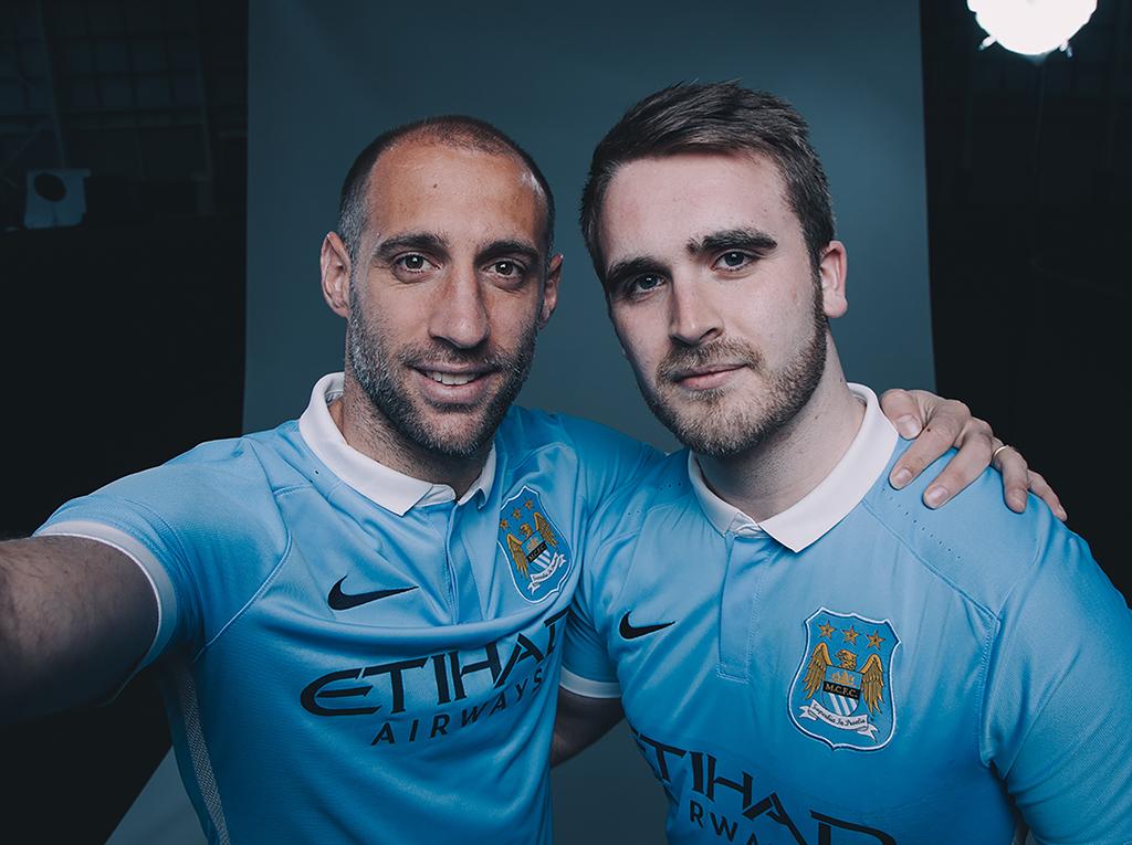
(Courtesy: Manchester City)
Sky blue is unique enough and the white collar is really classy, so it gives City fans a unique look at away games in the Premier League. But, we have to ask: why is Manchester City copying New York City FC's look? (We're kidding, of course).
1. Newcastle United
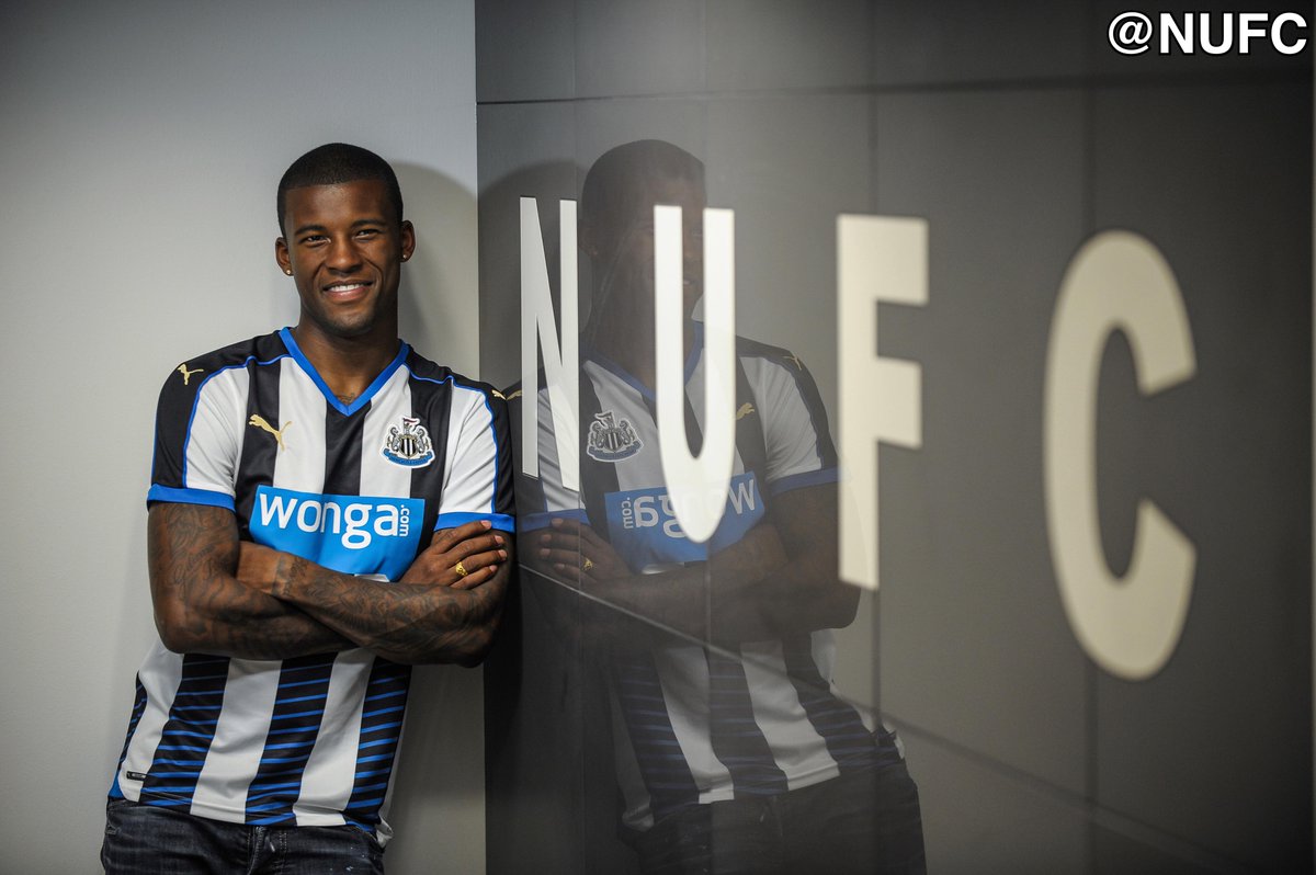
(Courtesy: Newcastle United)
Newcastle has found redemption at long last. This new home shirt is oh so pretty, a considerable feat when keeping in mind the club's awful, awful away kits from years past. The electric-blue trim makes this otherwise simple black and white shirt pop and makes the Toon Army the best-dressed of 2015-16.
HEADLINES
- Titans reveal new logo, Oilers-inspired uniforms
- Ducks' Gudas ejected after knee-on-knee hit with Leafs' Matthews
- Cowboys' Jones doesn't rule out re-engaging Crosby trade talks
- Geno Smith sees chance to 'make things right' in return to Jets
- Spoelstra: 'I apologize to absolutely no one' over Bam's 83-point game