Grading MLB's uniform changes for 2017
Another winter is finally gone, and Sunday a new baseball season begins - as do the lives of many new uniforms across baseball. There was only one major redesign, but quite a few new and improved alternates will be donned around the league this year.
Since we're all just rooting for laundry anyway, we've picked our own favorite pieces of new laundry for this season. Here is theScore's review of MLB's most notable uniform changes for 2017.
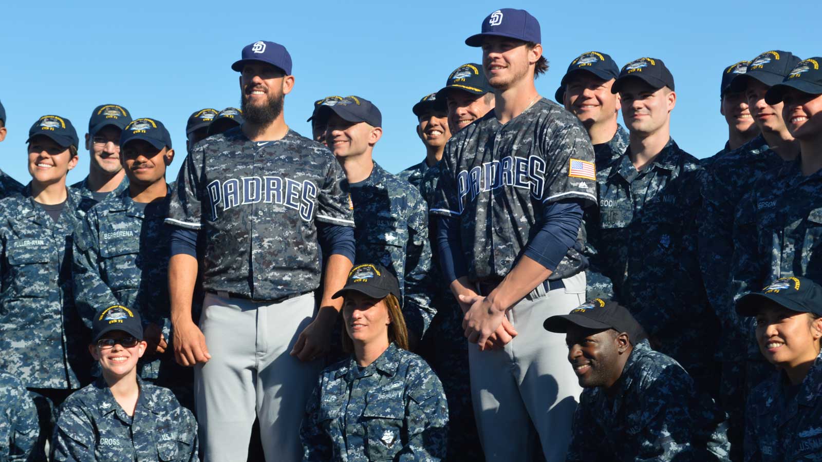
San Diego Padres
Introducing the 2017 #Padres uniform lineup! pic.twitter.com/mDyUO7pMiX
— San Diego Padres (@Padres) November 22, 2016
Grade: F
Really, Padres? After bringing some yellow back to the main set in 2016 (plus a wicked brown alternate) and giving fans a little hope of a return to their glorious colorful roots, the Padres instead somehow made baseball's blandest design even worse.
Their new road jersey is both dull and not all that new. Look at the PowerPoint-style "San Diego" on the road grays and you'll notice it's a nearly exact copy of the 2004-11 road font from jerseys that weren't very well-liked either. How did no one see this? Also shelved after just one year is 2016's beautiful home jersey, which brought life (and yellow) back to Petco Park; in its place is "Padres" in blue across the chest in block lettering. Shrug. These changes were greeted with lots of anger on social media in November.
We'll grant a point for keeping the brown alternates around, along with their improved Sunday camos - but come on, Padres, this is getting ridiculous. Your changes last year finally had you on the right track, and then you ditch it all - including your sick special All-Star gray jersey - for this? It's time to return to your roots as the loud, colorful, mustard-yellow and brown - even brown and orange - Padres who openly flaunted the laws of the uniform for almost 30 years and still made it an iconic look. If you won't do it for your fans, then do it for the players, so they can at least look good while finishing in last place.
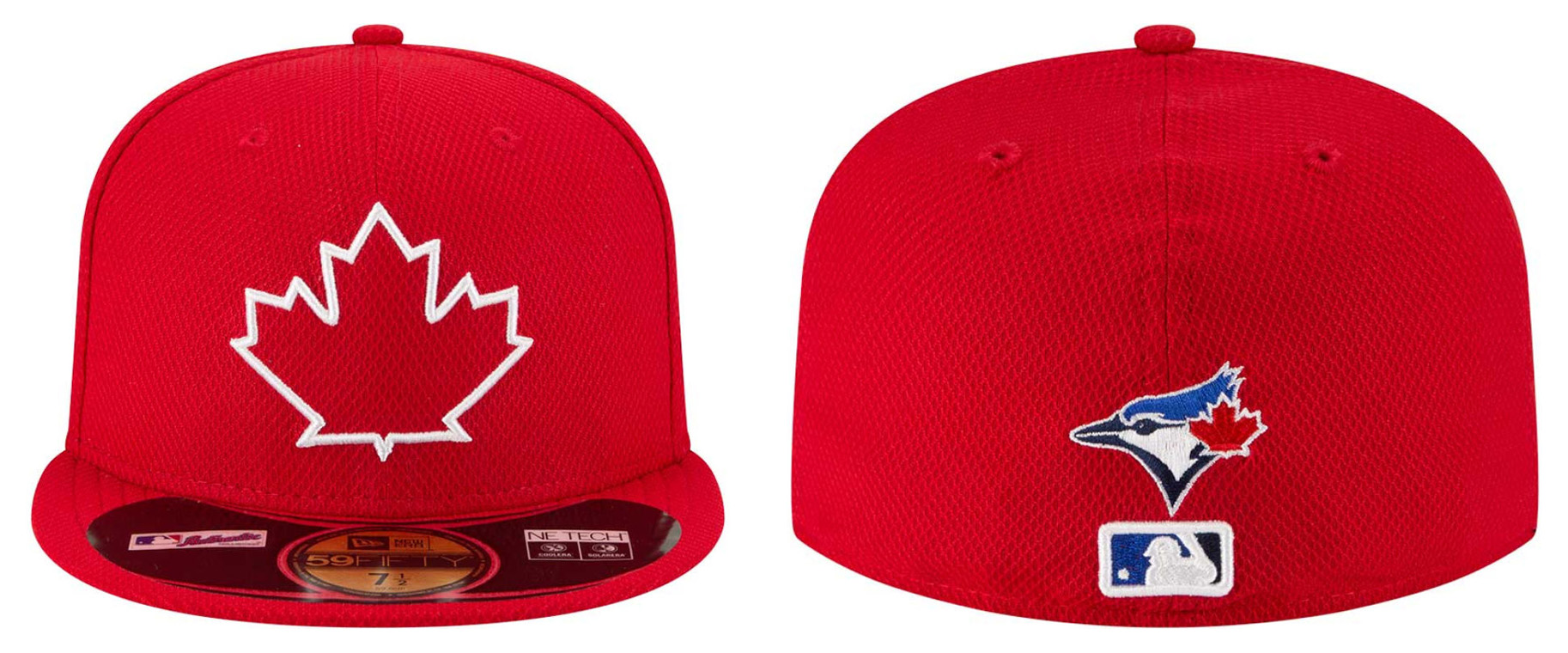
Blue Jays red alternate
👀 Another look at our red and white alternate uniforms! 🔥🔥🔥 pic.twitter.com/bsGFluwlNa
— Blue Jays (@BlueJays) January 20, 2017
Grade: C
Canada's team will celebrate Canada's 150th birthday by donning red jerseys every Sunday. They're similar to what the Blue Jays wear every year on Canada Day, except there's not even a trace of blue in these; also, there's a weird red maple-leaf hat. But the real problem lies in the jersey's Canada Day roots. By expanding red to all Sundays, Canada Day at Rogers Centre - a unique baseball tradition - has lost a little of what makes that afternoon so special. Wear this red gear once a year and it's cool; in the regular rotation, though, it'll get old pretty fast.
Giants black alternate
Giants changing "SF" logo on black home alternate jersey from outlined to solid this season. Old version on left, new on right. pic.twitter.com/dHn07ZBf5J
— Paul Lukas (@UniWatch) March 20, 2017
Grade: B-
After weirdly going black-on-black with their black alternates for years, the Giants switched the "SF" logo to orange on their Saturday jerseys - and boy does that make a difference. Still, it's a needless black alternate, and we do prefer their Friday orange tops.
Indians alternates
To clarify various Wednesday reports, here is our 2017 uniform plan.https://t.co/GMkDu208IX pic.twitter.com/wgrVzaDIr5
— Cleveland Indians (@Indians) December 15, 2016
Grade: C+ (hat alone gets a B)
Cleveland ditched its retro-ish cream alternates, but the slick red "C" cap remains and will be worn with the navy alternates at Progressive Field; the controversial Chief Wahoo hat will still pair with the alternates on the road.
Points for taking another step toward quietly getting rid of that dated cartoon logo, but this is still an aesthetic loss overall. The brighter red hat clashes too much with the navy jerseys, while the cream offered a reprieve from the status quo of a good 20-year-old set that's nevertheless showing its age a bit.
Nationals Stars and Stripes alternate
New #Nats home jerseys for 2017! #NatsWinterfest pic.twitter.com/EkZy6nGwC8
— Let Teddy Win! (@LetTeddyWin) December 10, 2016
Grade: A (jersey), B- (navy cap), D (red cap)
Washington's navy Stars and Stripes jersey now has a partner - and this one actually works. Putting the "W" flag design on a white top brings out the patriotic look far more effectively than almost hiding it on dark blue, and it's of course perfect for the nation's capital. The navy alternate hat is fine, but points off for the Stars and Stripes on a bright red cap. Yikes.
Pirates alternate cap
This is the new hat that will be worn with the camo jerseys this season. -RI pic.twitter.com/D4xFYOaEx0
— ROOT SPORTS™ | PIT (@ROOTSPORTSPIT) March 30, 2017
Grade: B- alone, C- with the camo jersey
Good news: The Pirates' weird camouflage cap is gone in favor of a mustard (or "old gold") cap that gives us visions of 1971. Bad news: These hats will be worn with what remains baseball's worst camo uniform.
HEADLINES
- Giants finally score 1st run of season after tying dubious franchise record
- Cease strikes out 12 in debut as Blue Jays win in extras
- Judge wins 1st ABS challenge after many meetings on new system
- McDavid regains scoring lead with 3 points vs. Ducks
- Doncic suspended 1 game after receiving 16th technical foul