When the NHL announced its Reverse Retro series for the 2022-23 season in October, there was a rush to rank the 32 new jerseys. The New York Islanders' entry - a remix of an infamous 1990s look - graded well, ranked fifth, 11th, 12th, 15th, and 17th by various media outlets, including theScore.
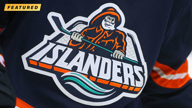
The Islanders would have dominated the competition if the rankings had been based on origin story instead of aesthetics. The "Fisherman 2.0" alternate, which will be worn for the sixth and final time Saturday night, is a throwback to one of the worst (and shortest) runs for a major pro sports logo and jersey.
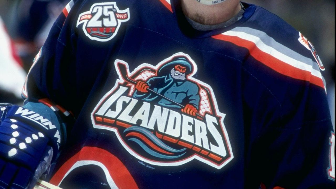
The original Fisherman, a quintessentially '90s graphic with a burly seafarer, three-dimensional lettering, and wavy stripes, was worn for only the 1995-96 and 1996-97 seasons due to a "comedy of errors." That's how Nick Hirshon, a longtime Isles fan and author of the 2018 book "We Want Fish Sticks: The Bizarre and Infamous Rebranding of the New York Islanders," describes it.
The critical "error" was the logo leaking months before the planned unveiling. The New York Daily News printed it alongside an article ripping the Isles for departing from their classic look and pointing out that the logo's grimacing fisherman closely resembled the mascot for Gorton's frozen seafood. At the time, the club was only a decade removed from four straight Stanley Cups, yet failing miserably under general manager and head coach Mike Milbury.
The Daily News article established a mocking narrative around the rebrand.
"I don't know if the fan base would have embraced the logo anyway. There would have been comparisons to the Gorton's fisherman by other people," Hirshon said. "That said, the Islanders made a lot of mistakes. They did not have focus groups or fan interviews before they finalized the logo. They also didn't really have a good sense of how the fan base felt about the original logo or that fans would be really upset about seeing the departure from tradition."
According to Hirshon, the Isles' market research was limited to minority owner Stephen Walsh asking his young son for his opinion of a mockup of the fisherman logo (thumbs-up) and a front-office executive holding up an early version of the jersey for a group of college students (50-50 approval).
Sports branding in the '90s wasn't as sophisticated as it is now. Plenty of franchises skimped on research. However, the Isles cut too many corners in order to save money, Hirshon notes, and generally approached the rebranding exercise from a delusional vantage point. For instance, they opted for a loud jersey in hopes that rappers might wear it in music videos on MTV. The front office also thought Billy Joel - the Long Island native who wrote songs about the area, including one about fishermen, "The Downeaster 'Alexa'" - might suddenly become an Isles fan.
"Jack Nicholson doesn't sell a lot of L.A. Lakers tickets. Spike Lee is not the one selling New York Knicks tickets," Hirshon said of the team's odd fascination with Joel, who didn't have an official relationship with the Isles, even after the rebrand. "You don't go to games because a celebrity is going to be there."
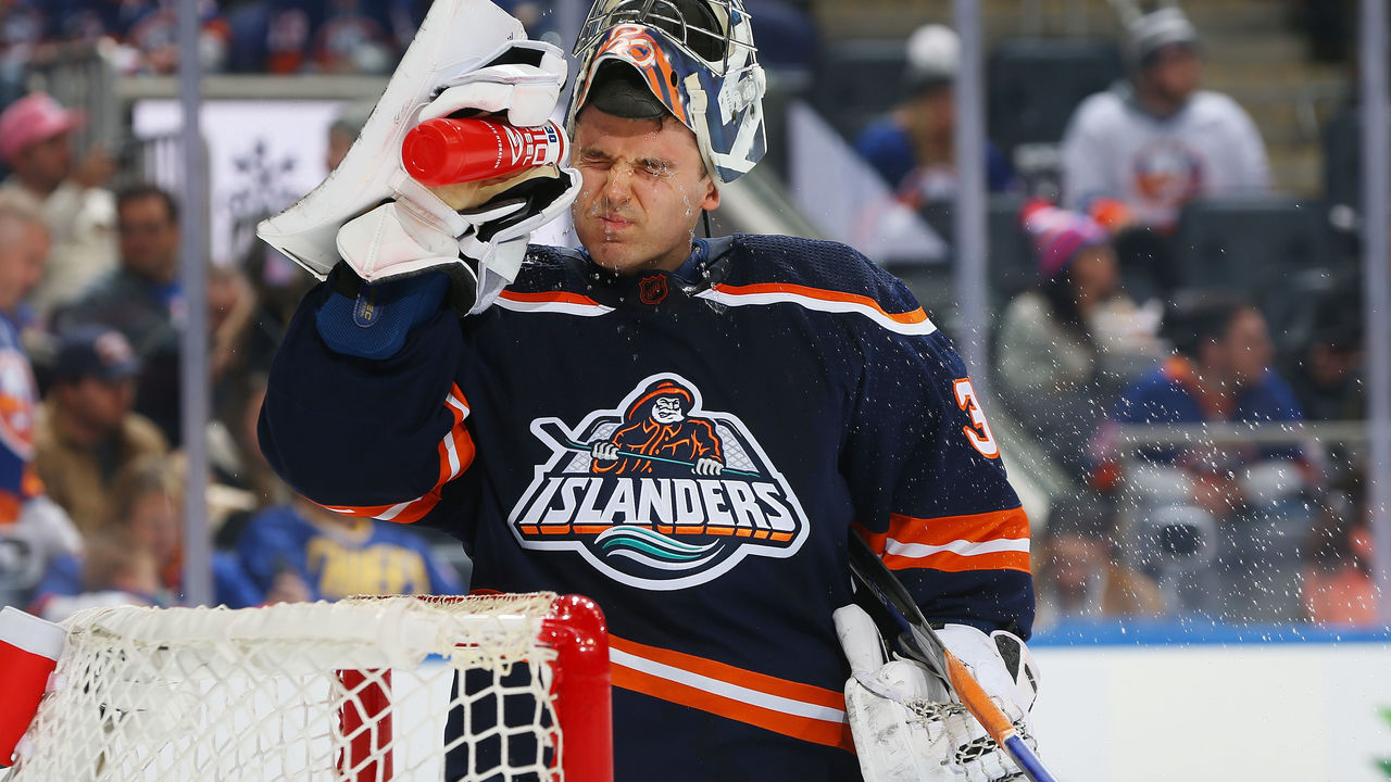
Fast-forward 25 years and the approval rating is significantly higher for Fisherman 2.0. The logo and jersey are sharper - the crest really pops off the sweater, for starters - and enough time has passed since the mid-'90s debacle that the once-maligned brand is a source of pride within the fan base. It certainly helps that the franchise is on better footing, both on and off the ice.
"Right now, some people, especially the younger generation, just view the Fisherman as cool and retro," said Hirshon, who did some historical research as a consultant for a branding agency that helped the Isles with the relaunch. "It does have a very '90s, in-your-face kind of feel. It's unabashedly a fisherman, someone from Long Island, who has this big grimace on his face."
As for the other 31 teams ...
theScore asked designer and sports branding expert Todd Radom to identify his five favorite looks from this season's Reverse Retro collection. Radom, co-author of the 2020 book "Fabric of the Game: The Stories Behind the NHL's Names, Logos, and Uniforms," volleyed back with six very different styles.
San Jose Sharks
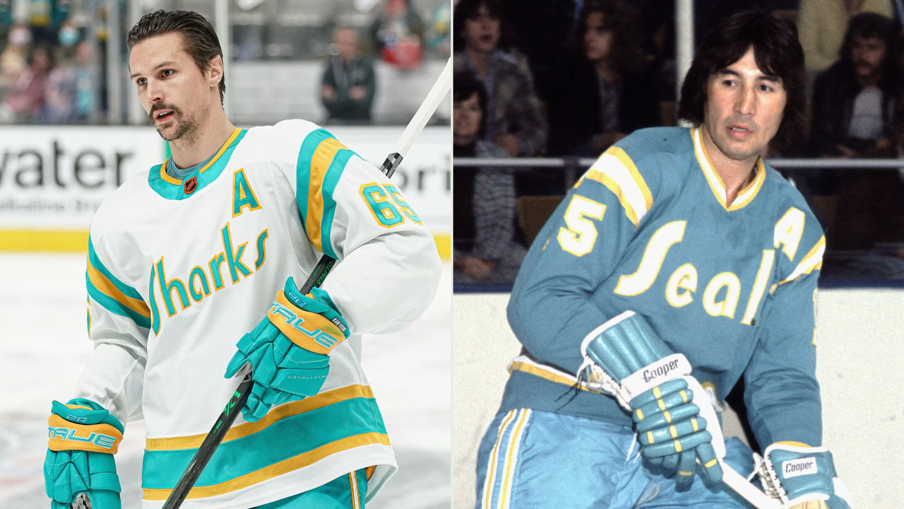
Inspired by the 1974 California Golden Seals, the Bay Area's first NHL team, the Sharks went for a "super-inventive" look with this "deep dive into history."
"It all makes sense from a delivery perspective," Radom said. "You're teaching people something without slamming it over their heads. It's educational and cool-looking, and those colors and that word mark - the fact it says 'Sharks' instead of 'Seals' - makes it incredible. I give them huge props. Love it."
Florida Panthers
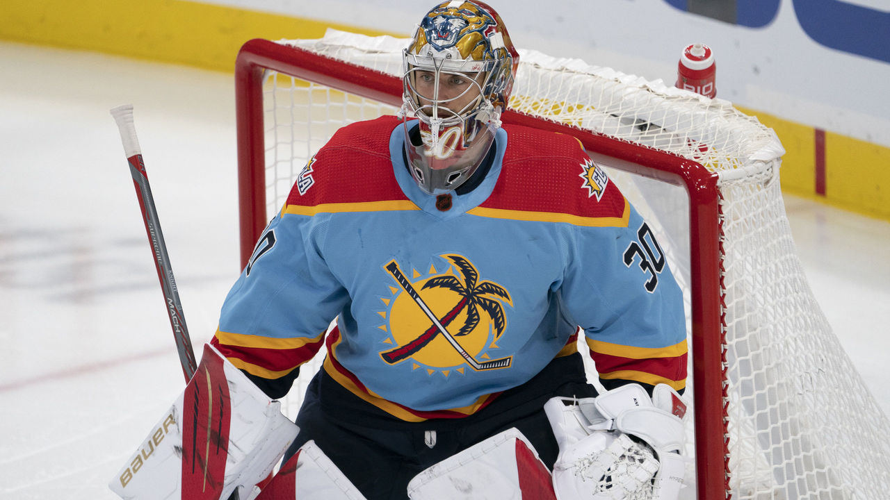
Radom sees some NBA City Edition uniforms, an NBA equivalent to the Reverse Retro, and questions some of the color choices. He'll ask himself, "Why are the Detroit Pistons in gray?" No such question was required here.
"I look at that beautiful blue color," Radom said of the Panthers' throwback, "and I say to myself, 'Geez, it looks just like South Florida.'"
Mix in the beautiful crest, which was originally a shoulder patch, and it's easy to picture a sandy beach. The club's embracing its status as a nontraditional market. "Maybe this couldn't have happened 10, 15 years ago. It sure wouldn't have happened 20 years ago," Radom said. "But the timing is right."
Vegas Golden Knights
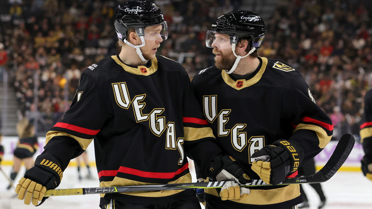
The Golden Knights, a franchise only six years old, emphasized city over team with the diagonal lettering. The glow-in-the-dark feature is a fitting add-on.
Radom calls it "original," "very cool," and "ingenious," a dessert to the Golden Knights branding meal, seeing as he loves the team's home and away jerseys.
"It looks legit," he said. "It's got some gimmicks within it, but it's in a fun way and it works. It's Vegas. It should have some pizazz and sizzle and all of that."
Los Angeles Kings
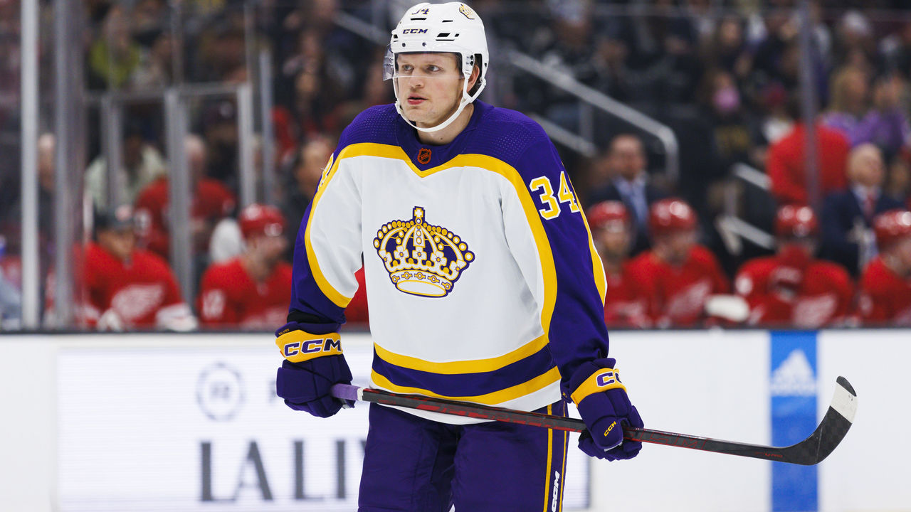
The Kings made a huge nostalgia play and were smart about it, Radom says.
"The Kings played in yellow sweaters at home and purple on the road back in the day," he said. "To see it in white is awesome. It's something you'd think would have happened in 1967 but in fact didn't. It has relevance, it grabbed my attention, and all it took was that one little tweak to make it work."
It doesn't hurt that the crown crest is intricate yet not too noisy. It's regal.
Colorado Avalanche/Minnesota Wild
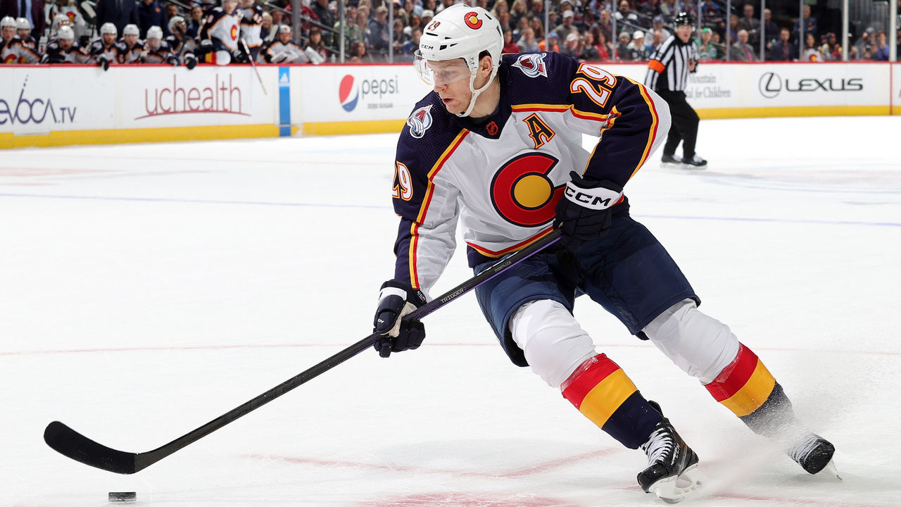
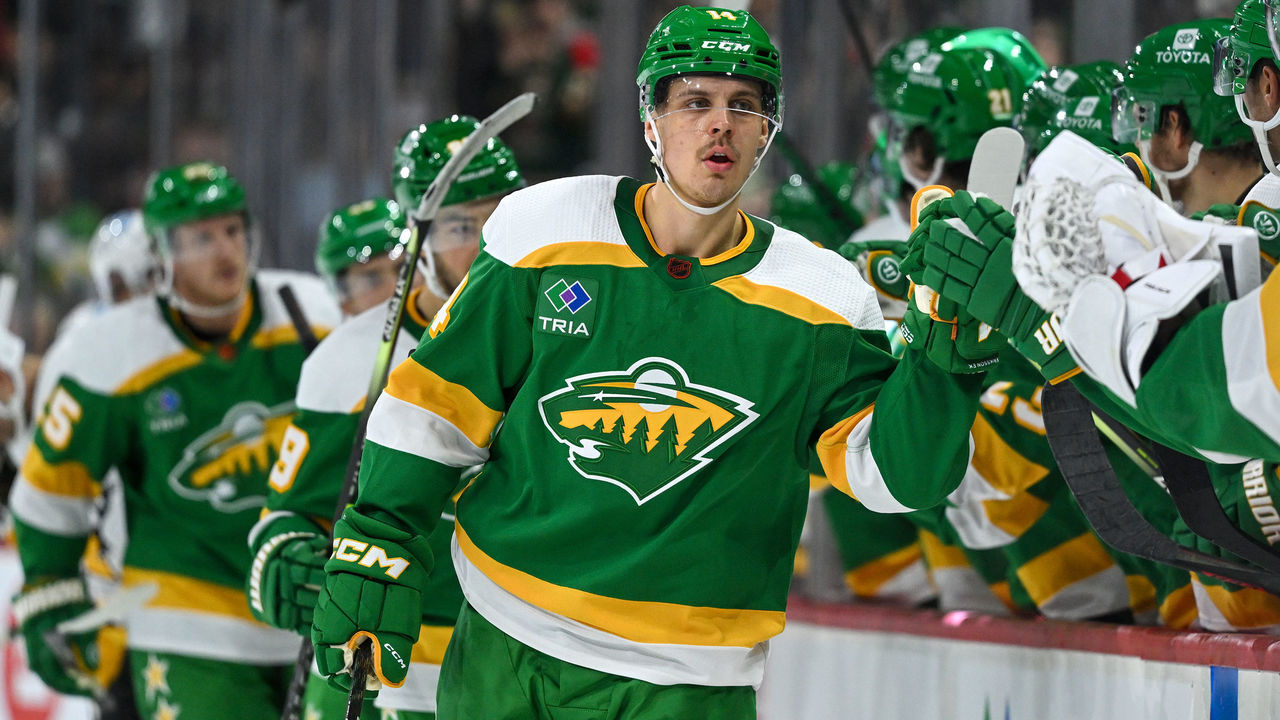
Radom grouped these two Western Conference fits together.
On the Avalanche's state flag crest: "I know there's people in Colorado who think the flag has been done to death. But I don't live in Colorado. I look at this and go, 'It's neat.' It's very bold and it gives me a good sense of place."
On the Wild's vintage color obsession: "I like how the Wild have stealthily transformed themselves into the North Stars. (laughs) Man, I just love the colors so much, and this is just something so unexpected overall. I mean, you're seeing a recolored Wild logo, which I think is very underrated."
John Matisz is theScore's senior NHL writer. Follow John on Twitter (@MatiszJohn) or contact him via email ([email protected]).


