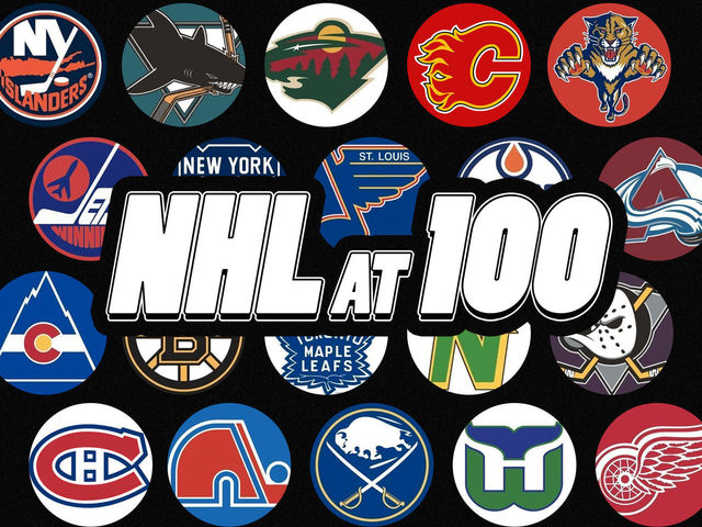
Throughout the month of September, James Bisson and a cast of editors from theScore will share their rankings of the greatest players, teams, and moments in the 100-year history of the National Hockey League. This week's list focuses on the greatest team logos (active team logos courtesy NHL; defunct team logos courtesy SportsLogos.net):
100-81 | 80-61 | 60-41 | 40-21 | 20-1
Voter List
- James Bisson, National Sports Editor
- Josh Wegman, NHL News Editor
- Sean O'Leary, NHL News Editor
- Esten McLaren, NHL News Editor
- Lucas Casaletto, News Editor
- Michael Amato, Senior News Editor
- Craig Hagerman, NHL News Editor
- Lanny Foster, Senior Social Media Editor
- Arun Srinivasan, News Editor
20. New York Islanders (1972-95, 1997-present)
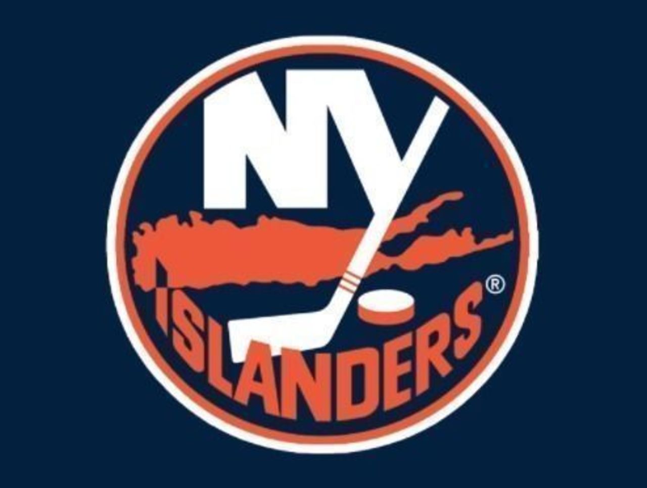
It's one of the most recognized hockey logos of all time - which makes the entire fisherman experiment even more mind-boggling. The orange Long Island outline in the middle is what really does it for us.
19. San Jose Sharks (1991-2007)
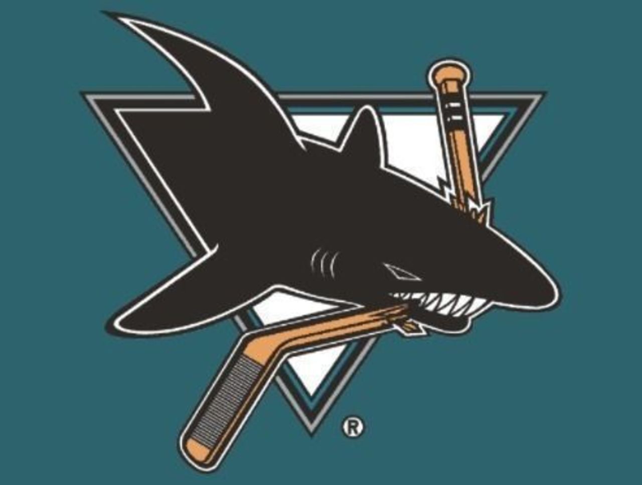
When the Sharks broke in as the 22nd NHL team in the early 1990s, they brought a brand-new approach to logo design with them. We can't decide what we like more: the fearsome shark chomp or the implementation of teal.
18. Minnesota Wild (2000-present)
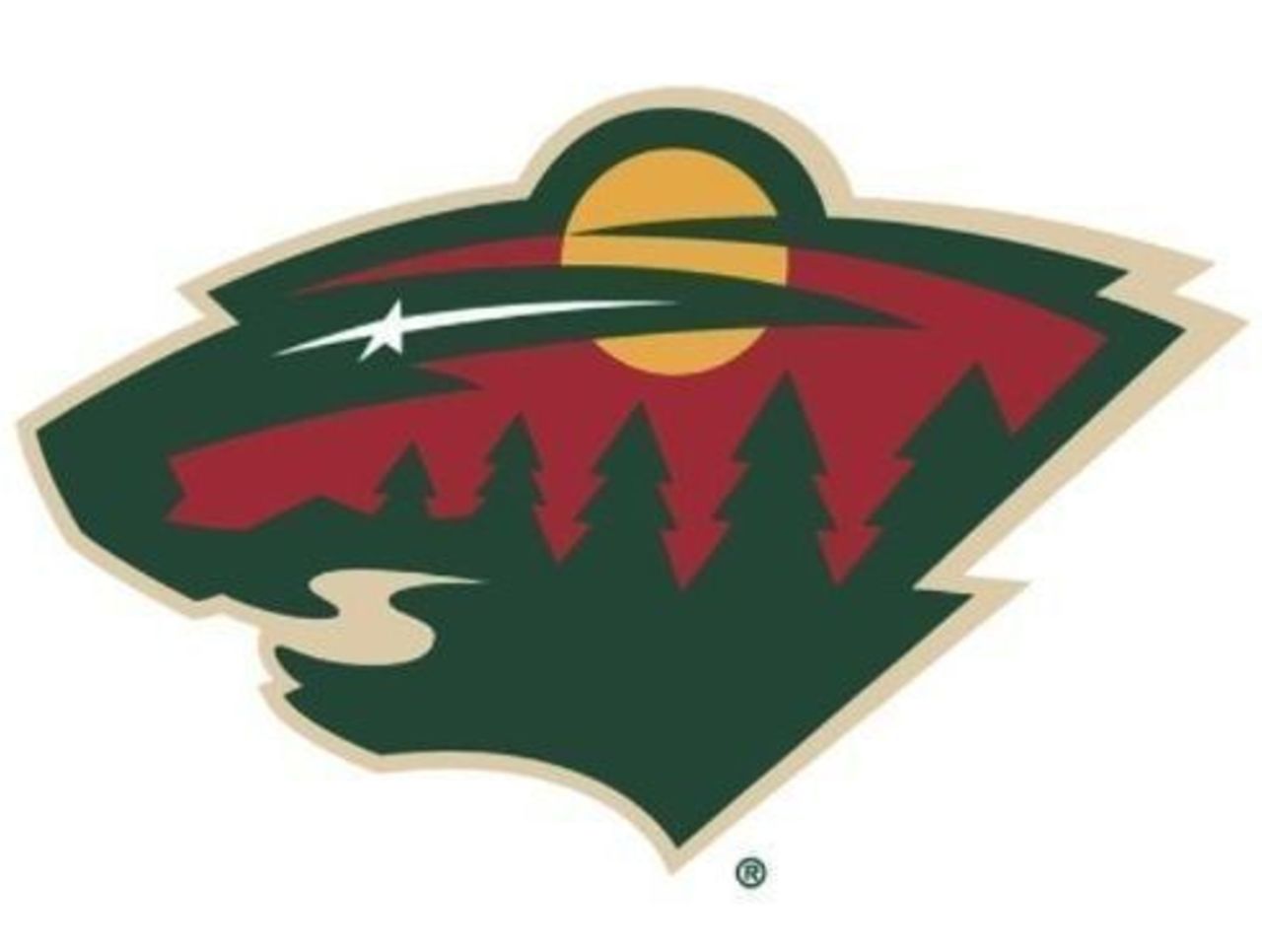
While this logo isn't quite as appealing as that of the North Stars, it's close. Using a river as a mouth, a star as an eye, and fitting in a row of pine trees, a red sky, and a bright yellow sun? This is a true work of art.
17. Calgary Flames (1980-present)
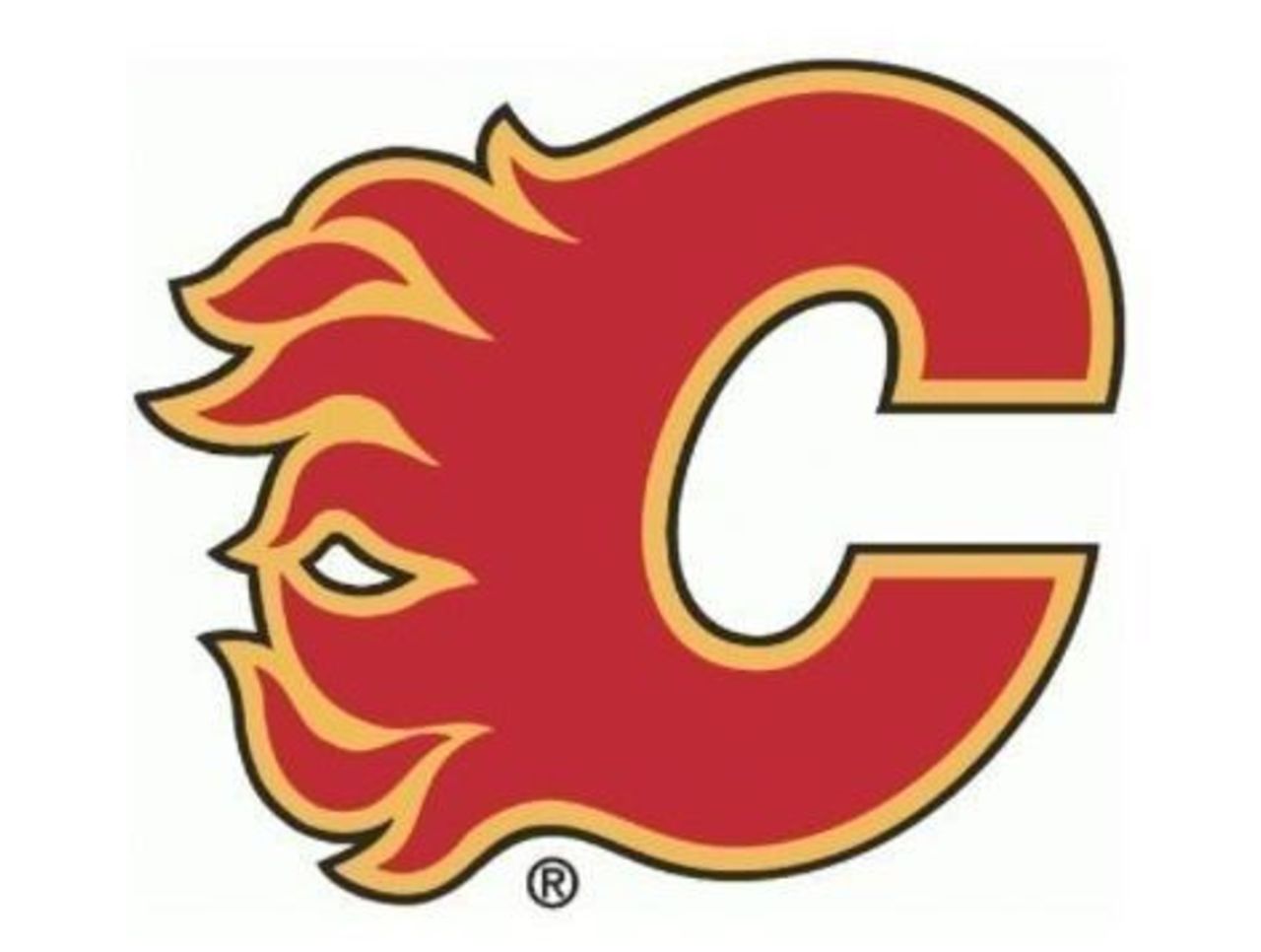
Some fans prefer the red-and-orange logo on a white jersey. Others favor the reverse color configuration. Whatever your preference, it's hard to argue with the flaming "C" as one of the coolest logos in NHL history.
16. Florida Panthers (1993-2016)
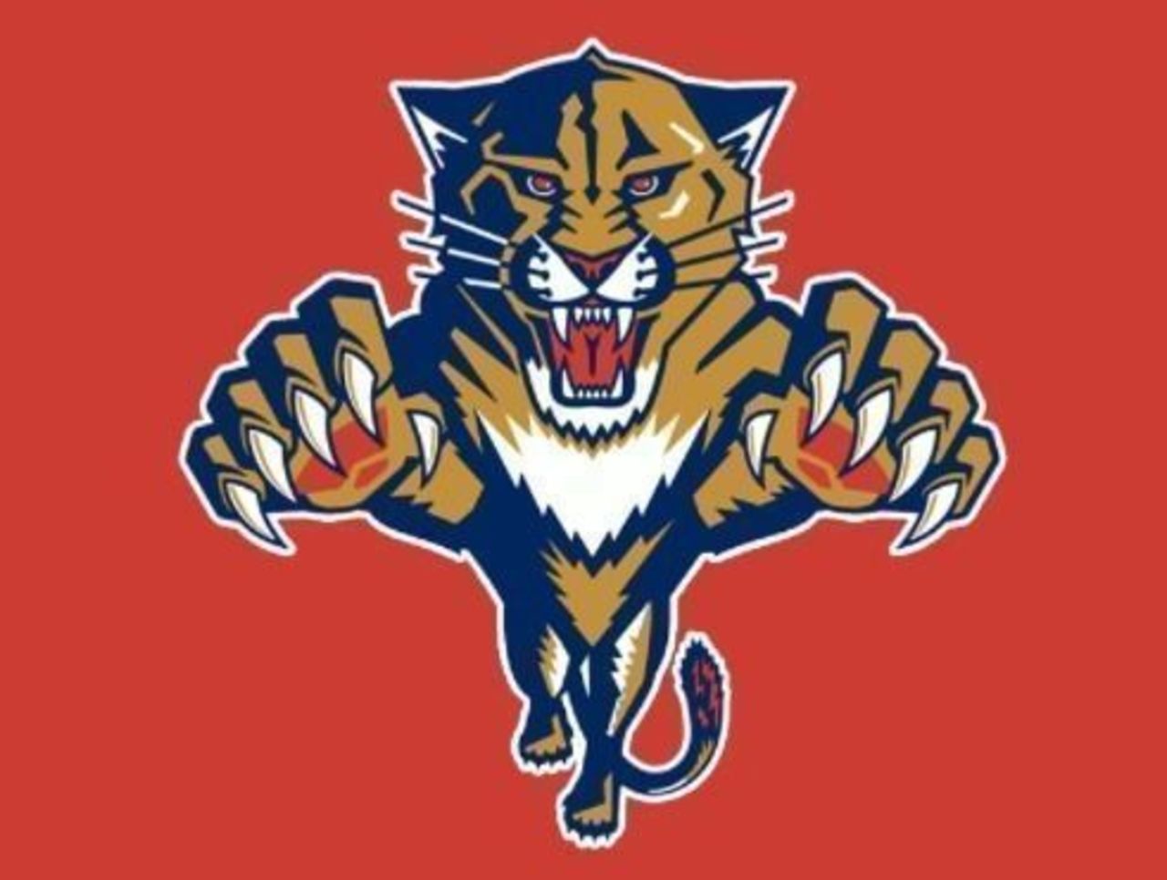
Florida's second NHL franchise came with a much livelier logo than the rival Tampa Bay Lightning; it looks like the cat is jumping right into your living room. If nothing else, it was a wildly popular jersey among younger fans.
15. Winnipeg Jets (1979-90)
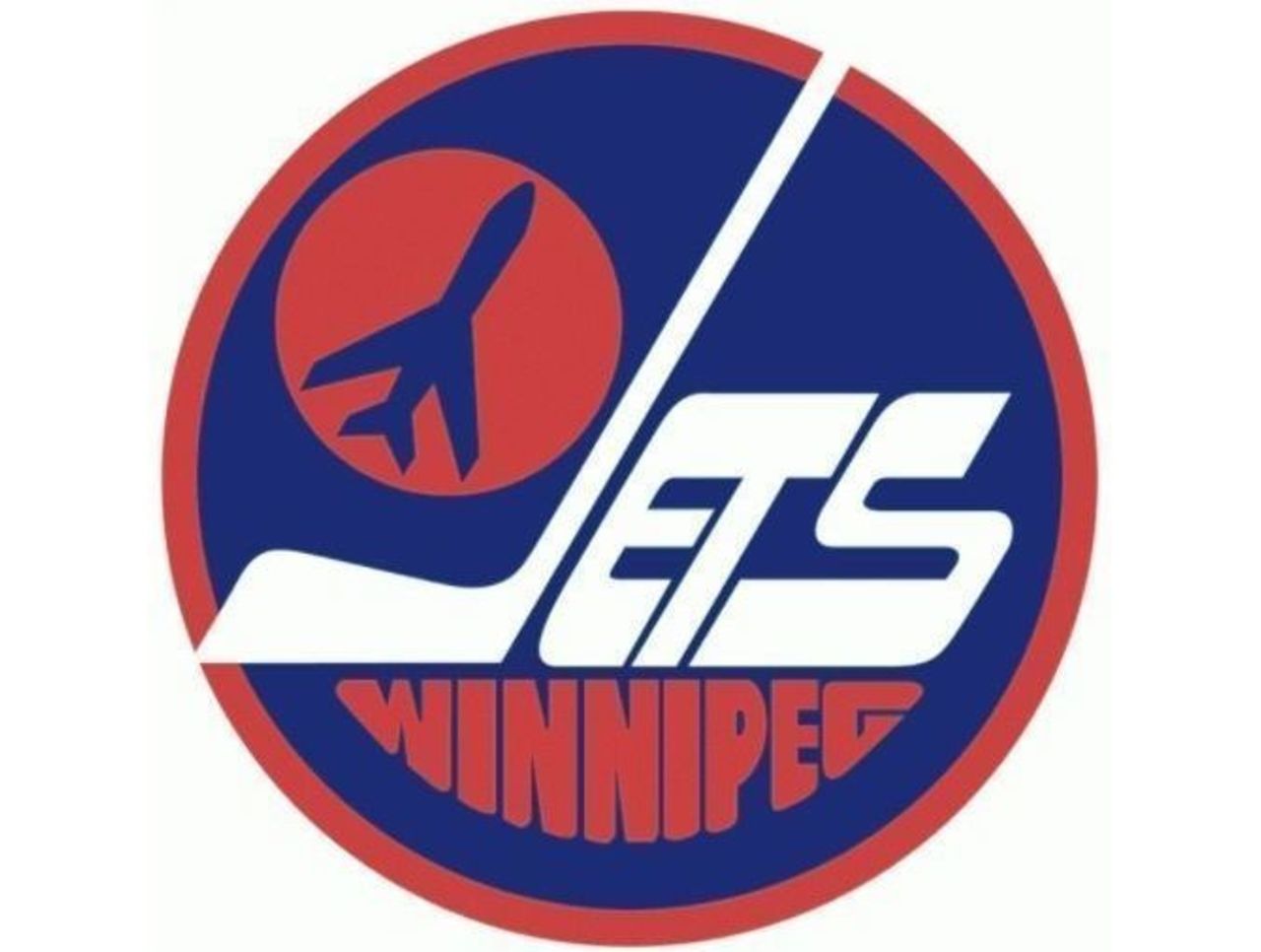
The merging of the WHA and the NHL in the late 1970s brought some truly great logos into the fold - including this one. It's no wonder Winnipeg fans wanted this logo brought back when NHL hockey returned to Manitoba.
14. New York Rangers (1971-present)
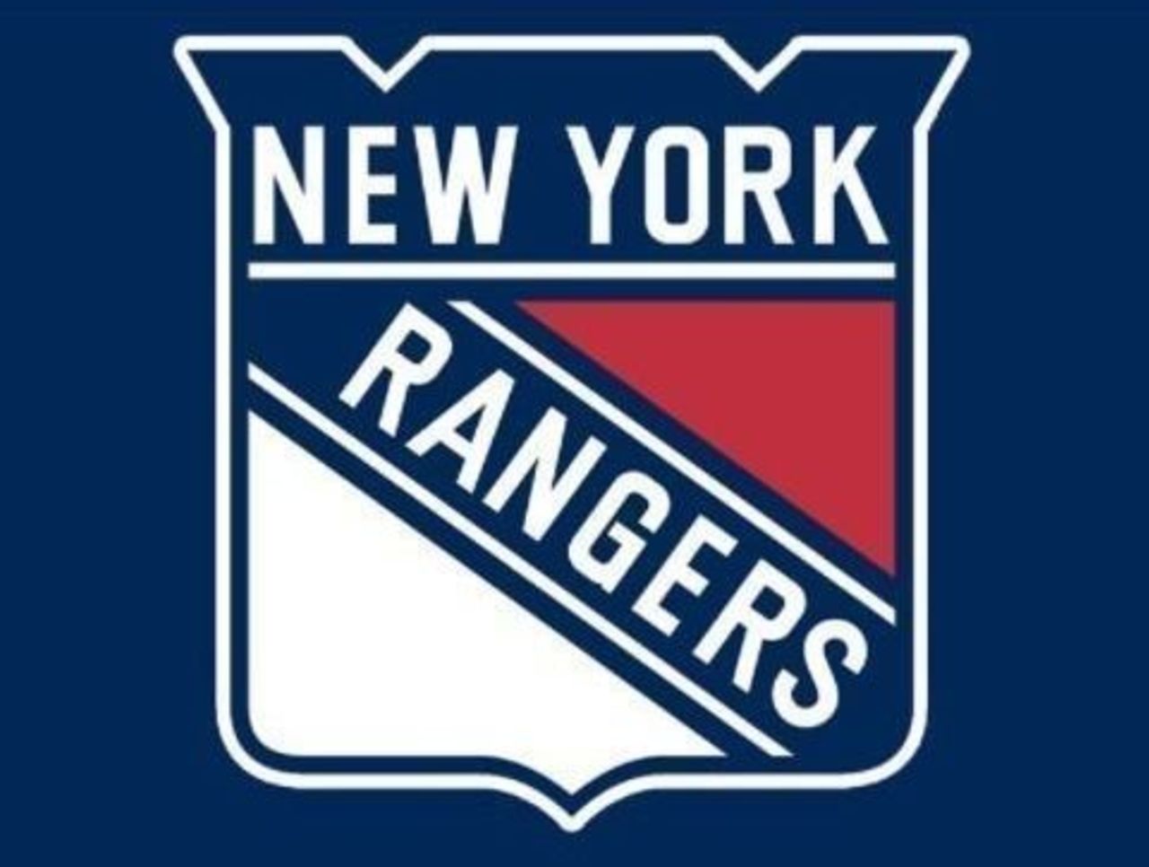
After going with a few different iterations of this design - most of which featured strange font-size choices - the Rangers finally settled on this sleek version, and have stuck with it ever since. As shield-style logos go, this is the best of the bunch.
13. St. Louis Blues (1987-98)
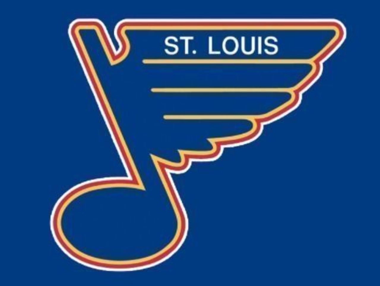
Normally we could do without a city or team name within the logo - but this one is tucked nicely at the top of what is an otherwise flawless design. Combining homages to flight and music? It doesn't get much better.
12. Edmonton Oilers (1979-present)
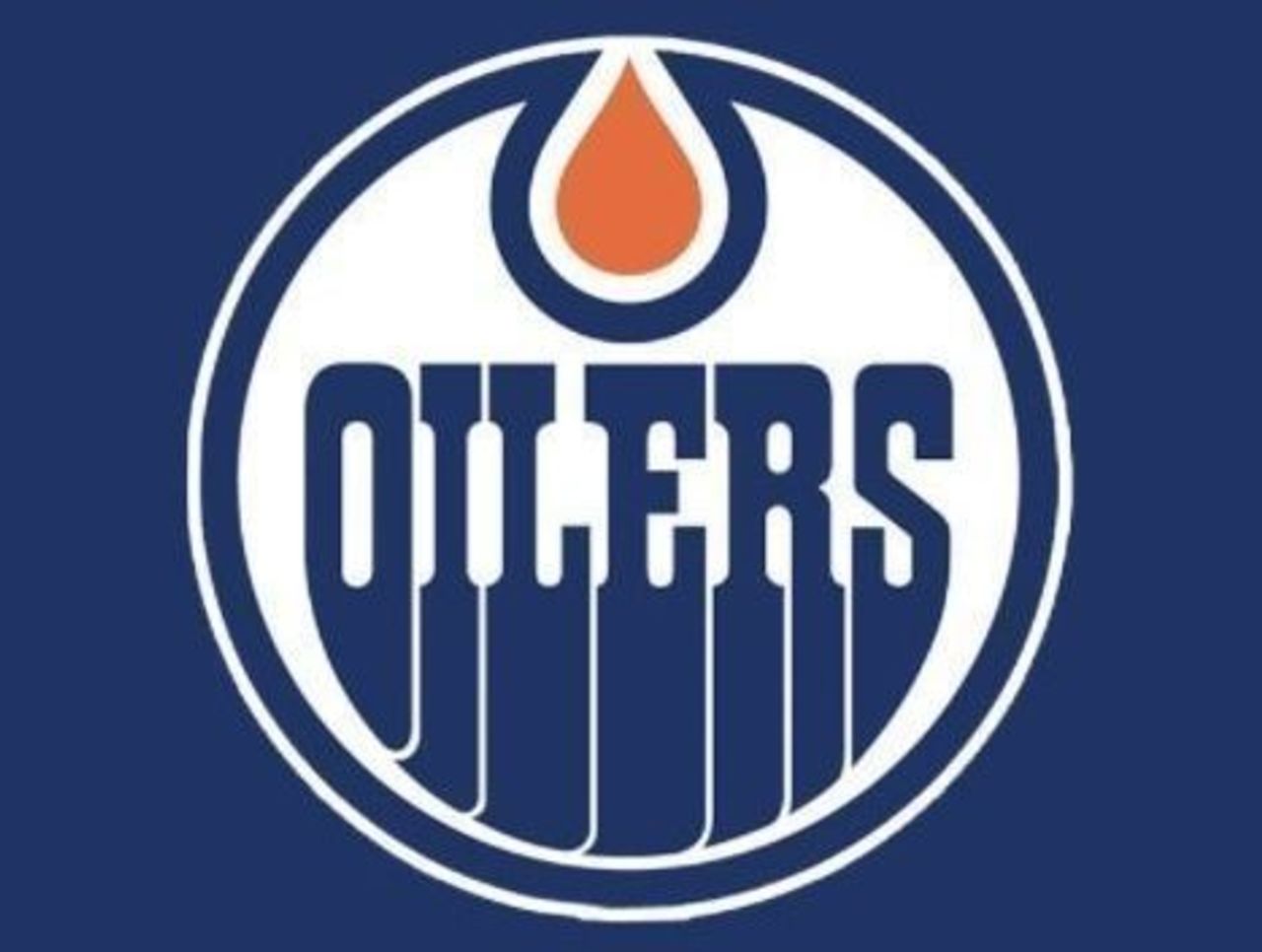
In the never-ending Battle of Alberta, Edmonton gets the nod by a razor-thin margin. The unique font choice, coupled with a little splash of color on top, makes this a popular logo no matter how well the team is playing.
11. Colorado Avalanche (1995-present)
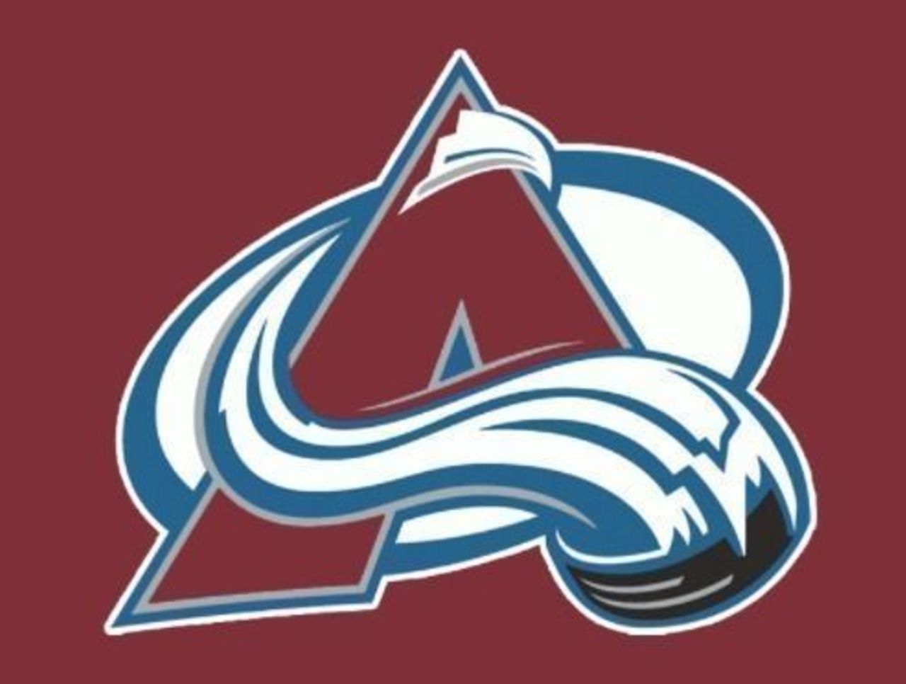
There's so much to love about the only primary logo the Avalanche have ever employed. Between the blue-and-white swoosh running through the middle (with a hidden puck attached) and the overall color scheme, it's a hit.
10. Colorado Rockies (1976-82)
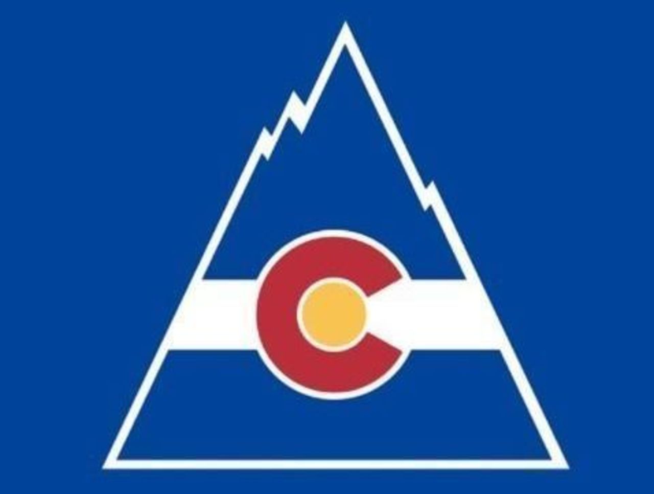
It might not have the same stylistic swirl as the design above, but the Rockies' primary logo is still an all-timer. Colorado fans have been blessed with two of the best hockey logos the NHL has ever seen.
9. Boston Bruins (1949-present)
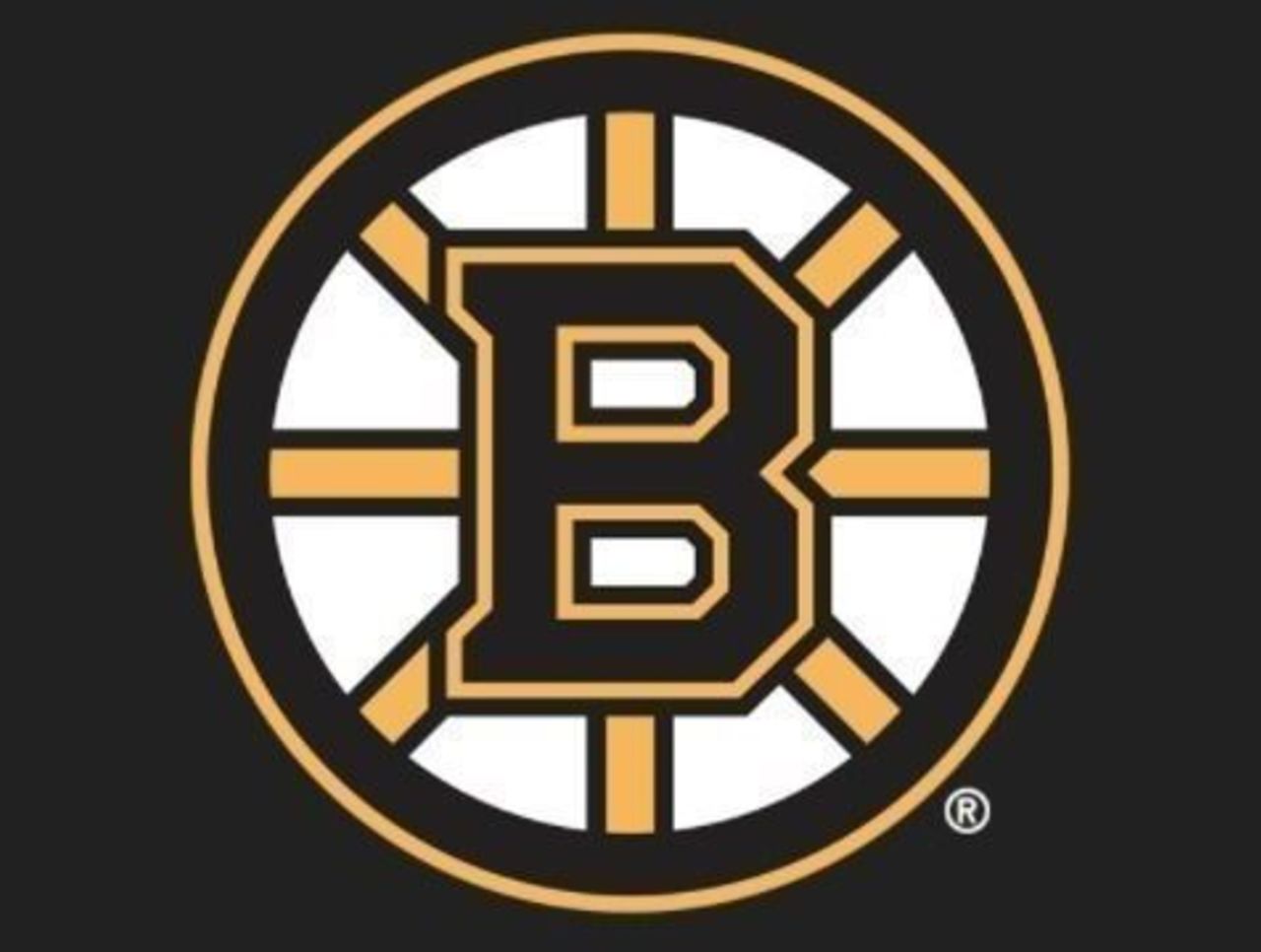
Fun fact: The spokes in the Bruins' primary logo are meant to represent Boston's reputation as an American "hub." Whether or not you agree, there's little argument that this tasteful logo is a pro sports classic.
8. Toronto Maple Leafs (1938-67, 2016-present)
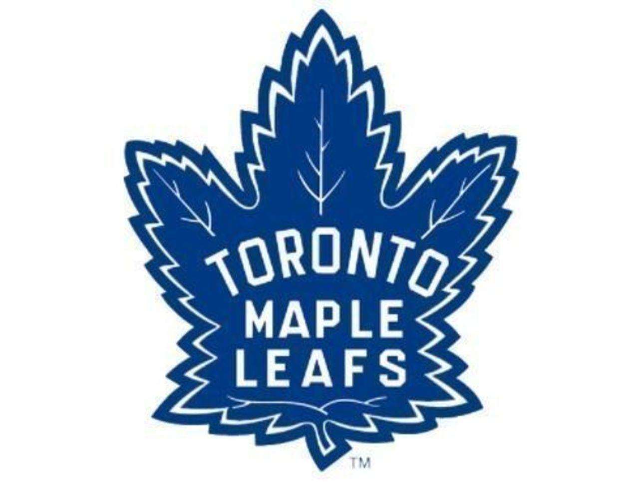
Traditionalists were delighted to see the Maple Leafs go back to their roots last season. As great as the more angular option is, this logo harkens back to the Leafs' glory days - and it just looks better.
7. Minnesota North Stars (1985-91)
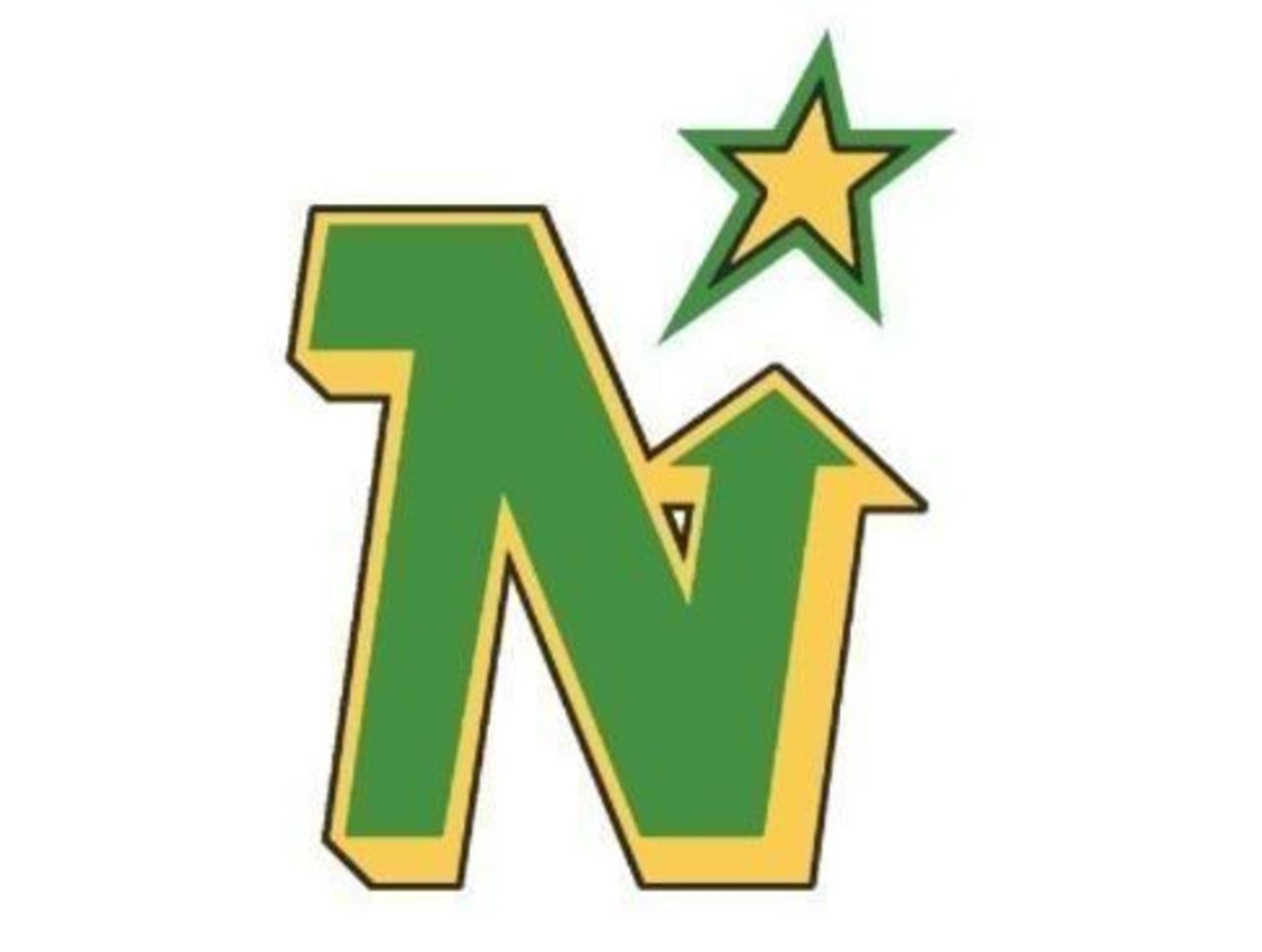
The first incarnation of the North Stars' logo was nearly perfect. Once the team got rid of that distracting circle, it was left with a flawless logo. The green-and-gold color combo is an all-time fave.
6. Mighty Ducks of Anaheim (1993-2006)
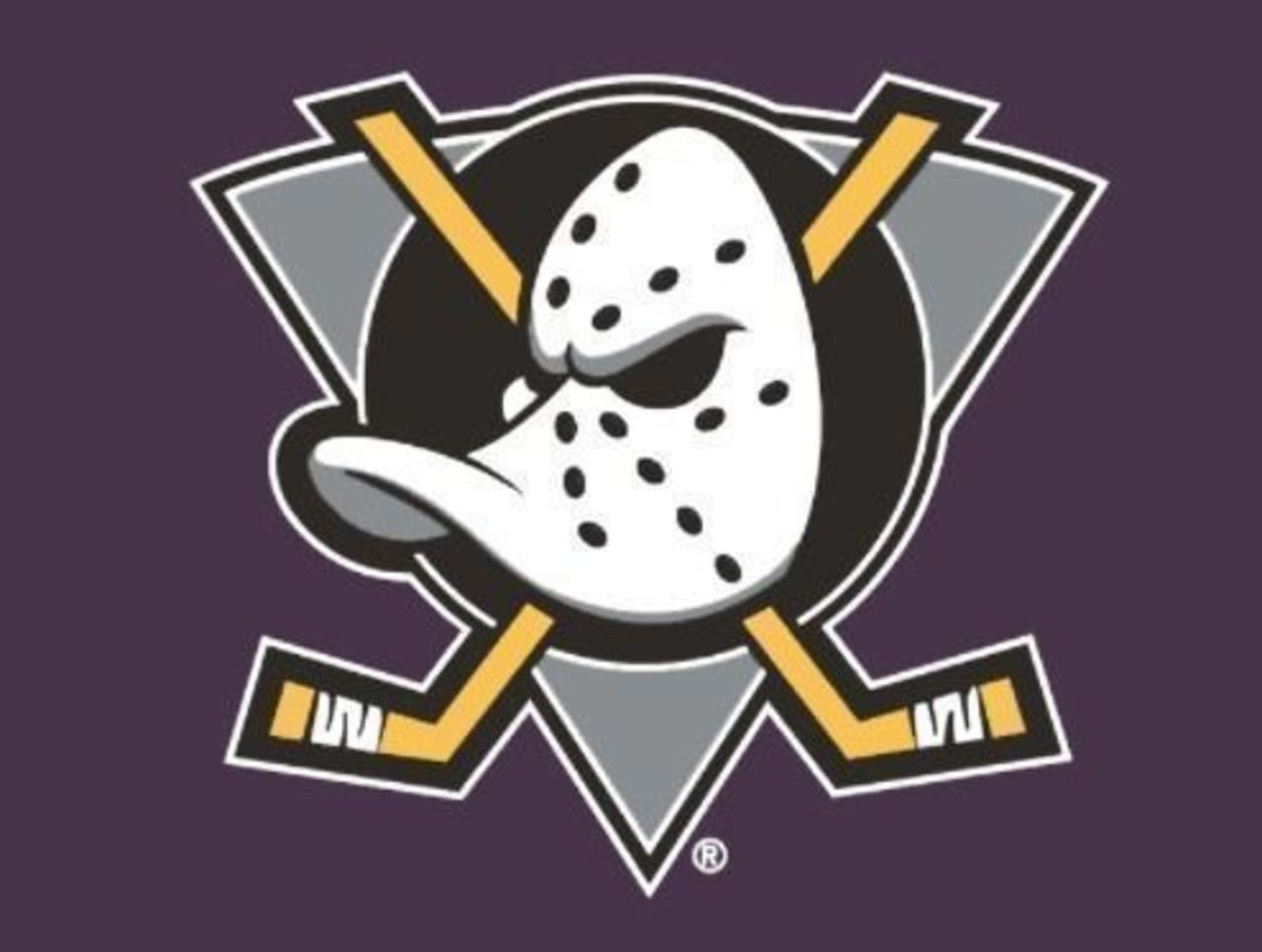
This ranking might elicit some interesting feedback, but as a hockey logo, the Ducks' original option is sensational. Judging by the sheer number of original Anaheim jerseys sold and kept over the years, fans agree.
5. Montreal Canadiens (1956-present)
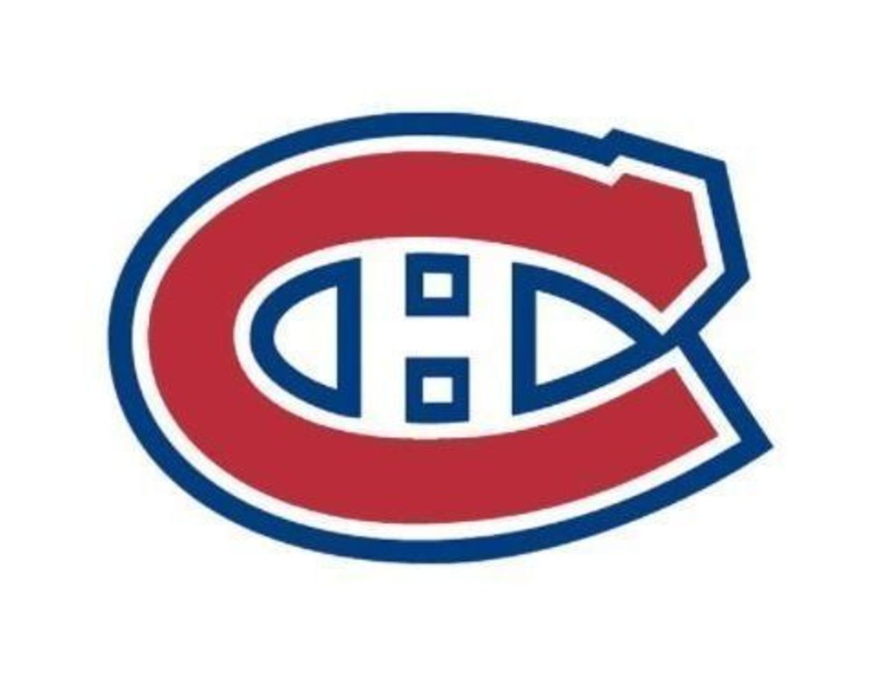
CHC. Club de hockey Canadien. It's so simple - and yet, this configuration with two "C"s and an "H" stands as one of pro sports' most iconic logos. Of all the variations, we like this one - featuring a thicker "H" - the best.
4. Quebec Nordiques (1980-95)
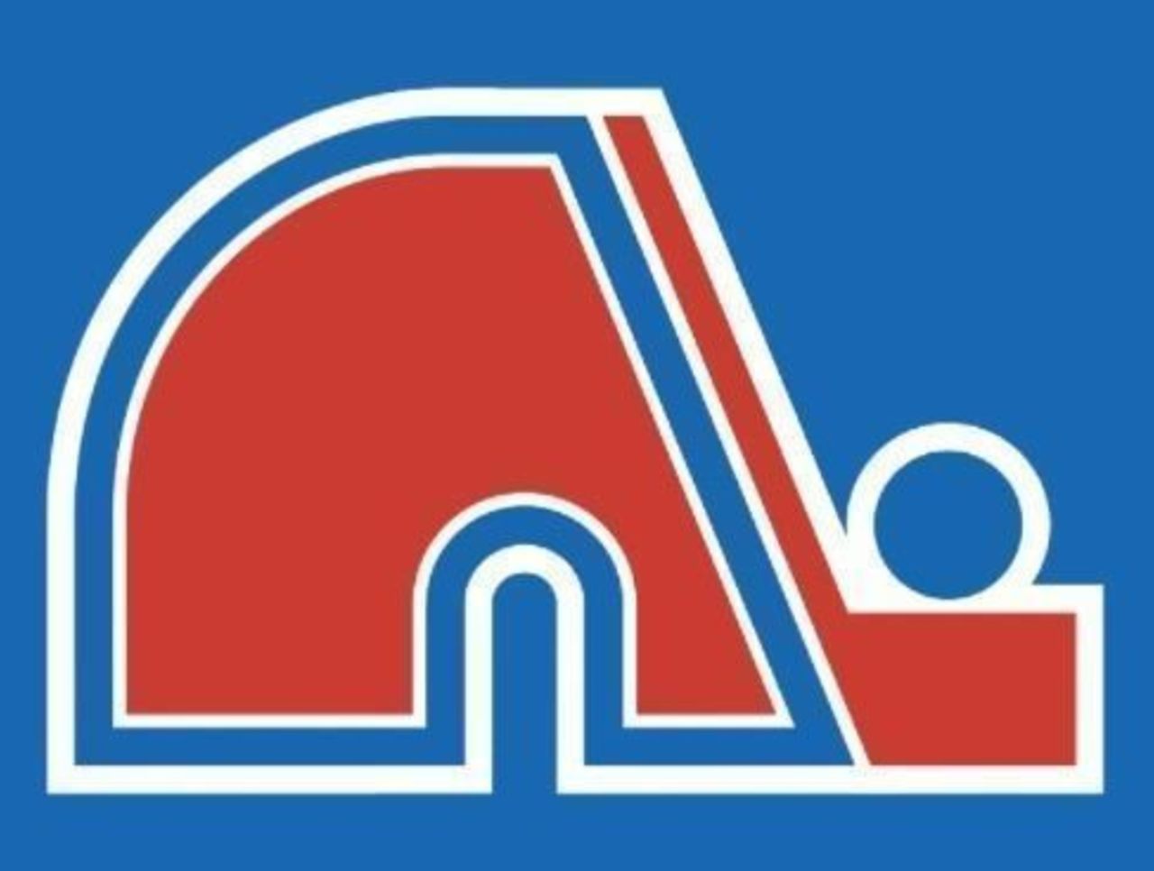
What is it supposed to be? Who cares! It's gorgeous! (We joke: Clearly it's an igloo, in honor of the name "Nordiques," which translates to "Nordics.") If NHL hockey returns to Quebec City, this logo has to come back, too.
3. Buffalo Sabres (1970-96, 2010-present)
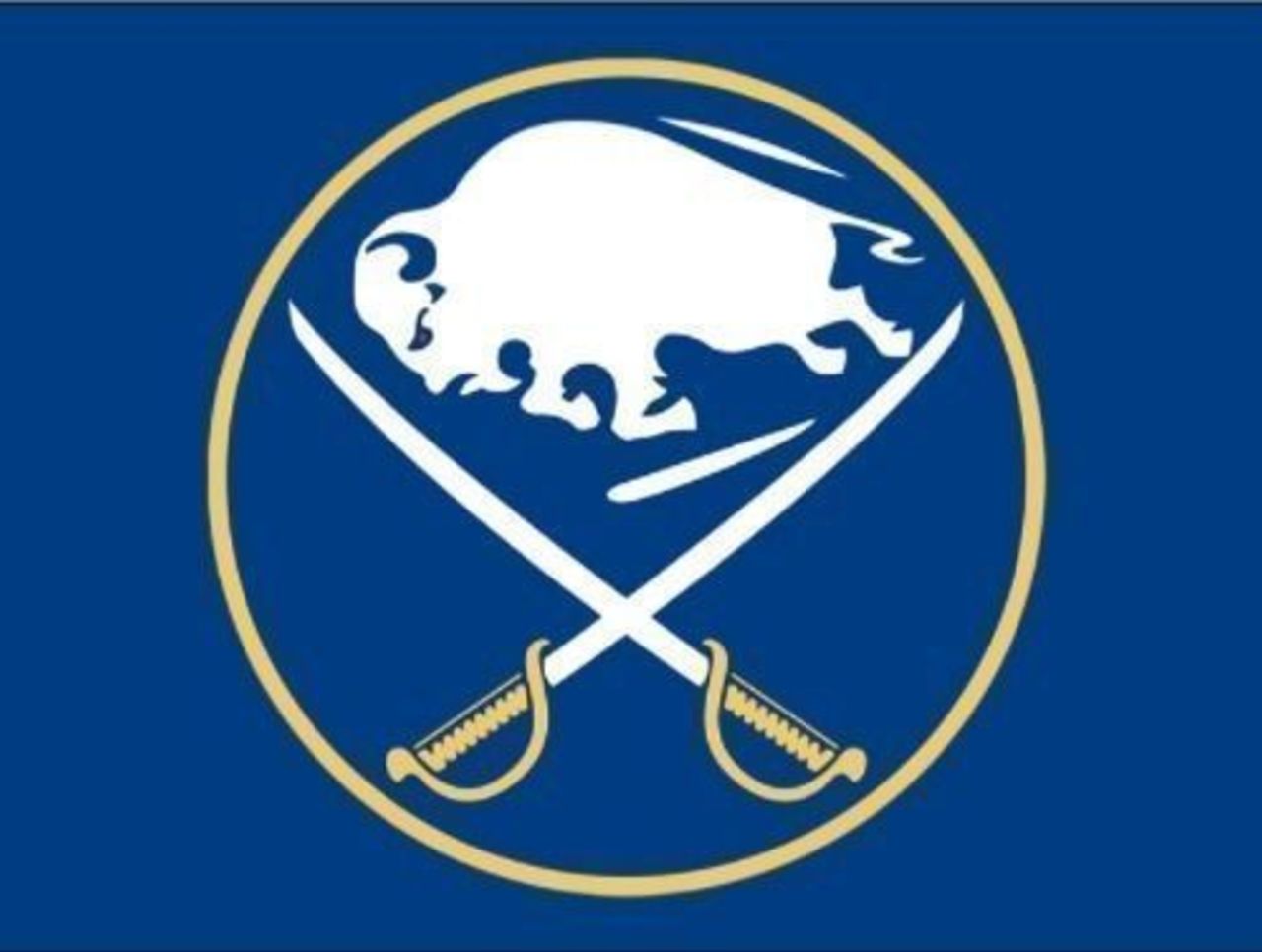
Why the Sabres ever strayed from this primary design, we'll never know. It has all the elements of a great logo: Both sections of the team name are included without any clutter, and the color scheme is bang-on.
2. Hartford Whalers (1979-97)
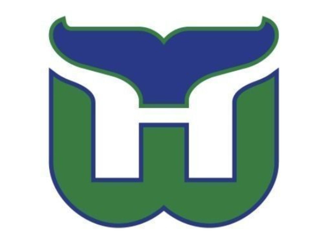
When Hartford abandoned its whale logo, some people probably wondered what in the world the franchise was thinking. Then you see this awesome replacement, with the whale tail helping shape the "H," and you simply nod your head in approval.
1. Detroit Red Wings (1948-present)
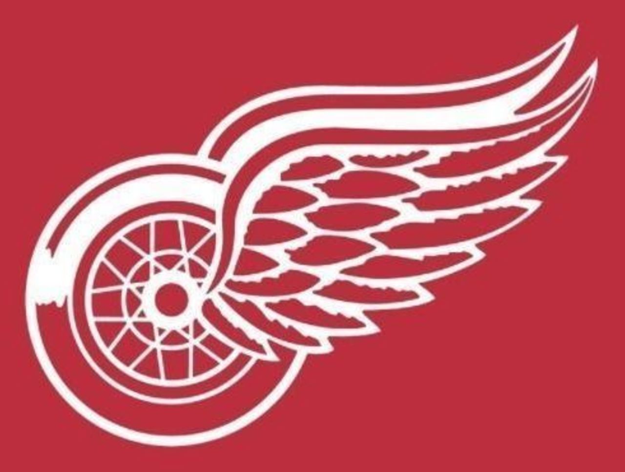
No other design combines style, intricacy, relevance, and all-around coolness like the winged wheel, a fitting homage to the Motor City. In the 100-year history of the league, this is the greatest NHL logo of all.
(NHL logos are used with permission and are courtesy of the National Hockey League.)