Grading the biggest changes of the NHL's new Adidas jerseys
While much of the excitement out of Las Vegas this week is yet to come (we hope), the NHL gave its fans something to chew on as the league congregates to welcome a new era in Sin City: new uniforms.
The league joined Adidas, its new jersey supplier, in debuting its new threads Tuesday night, with some teams undergoing more significant changes than others.
Below, we outline what's changed and provide an overall grade for the teams that will rock a significantly new look to start the 2017-18 season.
Golden Knights
Both jerseys that we will wear in our inaugural season. #VGKFirstJersey pic.twitter.com/NYj3zDQmdZ
— Vegas Golden Knights (@GoldenKnights) June 21, 2017
What's changed: Technically, nothing, but Vegas' debut uniforms introduce a fresh look. The Golden Knights are the lone NHL franchise to don gray as its primary color, and it blends nicely with black and gold accents. The red is a unique touch, and should pop on the ice.
If you look closely at the gold on the sleeves, you'll also notice added intricate details.
Grade: A
Wild
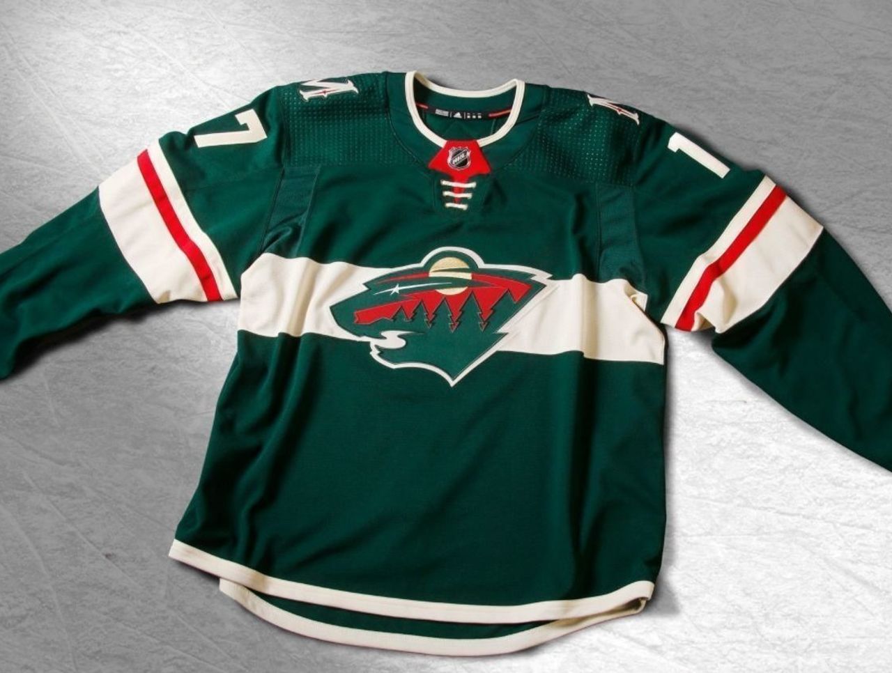
What's changed: Minnesota's made the permanent switch to forest green, and the white horizontal stripe is a terrific change to make the logo stick out. The thin red piping on the sleeve ties it all together, giving the Wild a strong case for best redesign.
Grade: A
Avalanche
A fresh take on the original jerseys from our inaugural season... 🔥🔥🔥#FormTheFuture pic.twitter.com/Gk9CrrSxwy
— Colorado Avalanche (@Avalanche) June 21, 2017
What's changed: The Avs revived their glory-days sweater by bringing back the mountain range design. Given their overall performance last season, reminiscing on the franchise's peak years might be a good thing.
That said, the retro look is a little dull for such a unique color scheme.
Grade: C
Oilers
What do you think, #Oilers fans?! #FormTheFuture pic.twitter.com/BGDA8M28W2
— Edmonton Oilers (@EdmontonOilers) June 21, 2017
What's changed: Edmonton already announced it will sport orange at home next season, but the Oilers made another change, darkening the shade of blue to navy. Additionally, the club thinned out the stripes at the bottom to complete the look.
The Oilers already had some of the nicest uniforms in the league, so the changes, though subtle, are underwhelming.
Grade: B-
Predators
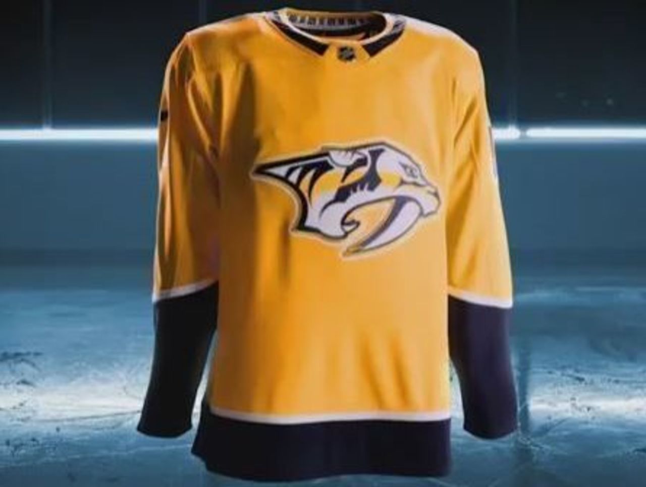
What's changed: The Western Conference champions got even more yellow. Nashville eliminated piping that ran up the torso and across the shoulders, which was the right call, but the Preds still managed to make things worse, creating a terribly bland look.
Grade: F
Hurricanes
See all the details about how the #Canes home uniforms have evolved here → https://t.co/ffC01rOhEC #Redvolution pic.twitter.com/mQxdUhYLxI
— Carolina Hurricanes (@NHLCanes) June 21, 2017
What's changed: Carolina integrated more black into its new get-ups, and also brought back the checkered warning flag pattern along the bottom to add some personality. Neat and clean. A solid improvement.
Grade: A
Devils
Here is a look at the redesigned Devils jerseys for next season. Same logo, same red and black https://t.co/MB1fYwi7q1 pic.twitter.com/aquNA62F0t
— Chris Ryan (@ChrisRyan_NJ) June 21, 2017
What's changed: For the first time since switching their secondary color from green to black in 1992, the Devils have a different design. New Jersey ditched its stripes on the bottom and squared up the shoulders, resulting in a resounding "meh."
Grade: D
The new home get-ups for all 31 teams can be found here.