Welcome to the theScore's NHL logo countdown. This list examines logos that date back to the inception of the Original Six and includes the main emblem for all 32 current teams, 11 clubs that moved or changed their name, and seven whose logo has undergone a significant redesign. Only primary ones were considered.
The five-part series concludes with the top 10 on Friday. Let's continue with Nos. 30-21.
30. Winnipeg Jets
When the Jets returned to Winnipeg, the team unveiled a brand new logo using the original Jets' colors. The emblem pays homage to the Royal Canadian Air Force by using its logo as inspiration with a jet plane placed over a red maple leaf. This is about as Canadian as it gets.
29. Ottawa Senators
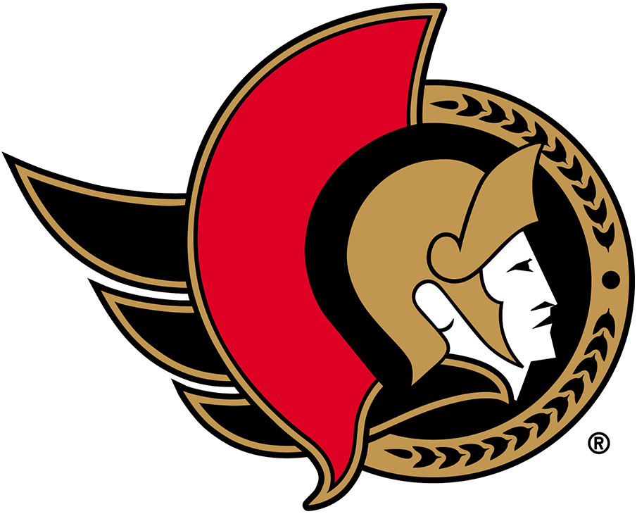
Senators fans rejoiced when the club announced they're reverting back to their original 2D design this offseason, and for good reason. Ottawa's original logo is a gigantic upgrade over the in-your-face 3D Senator caricature the team used for so long. Simplifying a logo is almost never a bad thing.
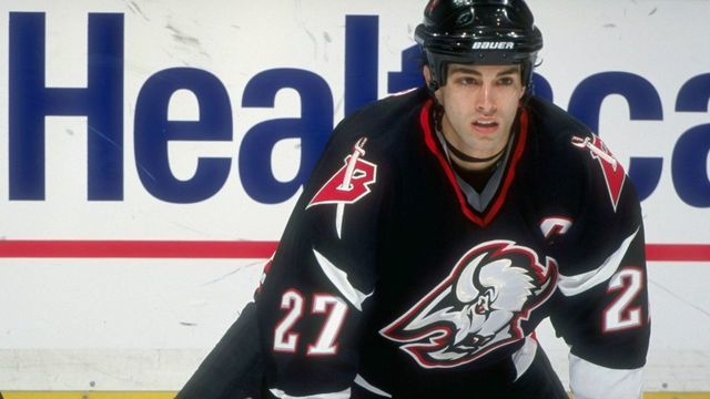
28. Buffalo Sabres (1996-2006)
The Sabres' complete uniform overhaul in the '90s was certainly bold, but the red and black buffalo head was so menacing that it worked. The design lasted only a decade, but it's forever linked to Dominik Hasek's peak run of excellence and a surprise trip to the 1999 Stanley Cup Final. Above all else, at least it's not the "Buffaslug" - the monstrosity of a primary logo that followed until Buffalo rightly returned to its roots in 2010.
27. New Jersey Devils
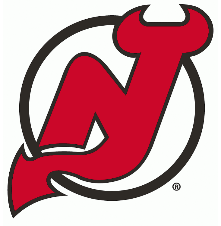
It's not immediately evident at first glance, but the Devils' incorporation of the "N" and "J" morphing into the image of a devil's tail and horns is fantastic. It's hard not to think of the glory days of Martin Brodeur and Co. when looking at this logo, which has gone mostly unchanged since its introduction in 1982.
26. Colorado Rockies
The ill-fated Rockies lasted just six seasons, but their logo lives on today. The Colorado state flag "C" used in this emblem can be seen on the shoulder patch of the Avalanche's jerseys, albeit with different colors. We love this '70s color scheme, and the logo might be more memorable had the Rockies enjoyed any sort of success during their brief tenure.
25. Seattle Kraken

The NHL's newest franchise knocked its logo selection out of the park. While we were disappointed to see green left out of the color scheme, the double blue and red works. The tentacle outline on the "S" is a nice touch, while the red eye adds to the intimidation of this sea creature.
24. Vegas Golden Knights
Vegas' logo was met with general approval upon its unveiling in 2017. The possibilities were endless for the team name and logo in Sin City, but ultimately the organization went with a safer choice. The color is a nod to Nevada being the highest gold-producing state in the U.S.
23. Philadelphia Flyers
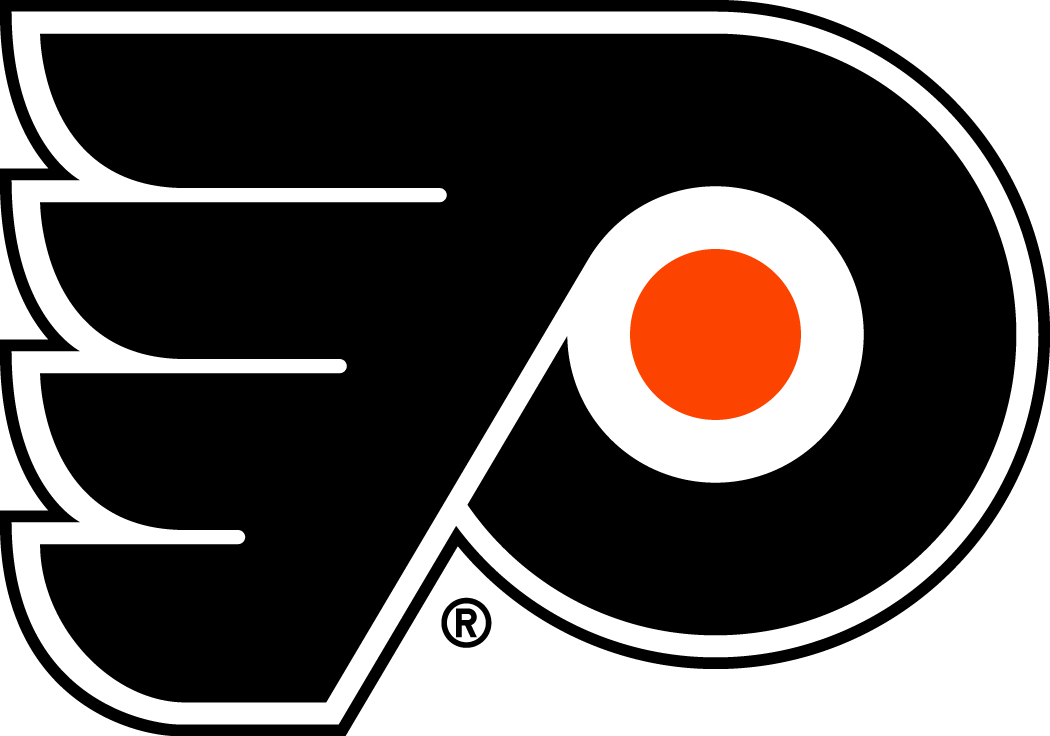
The Flyers' primary logo has gone completely untouched since the team's inception in 1967, and for good reason. It's just perfect: The slanted "P" with an orange dot in the middle to signify a puck, and the wings on the side to represent speed - hence the "Flyers." It's hard to imagine this logo ever changing.
22. Florida Panthers (1993-2016)
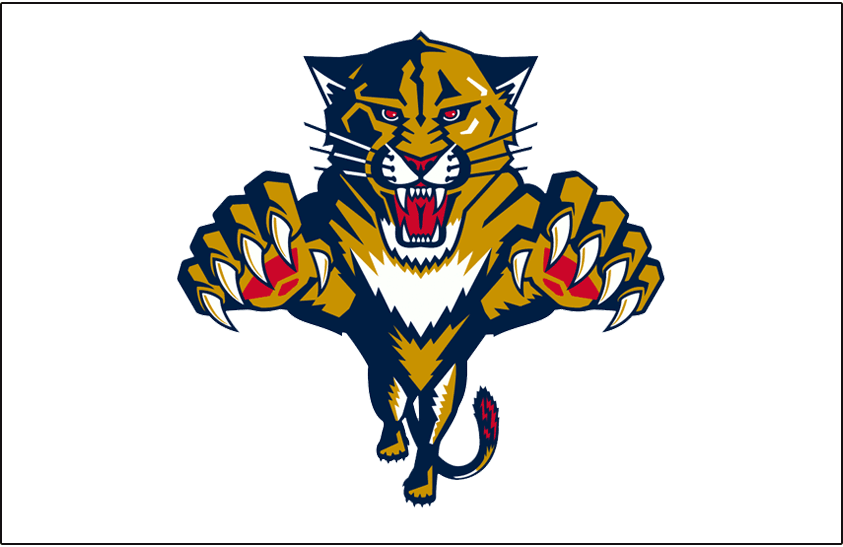
We agreed that the old Panthers logo is better than their current one, which came in at No. 37 on this list. While a bit cartoony, the original was much more fierce and intimidating.
21. San Jose Sharks
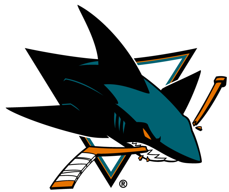
Logos don't get more unique than a vicious-looking shark demolishing a hockey stick with its teeth. The menacing graphic is one of the league's most distinct, but the incorporation of the beautiful teal color is what puts the cherry on top here.