Ranking the NHL's 100 Greatest Logos: Nos. 80-61
Throughout the month of September, James Bisson and a cast of editors from theScore will share their rankings of the greatest players, teams, and moments in the 100-year history of the National Hockey League. This week's list focuses on the greatest team logos (active team logos courtesy NHL; defunct team logos courtesy SportsLogos.net):
100-81 | 80-61 | 60-41 | 40-21 | 20-1
Voter List
- James Bisson, National Sports Editor
- Josh Wegman, NHL News Editor
- Sean O'Leary, NHL News Editor
- Esten McLaren, NHL News Editor
- Lucas Casaletto, News Editor
- Michael Amato, Senior News Editor
- Craig Hagerman, NHL News Editor
- Lanny Foster, Senior Social Media Editor
- Arun Srinivasan, News Editor
- Joe Ross, Vice-President, Content
80. Los Angeles Kings, 2011-present)
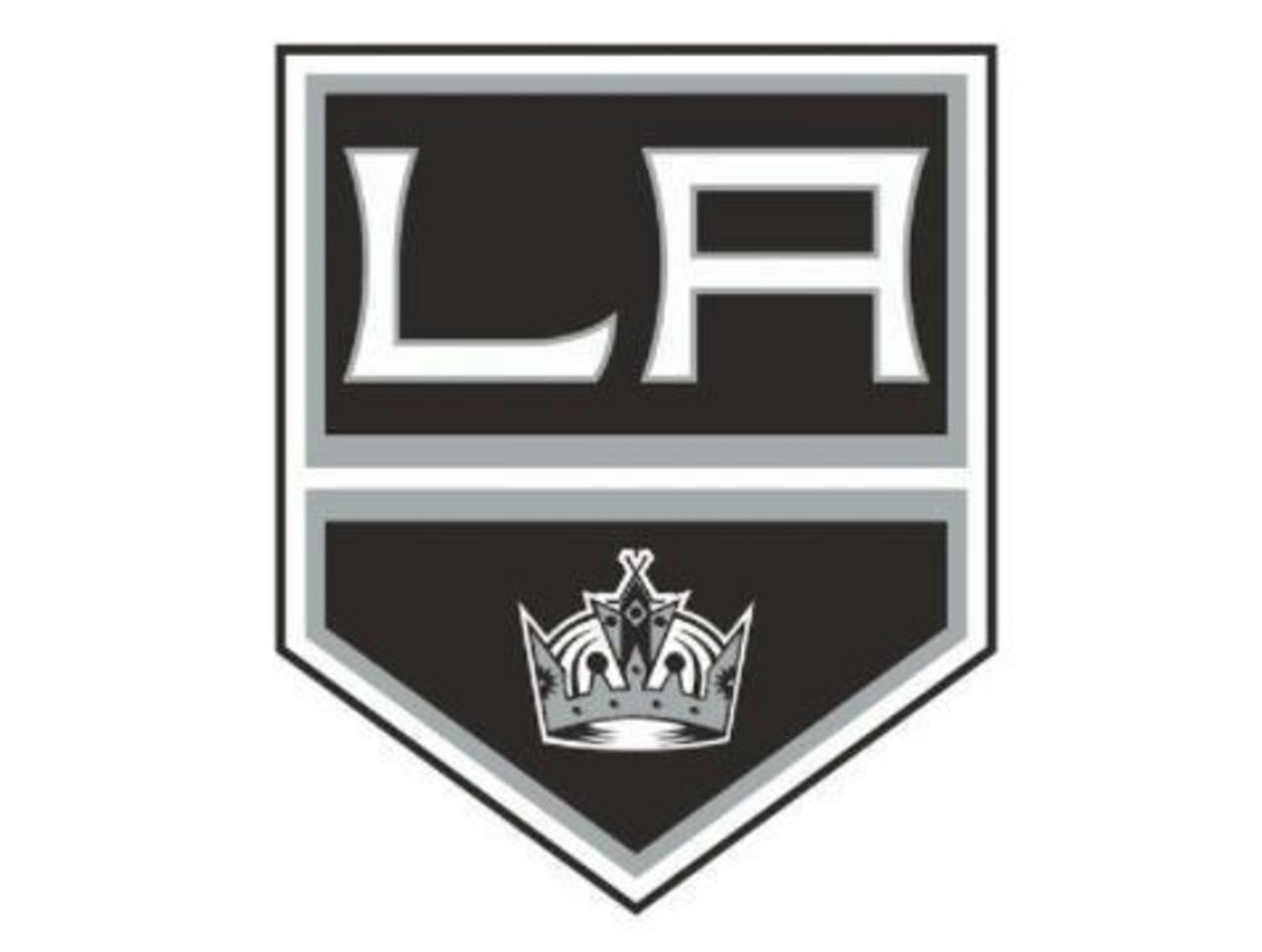
Few teams have undergone as many logo changes as the Kings, who appear to have nailed it with their most recent offering. While it lacks the pizzazz of earlier editions, it's sleek. That Oakland Raiders color scheme works.
79. Brooklyn Americans (1941-42)
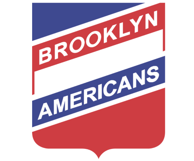
The Americans lasted just one season in the National Hockey League, but boy, did they nail the logo. Red, white and blue across every square inch, combined with a strong font and beloved shield design. Great work.
78. Columbus Blue Jackets (2000-07)
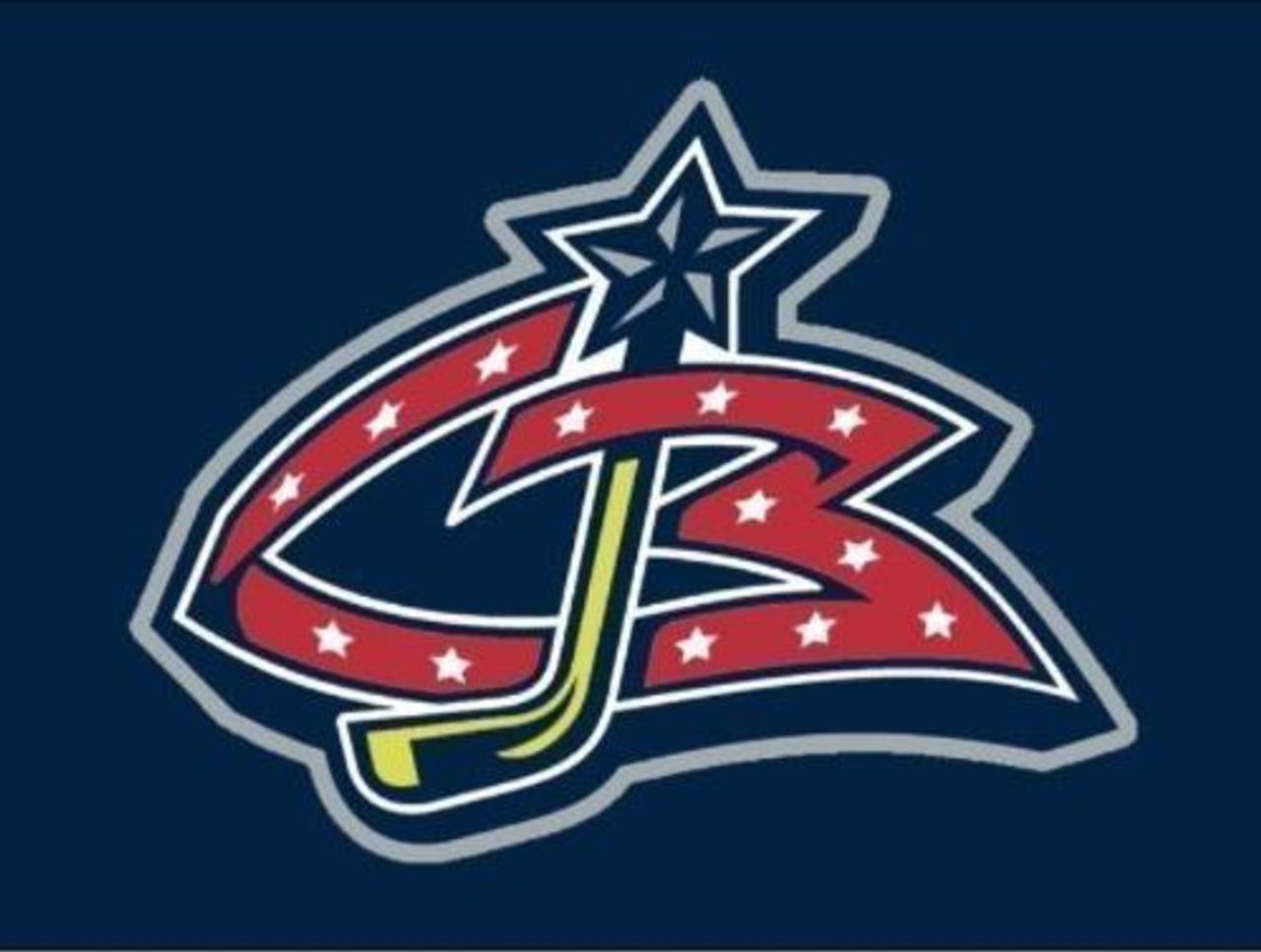
The original Blue Jackets logo was a work of art, with a star-spangled red banner spelling out CB while clutching a hockey stick with a star perched on top. Not bad at all for an expansion logo.
77. Nashville Predators (2001-07)
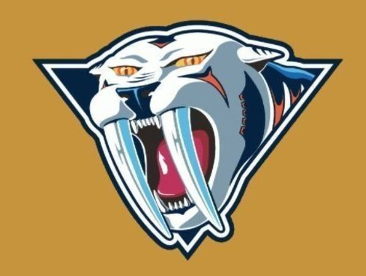
This was a nice attempt at an alternate logo, but you can't help but wonder why bother? If you're going to feature a saber-toothed cat, you might as well make it look fearsome - and this one pales in comparison to the original.
76. Columbus Blue Jackets (2003-present)
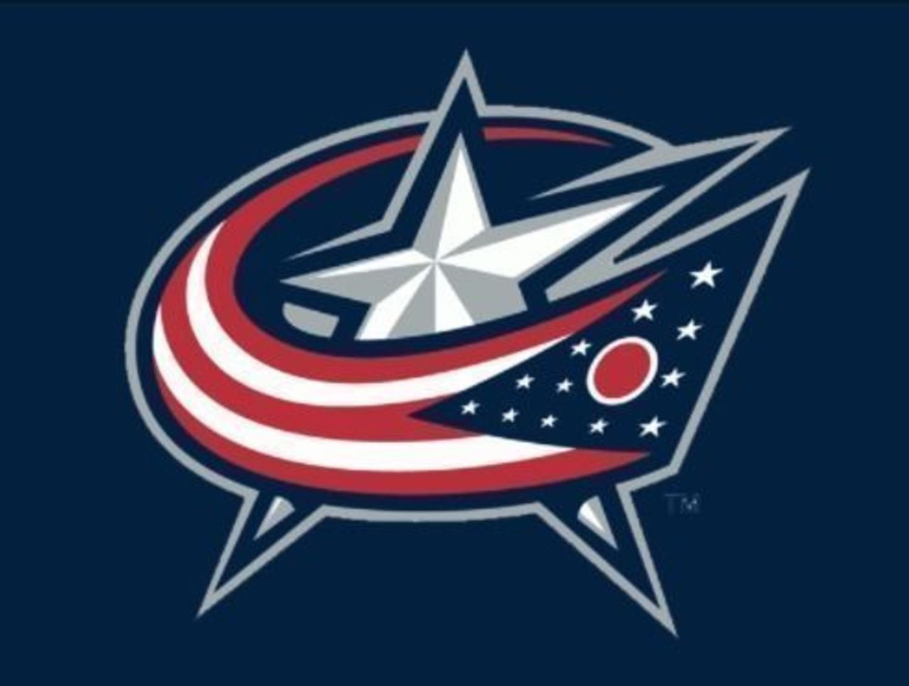
This logo gets major marks for its simplicity in relation to some of the Blue Jackets' other logos. A flag swoosh wrapped around a silver-and-white star gets the point across better than earlier iterations.
75. Colorado Avalanche (1996-2015)
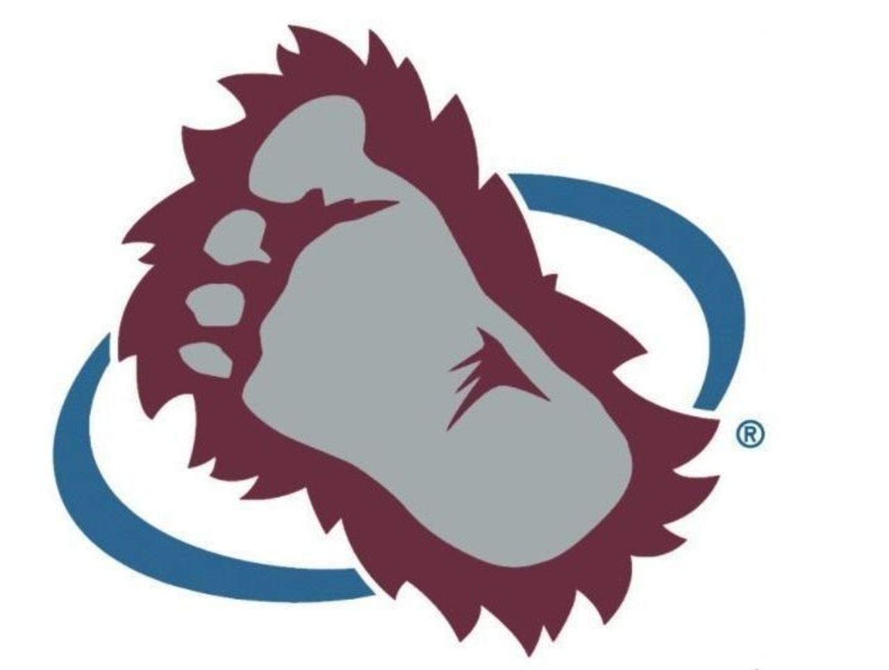
Few teams stuck with a secondary logo as long as the Avalanche did - and why not? The big hairy foot is a hit with younger fans, though traditionalists long for that old Rockies mountain logo. Don't worry - we'll get to it.
74. Quebec Nordiques (1980-95)
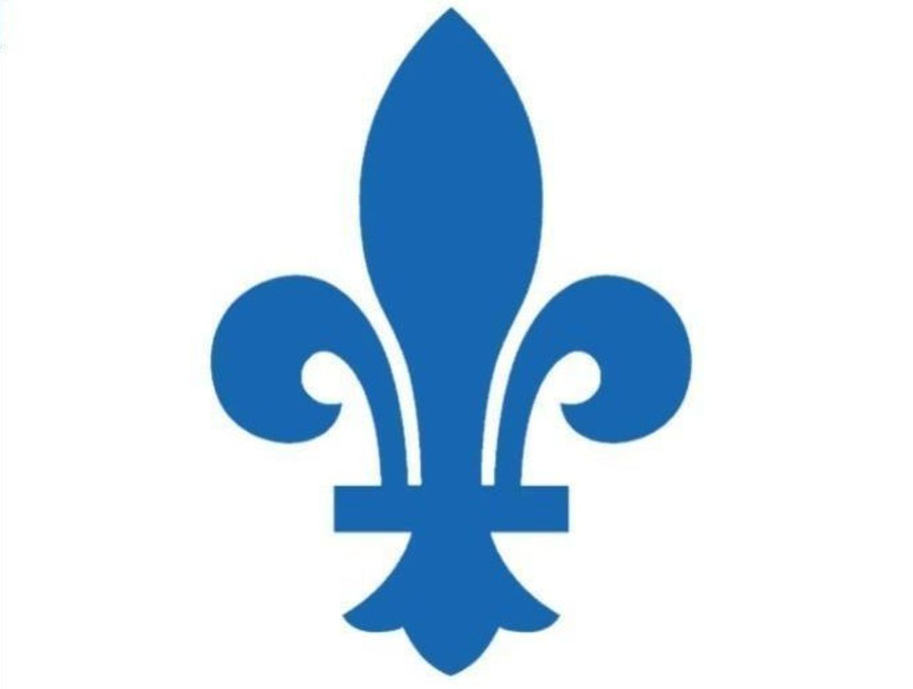
The Nordiques' primary logo is considered one of the most revered in NHL history - and the secondary one isn't bad either. It's simple, but elegant, and looks best in blue, after going through several color changes in the 1970s.
73. New York Islanders (1995-97)
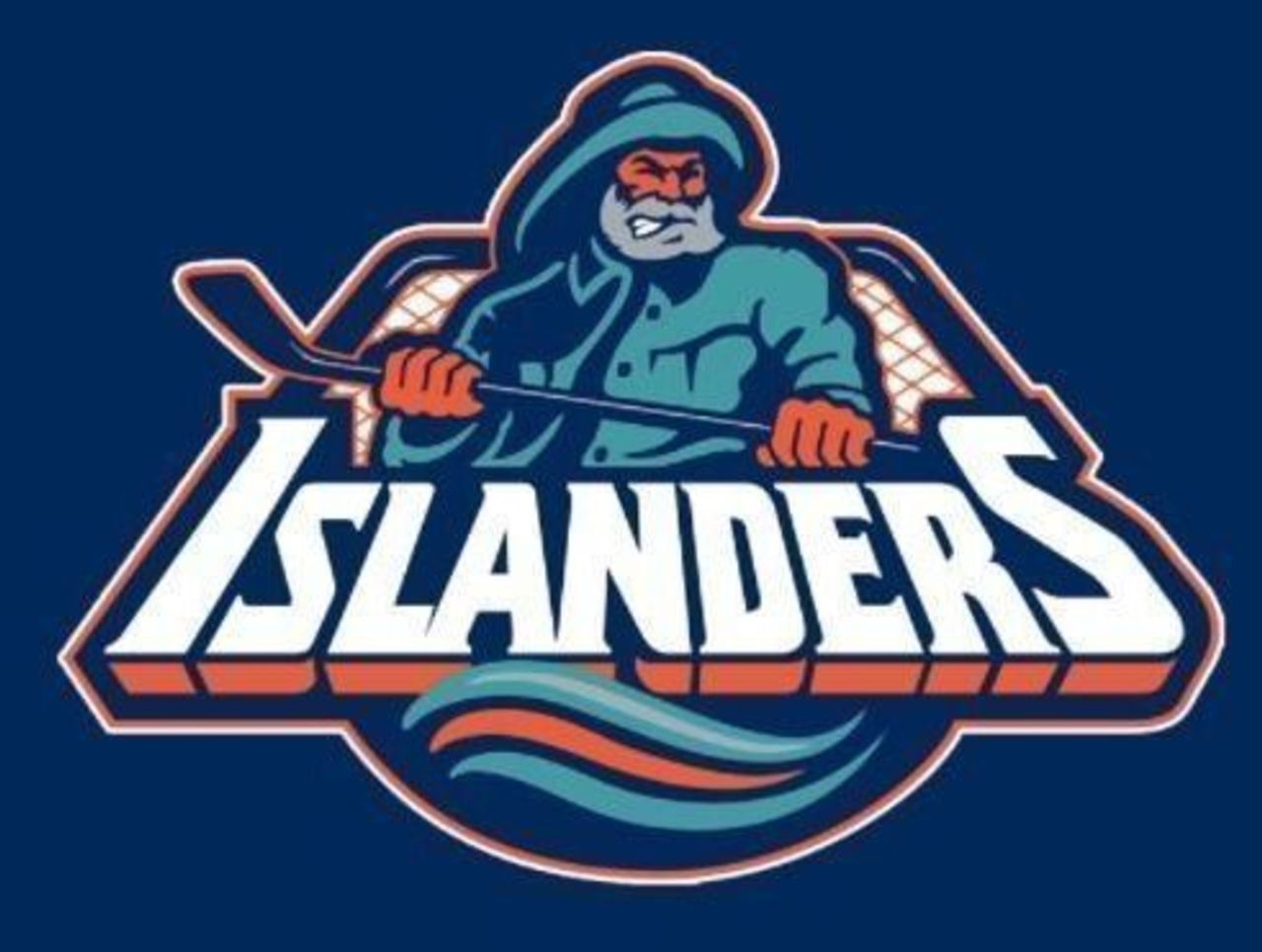
Teams can occasionally be forgiven for straying from a logo that works. We'll let you decide whether you can give the Islanders a pass for the now-infamous "Captain Highliner Debacle" of the mid-1990s.
72. Boston Bruins (1926-32)
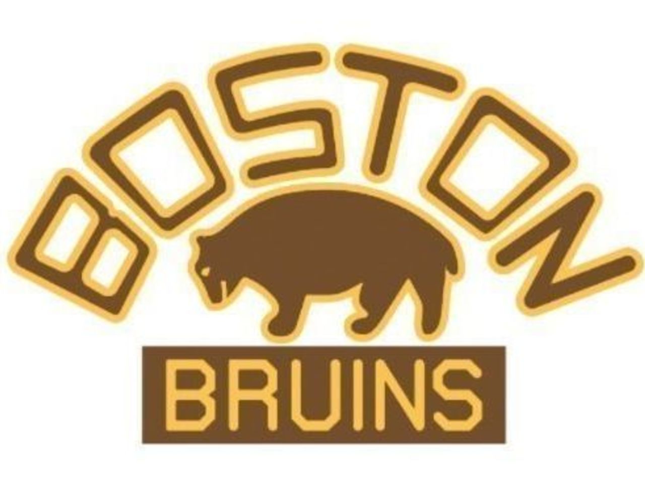
Before the famed spoked "B", there was this cute little number featuring an actual bear. The different fonts on top of and below the bear are a bit of a throw-off, but otherwise it's a decent logo.
71. Dallas Stars (2013-present)
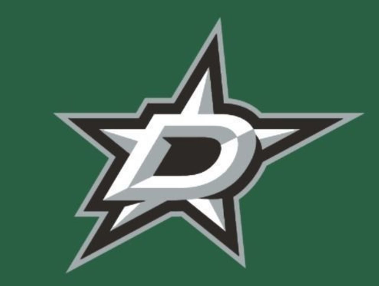
The Stars made a significant change to their logo in 2013, losing the "DALLAS STARS" text and opting instead for a big D. As logos go, they don't get much simpler than this - and that's not necessarily a bad thing.
70. Ottawa Senators (1997-2007)
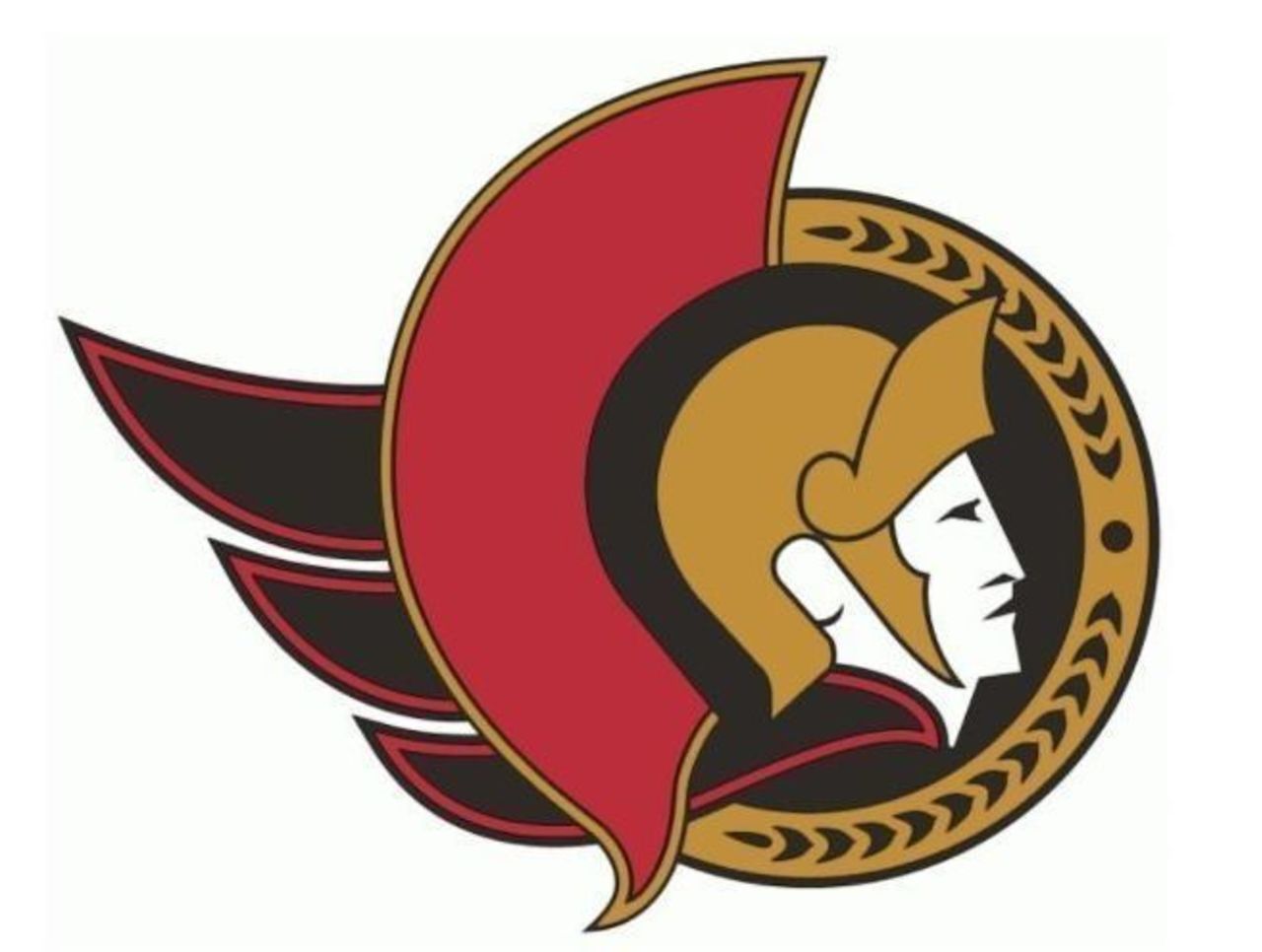
The Senators' subtle change - removing the logo's helmet laurels and moving them to the gold semi-circle band to replace the team name - was a home run. Laurels > team name every single time.
69. Atlanta Thrashers (1999-2011)
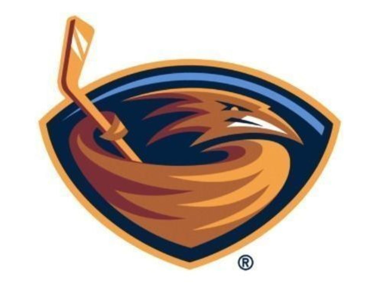
The Thrashers lasted just 12 years - and their primary logo stayed with them the entire way. Extra points for the small blue swoosh above the thrasher's head, which provided a much-needed splash of color.
68. St. Louis Blues (1985-87)
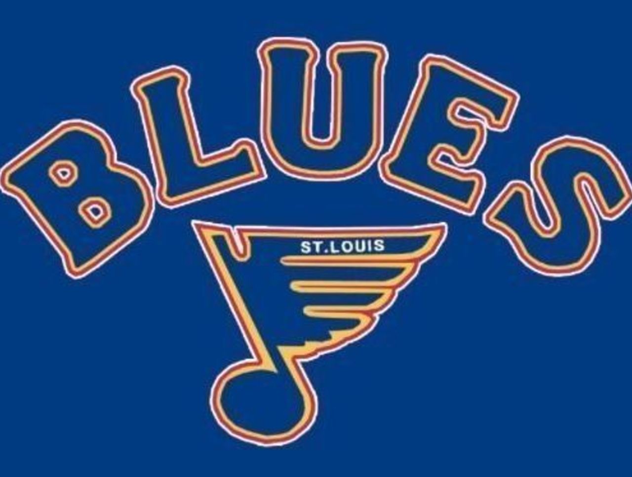
The Blues have one of the most iconic logos in all of professional hockey - but this mid-1980s alteration is a rare miss. In addition to looking a little too hand-drawn, is the giant "BLUES" marquee really necessary?
67. Anaheim Ducks (1996-2006)
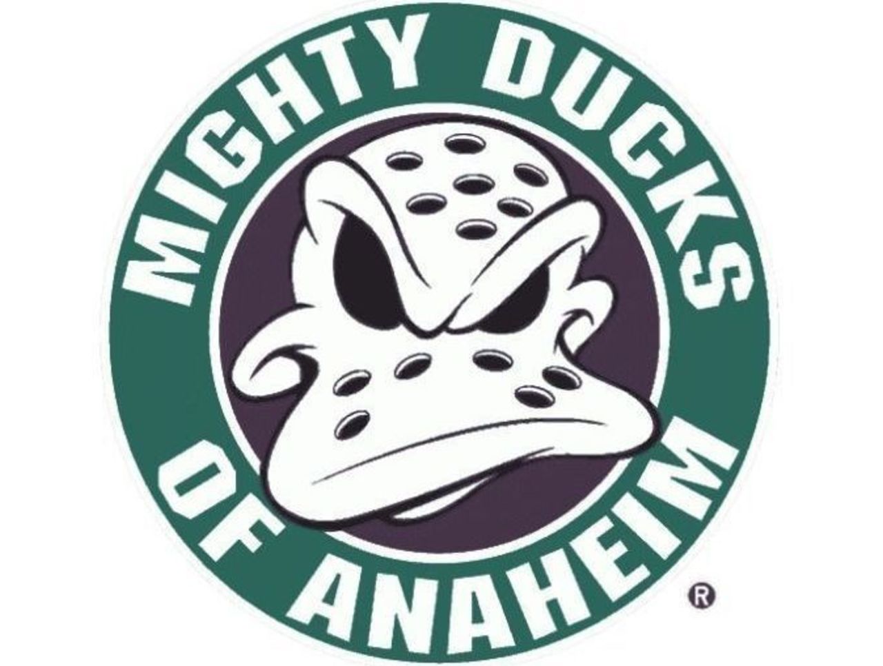
This alternate logo first appeared when Anaheim was known as the "Mighty Ducks" - though this duck looks more angry than mighty. We prefer the kinder, gentler duck face from the original logo.
66. Washington Capitals (1997-2007)
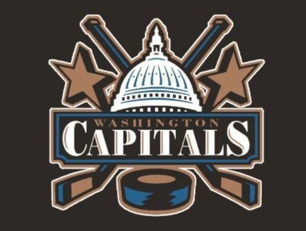
Washington went full Capital for a 10-year stretch, complete with a mini U.S. Capitol Building and two gigantic stars. The font doesn't exactly scream "hockey", and we would have preferred a solid black puck, but we're nitpicking.
65. Tampa Bay Lightning (1992-2001)
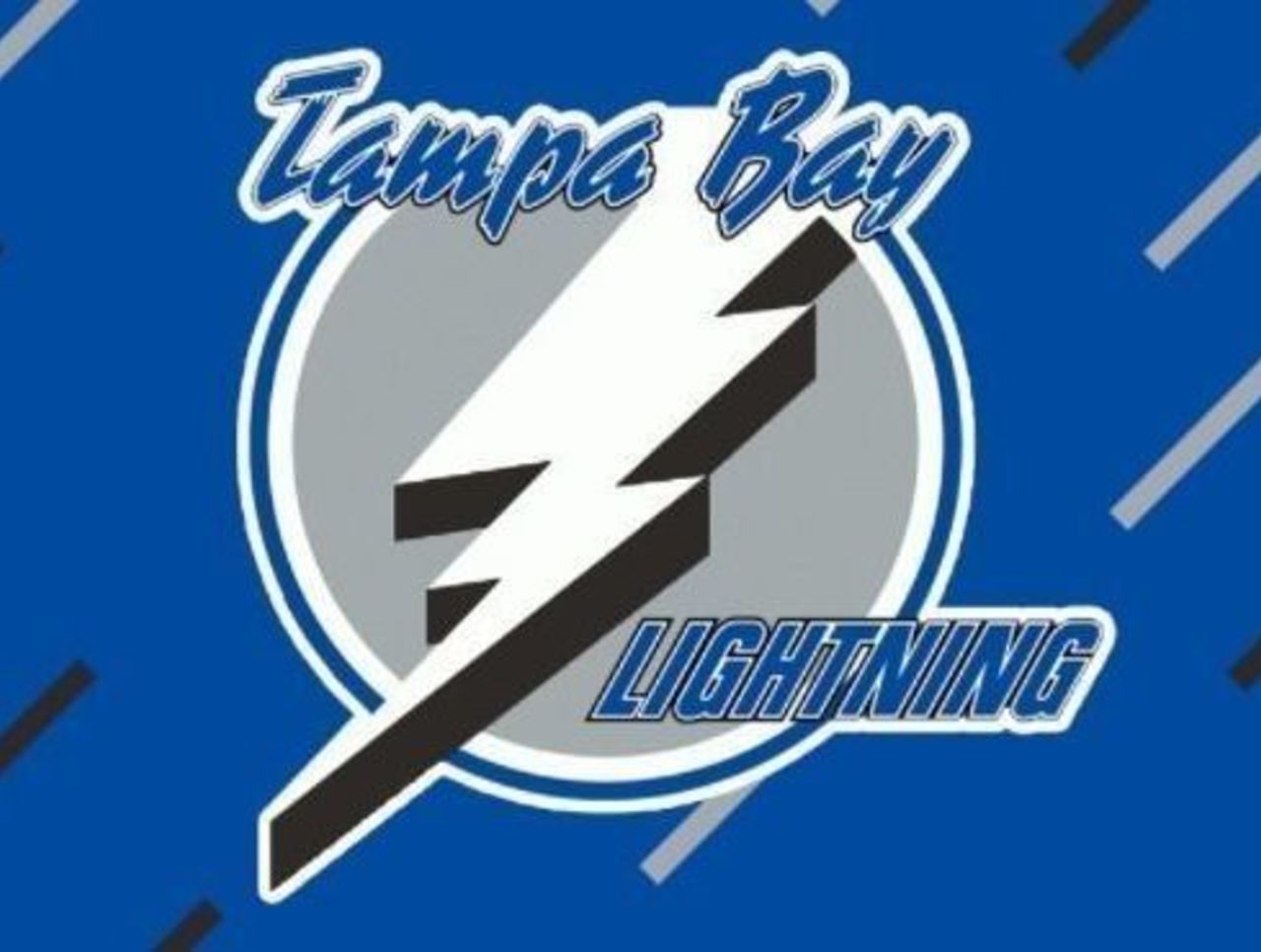
Oh, what a logo. Could any professional sports team get away with that crazy font these days? We're especially fond of this electric rain shower background of the late-1990s, though it's clearly not for everyone.
64. Colorado Avalanche (2015-present)
It isn't quite as eye-popping as the old Rockies logo, but this homage to the 1970s is one of the more popular secondary offerings this decade. Give the Avs credit: they do logos extremely well.
63. Vancouver Canucks (1997-present)
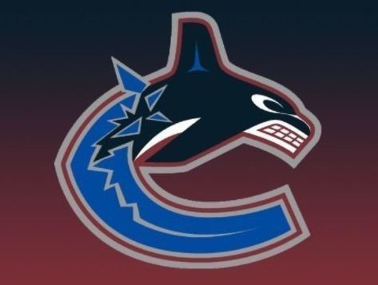
Give the Canucks massive credit for coming up with logos that get people talking. The addition of the word "VANCOUVER" above the logo in 2007 didn't really enhance anything, but that is one cool orca regardless.
62. Washington Capitals (1995-2007)
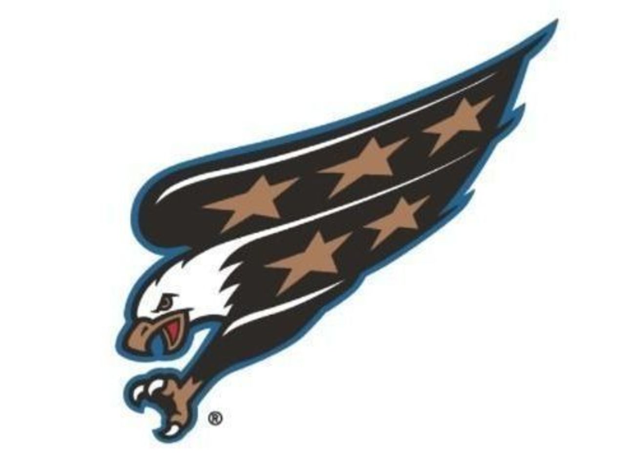
The mighty eagle found a home on Washington's jersey for more than a decade, and marked a significant shift from the iconic font-based logo the Capitals wore for the first 21 years of their existence. The talons are a nice touch.
61. Winnipeg Jets (2011-present)

The return of the Jets franchise to Winnipeg (actually, it was the arrival of the Atlanta Thrashers franchise, but whatever) came with a decidedly different logo, despite pleadings for the original. This one has kind of grown on us.
(NHL logos are used with permission and are courtesy of the National Hockey League.)