Ranking the best and worst Barcelona home kits of the last decade
Barcelona unveiled its latest home kit on Monday, and while the Blaugrana haven't made any major departures from their traditional blue and red shirts, the subtle changes make a world of difference in the kit department of Camp Nou.
Here's how we rank the last decade of Barcelona kits, from worst to first:
10. Oh boy, 2012-13
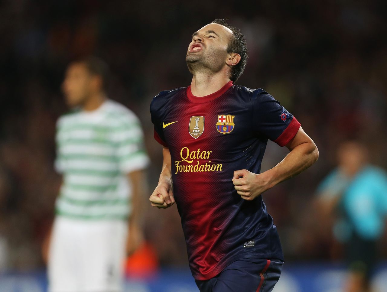
Remember when you discovered how to make those funky Microsoft Word headers with the two-tone gradient? Now imagine putting that on a kit, and you have this atrocity. Stick to stripes, please.
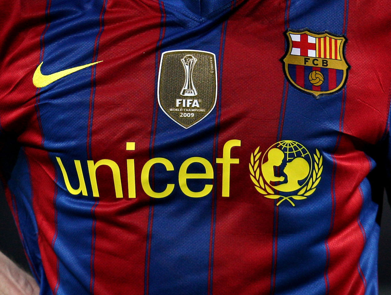
9. The 2008-09 misstep
These kits may have been bathed in Champions League glory, but no amount of champagne and good cheer can overcome the sheer level of awfulness that is the 2008-09 shirt, which made players look blue in one half, and red in the other.
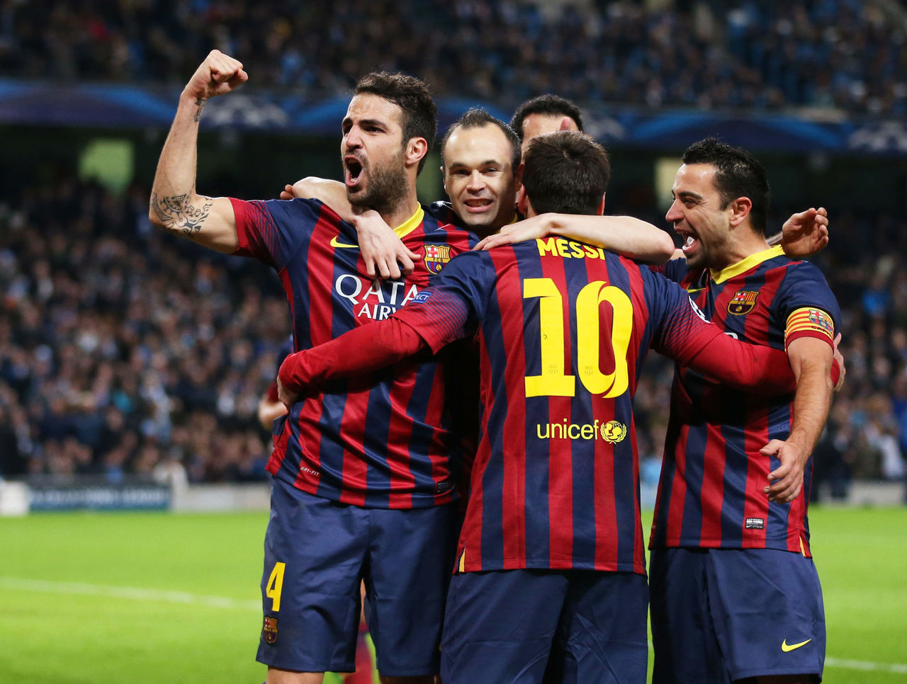
8. Ignoring tradition in 2015-16
Quick! How do you reinvent the most iconic shirt in modern football? Why, you flip the stripes from vertical to horizontal, of course. Which was, of course, very bad.
7. 2017-18? Get me pictures of Spider-Man!
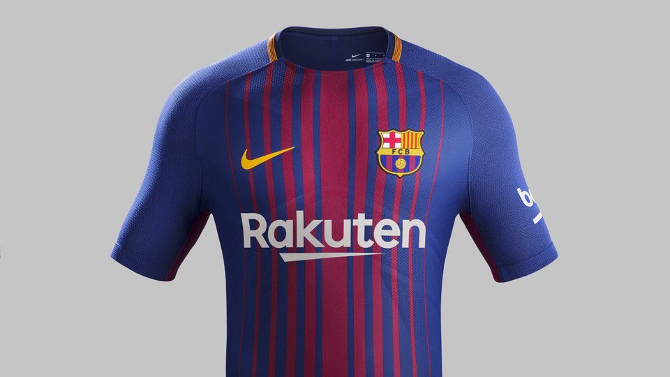
(Photos courtesy: @FCBarcelona)
The tightness of this shirt, coupled with the not-quite-straight lines, almost makes this kit look like an inverse of Spider-Man's costume. The curved lines even give off the same sort of spider-legs feel. It's a little too blue, too.
6. The 2011-12 thin stripes
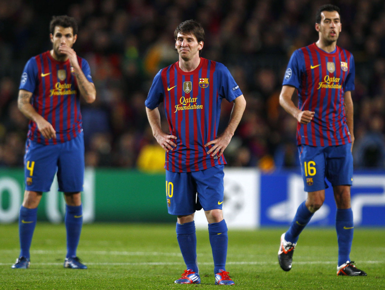
This idea was okay, on paper, and did a good job of mixing up both colours while offering something new. We like that the busyness of the thin stripes is canceled out with neutral blue sleeves, shorts, and socks. Not half bad.
5. The simple 2009-10 shirt
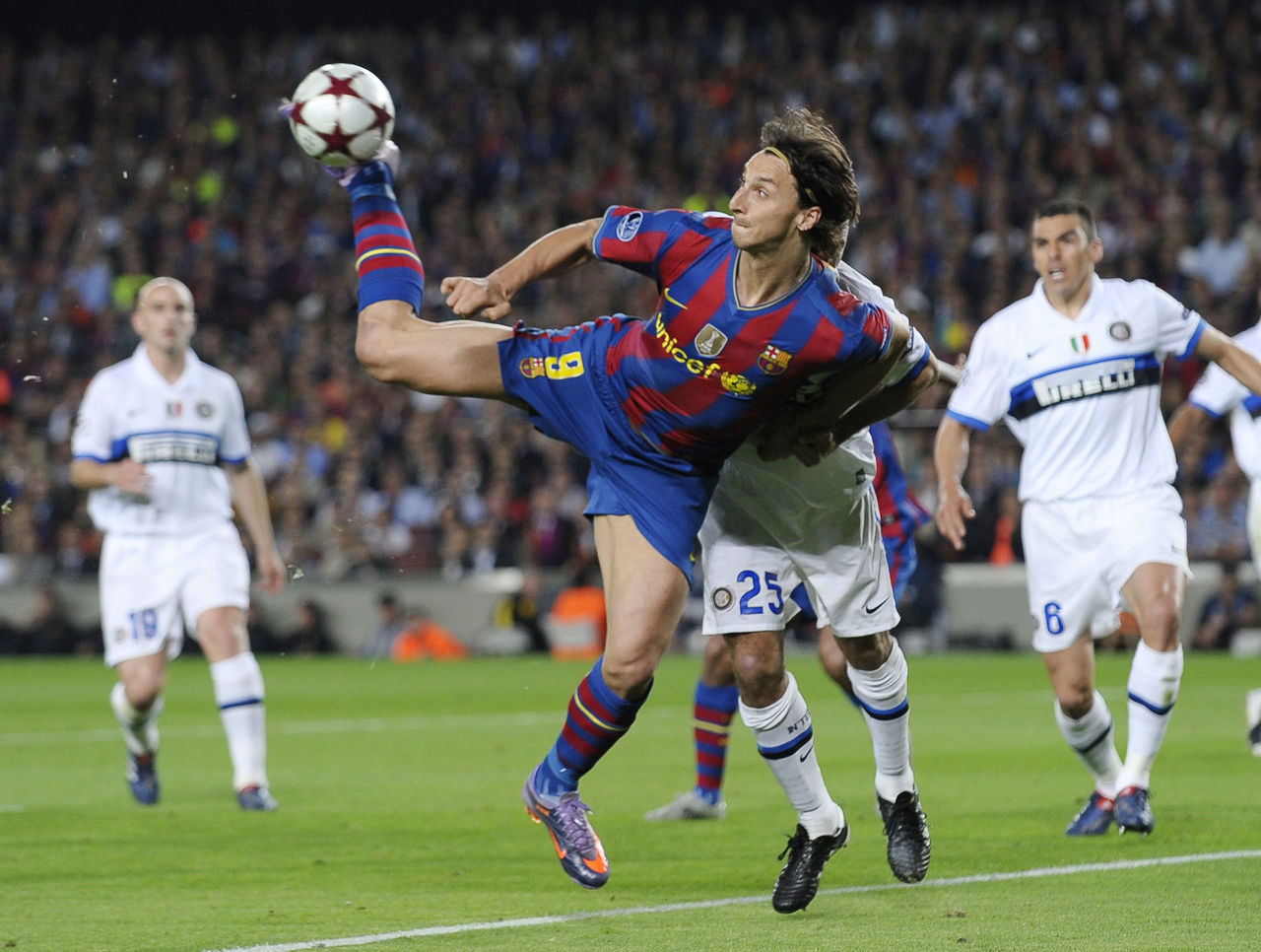
There's absolutely nothing wrong with sticking to what works, a point made clear in the 2009-10 season as Zlatan Ibrahimovic and Co. celebrated a Club World Cup and La Liga. Even-sized stripes tell the simple success story here.
4. Now we're talking, 2014-15
It's a pretty straightforward striped Barcelona shirt at first glance, but the detail work on this kit is magnificent. In particular, the small Catalan flag at the point of the collar is a masterstroke, as are the darker-toned colours.
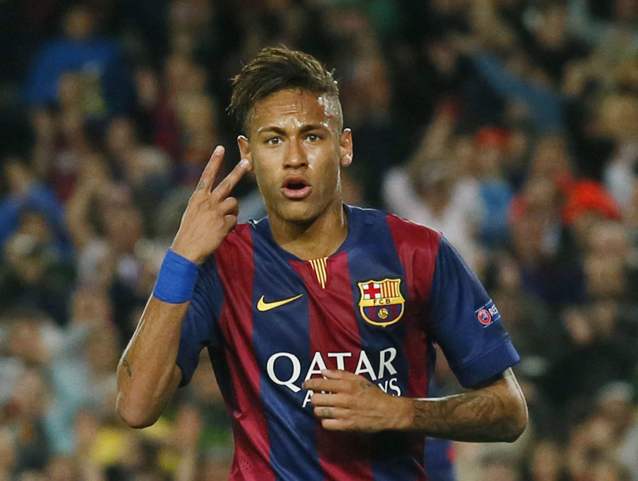
3. Remix on tradition, 2013-14
We love everything about this kit, especially the sleeves, and while the V-neck collar may be a bit too thick, it certainly made Barcelona stand out on the pitch. Worn under Tata Martino, the club celebrated only a Supercopa win in this kit.
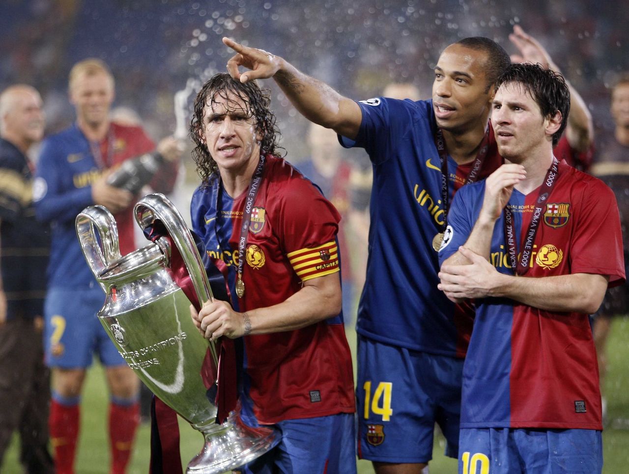
2. Commemorating the Camp Nou, 2007-08
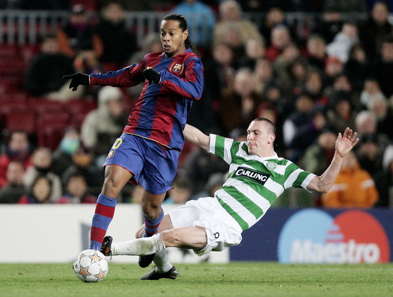
This shirt has a lot going for it; a nod to tradition, featuring brighter shades of red and blue, and a badge signifying the 50-year anniversary of the Camp Nou. It was a simple highlight in a year without silverware, marked by Ronaldinho's exit.
1. Back to beautiful basics in 2010-11
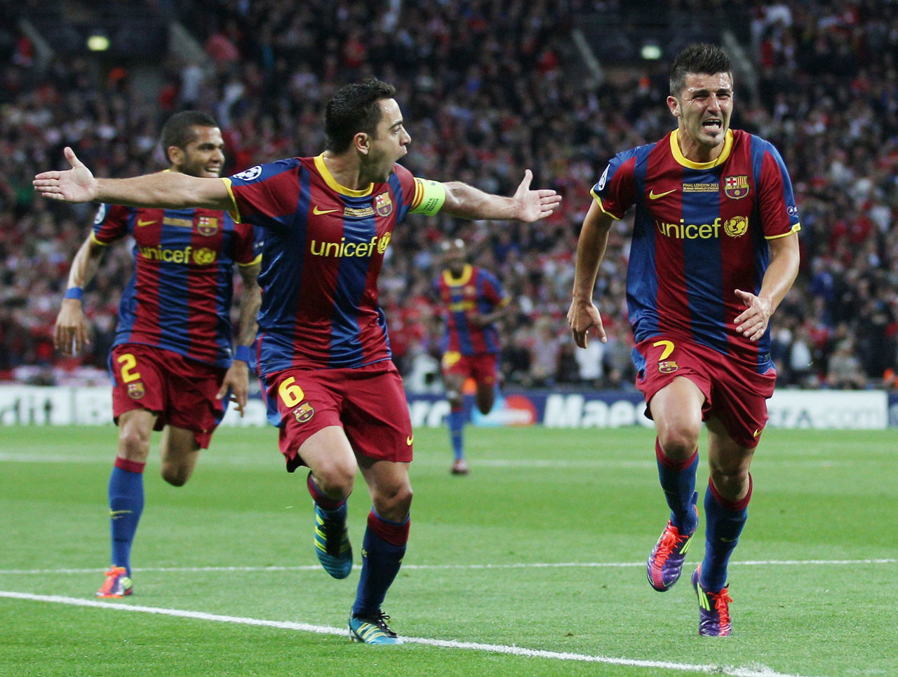
A fitting tribute to the team Sir Alex Ferguson called the best squad he's ever faced, there's not a stitch out of place in this traditional home kit. It looked quite nice as Barca celebrated a Champions League and La Liga double, too.
(Photos courtesy: Action Images)


