Another season is upon us - and so is a new batch of City Editions jerseys, which means it's time to dissect the artistic merits - and failings - of the latest offers.
You'll notice a few recurring elements. Black was used as the dominant color in 15 of the jerseys; seven featured metallic gold as a secondary accent; four pulled off the double whammy of a black base with gold accents. For the most part, teams stuck to the tried and true, gently tweaking familiar concepts from years past to provide a fresh coat of paint.
Here are the all 30 City Edition jerseys for 2020-21, ranked from best to worst.
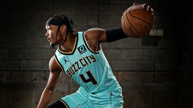
1. Charlotte Hornets
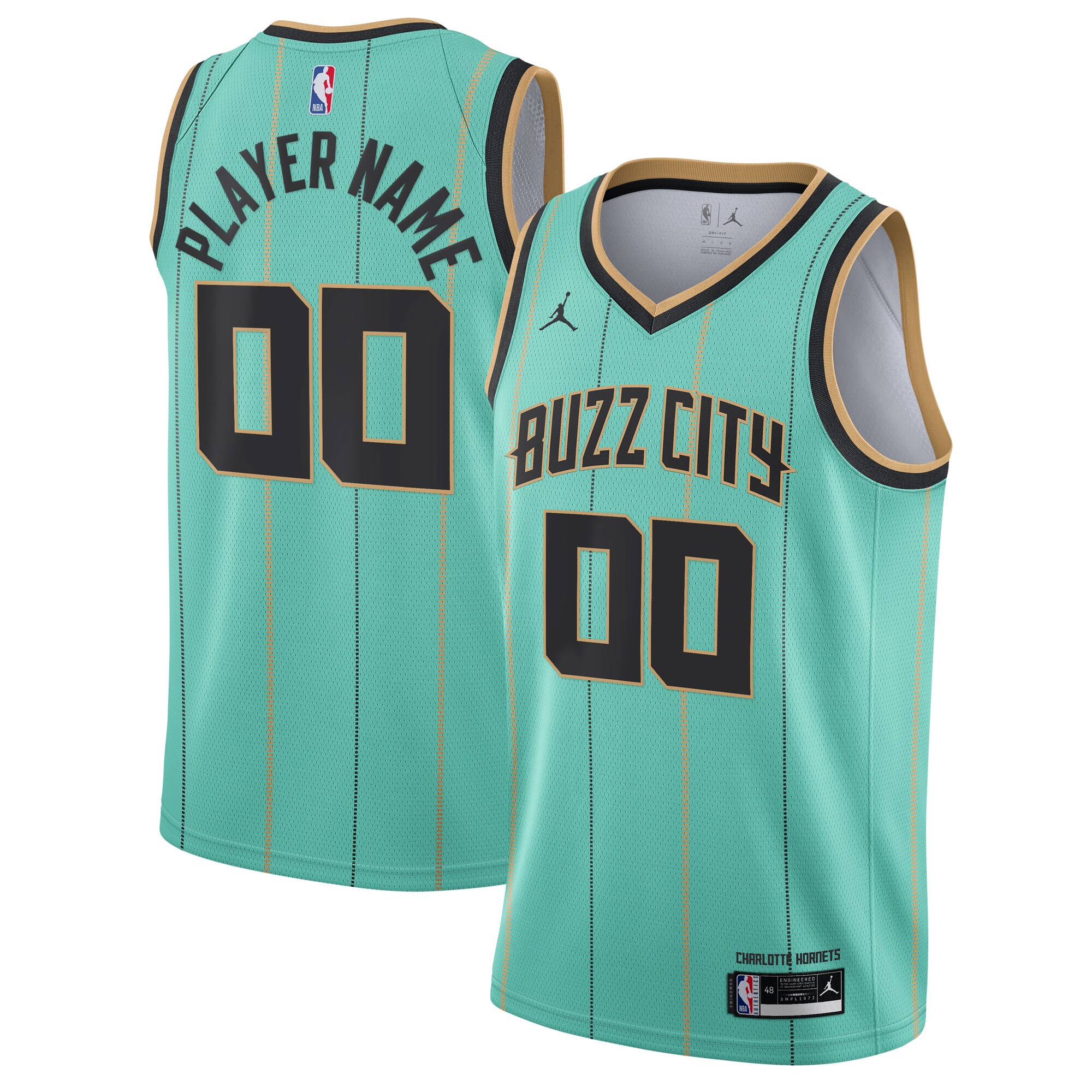
Teal and purple provide a unique point of departure for the Hornets' design team - a license to tap into the nostalgic hues of the 1990s. However, by putting the purple accents on the back burner in favor of gold trim and pinstripes, Charlotte has landed upon a modern classic.
2. Golden State Warriors
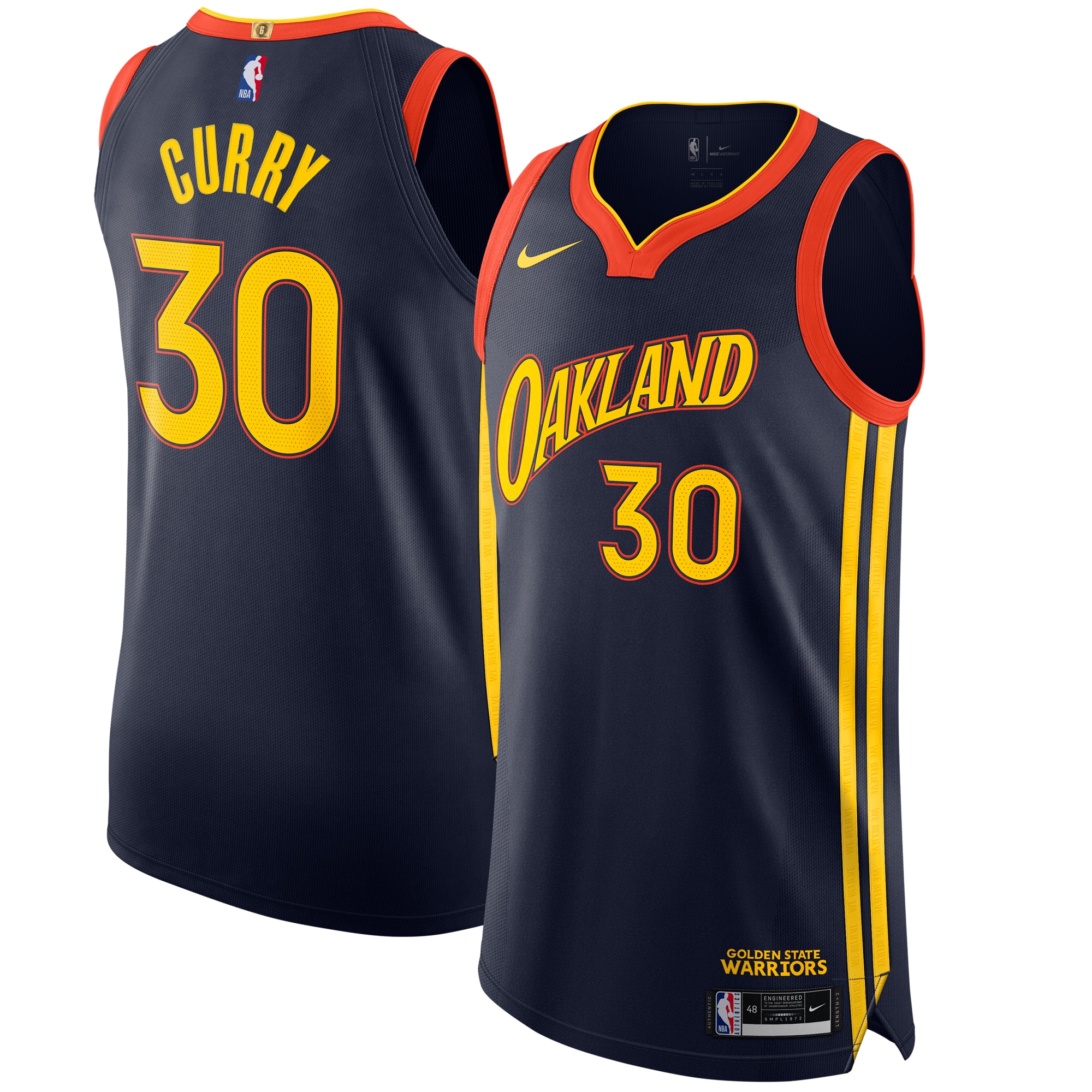
The Warriors didn't stretch their imagination with this updated take on the We Believe-era color scheme - but they didn't have to. Perhaps Oakland-based fans will find their city's inclusion a little too cute so soon after the team's relocation to nearby San Francisco, but it still serves as a nice reminder of the team's roots.
3. San Antonio Spurs
After years of (seemingly begrudgingly) trotting out a camo-print alternate jersey set, the Spurs finally acquiesced to fans who have long begged for the return of teal, pink, and orange.
This will actually be the first time that the Fiesta colors grace a jersey. The original introduction to fans came on the team's warmup jackets during the David Robinson era.
4. Memphis Grizzlies
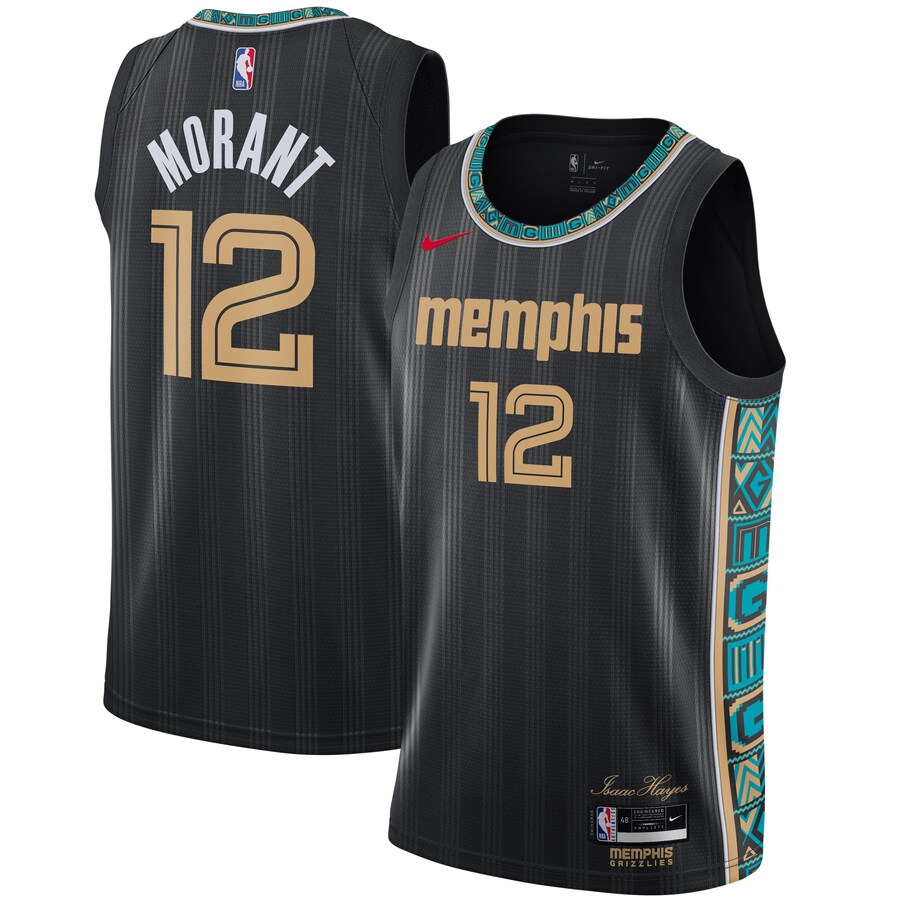
Didn't think you'd see a jersey inspired by the late Memphis soul icon (and former cartoon chef) Isaac Hayes, did you? The vertical lines down the jersey are meant to represent vinyl, while the patterns on the neck trim and side panels were inspired by Kente cloth.
5. Miami Heat
After using hot pink, white, black, and electric blue as the base color for previous iterations of their Vice jerseys, the final permutation for the Heat appears to be all of the above. There are a lot of cool elements crammed into the new Viceversa jersey. Still, one has to wonder if it's too much of a good thing. Will the jersey still look great when there are five players wearing it at once?
6. Phoenix Suns
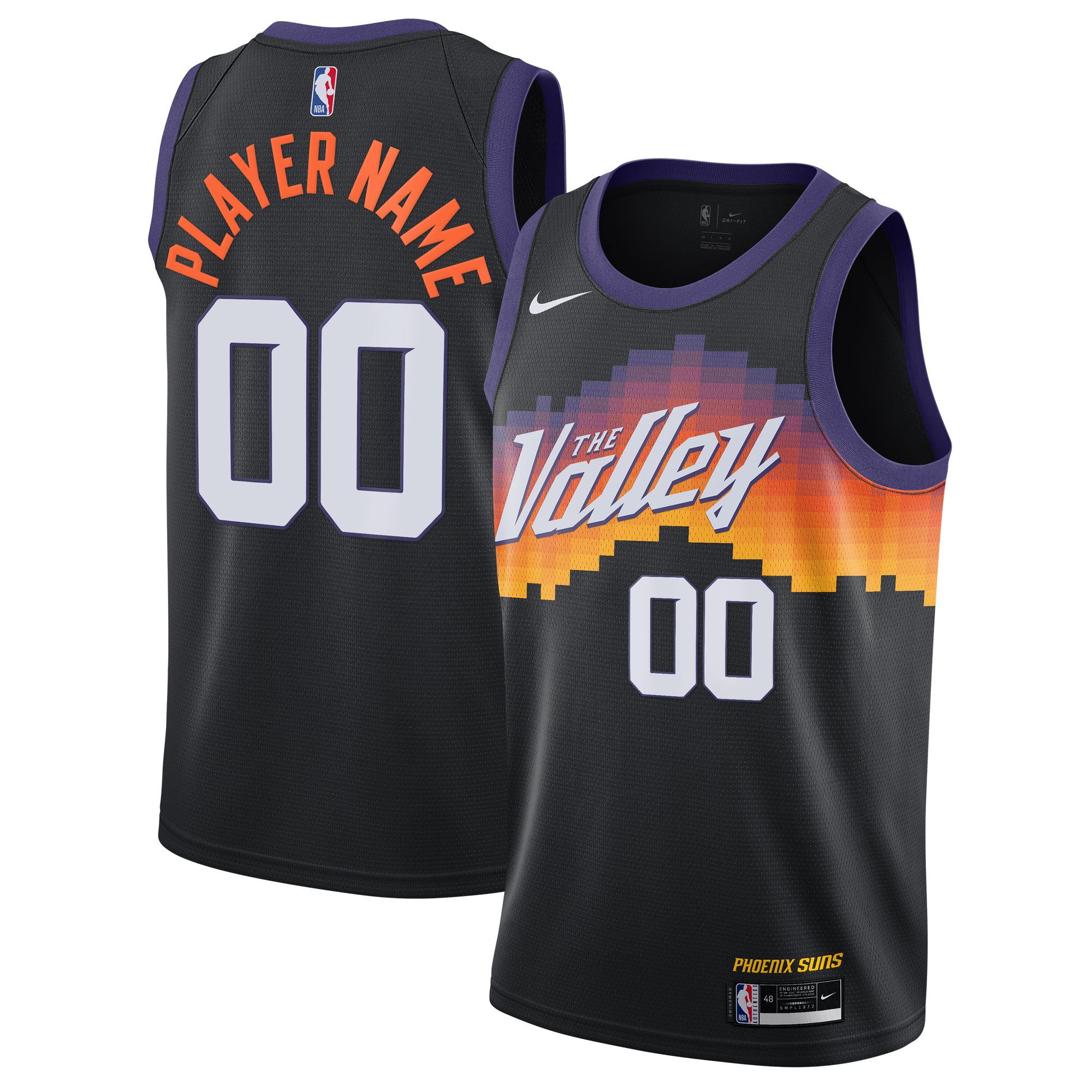
Kelly Oubre may play for the Warriors anymore, but his impact on the Suns' sartorial flair will live on (for 2020-21, at least). The gradient purple-to-orange blocks offer a slightly futuristic take on the team's old-west locale. We'll see if "The Valley" has staying power similar to other regional monikers like "The North."
7. Indiana Pacers
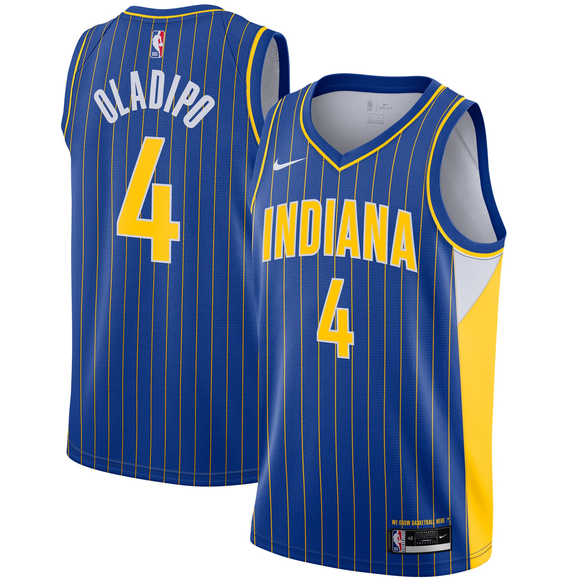
The Pacers finally stopped fiddling around with bland alternates inspired by the city's history in stock car racing, opting for this fresh take on an old, familiar staple. Note the base is more of a royal blue than the dark navy tones frequently sported during the Reggie Miller years. Hopefully, this isn't simply a one-season addition.
8. Atlanta Hawks
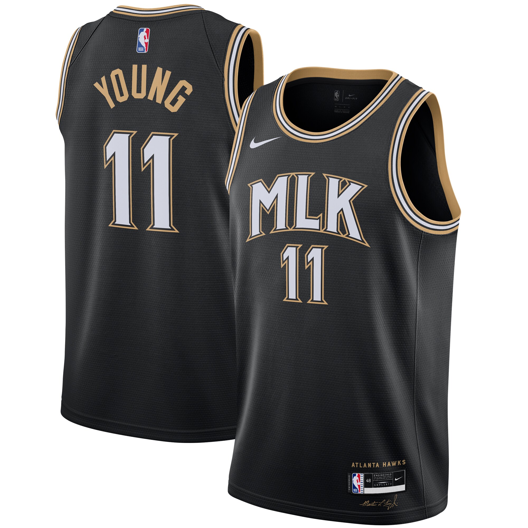
Disappointingly, the Hawks backed away from last year's courageous decision to add peach to their color palette. Technically, the trim in their new City Edition outfit is dubbed "vintage gold," which certainly befits the legacy of social justice advocate Martin Luther King Jr., the inspiration for the jersey.
Small aside: The team representing King's place of birth - and one of the hubs of modern-day social justice discourse - probably shouldn't have been saddled with a 2:30 p.m. ET game on MLK Day (Jan. 18).
9. Portland Trail Blazers
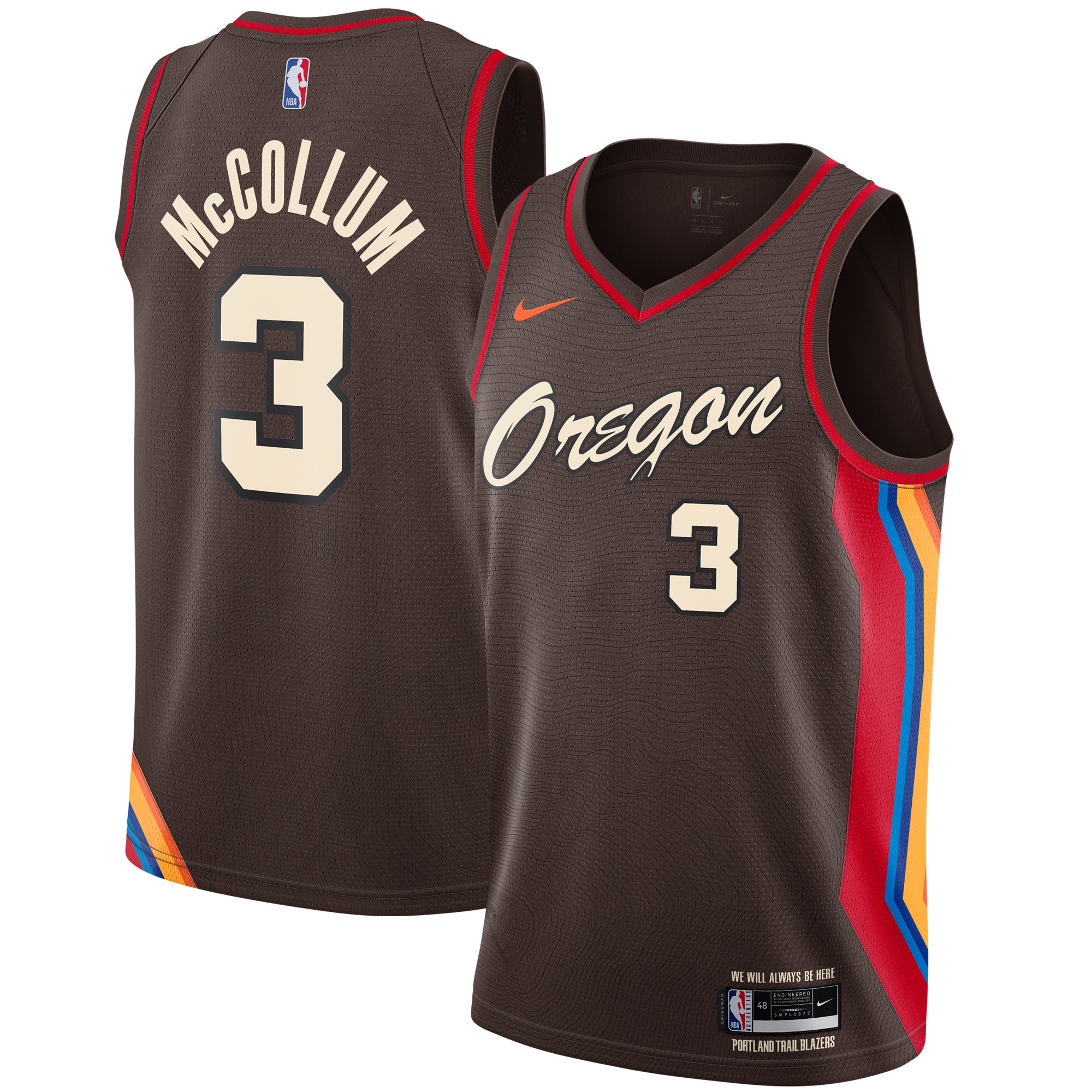
Brown (with or without a subtle topographical print) doesn't usually work as the base color of a jersey, but in this case, it really helps both the neck and arm trim and the unique side-panel design.
The unique palette harkens back to the state's landscape and is meant to acknowledge the region's tribal nations. Can't get much more Trail Blazer-y than that. Overall, it's a cohesive look that could've come off far worse.
10. Toronto Raptors
We're all in on @FredVanVleet. #BetOnYourself pic.twitter.com/Ecry0XTNDy
— Toronto Raptors (@Raptors) November 24, 2020
The Raptors barely tweaked last year's City Edition look, but it's still an improvement. The wordmark now follows a slight diagonal slash, and the front jersey number has been shifted off-center. The asymmetrical claw mark on the right side of the shorts is more noticeable.
11. Orlando Magic
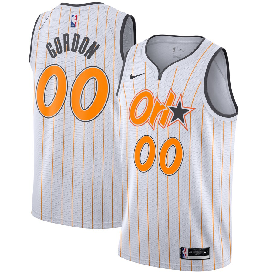
This is a much stronger marriage between the Magic's existing iconography (the pinstripes and typeface) and a local twist (orange) than last year's dour gray look. Still, the team should lay further claim to Florida's favorite citrus by swapping out the "O" in Orlando for the fruit itself.
12. Utah Jazz
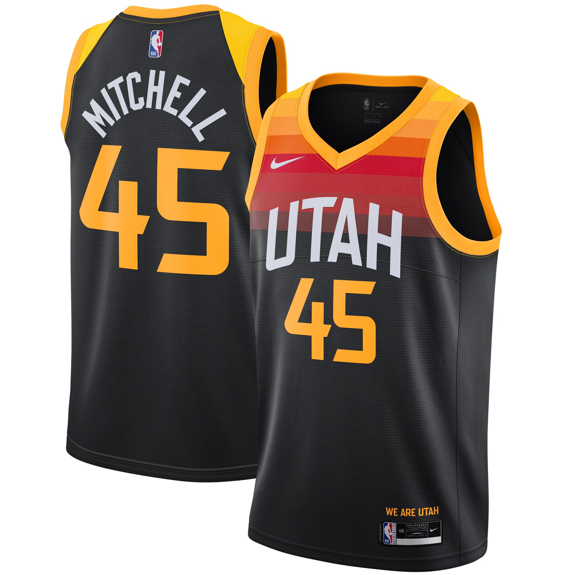
The Jazz rocked the first iteration of their red-and-orange-hued gradient jersey for three seasons. Why mess with a good thing? Of course, new jerseys mean more revenue, hence this year's Dark Mode edition. It offers a more sinister update befitting of a rising team looking to shake up the West.
13. Chicago Bulls
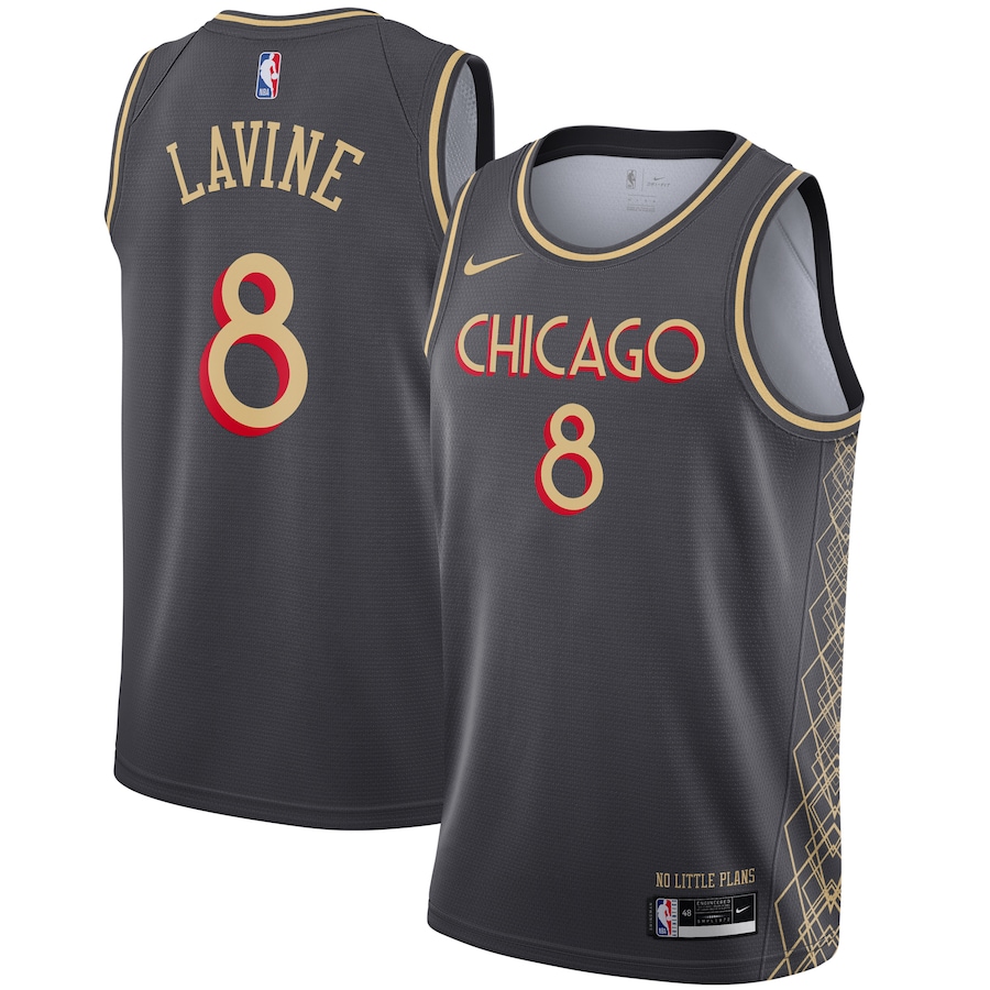
Fans of the Best Picture-winning musical "Chicago" rejoice: The Bulls have a jersey for you.
The muted black base helps the gold-and-red art deco font leap from the jersey like a Zach LaVine windmill dunk. The intricate geometric pattern up the side is unlike anything we've seen on an NBA uniform.
14. Boston Celtics
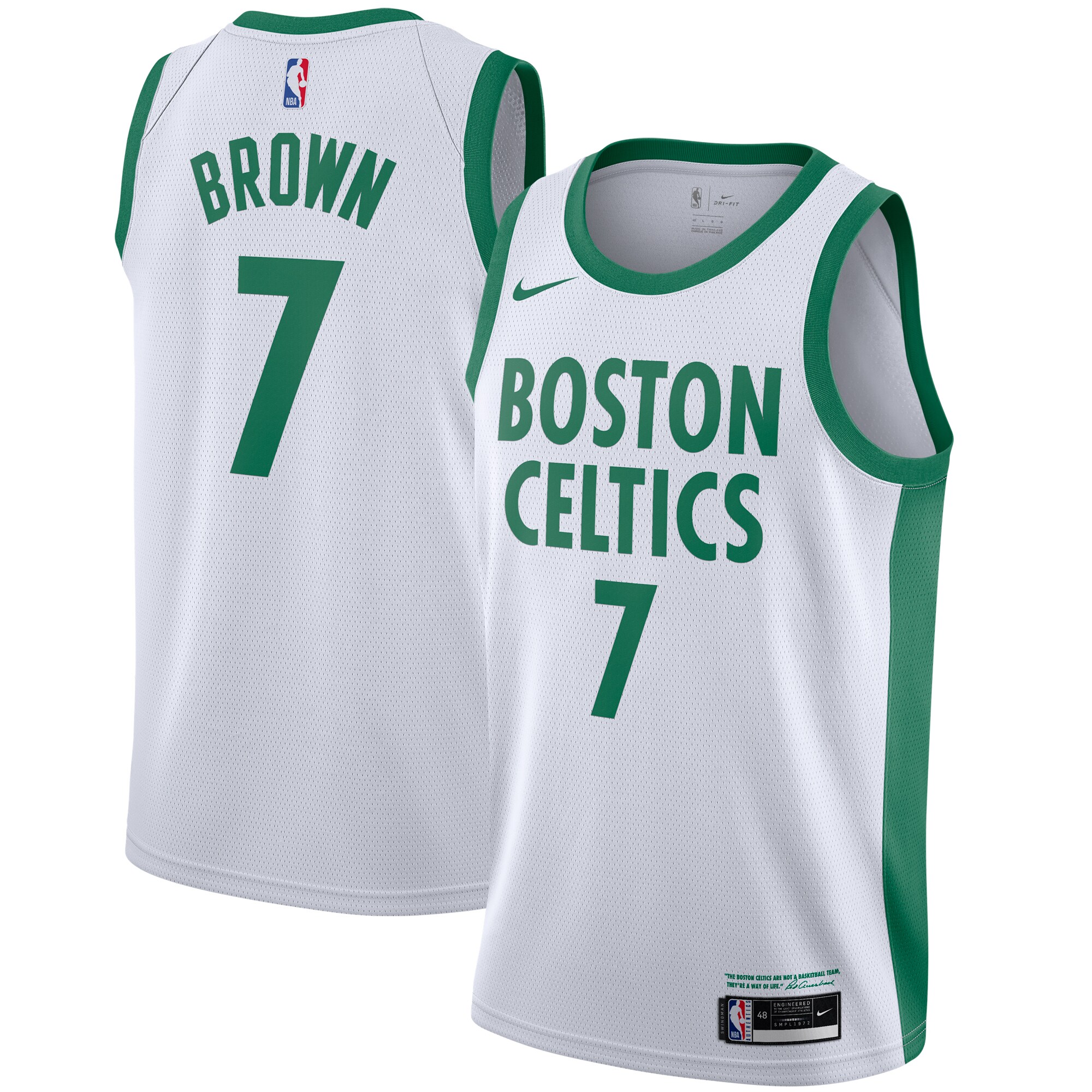
The Celtics already possess one of the cleanest and most iconic looks in sports history, so coming up with new alternate jerseys is typically a losing proposition. Veering too far from green and white (like last season's unsettling old-timey design) is practically sacrilegious, but anything less just comes off as lazy.
Anyway, this year's City Edition jersey evokes the Celtics' many championship banners. It's fine. Ho-hum.
15. Los Angeles Lakers
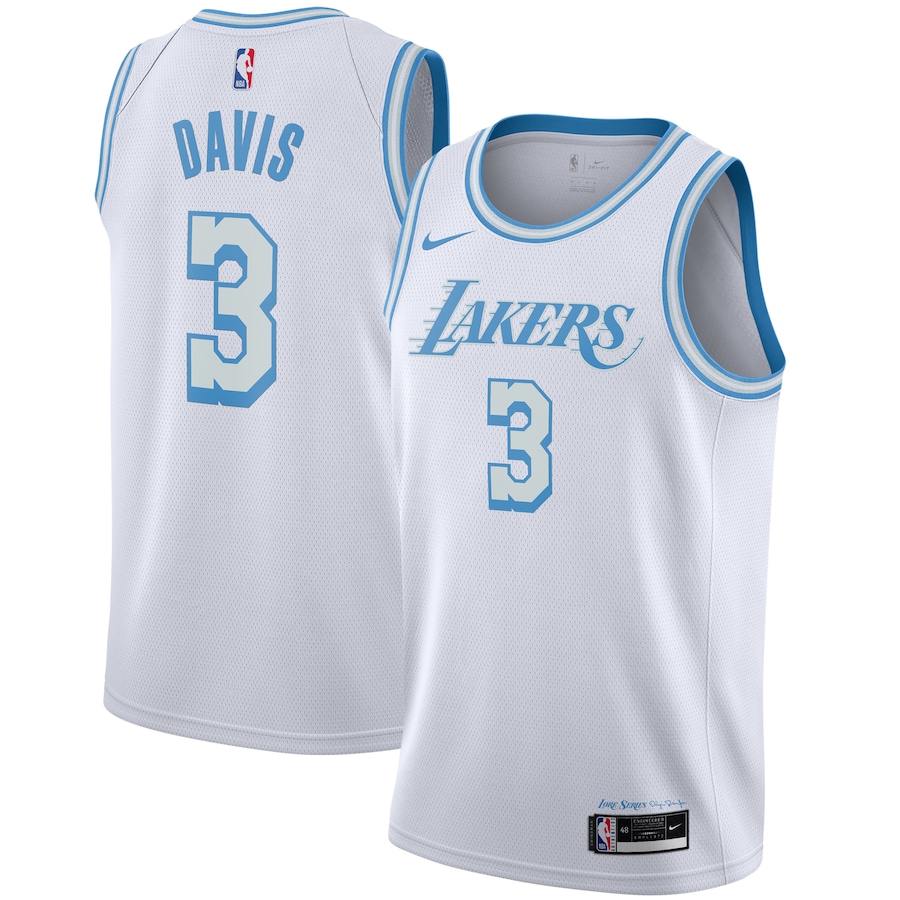
The Lakers continue their Lore Series, this time using the City Edition jersey to pay homage to club legend Elgin Baylor. Gold gets to take the odd game off in 2020-21, as the team's warmer base color cedes the way for a baby-blue set that harkens back to the accents on the purple-centric uniforms from the 1960s.
16. New Orleans Pelicans
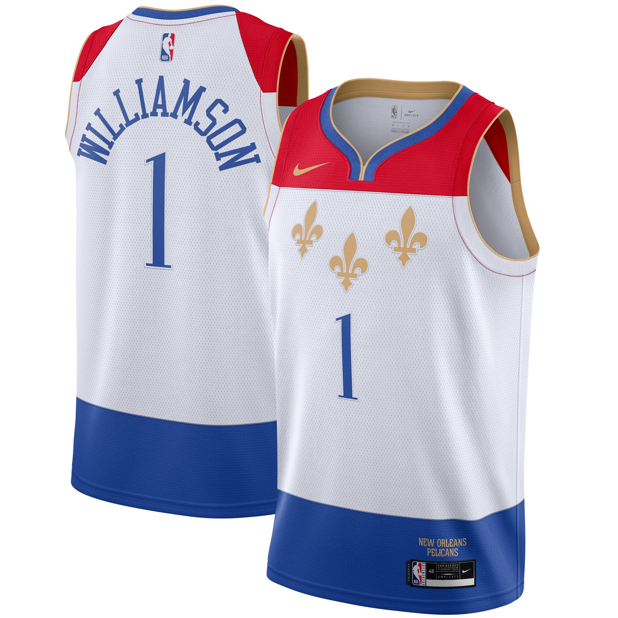
The Pelicans' Mardi Gras jerseys have been a hit. Shifting away from those green, white, and purple threads is certainly a bold choice. This city flag-inspired design isn't terrible - and almost anything will look good on Zion Williamson when he's throwing down in transition - but something feels off. Perhaps there's too much empty space below the numbering.
17. Minnesota Timberwolves
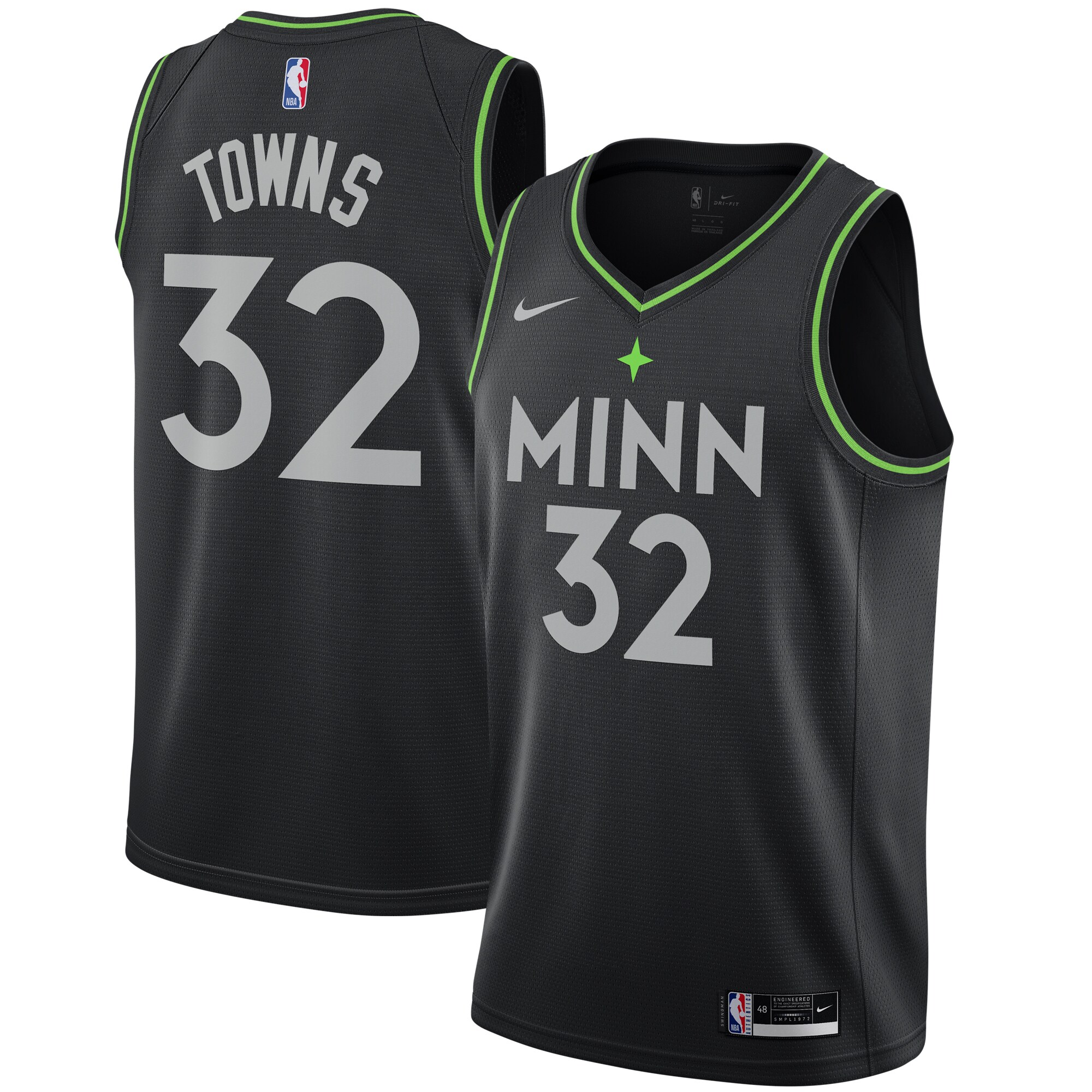
Having donned highlighter-green jerseys in the past, the Timberwolves were smart to use the neon tone more sparingly. You can't see it in the picture above (nice job, product shot person), but there's actually a stripe of stars up the right side of the jersey and shorts, adding a bit more flavor to an otherwise dull design.
18. Brooklyn Nets
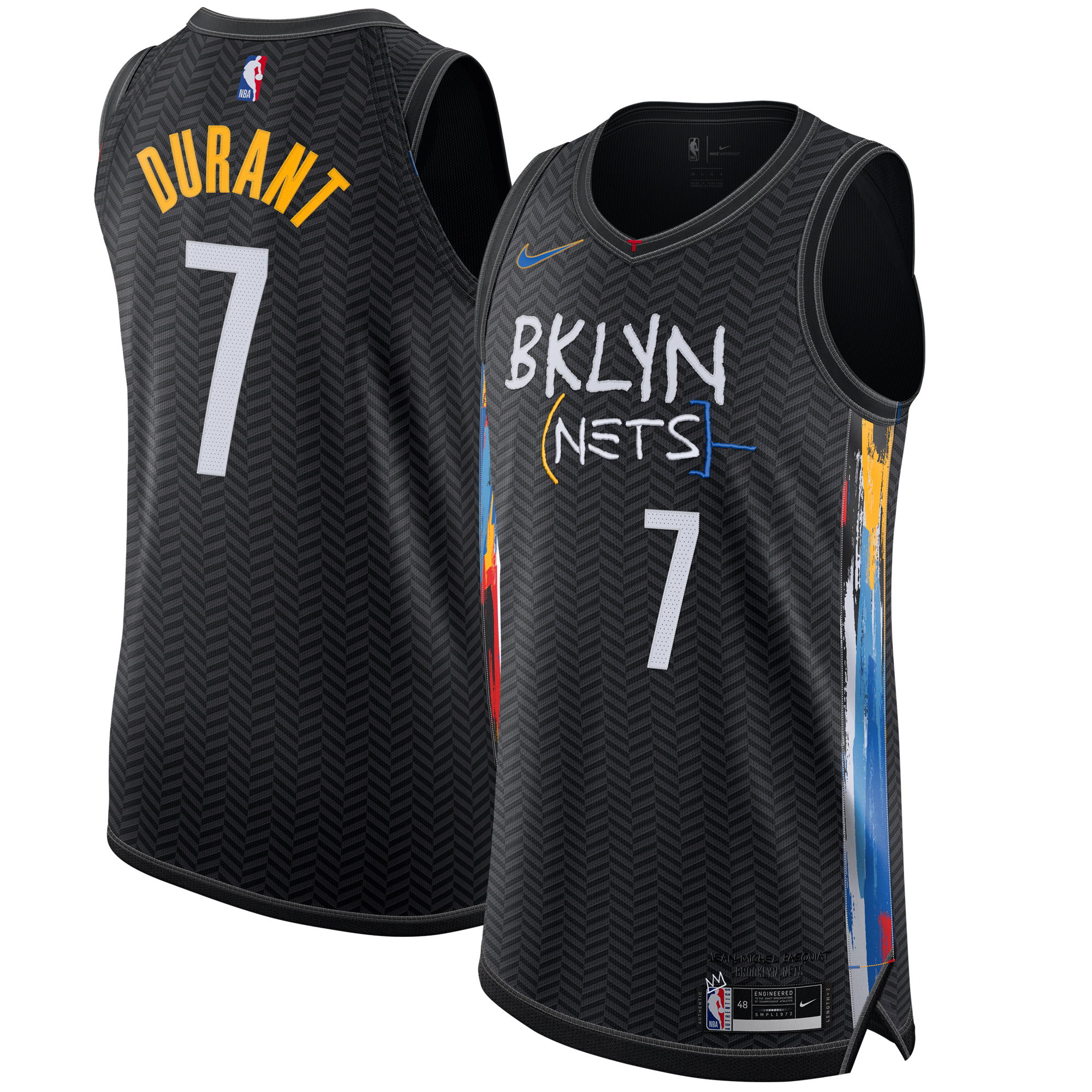
The Nets are one of the lone teams for whom a black jersey isn't an uninspired cop-out from a design team short on ideas, so we can't ding them on that point. In fact, Brooklyn's jersey people clearly have no shortage of creativity.
It's the execution that falters here. On their own, the elements inspired by Jean-Michel Basquiat - the abbreviated BKLYN wordmark, the neo-expressionist paint splotches up the sides - are awesome. Where the cohesiveness falls apart is the inclusion of a crisscrossing pattern that covers the entirety of the remaining space.
19. Dallas Mavericks
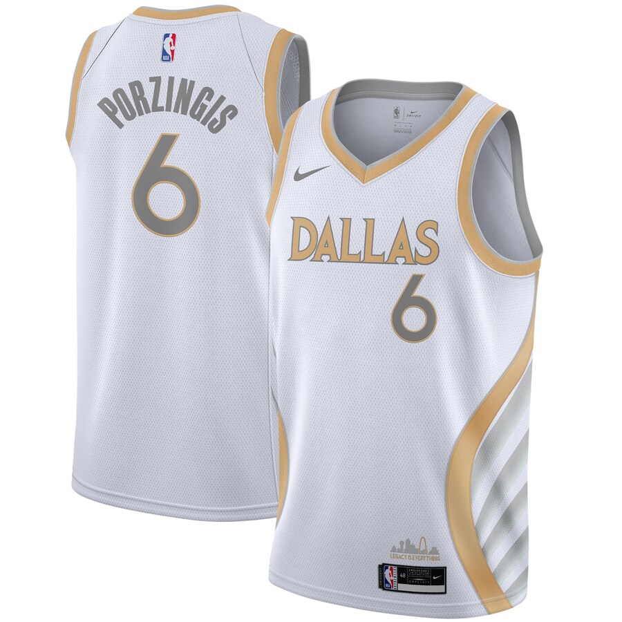
The Mavericks' 2019-20 alternate featured neon green trim with dark blue and bubble graffiti font. Obviously, this angelic look registers as an improvement of several magnitudes. In tandem with the matching shorts, the wing pattern up the side is inspired by Dallas' connection with the mythical Pegasus.
20. Denver Nuggets
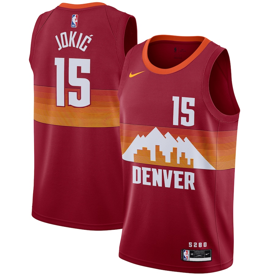
Billed as the third and final version of the Nuggets' Skyline series, this year's iteration foolishly omits the team's beloved rainbow motif. Instead, fans are left with a Rocky Mountains-inspired jersey that looks like something their rivals in Utah have sported in recent years. This is a misfire relative to the team's prior successes.
21. Sacramento Kings
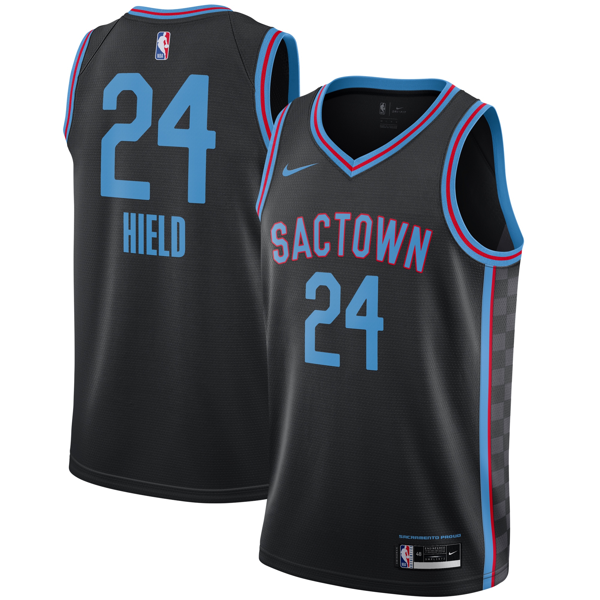
The Kings just can't seem to quit firetruck red and baby blue - or the unfortunate Sactown nickname, for that matter. Like many teams on this list, Sacramento's decision to default to a black alternate jersey might be an indication that the design teams at Nike and the NBA are running low on inspiration.
22. Philadelphia 76ers
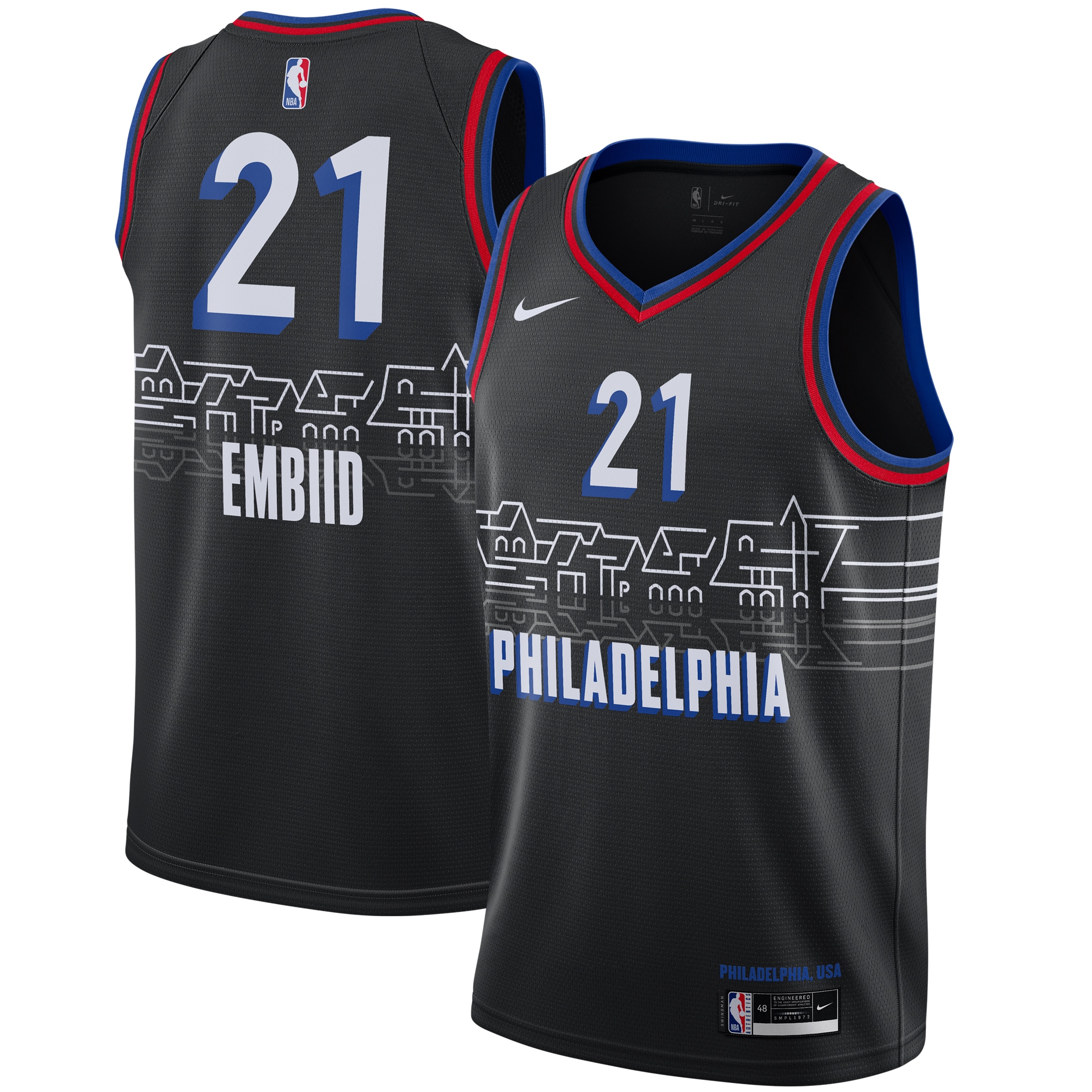
While some of the new jerseys will undoubtedly look better in action, the 76ers' Boathouse Row-inspired set might simply end up looking crowded and messy on Joel Embiid as he jostles in the low post. With so many asymmetrical details across the chest, this concept probably makes more sense as a poster.
23. Detroit Pistons
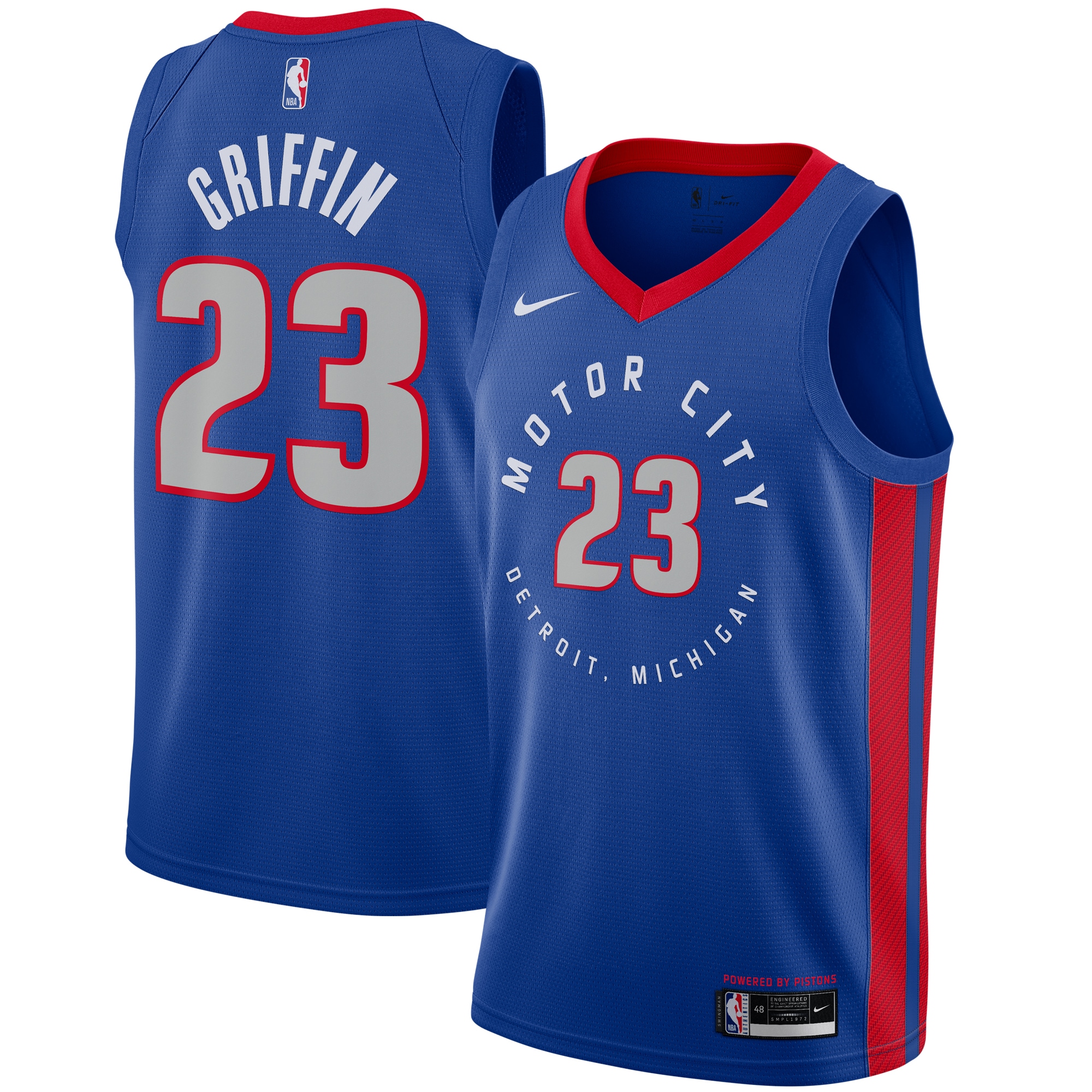
Haven't we seen this before? Nothing about the Pistons' latest riff on the Motor City nickname stands out. Maybe the team is just whetting fans' appetites for the inevitable return of the Pistons' gauche burgundy and teal 1990s throwbacks.
24. Houston Rockets
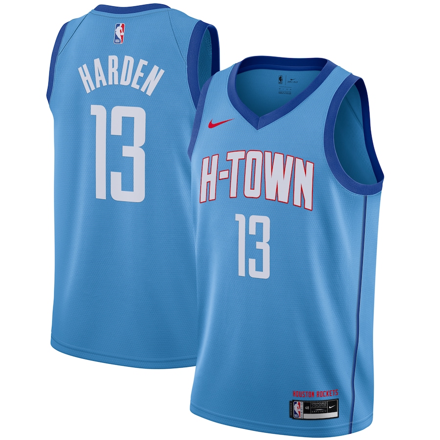
If the NBA was a place of higher learning, the Rockets would be expelled for plagiarizing several attempts at this exact look in recent years, most notably those by the Kings and Bulls.
However, if you want to go way back into Houston sports history, you can charitably excuse the Rockets for cribbing the formerly crosstown Oilers' old color scheme. Earl Campbell would be proud.
25. Oklahoma City Thunder
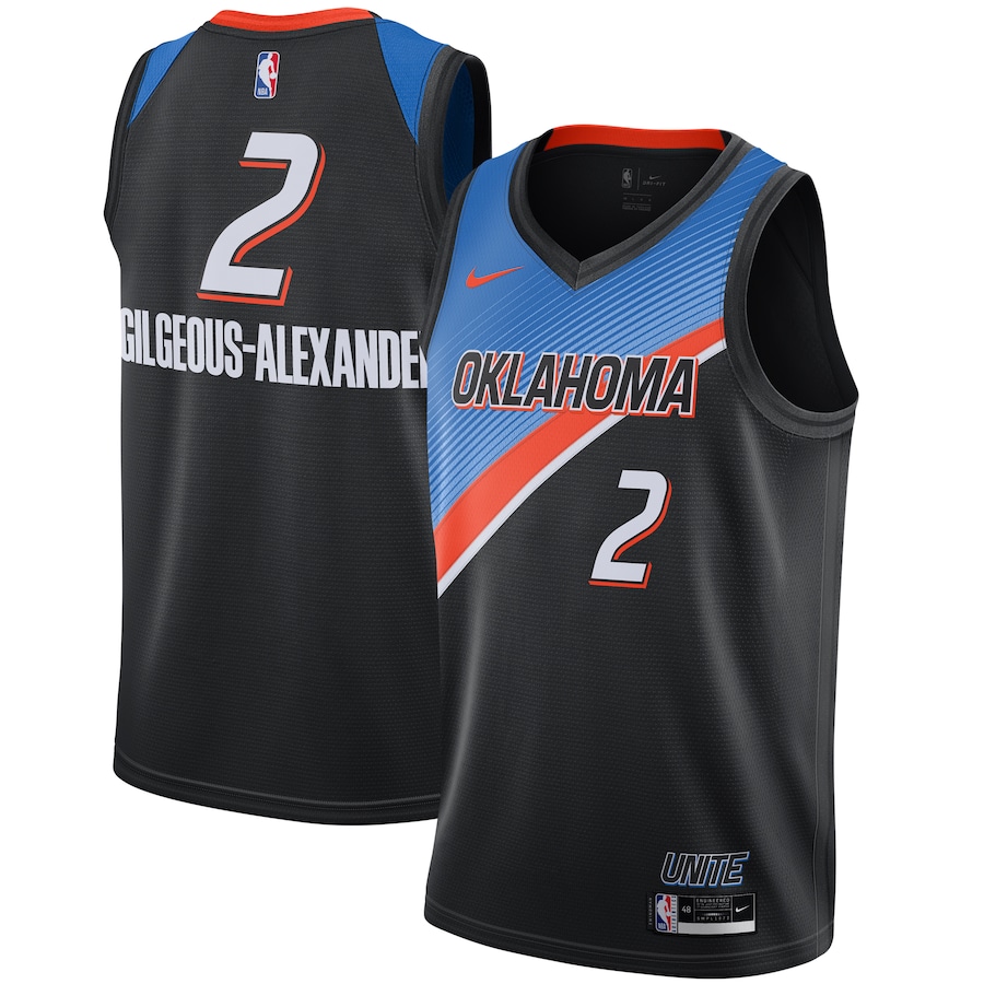
This is a completely forgettable design for a Thunder team that has gone from surprise playoff darling to a clearing house for some of the league's most onerous contracts. Anyone who purchases an Al Horford 2020-21 City Edition jersey deserves complimentary tickets to a game once the team is good again.
26. Los Angeles Clippers
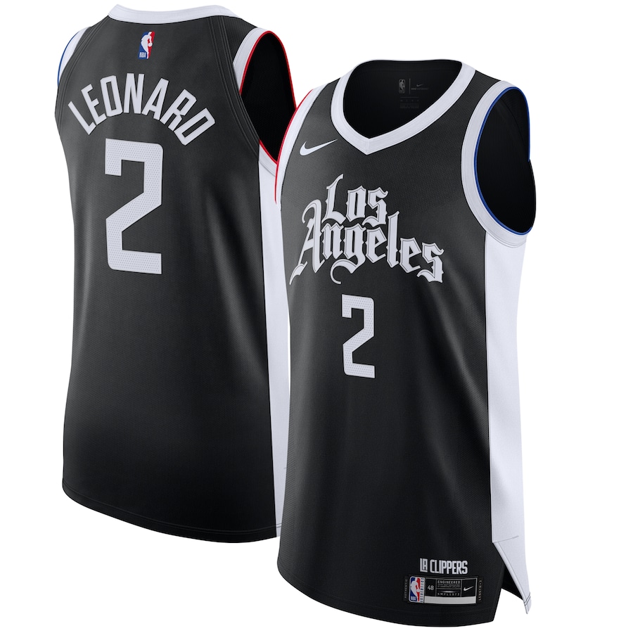
The Clippers flipped the base color on their street culture-inspired uniform from white to black. It still looks like something you'd see in a low-budget movie that wasn't able to clear the rights to use actual NBA team names and logos.
27. Cleveland Cavaliers
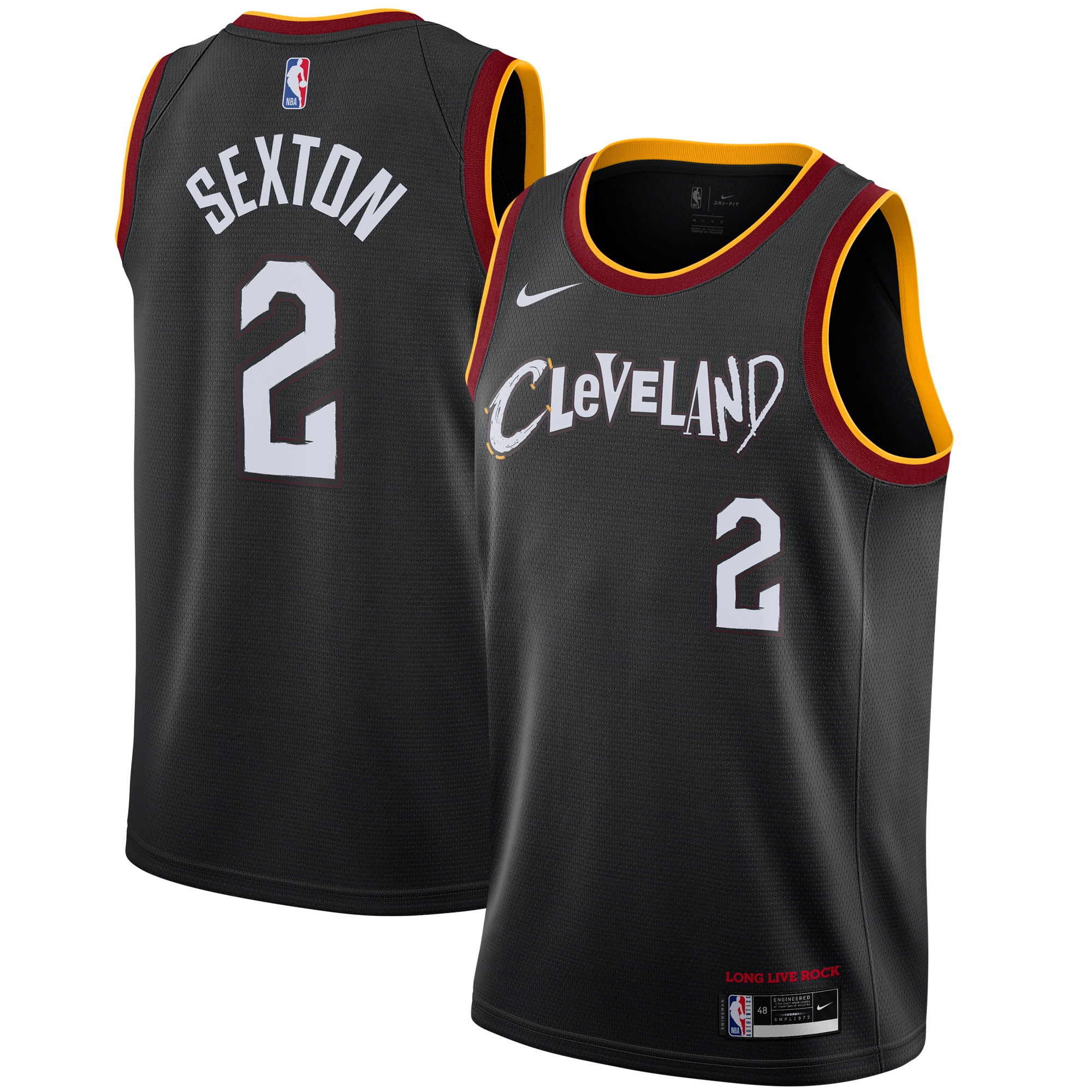
The Cavaliers say this jersey plays off the city's rock 'n roll spirit. However, that ransom-note font and scratchy numbering feel more like a cry for help. This might be the first NBA jersey that looks like it's experiencing serious emotional distress.
28. Milwaukee Bucks
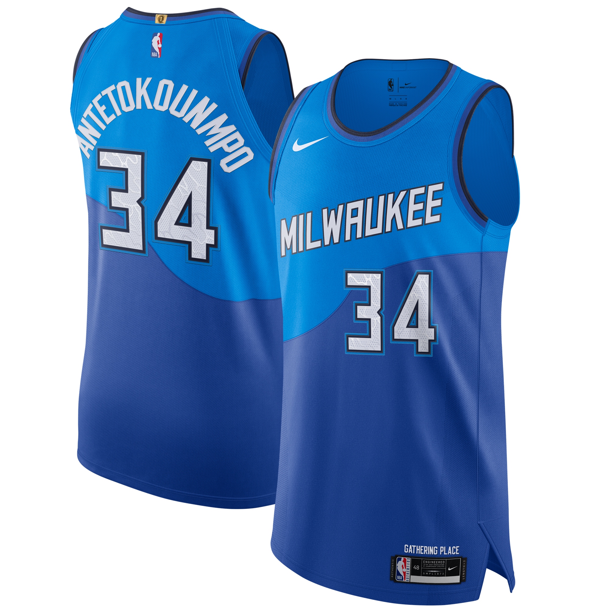
Unless Giannis Antetokounmpo himself demanded a two-tone blue alternate, the Bucks had little reason for this wild deviation from their usual look. The cartoonishly sharp typeface doesn't match the tranquility of the rolling Great Lakes-inspired waves whatsoever.
29. Washington Wizards
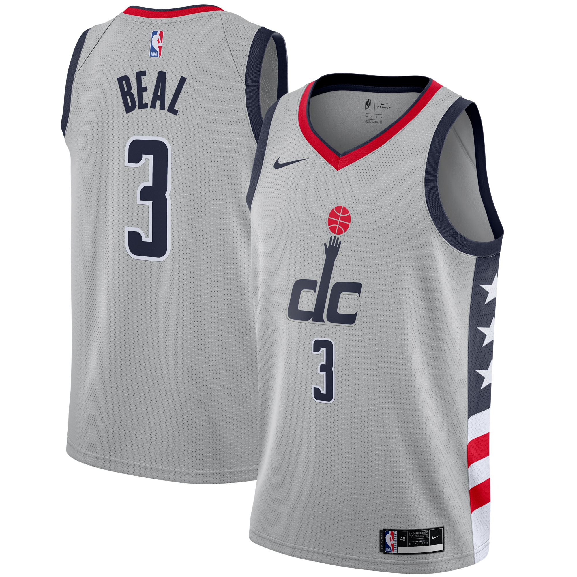
The Wizards clearly didn't spend much time coming up with this look. Why even bother producing a new City Edition jersey if this is all you can muster?
30. New York Knicks
It's like I've always said:
— ᴍᴀᴛᴛ ᴊᴀᴍᴇs 973 (@_Matt_James_) October 31, 2020
"City never sleeps New York Knicks."
🤦♂️ pic.twitter.com/ACgJya3spH
This Knicks collaboration with streetwear purveyor KITH doesn't succeed on any artistic front. The team's colors don't lend themselves to the gradient fade on the sides. With no indication of where to start reading, the circular wordmark is needlessly confusing. And once again, a jersey with a black base is incredibly uninspiring.


