This week in uniforms and logos: RIP Chief Wahoo
It appears Chief Wahoo's time is coming to an end. Recent evidence suggests the Cleveland Indians and Major League Baseball have been eliminating the logo from various marketing materials and merchandise over these past few months.
True, seeing signs that the Chief may be replaced someday isn't exactly anything new, it's more the speed at which things have been happening in 2013 that's raising an eyebrow with me. The Indians have been oh-so-slowly introducing various logos to be used in concert with Wahoo for over a decade. It started with an alternate cap featuring a cursive "I" logo in 2002, moving on to a block "C" cap in 2008 which eventually managed to kick Wahoo off of the Indians' road ballcaps altogether in 2011.
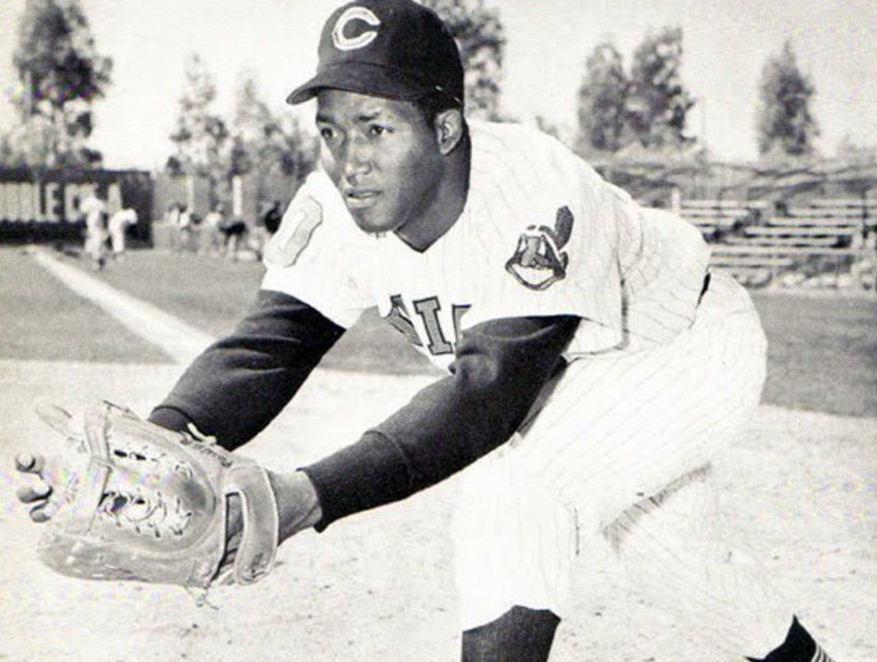
The Chief, for what it's worth, has been used by the Indians' in various ways on their uniforms, ballcaps, and/or promotional materials for past 63 seasons, making his début in 1951. It might also be worth mentioning the Cleveland Indians last won the World Series just three seasons before adopting the controversial logo, giving them the dubious honour of having the longest World Series draught currently active in the American League. Hey, it's a curse of the Chief!

The first sign of Wahoo's end days in 2013 came during the Indians home opener when we first learned the team had kicked the logo off of their helmets altogether. While the Chief had been replaced from the road helmets when it was taken off the road caps in 2011 he was still present on the protective lids for every home game. The team was adamant that it had nothing to do with Chief Wahoo but instead was due to a new MLB policy limiting teams to one helmet design despite other teams, such as the Washington Nationals, continuing to use separate home and road helmet designs.
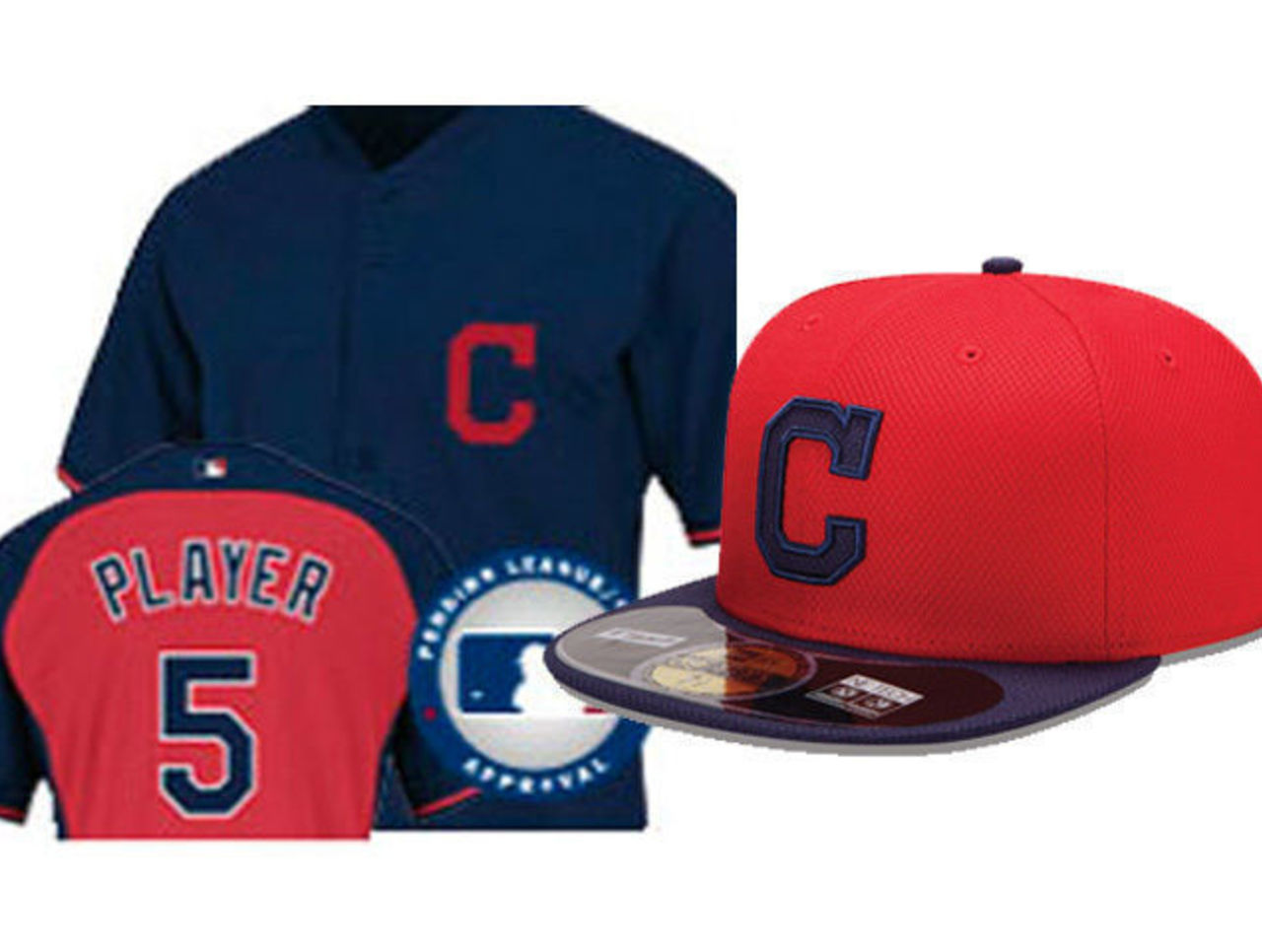
Later on in the season we saw a leak of the Indians' new 2014 batting practice uniforms, and... no Chief. Not on the caps, not on the jerseys. What this also means is that the Chief Wahoo logo will be absent from every Indians Spring Training game in 2014. Assuming everything else stays the same with their uniforms from 2013, the Indians won't wear their supposed primary method of branding for the first time next year until April 4th, a full two months after pitchers and catchers report.
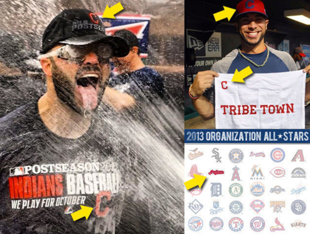
The Indians omitted the Chief from merchandise celebrating their 2013 postseason birth (the only team to not use their home cap logo), 2014 season ticket brochures, schedules, and their Twitter, Facebook, and Instagram pages. Some newer graphics in use on various MLB websites in which primary logos are used for the other 29 big league teams do not use the Indians primary logo, instead using either the red "C" logo or the "Indians" home jersey script.
I can't stress enough that Chief Wahoo is a logo which is officially identified as their primary logo and is also worn on both their home cap and sleeve of every jersey - you would think this logo would be the one the Indians should be using most often based on it's designation alone, instead it's the complete opposite. The block "C" logo the team uses everywhere these days is *officially* nothing more than a road and alternate cap logo. No other team in baseball uses a secondary cap logo as much as the Indians do in place of primary branding.
If all of the above wasn't enough to convince you the Indians are moving on, last week they sent out a survey to season ticket holders asking how they felt about three different Indians logos - one of which was obviously Chief Wahoo. Gauging how the public and fans would react to an official elimination of the Chief? I'd say that's a safe bet.
The team will likely never make any announcement that the logo is gone, it'll just happen. One of these upcoming seasons it'll be demoted from it's place as "Primary Logo", then the next it'll be stripped off the uniform sleeves, before finally used only on an alternate cap or jersey. Fans will undoubtedly raise a fuss but the final elimination will be so gradual that many will have stopped caring by the time it finally happens for good. You can call me crazy if you want but I'm usually bang-on when it comes to these things.
Fare thee well Chief Wahoo, your days are numbered, an absolutely memorable logo, for good reasons (such as team history) or bad (eh, the obvious) over the past seven decades is quietly being swept under the rug right in front of our eyes.
Chris Creamer is the creator and editor of SportsLogos.net. You can follow him on twitter at @sportslogosnet.