Rebranding a team is hard. Will the Guardians serve Cleveland's needs?
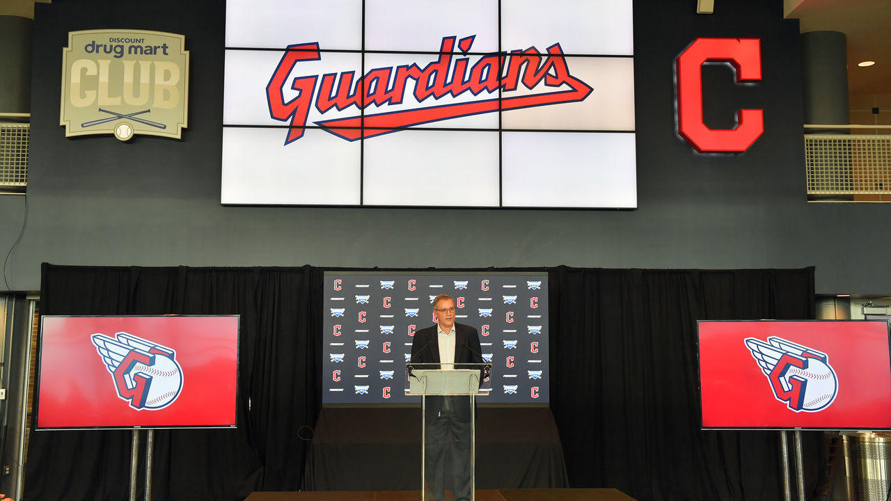
After seven months of deliberation, Cleveland's baseball team announced its new name Friday, the day of the week when companies often drop unpleasant or inconvenient news.
The announcement of the Guardians name included a message narrated by actor Tom Hanks, who spent three summers early in his career at the Great Lakes Theater in Cleveland. The video was published on the club's social media platforms.
The team had already cut ties with Chief Wahoo's likeness last December, when ownership announced it would drop its team name as pressure mounted to change an insensitive moniker. Since 1915, the club was dubbed the Indians. The decision was controversial within the fan base and city.
Getting a majority to like and agree on anything, let alone a new team name, figured to be a monumental challenge whenever it came, especially in the era of expressing outrage on social media.
"Terrible" trended as a topic on Twitter after the name was announced.
"Space force" jokes abounded regarding the new logo.
Together, we are all... pic.twitter.com/R5FnT4kv1I
— Cleveland Indians (@Indians) July 23, 2021
Some liked the name. Many did not. There were groups in Cleveland advocating for the other options: Spiders, Municipals, Blues, Crusaders, and Commodores. Cobbling together a majority seemed impossible.
So how did Cleveland’s ownership group do in renaming the club? Did it follow a good process? Did it come to a logical if not popular choice? Or did it totally miss the mark? Inspired or dull? It was a difficult task, and you only get one shot. To get a sense of how Cleveland did, and what boxes ought to be checked, we spoke to baseball's top rebranding company, Brandiose, earlier this month.
Jason Klein and his pal Casey White launched their company 20 years ago from their college dorm room. They sent 150 letters to minor-league teams stating a simple mission: to make their teams famous. One team wrote back: the West Tennessee Diamond Jaxx. They've since come up with new names and logos for 70 minor-league teams - including the Iron Pigs of Lehigh Valley, and the Flying Squirrels of Richmond - and also assisted the Cincinnati Reds in their rebranding effort several years back.
Klein noted many efforts to rebrand away from Native American-inspired team names have failed. He cited examples like the St. John's Redmen becoming the Red Storm, or the Miami (Ohio) University Redskins becoming the Red Hawks.
"The biggest reason is fear. People are so afraid," Klein said. "They’ve been stuck with this idea, 'We have offended, we have to change.' Fear is so rampant, decisions are so politicized. They are not out there saying, 'OK, we need to change, let's do something that is incredible.' I think that’s No. 1.
"No. 2 is if you get too referential - 'We were the Redmen, now we are the Red Storm' - you are still linked to that old identity and team name. Everyone will hear the name and think about where you came from and what you left. … If you are going to decide you are going to run away from it, you need to cut the cord."
Cleveland completely cut ties with its old name and logo. That's one box checked.
The next step is beginning the rebranding process. Klein said too many rebrands begin with names. What he's found helpful: start with stories. He has plenty of experience, living through countless focus groups and name-a-team contests.
"Sometimes you'll find the name is not very good but the story is really good," Klein said. "In these name-a-team contests, I'm much more interested in the stories that fans submit on why a potential name represents the community. ... I think you have to ask, 'Is there any history we can mine? Can we build an entire brand off of it?'"
To many, the choice of Guardians seems too safe, too cheesy, or too generic, something Klein warns against.
Guardians is the wedding dinner chicken entree of team name options
— Ellen Adair (@ellen_adair) July 23, 2021
Guardians also felt like something from Marvel Studios to some.
I wonder what these guys have to say about the name change pic.twitter.com/jcX4n9uxh7
— Travis Berardi (@TBerardi_) July 23, 2021
The logo? Even worse for some.
I'm not a fan of the three-dimensional G either. Looks like the logo of a superhero named Greg who is in the Justice League but his superpower is being amazing at managing the HR department.
— Dan Szymborski (@DSzymborski) July 23, 2021
And why not use the opportunity for a more interesting color palette?
Locally, though, the story behind Guardians is interesting and unique to Cleveland.
The Guardian name and aspects of the logo - the art deco-style wings attached to the baseball - are a nod to eight art deco Guardians of Traffic statues that in 1932 were carved into four, 32-foot sandstone pylons at the east and west entrances of the Hope Memorial Bridge. The bridge, one of 330 in Cleveland, spans the Cuyahoga River to connect downtown Cleveland with the west-side neighborhood of Ohio City. The bridge's east entrance is a Jose Ramirez toss from the home-plate gate at Progressive Field.
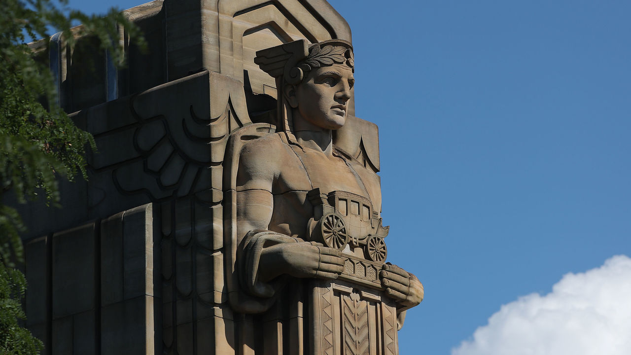
The bridge's chief engineer wrote that the art deco figures were meant to "typify the spirit of progress in transportation," an industry Cleveland played a key role in when its steel mills roared. The automobile built the Midwest and gave the country a massive leap in transportation capabilities. That's the history. That's part of the civic identity.
TBH, The Guardians is much more authentically Cleveland than most jokesters on this website understand
— josh grubbs (@JoshuaGrubbsPhD) July 23, 2021
These four statues--The Guardians of Transportation--are absolute icons in the city and familiar to anyone who has any sort of roots in the area https://t.co/8u0fx9SKI0 pic.twitter.com/vlifF39JjQ
When Brandiose rebranded Huntsville, Alabama's minor-league team, it ran surveys and held focus groups to understand what people thought represented their community. There was a common theme: rockets and engineering. The city was a rocket and engineering center for NASA - it has more engineers per capita than any other city in the U.S.
Klein and White then tried to find an animal they could associate with an engineer.
"We watched videos of raccoons picking locks, engineering things, cobbling stuff together, and we were like, 'The raccoon! That is the engineering animal,'" Klein said. "We know the trash panda is slang for raccoon, and one name you cannot ignore."
The Rocket City Trash Pandas were born.
With the Reds, there was more of a focus on tradition. They wanted a more classic look. They reduced some of the black color that had crept into the club's lettering and logo. They're the Reds, after all. They also researched late 19th-century typeface, storefront signage, and jersey lettering in order to strengthen the idea - the look, as it were - that this was the original MLB team.
In that sense, Cleveland could have leaned more into the art deco design and adopted art deco lettering. Some of the released jersey images feature only slight alterations from the club's current jersey lettering. For instance, a script "Guardians" is a failure if the goal was to distance the team fully from its former brand.
A fresh look from the 216. pic.twitter.com/0W8VTtZ7b0
— Cleveland Indians (@Indians) July 23, 2021
Another question: keep or shed the team colors?
"If you change to purple, and some people are wearing red and blue, and some people are wearing purple (at the ballpark), now there is a dynamic that becomes a sort of statement that 'I am not for the new brand,'" Klein says.
Sports ought to unite more than divide. The Guardians are keeping the team colors, the club announced Friday, and it's probably the right call.
"Sports is a passion business. It's all about emotion," Klein says. "For you to grow up in Cleveland and cheer on the Indians, maybe you took your daughter to her first baseball game, or you remember that playoff run, you put your emotions in this box. And at some point, someone takes that box with a logo on it and dumps out your emotions, and tosses the box aside and says 'Now put your emotions in this new box'? People are like, 'No. I don't want to do that.'"
More than anything, Klein warned against fear creating something "tastefully dull." He repeats that term multiple times.
"I think you should find a name that cannot be ignored. If I was there assigned to them, I would tell them to think more like a minor-league team," Klein said. "We are absolutely trying to involve in the community and have fun. But I want to sell as much merch outside of Cleveland as in Cleveland. If you ask a big baseball fan to name all 30 MLB teams, there are probably going to be a couple at the end, 'Who am I missing?' You never want to be one of those clubs."
Are the Guardians one of those clubs? On Friday afternoon, they were difficult to ignore.
Travis Sawchik is theScore's senior baseball writer.