Ranking the 3 best and worst MLB spring training hats
Major League Baseball clubs unveiled new headwear for spring training Friday, and some sides definitely nailed their designs.
Unfortunately, we can't say the same about a few others, as some clubs released confusing selections that we attempted to decipher.
Here are the three best and three worst caps:
Best:
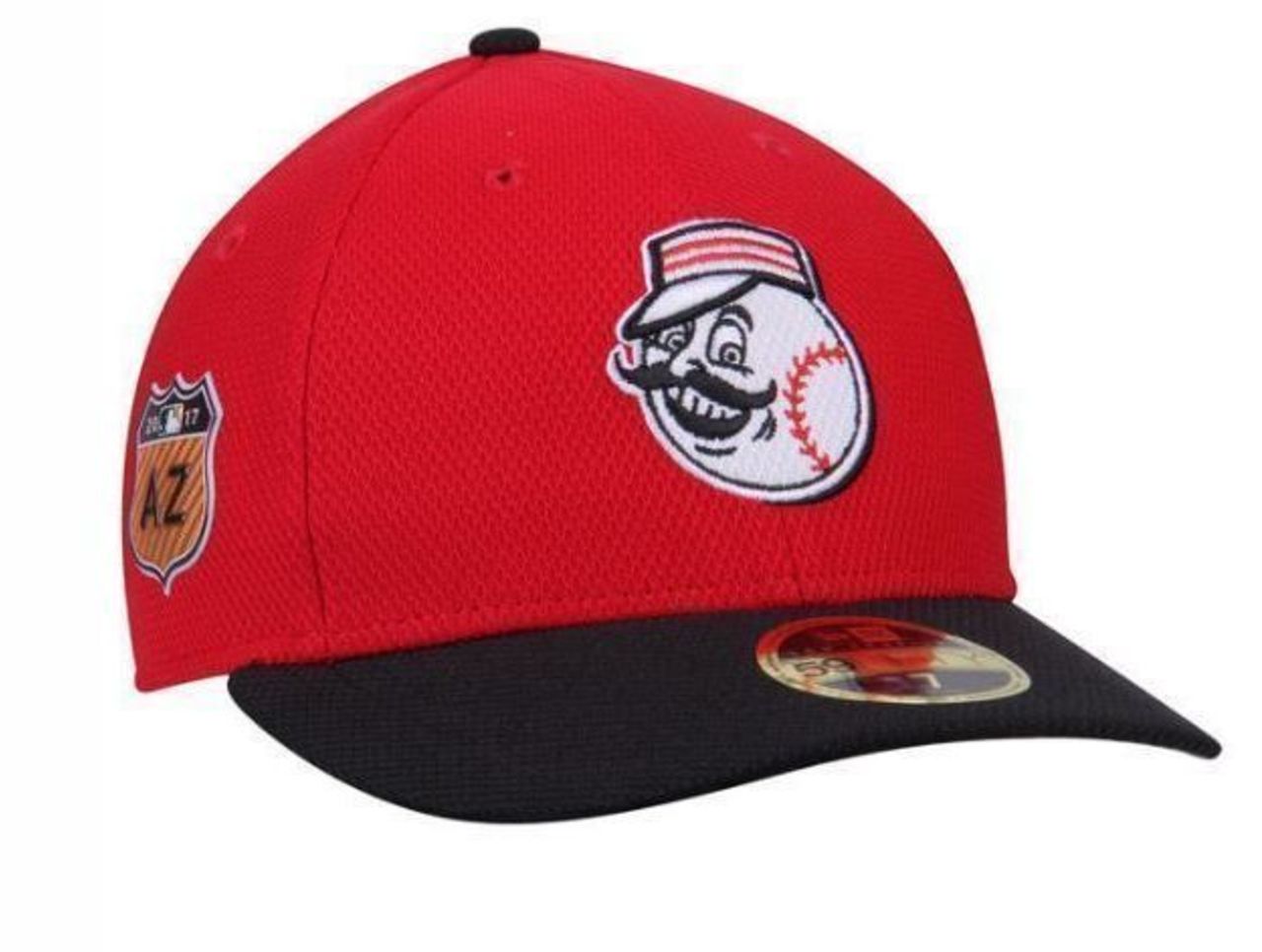
3. Cincinnati Reds

The historical and mustachioed "Mr. Red" has been a staple on Cincinnati's hats for seasons now, but, put simply: If it ain't broke, don't fix it.
2. Chicago Cubs
Fresh #SpringTraining threads. pic.twitter.com/jnkV7iOraH
— Chicago Cubs (@Cubs) February 3, 2017
Never mind the dull "C" cap here - Chicago also released a second version featuring its alternate cub logo that drew a lot of attention for all the right reasons. Pairing it with Kyle Schwarber helps, too.
1. Seattle Mariners
The trident returns and it is 🔥.
— Mariners (@Mariners) February 3, 2017
Here's your first look at our cap and threads for #MarinersST 2017. pic.twitter.com/qFWhbkY1H9
Seattle surprised everyone by reaching into the history vault and pulling out its classic trident look from the late 1970s. As you'd expect from a mariner, it blows every other cap out of the water.
Worst:
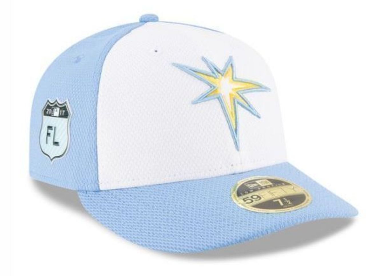
3. Tampa Bay Rays

It's not easy transforming an actual sun ray into a logo, we get it. The problem here isn't so much the bland emblem, however, but the awful sky blue tint overwhelming the rest of the hat.
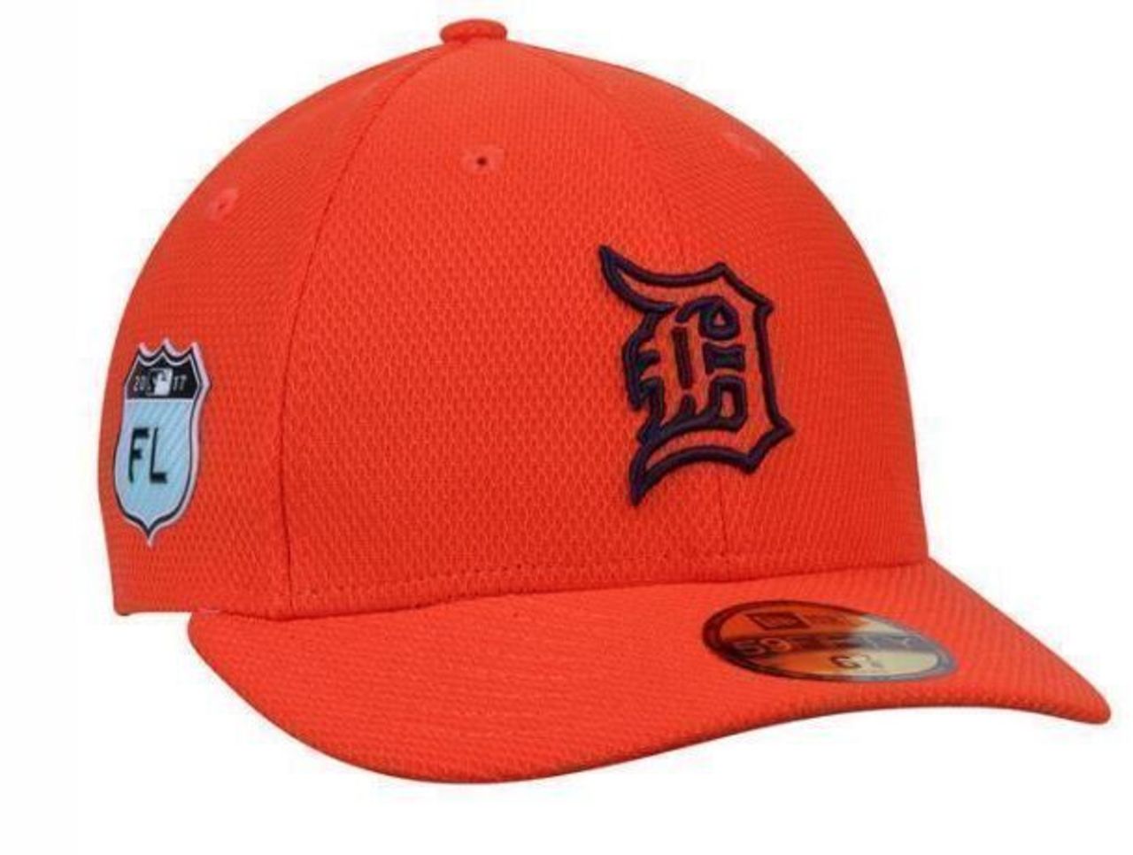
2. Detroit Tigers

The Tigers adorn their uniforms with a subtle tint of orange that works really well against their road greys, but overloading one of their hats with the color was, ironically, not a bright idea.
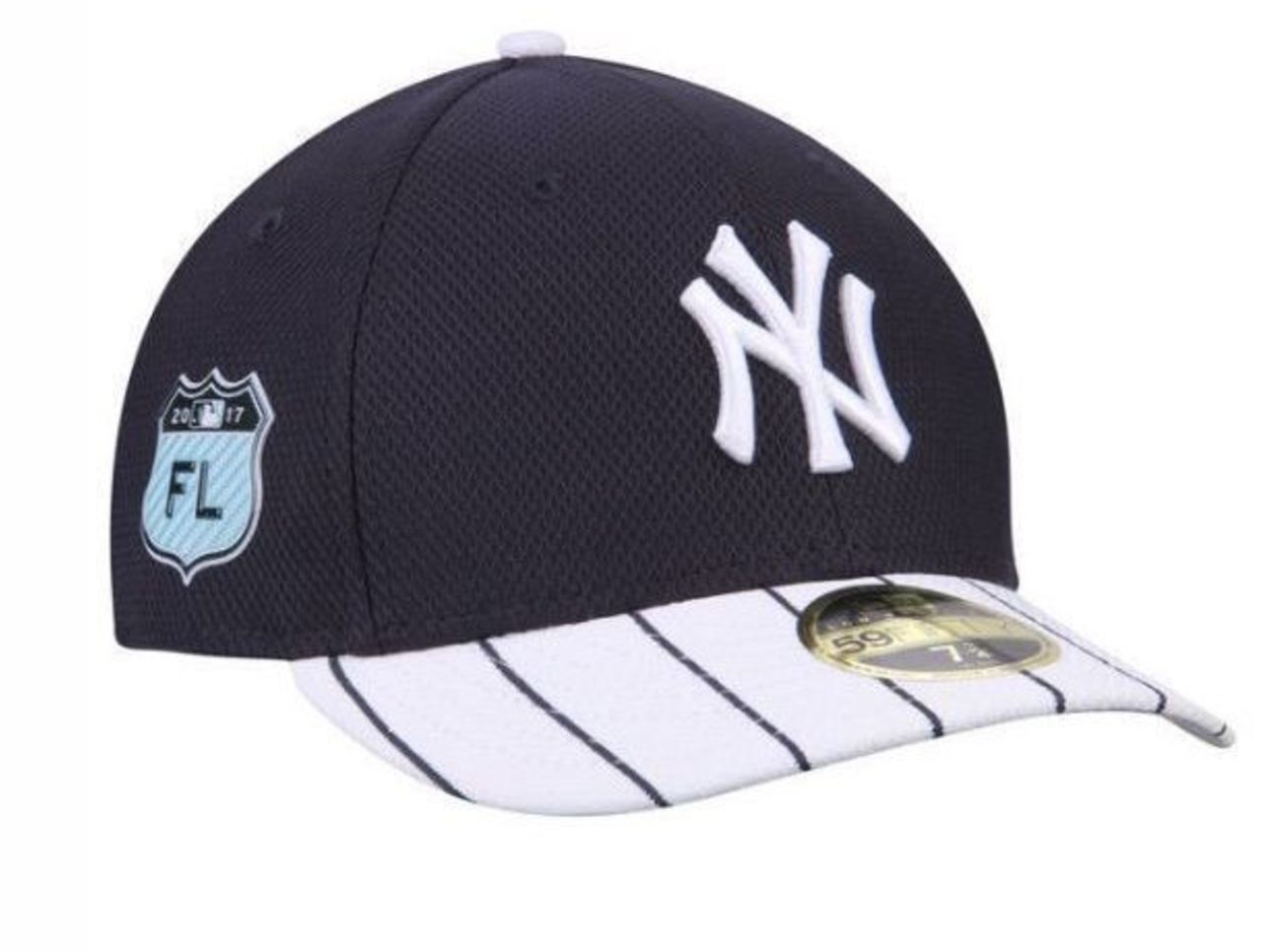
1. New York Yankees

No one is disputing that pinstripes and the Yankees are synonymous, but New York tried to transfer the classic pairing to its headgear, and it failed. Miserably.